Obese visualizations are bad, but anorexic content is even worse. Lean-looking reports that are packed with information are ideal. All you need is a sharp scalpel and…the death of the business chart. Finally!
Business charts shape the culture of communication. When they come from charting software, however, they look rather crude. I first learned how extreme this could be thanks to a 1990 internship at Roland Berger & Partner, a management consultancy headquartered in Munich.
The physical result of every consulting project is and always was a tome of charts. Nimble-fingered graphic designers create computer charts based on what the consultants sketch with pencil and paper. Detailed style guidebooks determine every aspect of the chart’s appearance. The knowledge pooled into these guidelines is astonishing. Even today, no charting program can replicate the quality of these graphics. Back at the time of my internship, the graphic designers preferred to work with Freehand on an Apple Macintosh. As the name suggests, ‘Freehand’ gave the designers an enormous range of freedom but they had to draw almost every detail themselves.
Following my internship, I helped a friend with a small consulting project. Unfortunately, I was able to convince him that he needed a tome of charts as well. We borrowed a computer, printer and Harvard Graphics, one of the first business charting software tools on the market, because we were overwhelmed by Freehand. The deadline was tight and we worked on that tome three days non-stop.
The quality was pitiful.
Since that time, I regularly see charts of a similar stature. Unfortunately, that ‘quality’ is standard for most companies, newspapers, publications and even many specialized information services. The ideal of a dense, straightforward graphic is rarely attained. The New York Times or Sunday papers such as Germany’s “Welt am Sonntag”, however, do publish precise graphics on a regular basis. They place numbers next to the graphical elements, abstain from cumbersome color-coding and avoid non-informative clutter – just like they should.
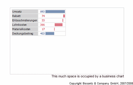
The charts that you can produce with Excel, charting software and many management information systems don’t come anywhere close to the ideal. The animation illustrates how far away they really are. You need twelve steps to remove all of the unnecessary chart junk.
The causes, which are general in nature, are only remotely connected with the bad taste of Excel’s programmers.
For starters: The font runs horizontally while the bars run vertically. As you can see in our example above, vertical text is rarely a justifiable solution. The combination of horizontal and vertical columns requires significant space and tilts the weight of the graphic element to the left. Excess weight emerges quickly in visualizations, for example, when the author wastes more pixels than necessary, because he or she feels that the human eye can detect differences in size better than it can comprehend numbers.
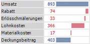
Clutter-free and 5 times smaller: graphical tables
The final step of the animation shows how simply you can replace a bar chart with an efficient graphic table. All of the clutter – the lines, axes, frames, spacing, empty spaces and even the oversizing – is gone. The bars were rotated from a vertical to a horizontal position.
The future looks bleak for the business chart. May it rest in peace †.
