![]()
Greetings, fellow data analysts!
Companies spend a great deal of time and effort collecting, saving, preparing, and consolidating data – and, ultimately, making reports. But if a report is read and understood or even triggers a reaction doesn’t just have to do with the quality of the underlying data. The design plays a key role as well. When it comes to designing reports, DeltaMaster already answers many open questions and takes over a range of tasks, for example, through reasonable default settings, automatic formatting, and a carefully defined set of options. And for all of the tasks that you can’t automate (yet), we have set up recommendations and guidelines. We will present these to you as a series of checklists and explanations in a special edition of DeltaMaster clicks!:
Part 1: General Guidelines DeltaMaster clicks! 09/2013
Part 2: Pivot tables/graphical tables DeltaMaster clicks! 10/2013
Part 3: Sparklines, pivot Charts DeltaMaster clicks! 11/2013
Part 4: Nomenclature DeltaMaster clicks! 01/2014
You will see how you can make many improvements to your reports with very little work. Oftentimes, all you need to do is tweak a few settings to make your reports more attractive and easier to understand. The readers of your reports and audience of your presentations will surely thank you.
Best regards,
Your Bissantz & Company team
The third part of our series on improving DeltaMaster applications focuses on sparklines. Sparklines, which have been offered in DeltaMaster since 2004, are one of the main pillars in our “industrial reporting” concept. We will also offer tips for business charts, which are called pivot charts in DeltaMaster. A few tips will probably suffice because most DeltaMaster users rarely create pivot charts in their reports any more – because of the advantages of graphical tables. Here is an overview of our tips:
| Sparklines
1) Use columns or dot lines for short series 2) Do not visualize cumulations 3) Avoid redundancies 4) Include the same period of the previous year 5) Do not use cumulated values as captions in monthly sparklines 6) Do not use sparklines for quarters Pivot charts 1) No 3D visualizations 2) No pie charts 3) Use bars for structures, columns for time 4) Set the chart size automatically |
Sparklines
1) Use columns or dot lines for short series
Columns and dot lines are easier to read than pure lines, but they also require more space. As a result, column or dot line sparklines are the better choice for short time series while line sparklines are more suitable for long ones.
| Short time series: | 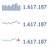 |
Long time series: | 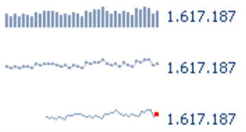 |
2) Do not visualize cumulations
Sparklines are not suitable for visualizing cumulations because the reader can not differentiate the changes from period to period. Instead, these sparklines form a saw-tooth pattern in which you cannot expect to find any new insights. Cumulated variances, however, are an exception to that rule and can be visualized as sparklines.
| Avoid this: | 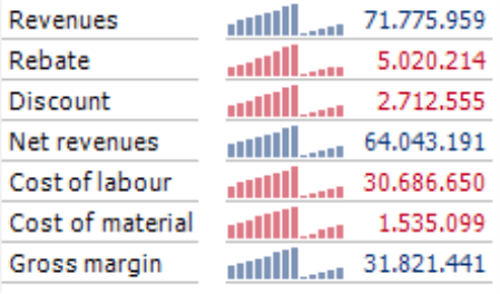 |
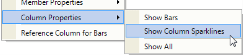
As a result, you should hide sparklines in columns or rows containing cumulated values. For sparklines and other graphical elements (e.g. bars, columns, circles), DeltaMaster will always first activate the respective visualization for the entire table. Afterwards, you can hide individual columns and rows (Column Properties or Row Properties in the context menu of columns or row headers).
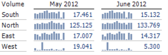
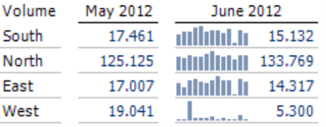
3) Avoid redundancies
Many reports show both the current and previous periods. When both of these columns (i.e. current and previous periods) contain sparklines, the report wastes valuable space with redundant information. The two sparklines, namely, only contain two different values: While the current period’s sparkline is longer by one value (i.e. current value), the previous period’s sparkline begins one period earlier. If the sparklines cover a period of 12 months, therefore, this type of visualization would display 11 of them twice.
Our recommendation: Use sparklines for the current period only (i.e. not the previous one) and extend the sparkline as described below in Rule 4.
 |
 |
If the report shows the same period of the previous year (and not the previous period), you should still ask yourself if you really need the sparklines. Although the values are not redundant, the period shown is probably so long ago that it is no longer relevant for current tasks and decisions. If in doubt, remember that a second column with sparklines would only emphasize the past. In that case, you are probably better off to omit it as described in Part 2 of our “Check list for DeltaMaster applications“ series (DeltaMaster clicks! 10/2013, tip #2).
Sparklines for absolute and relative plan-actual variances are often redundant as well. Since you can usually see that the patterns coincide just by looking at them, you can omit the sparklines in one of the two columns.
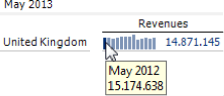
4) Include the same period of the previous year
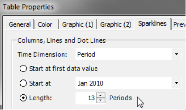
A best practice for reports on monthly levels is to draw the sparklines with a length of 13 months. This allows you to compare the values to the same period of the previous year as well because the first column (or dot) in the sparkline stands for the same calendar month of the past year.
You can set the Length of sparklines in the Table Properties (context menu of the pivot table, I want to menu, or F4 key) on the Sparklines tab. The standard length for new pivot tables is 13.
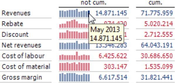
5) Do not use cumulated values as captions for monthly sparklines
Cumulated values should not be used as captions for non-cumulated monthly sparklines. In sparklines, the number is always the last member in the time series. If you diverge from this standard and want to display the number as the sum of the time series members, your readers may oversee this deviation and misinterpret the information as a result. The alternative is simple – just work with two columns as shown in the screenshot on your right. The first column shows the individual values with a sparkline, and the number equals the last member of the sparkline as usual. The second column then lists the cumulated value without a sparkline.
6) Do not use sparklines for quarters
Using sparklines for quarters doesn’t always provide meaningful insights because the quarters of the year are often very different (e.g. seasonal business), and trends are difficult to foresee. If you still wish to use sparklines to compare quarters, the relative variance to the same period in the previous year is more suitable.
Pivot charts
1) No 3D visualizations
Although this is a long-established rule, we are repeating it for emphasis. Three-dimensional visualizations are difficult to read. When the numbers are displayed in the front and back, you can’t even differentiate the smaller and larger ones. In short, don’t use 3D in reporting.
| Avoid this: | 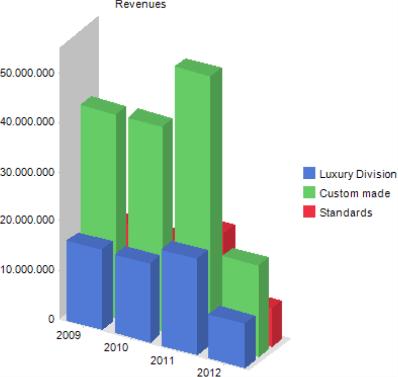 |
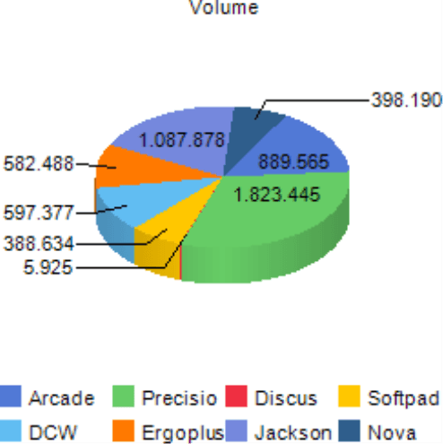
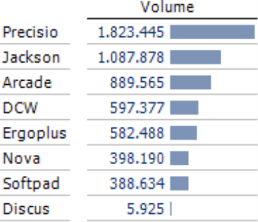
2) No pie charts
In pie charts, it is often difficult to estimate the size of the individual segments – especially when they are three-dimensional. When they show many types of data, displaying the captions becomes difficult and tedious. On top of that, they waste a lot of precious space. Bar charts and graphical tables are better because everything is placed where it belongs – underneath each other for easier comparisons.
 |
 |
3) Use bars for structures, columns for time
In charts, time always passes from left to right – and always belongs on the horizontal X axis. For individual points in time, use columns that stand next to each other and are positioned in the order that you would read them, just as in sparklines. Everything else, especially structures, go on the Y axis. Here, we use bars to represent them.
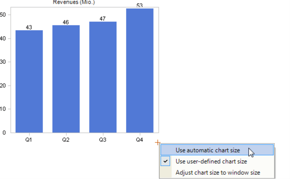
4) Set the chart size automatically
Let DeltaMaster set the chart size automatically so that you can make the most of the space that is available. This function, which is the default setting for new charts, can be activated in existing charts. Simply click on the cross symbol on the bottom-right corner of a pivot chart (double click or context menu) and activate the option.
In the next part of this “Check list for DeltaMaster applications” series, we will provide tips for creating a standard nomenclature.
Questions? Comments?
Just contact your Bissantz team for more information.
