





































What is a dashboard?
Dashboards are visual overviews that present business KPIs in a compact format, highlight important trends, and enable fast, data-driven decisions. Their purpose is to make complex information easy to grasp and support well-founded decisions. In a business context, dashboards consolidate data from different sources and provide an at-a-glance view of the company’s “state.”
| Feature | Details |
| Category | Business intelligence / data visualization / reporting |
| Application | Visual presentation of KPIs, trends, and variances for decision support |
| Typical areas of application | Controlling, management reporting, sales, marketing, production, project management |
| Related terms | KPI, reporting, data visualization, business intelligence, cockpit, scorecard |
| Benefits | Quick overview, trend identification, variance identification, well-founded decisions |
At a glance
turn complex figures into easy-to-understand visualizations
help users continuously keep both operational processes and strategic objectives in view
present information through charts, tables, and other visual elements
good dashboards are clear, up to date, relevant, and based on a consistent data foundation
Dashboard definition
A dashboard is a visual user interface that presents important KPIs, data, and information in a compact and clearly structured format. The purpose of a dashboard is to make complex information easy to grasp and support well-founded decisions. Typically, data is presented in the form of charts or tables that are automatically consolidated from different sources.
Dashboards are also often referred to as management cockpits or KPI cockpits because, much like an aircraft cockpit, they bring together various instruments and provide an overview of the company’s “state.” In business intelligence (BI), BI dashboards serve as monitoring and analysis interfaces for monitoring performance indicators in real time, identifying trends, and quickly detecting variances.
What does a good dashboard look like? – Dashboard requirements
A good dashboard does more than present data clearly and unambiguously: it makes the meaning of the data immediately apparent and thereby enables fast decisions. To meet this standard, a dashboard should fulfill certain requirements:
Clarity: Clear structure, logical organization, and visual hierarchy for a quick overview.
Relevance: Only the most important KPIs, tailored to the target audience and use case.
Interactivity: Filters, drill-downs, and flexible views to enable detailed analyses.
Timeliness: Automatic data updates in real time or at short, regular intervals.
Visual design: Consistent use of colors and symbols, with a reduced presentation free of unnecessary distractions.
Usability: Intuitive operation, short loading times, and responsive design for different devices.
Consistency: A consistent data foundation and defined calculation logic to ensure comparability and build trust.
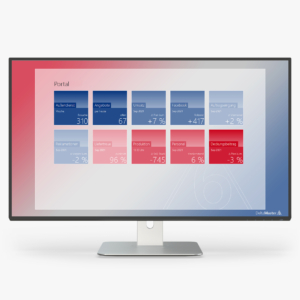
DeltaMaster follows these core principles of data visualization, for example through a two-color logic and typographically scaled numbers, and uses automated data integration to provide consistent and up-to-date data.
What types of dashboards are there? – Dashboard examples
Dashboards can be divided into different categories. They differ primarily in the information they prepare and the KPIs they focus on. Typical dashboard types include:
| Dashboard type | Content and purpose |
| KPI dashboards | Visualize the most important performance indicators and show progress toward business objectives at a glance. |
| Management dashboards | Provide executives with a strategic overview of key business data, often at an aggregated level. |
| Operational dashboards | Support day-to-day operations and provide real-time information, for example on processes in production, logistics, or service. |
| Project dashboards | Track schedules, budgets, and task status to provide a transparent view of project progress. |
| Function-specific dashboards | For example, marketing dashboards, sales dashboards, or finance dashboards. |
| Industry-specific dashboards | In areas such as healthcare and retail or e-commerce, they help present industry-specific KPIs such as patient numbers, inventory levels, or revenue trends in a clear format. |
Reporting and dashboards: differences and relationship
Dashboards and reporting are key components of the Business Intelligence environment. Both aim to make data accessible and usable, but they differ in structure, level of detail, and application. The key similarities and differences are summarized below:
| Feature | Dashboard | Report |
| Presentation | Visual: charts, KPIs, graphics | Tabular, text-oriented |
| Purpose | Condensed overview at a glance | Detailed analysis of a clearly defined subject |
| Interactivity | High: filters, drill-down, flexible views | More static, fixed layout |
| Time horizon | Current data, often in real time | Periodic retrospective views (monthly, quarterly) |
| Target audience | Managers and decision-makers under time pressure | Stakeholders requiring documentation |
In summary, the two tools complement each other and together provide a comprehensive data foundation for controlling. Reporting dashboards can serve as a starting point for more detailed reports. The reports provide deeper levels of analysis to which the reporting dashboard directs users.
Practical example: controlling dashboard with Bissantz
A company with several sales regions and product lines wants to accelerate its monthly management process. Until now, data from ERP and CRM systems has been manually consolidated in Excel spreadsheets – an error-prone and time-consuming process that delays month-end closing.
With DeltaMaster by Bissantz, an integrated BI dashboard is created that automatically consolidates data from all relevant sources and prepares it consistently. Key performance indicators – revenue, contribution margin, variance from plan and prior year – are presented in graphical tables with embedded sparklines: trends are visible at a glance, while outliers are immediately highlighted through the two-color logic.
The executive can see at a glance which region or product group deviates from plan and can navigate to the underlying cause in just a few clicks using drill-downs or natural-language queries, without having to switch between systems. What used to take hours can now be done in minutes: the dashboard is not an endpoint, but the starting point for structured analysis.
FAQ – frequently asked questions
A dashboard is like a car’s dashboard: at a glance, you can see the most important values – speed, fuel level, and warning lights. In a company, a dashboard shows the most important KPIs so that executives can immediately see where everything is on track – and where action is required.
Less is more. An effective dashboard focuses on the 5–10 KPIs that are genuinely relevant to decision-making. Too many KPIs lead to information overload – users see everything but understand nothing. Selecting the right KPIs is more important than presenting all of them.
A good dashboard answers the right question for the right target audience – immediately and without explanation. It should not require a legend, accompanying text, or training. Clarity, consistency of the data foundation, and a clear visual hierarchy are more important than elaborate design.
A dashboard is suitable for continuous monitoring and quick status overviews. A report is useful when a subject needs to be documented, explained, or prepared for external stakeholders. In practice, a dashboard can lead to a report: anomalies identified in the dashboard can be analyzed in the report.
DeltaMaster by Bissantz combines automated data integration with intelligent visualization: KPIs are calculated consistently, variances are automatically highlighted, and trends are immediately visible through embedded sparklines. Controllers receive a dashboard that not only shows what is happening but also immediately indicates where action is required.
Summary
A dashboard is far more than an attractive visualization: it is a central management tool for data-driven decisions – in controlling, management, and operational teams. Good dashboards are relevant, consistent, and tailored to the needs of their target audience. With DeltaMaster, Bissantz offers a platform that automatically builds dashboards from integrated data sources, intelligently highlights variances, and provides seamless access to more in-depth analyses.
Free of charge for you
How AI takes over the work of interpretation—and helps companies move more quickly from analysis to action