Ein Gespräch zwischen dem Publizisten Murat Suner und Nicolas Bissantz über die Bissantz‘Numbers.
Ein Gespräch zwischen dem Publizisten Murat Suner und Nicolas Bissantz über die Bissantz‘Numbers
Murat Suner: Wie bist Du auf die Bissantz‘Numbers gekommen? Wenn man das einmal gesehen hat, diese typografisch skalierten Zahlen, dann kann man sich schwer vorstellen, warum das niemand schon früher vorgeschlagen hat.
Nicolas Bissantz: Ja, in der Tat. Ich meine fast: Wir leben in so bildverliebten Zeiten, dass der Primat des Bildes einen frischen Blick auf die Zahl verhindert hat. Tag Clouds zum Beispiel gibt es schon lange, dabei ist die Vergrößerung von Text proportional zu einem Wert weniger naheliegend als die Vergrößerung von Zahlen.
MS: Waren Tag Clouds die Inspiration für Dich?
NB: Nein. Ich war selbst überrascht: Sie sind ein Nebenprodukt unserer Eyetracking-Forschung zum Business Intelligence – auf Rennstrecken.
MS: Bei Autorennen?
NB: Ja. Wir wollten besser und grundsätzlich verstehen, wie der Mensch sieht. Dafür haben wir eine Testumgebung gebraucht, die keine Fehler verzeiht.
MS: Ist das Sehen denn so rätselhaft? Man sollte meinen, das „Augentier Mensch“ ist gut erforscht und es gibt genug Augenärzte und Optiker, die darüber Bescheid wissen?
NB: Richtig scharf und bunt sieht man nur mit der Fovea, das ist der kleinste Teil des Auges. Damit wird ein Bereich des Sichtfeldes abgedeckt, der nur so groß ist wie ein Daumennagel in etwa einer Armlänge Entfernung. Aus den damit gewonnenen Stichproben konstruiert das Gehirn, was wir sehen. Ein großer Teil davon ist eine Projektion, die auf Wahrscheinlichkeitsrechnung und Erfahrung beruht. Wie das genau vonstattengeht, ist nur in Grundzügen bekannt. Vor allem aber gibt es bisher wenig Anstrengungen, aus den Grenzen des Sehens die richtigen Schlüsse für die Gestaltung zu ziehen. Dessen habe ich mich angenommen.
MS: Du warst dazu mit Hans-Joachim Stuck auf der Nordschleife und ihr habt seine Augenbewegungen mit einer Eyetracking-Brille aufgezeichnet. Was war euer Ziel und was hat das mit Tabellen oder Infografiken zu tun?
NB: Wir verstehen das Sehen nur unter Extrembedingungen neu, also dort, wo etwas offensichtlich nur dann gelingt, wenn das Sehen den notwendigen Beitrag dazu liefert. Spitzensport hat solche Extrembedingungen. Aber nur Rennfahrern können wir eine Eyetracking-Brille auf die Nase setzen. In geschlossenen Rennwagen wird der Kopf nur mäßig bewegt, die Erschütterungen halten sich in Grenzen, die Aufzeichnung ist stabil genug.
MS: Und Rennfahrer „lesen“ die Strecke wie ein Manager einen Bericht?
NB: Ob Manager oder das Design von Berichten von Rennfahren etwas lernen können, das galt es erst herauszufinden. Ich war mir lediglich sicher, dass man als Grundlagenforscher Neues entdecken würde und wir dieselben Augen für die Konstruktion des Bildes einer Rennstrecke und eines Diagramms benutzen. Jedenfalls wurden wir nicht enttäuscht. Schon die allererste Fahrt brachte atemberaubende Erkenntnisse.
MS: Klingt, als ob wir nicht alles darüber erfahren sollen?
NB (lacht): Richtig! Unsere Forschung geht weiter und ein paar Dinge wollen wir noch für uns behalten. Andere teilen wir: Die Bissantz’Numbers stellen wir jetzt schon vor und ein Excel-Add-in dafür gibt es kostenlos. Die bisher wichtigste Folgerung kann also jeder für sich nutzen.


"Bissantz reinvented the number.”
Dr. Henri Lüdeke, CEO, iwb
"Typographic scaling facilitates the neuronal processing of numbers considerably."
Prof. Dr. Dr. Gerhart Roth, Biology, University of Bremen
"I could not imagine that you are able to experience numbers in an emotional and a rational way."
Thomas Salow, CEO, Coretastics
MS: That turns everything we thought we knew about graphics upside down.
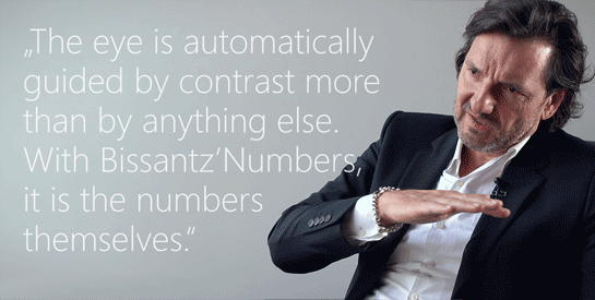
NB: It does come as something of a surprise, yes – but there is nothing we can do about it. Whatever we put next to a number, the result is a visual code that our brains then must decode. And that effort is mostly superfluous. What’s more, a lot of charts are misleading, which presents a risk in its own right. Pictures pass by the “gates of consciousness” on their way to our brains. And unlike incorrect words or figures, the brain finds it difficult, if not impossible, to forget incorrect pictures.
MS: I see. Numbers reach our brain consciously. And a bigger number makes for a bigger contrast, thereby guiding our eye in the order of the sizes of the values. But can the same be said for time
series? Even hardcore number crunchers would find it difficult to identify a pattern from a table.
NB: Short time series are perfectly suited for this approach, as the examples on our website show. The compact number formats that we have designed for this purpose help here. We no longer write large numbers out in full. Instead, we abbreviate them. So, 391,412 becomes “391k”, for example, while 1,376,455 is shortened to “1.4m” – all within the same table.
MS: I see. This stops you from having to use an awkward “0.9” for 900,000 just because everything is presented in millions.
NB: Exactly. And if you want things to be even more compact, you can use quotation marks and write 391‘ for 391 thousand and 1.4‘‘ for 1.4 million. Most people whose reports we change in this way don’t even notice that anything has changed. They understand their figures more quickly, and they certainly don’t miss the unnecessary detail.
MS: Would I be right to think the same principle could be applied not only to management reports but also in more general contexts, such as newspapers or technical appliances with digital displays?
NB: That’s right. Our website already shows a few examples, such as blood glucose monitors and mixing consoles, and we are working with product designers on further applications.
MS: One of the ways you have made your name is with Sparklines and Graphical Tables, i.e. the integration of bars, columns, and pies directly into the cells of a table. I can’t help but ask: Has the chart had its day?
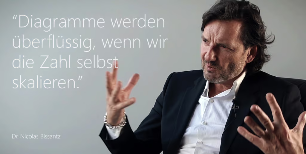
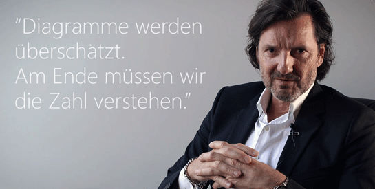
NB: That is a question I have been wrestling with myself about. Once you start working with Bissantz’Numbers, charts in annual reports start to seem childish and a lot of infographics look as if they were made by nerds for nerds – with little regard to the actual content in either case. I think numbers reveal less than we might often hope, and this little information should be imparted more quickly. I believe Bissantz’Numbers is more objective. It will set the benchmark for the graphical representations of the future.
MS: I’m impressed! And excited to see what happens next.
MS: Eyetracking in der Forschung gibt es schon länger. Was war so neu an eurem Vorgehen, dass auch etwas Neues dabei herauskam?
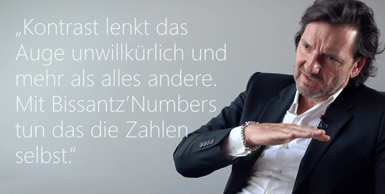
NB: Mit Eyetracking können wir beobachten, wohin ein Mensch blickt – wir wissen aber nichts darüber, was er dabei denkt oder ob er das Gesehene versteht. Aus dem Vergleich von Rundenzeiten und Blickverläufen zwischen Rennfahrern können wir u. a. ableiten, welche Sehstrategien schnell machen. Aus diesen Strategien wiederum lässt sich auf Gestaltung schließen, die es dem Auge leicht macht.
MS: Du setzt dich auch selbst ins Auto und vergleichst deine Rundenzeiten mit denen anderer Fahrer. Klingt nach Forschung, die auch Spaß macht.
NB: Aber ja! Im Winter gehen wir auf Rennstrecken in Spanien; das Wetter und das Essen sind dort, wie man es sich vorstellt. Für mich ist es ein unschätzbarer Vorteil, mein eigenes Versuchskaninchen zu sein. In vielem bin und bleibe ich Amateur und Anfänger. Die Analyse der Daten von Hans-Joachim Stuck hat bereits große Überraschungen gebracht. In Versuchen mit mir selbst bin ich dann aus dem Staunen nicht mehr herausgekommen.
MS: Ich könnte mir vorstellen, dass das nicht nur in Managementberichten funktioniert, sondern ganz allgemein für Zeitungen oder technische Geräte mit digitalen Anzeigen?
NB: So ist es. Wir haben auf der Webseite auch ein paar Beispiele für Blutzuckermessgeräte, Mischpulte usw. und arbeiten mit Produktdesignern an weiteren Anwendungen.
MS: Bisher seid Ihr in der Szene auch für Sparklines und Grafische Tabellen bekannt, also die Integration von Balken, Säulen, Kreisen direkt in die Zellen einer Tabelle. Da drängt sich mir die Frage auf: Steht der Tod des Diagramms bevor?
NB: Darüber zerbreche ich mir tatsächlich den Kopf. Wenn man einmal mit den Bissantz’Numbers angefangen hat, kommen einem Diagramme in Geschäftsberichten kindlich vor und viele Infografiken, als seien sie von Nerds für Nerds gemacht – und als käme es beiden auf den Inhalt gar nicht an. Ich meine, in Zahlen steckt weniger, als wir oft hoffen, und dieses Wenige sollten wir schneller zeigen. Ich halte die Bissantz’Numbers für objektiver. Daran müssen sich grafische Darstellungen zukünftig messen lassen.
MS: Ich bin beeindruckt! Und gespannt, wie es bei Euch weitergeht.