Data visualization tool für clear signals
Our BI tool for data visualization presents data clearly and unambiguously. Deviations and trends become immediately apparent.
uncluttered KPI visualization with clear two-color logic
intelligent dashboards for an immediate overview
visual design standards for uniform reporting
intuitive handling and visualization for mobile dashboards on smartphones
awarded with multiple UX/UI prizes


KPI visualization that shows key information at a glance
The data visualization tool DeltaMaster makes business data clear and understandable
Data visualization within companies is highly demanding when it comes to clarity and comprehensibility. When data is visualized, graphical code is created. Readers and recipients of KPI visualizations are typically in a hurry. This results in higher expectations for the subsequent error-free decoding. In companies, incorrect conclusions and misinterpretations are associated with costs and risks for the organization.
For business data to be recorded and evaluated correctly, a few consistently used visuals and the right color scheme are sufficient. Bissantz’ data visualization for BI automates the often tricky issues of report design and ensures integrity, consistency and clarity.
Visual overload?
A colorful palette and varying chart types overwhelm the eye and dilute the message. Our data visualization tool therefore sticks to a consistent two-color logic in red and blue. Because nobody needs a yellow maybe and blue is the better green.
Unclear priorities?
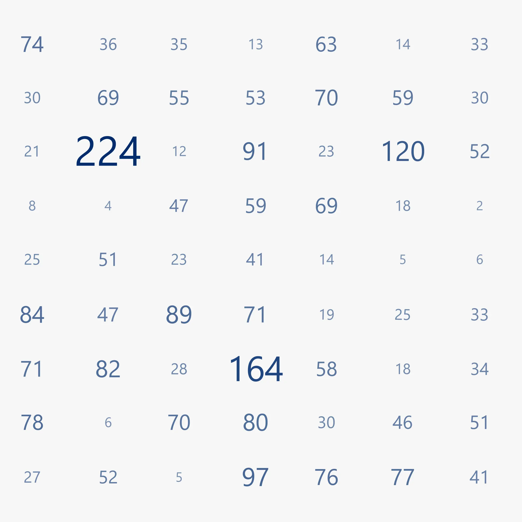
When figures are presented as rows of numbers, there is no visual prioritization: report recipients spend a long time searching for the largest deviations or critical trends. With Bissantz’Numbers, large figures are displayed large and small figures small. This guides the viewer’s eye and clearly highlights points of interest.
Figures without a message?
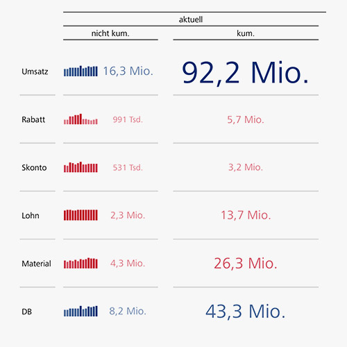
Many tables show values but no context: developments, patterns and discontinuities remain hidden until someone tediously searches for them. Graphical tables in DeltaMaster supplement figures with sparklines and other graphical elements – for trend recognition directly in the table.
Market leaders and hidden champions trust us.
Consistent signals throughout the entire company
Data visualization tool that builds trust and speeds up decisions
Without consistent visual standards, every report needs to be “translated” first. And when you have to check what colors, symbols and formats mean, insights come too late. Using a consistent, intuitive data visualization tool, controllers save time because reports do not have to be explained each time anew.
Managers can make decisions with certainty because the message is clear from the start. Our data visualization tool therefore relies on research-based visual principles and logic that send clear signals for action and intuitively guide the eye – even on the go.
KPI visualization
wherever you need it
Good data visualization tools are only effective if they are actually used in everyday life – at the workplace with DeltaMaster, on the go on your smartphone with DeltaApp and also in Power BI. The same principles apply everywhere: clear, tidy and unambiguous, so that deviations and trends immediately stand out.
For mobile reporting, DeltaApp was specifically designed to address the limited attention span in management and combines data navigation, deviation analysis and key figure comparison in a compact, understandable manner.
With Bissantz Tables Visual, data can also be visualized in Power BI, exactly like our proven principles in DeltaMaster.
In DeltaMaster
Bissantz principles in reports and analyses – for typical work at the desk.
In DeltaApp
All your data compactly on your smartphone – for reporting on the go.
In Power BI
With Bissantz Tables Visual, you can also use our data visualization in Power BI.
Simple, effective principles for data visualization
Turning your data into valuable insights in an instant
The DeltaMaster dashboard provides convenient access to all your analysis and reporting applications. Thanks to intelligent KPI visualization, you can immediately identify the most important key figures for each application, such as incoming orders, contribution margin, pipeline or closing rate.
The BI tool for data visualization presents your data in an eye-catching, color-coded overview that shows the company’s performance at a glance – and which issues you should focus on first. DeltaMaster takes care of parameterization, configuration and layout for you.
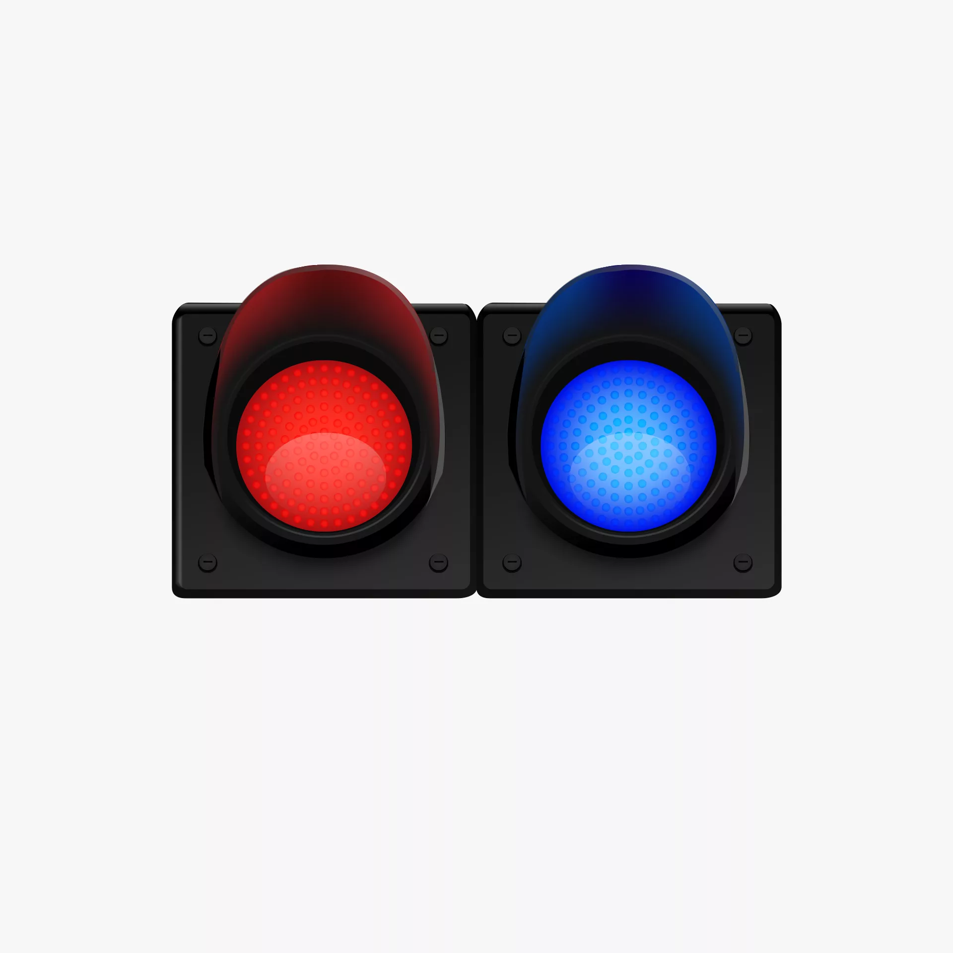
Two colors:
red and blue
The two-color logic of Bissantz provides clear signals for action and makes key figures intuitively understandable. A yellow “maybe” is not only unnecessary in a business context, but also counterproductive. In fact, the lemon-colored warning signal often has the exact opposite effect of what it is intended to achieve, namely inactivity or even indifference. Red and blue, however, already carry an important meaning in themselves. They show what you can be pleased about (blue) and what requires attention (red) – differentiated based on data and sorted with color intensities that intuitively guide the eye. Colorful can’t do that.
Typographic
scaling
Instead of diagrams, our data visualization tool uses typographically scaled numbers – Bissantz’Numbers. They draw the attention to the most important values. To those that need to be reflected upon and from which decisions are derived. These “numerograms” are as simple as they are effective: the larger the value, the larger the number. This directs the eye and conveys what the numbers have to say without any distraction. Bissantz’Numbers are protected by European design and patent registrations.
Graphical
tables
In DeltaMaster, graphical tables are the most important report format – pivot tables whose numerical values have been complemented by Bissantz’Numbers, bars, columns, circles or sparklines. Graphical tables combine the neatness of a table with the attractiveness of a graphic. Tables are compact and data-dense, easy to grasp and read. Graphics attract and direct the eye and convey an intuitive impression of the value distribution and patterns. Therefore, in graphical tables the graphics are for guiding, the figures for thinking. The cells adapt to the graphic elements and the labeling stays where it belongs.
Data visualization tool based on science,
proven in business
Our BI tool for data visualization is based on neurobiological research and impresses users and juries
Bissantz stands for data visualization that explains rather than decorates. Our KPI visualization principles are intuitive because they are based on our own fundamental research into human perception. The resulting data visualization tools have gained traction in the market and among industry experts.
Our customers appreciate the clear data visualization in reports and dashboards as well as the ease of use: important content is immediately recognizable thanks to a clear, uncluttered design. This has earned our software multiple awards: our AI algorithms, visualizations and analysis methods impress users, analysts, expert juries and patent offices.
FAQ – Frequently Asked Questions about
our data visualization tool
Key information at a glance – answered concisely and clearly
Red and blue are more clearly distinguishable in the color spectrum and are reliably perceived – especially by people with red-green color blindness.
In BI tools for data visualization, yellow often leads to inactivity or indifference and is therefore counterproductive from a business perspective.
In controlling, users need to recognize both exact figures as well as patterns and deviations. Graphical tables let you do both at the same time: figures stay readable, while graphical elements draw your attention to anything unusual.
Yes. Favorable business figures are displayed in blue, while unfavorable ones are displayed in red. The typographic scaling also reflects business logic.
Yes. Individual logic for interpreting key figures can be stored centrally so that the data is visualized in a way that fits your business logic.
Free of charge for you
Quickguide “Business Intelligence” – download now