![]()
Greetings, fellow data analysts!
How many different colors does a map need so that no neighboring areas have the same colors? Although it seems rather simple at first, this very question occupied mathematicians and cartographers for centuries. In 1976, Kenneth Appel and Wolfgang Haken discovered that four colors suffice. To answer this question, they applied a procedure which was developed by the German mathematician Heinrich Heesch in 1950 but only executable with the help of computers 26 years later. Most mathematicians feel that this type of proof is awkward if not controversial because the humans doing the work can hardly understand it themselves. The four color set even gives cartographers a headache. Even though they know they only need four colors, which colors should they use for which region?
Fortunately with management reports, your color schemes can be even more reserved. Most times, you only need two: a good and a bad color. This way, your reports are incredibly easy to understand. And when you use your computer for support, you don’t even have to distribute the colors yourself. DeltaMaster does it all for you. You already know how elegant these reports can be because you see them constantly in DeltaMaster. And seeing is proof…today.
Best regards,
Your Bissantz & Company Team
When it comes to coloring in reports, people can make many mistakes – especially through the exaggerated or inconsistent use of colors. DeltaMaster has its own built-in concept called ‘Business Intelligence colors’ which automatically determines which hues should be used in pivot tables, graphical tables and other analyses.
The idea behind this concept is rather simple. We simply want to avoid that your report consumers need a legend to decode colors. That’s why we use so few in the first place. In fact, we only use two, namely, blue and red. DeltaMaster writes whatever is ‘good’ for achieving our business goals in blue and whatever is ‘bad’ in red. It automatically implements this concept consequently in every pivot table, in every table view of analyses, and as the default setting in Flexreports. In addition, it works independently from your accounting logic. (Note: Some ERP systems book revenues as negative figures and costs as positive ones.) If your readers receive this kind of automatically formatted reports, they can see in an instant where something good or something bad has happened. Plus, as the report editor, you don’t have to wrack your brain to decide which colors you should use.
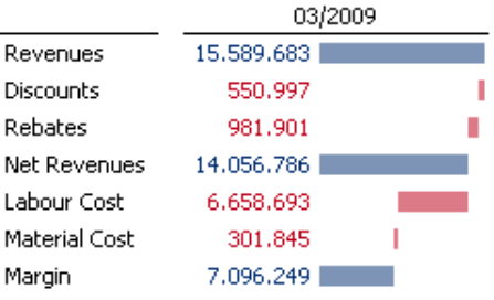
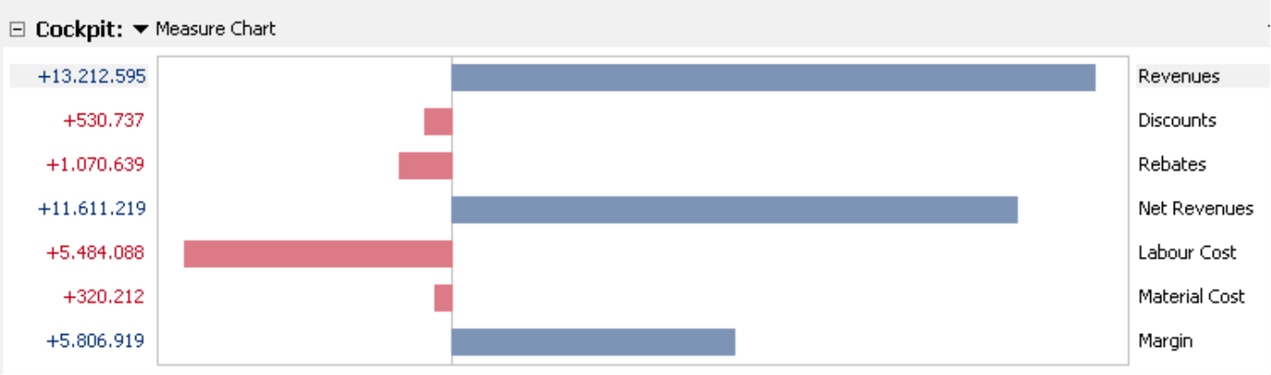
The screenshot on your right shows a simple example: revenues, net revenues and margin are good and, therefore, written in blue. Since discounts, rebates, labor costs, and material costs reduce profits, they are written in red. The accompanying waterfall chart uses the same colors. The direction of the bars and their alignment depend on the same logic.
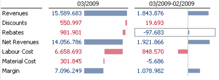
In particular, BI coloring provides valuable insight on variances (e.g. budget/actual) or changes over time. In the table on your right, you can see that rebates have dropped by 97,683 euros compared to the previous month. That’s good and, therefore, is written in blue. Although the algebraic sign is negative in a mathematic sense, it is a cost item which has gone down – which is good from a business standpoint. Discounts which are located one row above, however, have increased by 19,693 euros. Its algebraic sign is positive but since this factor reduces profits, this is bad. That’s why the color is red.
And how does DeltaMaster know which measures you think are good and which ones you don’t? That depends on the BI factor – but more on that later.
BI coloring in pivot tables
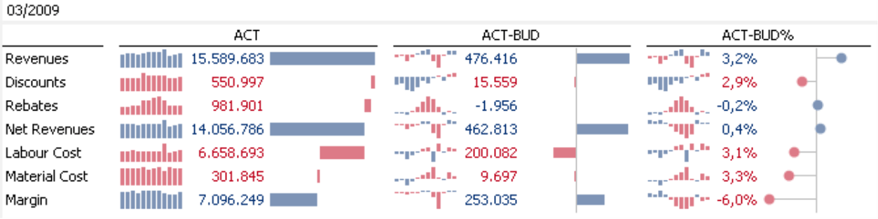
DeltaMaster continuously applies BI coloring throughout the application. In pivot tables, this automatic feature affects the color of data values, graphical elements (e.g. bars, columns, or waterfalls), sparklines, and trend arrows. In particular, Column sparklines showing the values of different variances or changes benefit from this logic. Since DeltaMaster determines the color for each miniature column, you can quickly pinpoint where something has changed for the better – or worse – in the series.
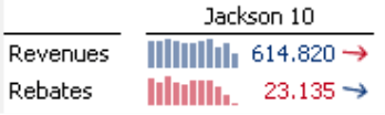
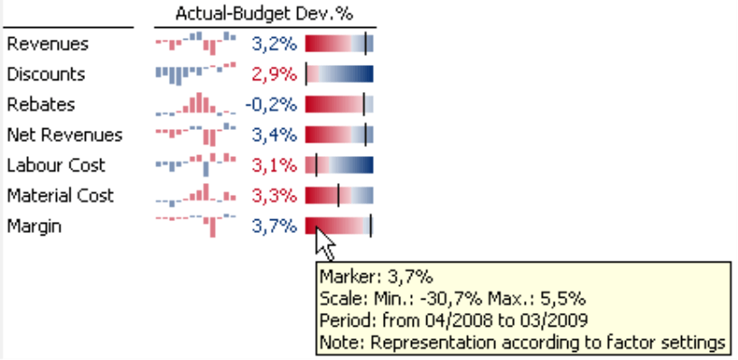
The color of Trend arrows also depends on BI logic. Here, DeltaMaster calculates the complete time series which is represented in the respective sparkline. The screenshot on your right shows that sales for the ‘Hansen 10’ product are dropping (red arrow pointing downward) but rebates are falling as well (blue arrow pointing downward).
The Cell coloring and Scale both take the color rules and the underlying business logic into account. DeltaMaster offers both of these types of visualization in various color schemes including Business colors.
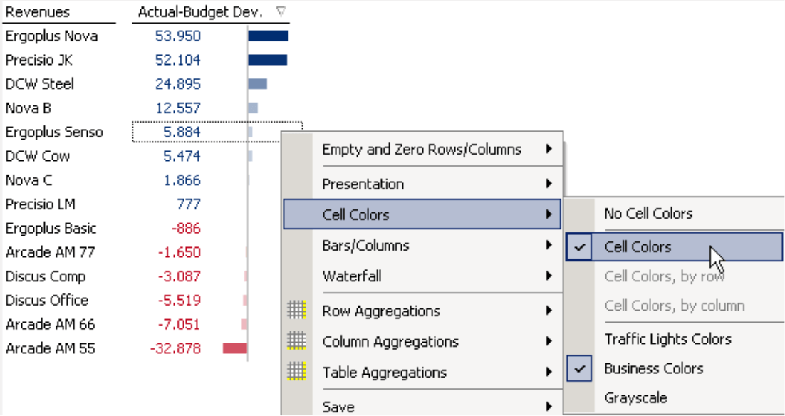
In this scheme, DeltaMaster uses an entire spectrum of blue and red hues instead of just a single color so that it is easier to compare the different values.
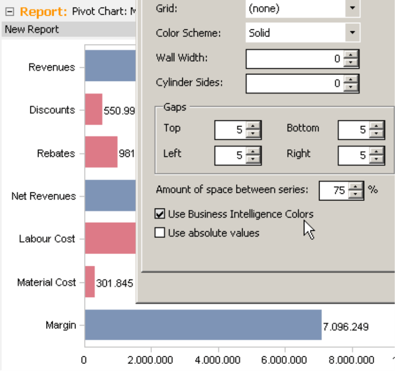
BI colors for pivot charts and Flexreports
In case you’d ever prefer to use a large-scale chart instead of an information-dense graphic table, you can also choose BI colors as an alternative to the specified color palette in the View as a Chart. Just activate the respective option under Chart properties (context menu, I want to… menu, F4 key).
BI coloring also applies in the default setting of Flexreports and ensures consistent, appropriate coloring in your business data. If you wish, you can deactivate the automatic color selection under the Cell properties (context menu of the cells) on the Format. As long as the Business Intelligence coloring is activated for the cell, DeltaMaster will ignore the selected font color. In other words, it will only apply a different color if the Business Intelligence coloring is deactivated.
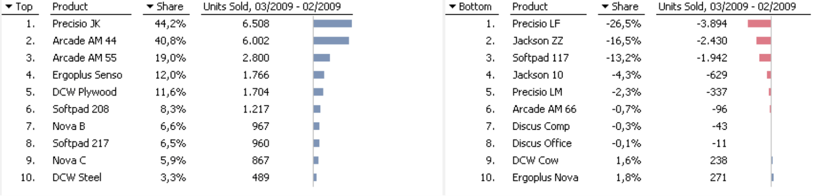
BI coloring in analysis methods
When you set the factor for determining the colors in the pivot table, this setting also applies to the table view in the analytic methods – fully automatically, just like in the pivot table. This way, you don’t have to worry about coloring the bars in the following top-bottom ranking which we created with the Ranking method.
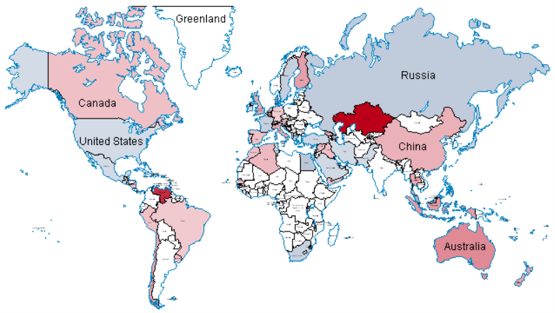
You can use Business colors once again in the Geo analysis or Hyperbrowser to color the map regions or tree nodes with different shades of blue or red.
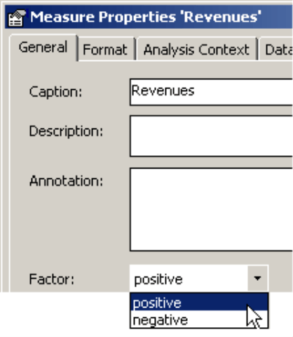
Setting a factor for measures
So far we have seen many different examples of how and where DeltaMaster applies BI coloring. But how does the software know how it should treat a number and if it is good or bad?
The measure’s Factor generally determines the coloring. You can define or change this factor in the Measure properties on the General tab.
- A positive factor means that the measure has a positive effect on the business. In other words: the higher it is, the better. Revenues, sales, margin, market percentage, and capacity are just a few examples of positive factors.
- A negative factor means that the measure has a negative effect on the business. In other words: the lower it is, the better. All types of costs are generally given a negative factor (provided that they are booked as positive figures).
So the color primarily depends on the measure or, specifically, how it affects the business. DeltaMaster always interprets the algebraic sign of a number in conjunction with this factor. As a result, new users might be surprised to see that a positive number (in the mathematical sense) is marked red while a negative number (again, in the mathematical sense) may still be blue. This notation, however, is very easy to learn and has many clear advantages.
In some cases, however, there may be conflicting opinions whether a measure is good or bad. If a high number of repairs secure revenues for your customer service department, that measure would be positive. From a quality management view, however, you would want to have as few repairs as possible. In that case, the same measure could have a negative factor as well. In order to give you room for interpretation, you can set the factor so that you can change it depending on the respective application.
You can alter this setting in the Measure properties, which you can access from the measure’s context menu in the Measure browser (Model menu) or the pivot table.
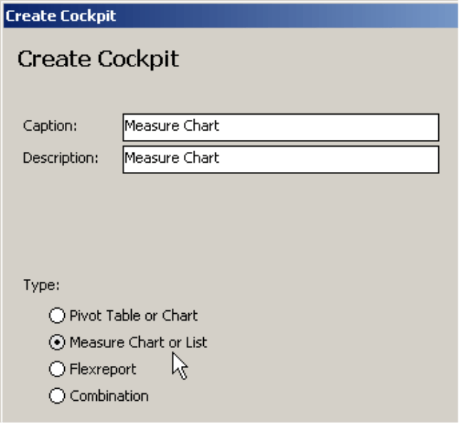
If you want to set the factor for a large number of measures all at once, you can use a different procedure. You can change the factor with a mouse click in the Measure chart or list. Since this report format is rarely used today, let’s take a closer look at the steps involved.
To start, switch to Miner mode and create a new cockpit (Change menu in the Cockpit window) of the type Measure chart or Measure list. From here, you can select all of the measures – or at least those which you want to edit – from the Measure browser.
If you want, you can change the number of measures displayed in the chart or list by going into the Change menu and opening the Cockpit definition.
- To switch the factor, press and hold the Alt key and click on the respective bar in the Measure graphic or list with your right mouse key.
When the factor changes, the color and direction of the bar and measure immediately switch as well. Using this method, you can quickly change the factors for many different measures at one time.
Measure charts can only be edited in Miner mode. Measure properties, in contrast, are also available in Analyzer and Pivotizer modes.
Setting the factor for dimension members
You cannot determine the business meaning of measures in all applications. Finance and cost accounting, for example, often deal with accounts structures that are modeled as dimension elements. In this case, there is often only one measure (called ‘Value’ or ‘Amount’ or frequently just ‘NumVal’ e.g. in MIS Alea/Infor PM OLAP). In relational tables, this value will then be stored in its own column, whereas the different dimension elements (accounts) are arranged in rows. This creates a row of filter measures although you really are only dealing with a single ‘measure’. So how do you apply BI coloring in this case?
One possibility would be to create a new measure – a filter measure – and assign it the desired factor. Although this option requires no changes to your data model, you may be dealing with a (possibly large) number of measures which aren’t as easy to handle as the specified account hierarchy, for example, when creating new reports.
The simpler and more elegant alternative would be to define the factor information in the data model. In this case, DeltaMaster can automatically set the factor for the members in the respective dimension (i.e. the account dimension).
To do this, you will need to add a separate member property in the account dimension. Using this attribute, you can specify which factor the member should receive. If the member property measure is +1, DeltaMaster will give the respective member a positive factor. If the member property measure is
-1, the factor will be negative.
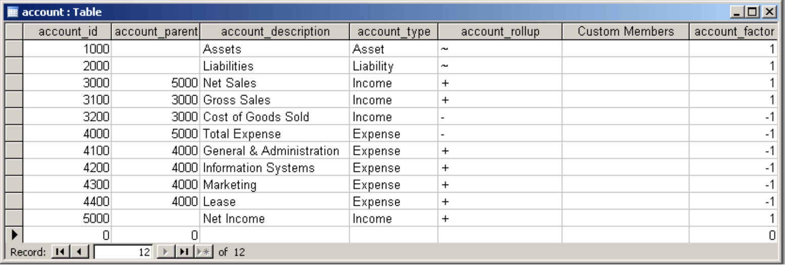
Let’s take a look at an example using the ‘Foodmart’ demo application which comes with Microsoft Analysis Services 2000. This database contains the ‘accounts’ dimension table (as shown in the screenshot on your right), which includes an accounts structure with different income and expense positions as described above. In Microsoft’s sample application, these are used in the ‘Budget’ cube. For this example, we have added the ‘account_factor’ column on your far right and filled it with the proper values: +1 for positive and –1 for negative factors. This column will be added as a member property in the OLAP dimension.
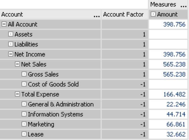
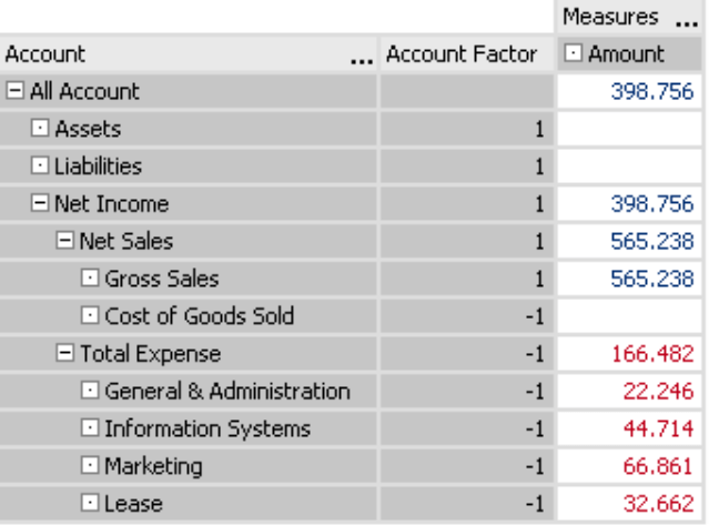
The screenshot on your right shows what a new DeltaMaster analysis model based on the edited cube would look like. Now, you can access the ‘Account factor’ member property. We chose to display the values in a pivot table (context menu in the hierarchy column, Member properties) purely as a control function. For the time being, all values are still written in blue because the same (positive) factor still applies to all members.
To derive the factor from the member property and define it for each member, you will need to switch into the Hierarchy properties of the ‘Account’ dimension (Dimension browser, I want to… menu).
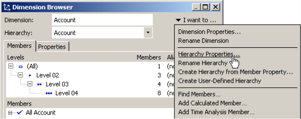
Here, you can define if a certain member property should determine the factor.
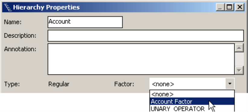
Thus you may determine in DeltaMaster that the factor should be based on the ‘Account factor’ member property. The software immediately recognizes the factor and applies the appropriate coloring.
This topic shares similarities with the algebraic signs of relative variances, which were covered in detail in DeltaMaster clicks! 6/2008.
To the point
Thanks to the automatic coloring options in DeltaMaster, you can spare your report consumers the struggle with algebraic signs, accounting logic, on so on. Blue = good, red = bad. The formula is that simple. And following the initial setup, using it is just as easy – so your report editors have one less thing to worry about.
Questions? Comments?
Just contact your Bissantz team for more information.
