![]()
Greetings, fellow data analysts!
Gesellschaft für Informatik (GI), the largest organization for computer science professionals in Germany, Austria and Switzerland, honors pioneers in this field with its annual Innovation Prize. And the winner for 2007 is … DeltaMaster from Bissantz & Company!
“The patent-pending innovations developed by Dr. Nicolas Bissantz offer a whole new way to analyze and visualize information,” emphasized Professor Matthias Jarke, President of GI, in his appraisal of the award-winning entry. “Many users have already taken the leap from classical reporting to modern, knowledge-based management.”DeltaMaster’s Pivot navigation is a prime example of these acclaimed concepts. As a tribute, we would like to explore this feature in detail in this edition of clicks!. You will be amazed to discover that a major step towards knowledge-based management is only a click away!
Best regards,
Your Bissantz & Company Team
The Pivot navigation is a sophisticated option that allows Analyzer and Miner users to examine and visualize pivot table data like never before. You can drill down to expand the table step by step with additional rows or columns to uncover relevant background information and help find the answers to your open questions.
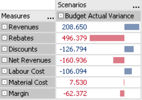
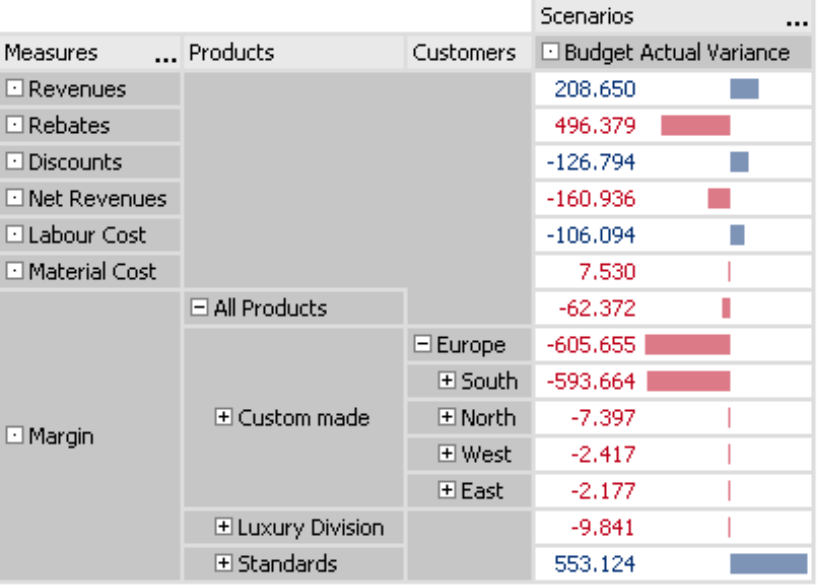
We can explain this procedure based on a simple example from our Chair reference model. Let’s start with a pivot table showing the budget-actual variance of our break-even analysis. (Note: In this example, the measures lie on a single axis but we could have just as easily started from any other pivot table.)
Through the bar visualization as seen on the screenshot to your right, you can easily identify large and small variances. Although revenues are above target, margin is below. What caused this difference?
You could use DeltaMaster’s Hyperbrowser or built-in analytic methods such as Navigation, Staircase analysis or PowerSearch to shed light on the situation. The Pivot navigation, however, allows you to drill down on your numbers without leaving the pivot table or switching to a different window.
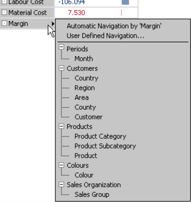
To start the Pivot navigation, simply mouse over a member and a small black arrow will appear in the cell. Now, place your mouse on the arrow.
![]()
Here, you can choose how you want to drill down on the data, in other words, which table you want to expand. DeltaMaster offers three different Options:
- If you choose automatic navigation, DeltaMaster will select the dimension showing the most helpful information and automatically display it as the next column. This concept uses the same algorithm as in the Navigation analysis module, which you will learn more about later.
- The second option is user-defined navigation, which lets you choose which column should be displayed next. The dialog box in which you select the column has a look and feel that resembles the Axis definition in a pivot table.
- For fast access to the dimension levels, you can also drill down by selecting a dimension or a level directly from the list in the menu. Alternatively, you could make the same selection in the dialog box of the user-defined navigation.
For this scenario, let’s assume that you have selected the data-driven automation which has produced the screenshot to your right. DeltaMaster identified “Products” as the most informative dimension and added this column to the pivot table – BUT only under margin! This illustrates how refined this method truly is. If you viewed the measures and products in a normal pivot table, the dimensions would be nested and multiplied so that each of the seven measures would be displayed for all main product groups (and their totals). This often results in large, unmanageable tables. In the scenario above, for example, you would have to deal with 28 rows instead of ten. To answer many questions, you often only need a fraction of the information. This is why the Pivot navigation only delivers details for a single section.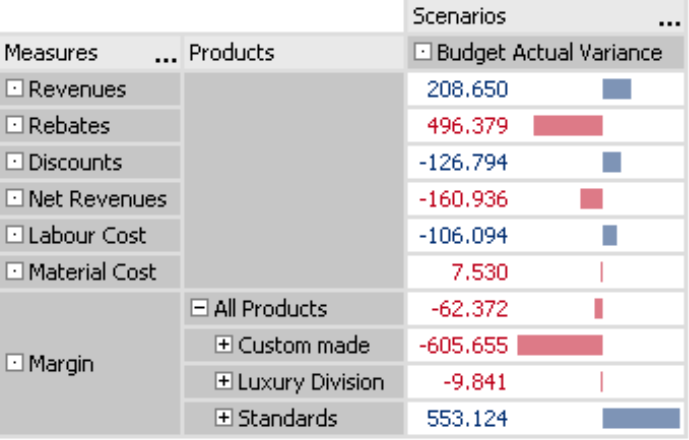
With this information you can easily identify that “custom made” is a problem zone. You can differentiate the analysis even further by selecting Automatic navigation a second time.
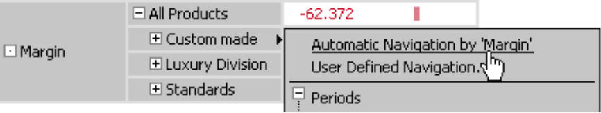
The Automatic navigation would produce the screenshot to your right. As you can see, the reason why custom-made products have a strong margin variance traces back to the customer dimension.
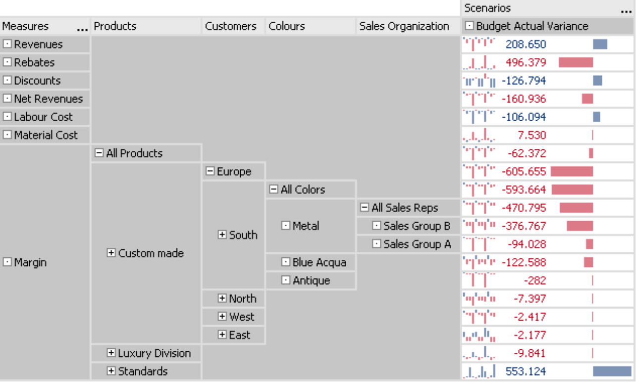
The screenshot to your right shows the progress two steps later. The wedge shape is typical for navigation paths of this kind. We have now traced the variance back through four dimensions. While a conventional pivot table would contain a maze with hundreds of rows, the Pivot navigation only needs 19.
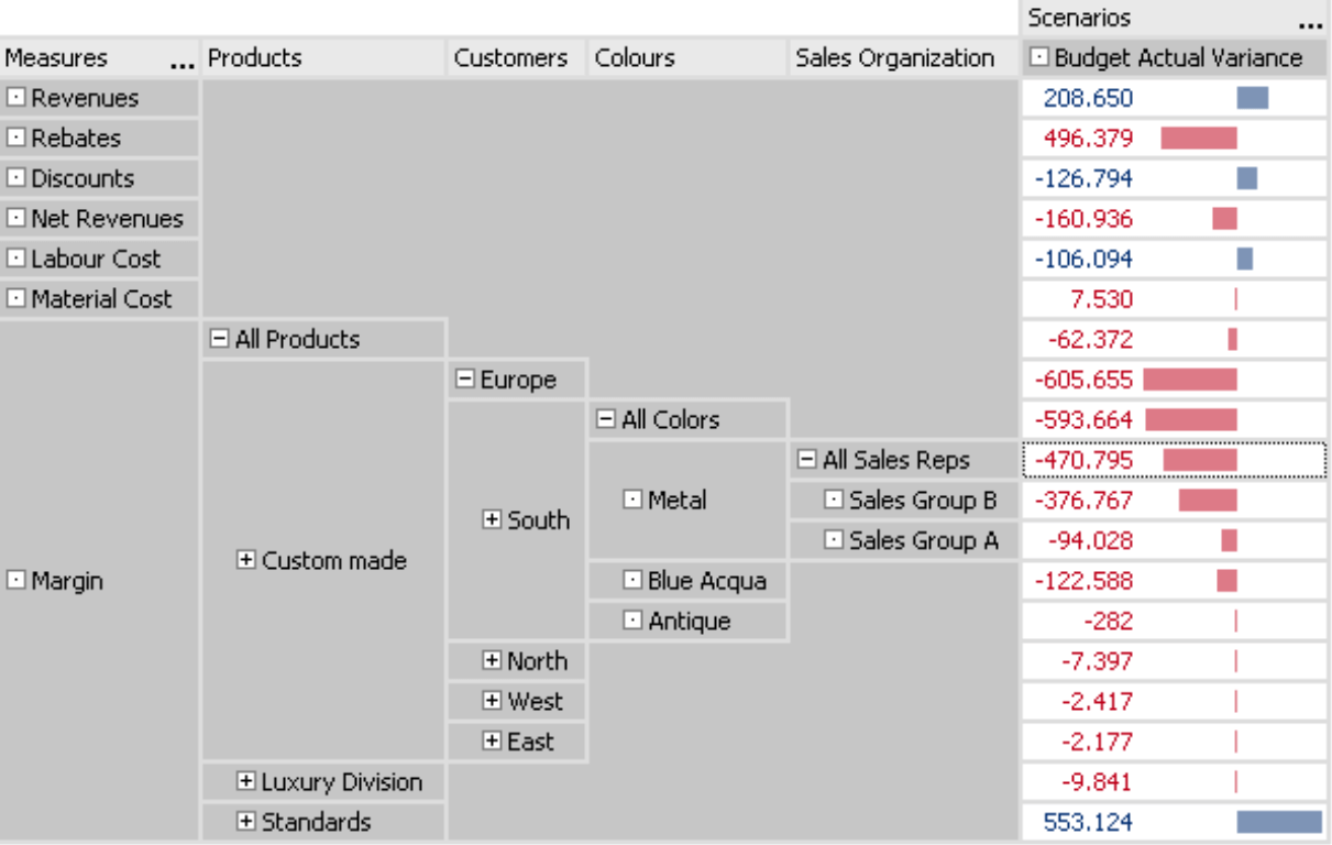
One of the advantages of these types of reports is that you do not lose sight of the objects that you are comparing. You can view the “sibling” members on each level as well as their parent on the subordinate one. At the peak of the wedge, you can see the total variances as well as the breakdown by sales reps for the color “metal”. You can directly compare the margin for metal with blue aqua and antique as well as the total margin for all colors – all within Southern Europe. This value also stands in a row with North, West, East and the total variance across Europe – for custom-made products. You can easily compare these, in turn, with the luxury division and standards as well as the total variance across all product lines.
Automatic navigation means automatic sorting
The automatic pivot table navigation, as described on the previous pages, is based on the same concept as the Navigation analysis method. The objective is to locate the path to the underlying causes that best explains the measure that you are analyzing. A dimension is considered atypical when the examined measure is divided unevenly among the members. The more unbalanced this relationship is, the more suspicious it becomes. DeltaMaster then suggests the object with the most heterogeneous composition for further analysis.
In addition, DeltaMaster runs a ranking in the added dimension and only shows the top ten members in descending order (“Ranking: TopCount/10”). This default setting helps you focus your attention on what is most important.
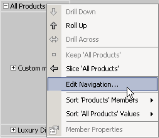
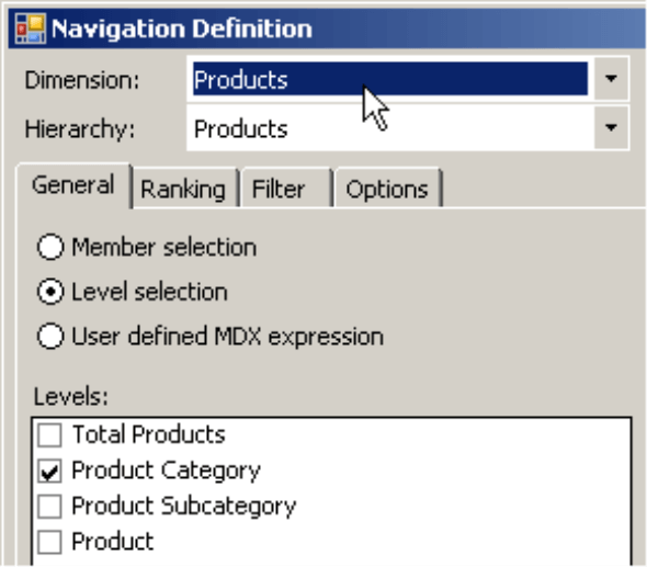
You can Edit [the] navigation by opening the context menu of the top member of each column. The Navigation definition is almost identical to the dialog box of the Axis definition (see illustration below). The only difference is that in the Navigation definition you can change the dimension that should be used in the navigation step. In a normal pivot cockpit, you select the dimension in the Cockpit definition – and not in the access definition.
User-defined Navigation
DeltaMaster uses the same dialog box for user-defined navigations. In this case, the Ranking tab is limited to the ten largest members in the default setting.
As you learned at the beginning of this edition of clicks!, the faster alternative to selecting the Level in the dialog box would be to directly choose the desired level of the model from the Pivot navigation context menu.
You can use this dialog box to make changes in any step of the process, regardless if you choose the automatic or user-defined navigation or you select the level directly. In addition, you can also opt to edit the steps in the middle – and not merely the end – of the path. In the user-defined navigation, however, you may “lose” a member that was previously opened, because DeltaMaster deletes all of the columns that follow the edited one.
Taking a few steps back
To remove any unwanted columns and restore the table to the previous view, simply click on the minus sign (“-“) next to the top member of a column. This will remove this column as well as all others to the right of it. The same effect happens when you drag and drop an unwanted dimension back into the My view window.
For rows and columns
In our example, we expanded the table, column for column. You can also drill down row by row in the same manner. The small black arrows, which act as your gateway for the pivot navigation, also appear in the column headlines.
To top that off
…you can create really sophisticated reports by activating sparklines on the Pivot navigation. This allows you to add another comparison (i.e. the development over time) to the pivot table. Other visualizations, such as trend barometers or cell coloring, are also possible.
The chart above is a prime example of why Gesellschaft für Informatik awarded DeltaMaster for the 2007 Innovation Prize. This approach combines the ability of modern computers to explore large volumes of data with the unsurpassed talent of human beings to intuitively recognize and evaluate patterns. This enables you to uncover important facts more quickly. Since visualization is in tune with context, you can see everything you need to interpret these numbers correctly.
Questions? Comments?
Just contact your Bissantz team for more information!
