Greetings, fellow data analysts!
At the beginning of the 19th century, David Ricardo set a milestone in classical economics with his theory on comparative advantage. In short, the core message of his theory simply says that each person should do what he or she does best. To explain his theory, Ricardo gave an example of two countries (England and Portugal) and two products (cloth and wine). He showed that if Portugal specialized in wine and England specialized in cloth, then society as a whole – and not merely wine and fashion connoisseurs – would benefit in the process.
This implied division of labor is also relevant for analytical reporting. We humans have a key competitive advantage in interpreting, explaining and executing; technology, on the other hand, is better at differentiating the extraordinary from the ordinary among large volumes of data. In this edition of clicks! we will introduce an algorithm in DeltaMaster that can do just that – the Comparator.
Best regards,
Your Bissantz & Company Team
DeltaMaster offers several different options for placing two sets of measures next to each other in order to make them comparable. Common usage scenarios include:
- Logistics: package weight and corresponding shipping costs; incoming orders and packing performance
- Procurement: number of orders and order value
- Sales analysis: goods sold and revenues; revenues and margin; revenues and discounts
In order to observe and compare these values, you could opt to use DeltaMaster’s Portfolio analysis or Regression functions or simply create a pivot table displaying the desired measures on the row or column axis. What is most interesting, however, is pinpointing when the measures in question act differently, meaning that their distribution patterns deviate among the members of the searched dimensions and levels. Instead of trying to manually locate unusual patterns through trial and error, you can let DeltaMaster automatically spot them for you using the Comparator method.
Comparator is a Mining algorithm that searches all dimensions and levels of the underlying database and reports where one of the two measures acts differently than the other.
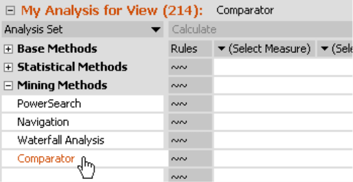
Since the two measures are the only required parameters, the gateway into this analysis is very straightforward. To start, select Comparator from the analysis set and then pick the two measures that you wish to analyze from the Measure browser or drag them from a cockpit into the column headline of the table. Then simply click Calculate to start the analysis.
Calculating rules
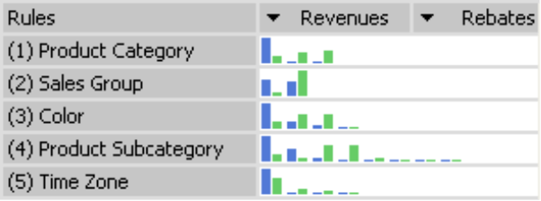
Comparator will produce a list of Rules. Each rule pertains to exactly one level in the data model in which DeltaMaster has identified an unusual distribution of the two values. The rules are sorted from the highest to lowest relevance. Each rule will be summarized as a sparkline in the row. If you mouse over these miniature charts, a tooltip explains the details.
By changing the Sensitivity factor under Properties, you can influence the number of returned rules. Its job is to filter out less important rules. A higher sensitivity tends to produce more rules; a value of zero will deactivate the automatic filter. In addition, you can set the Properties so you can Exclude objects with a Null value for one measure and non-Null for the other measure.
To get a larger view of the chart and more details, simply double click on a rule.
Reading charts
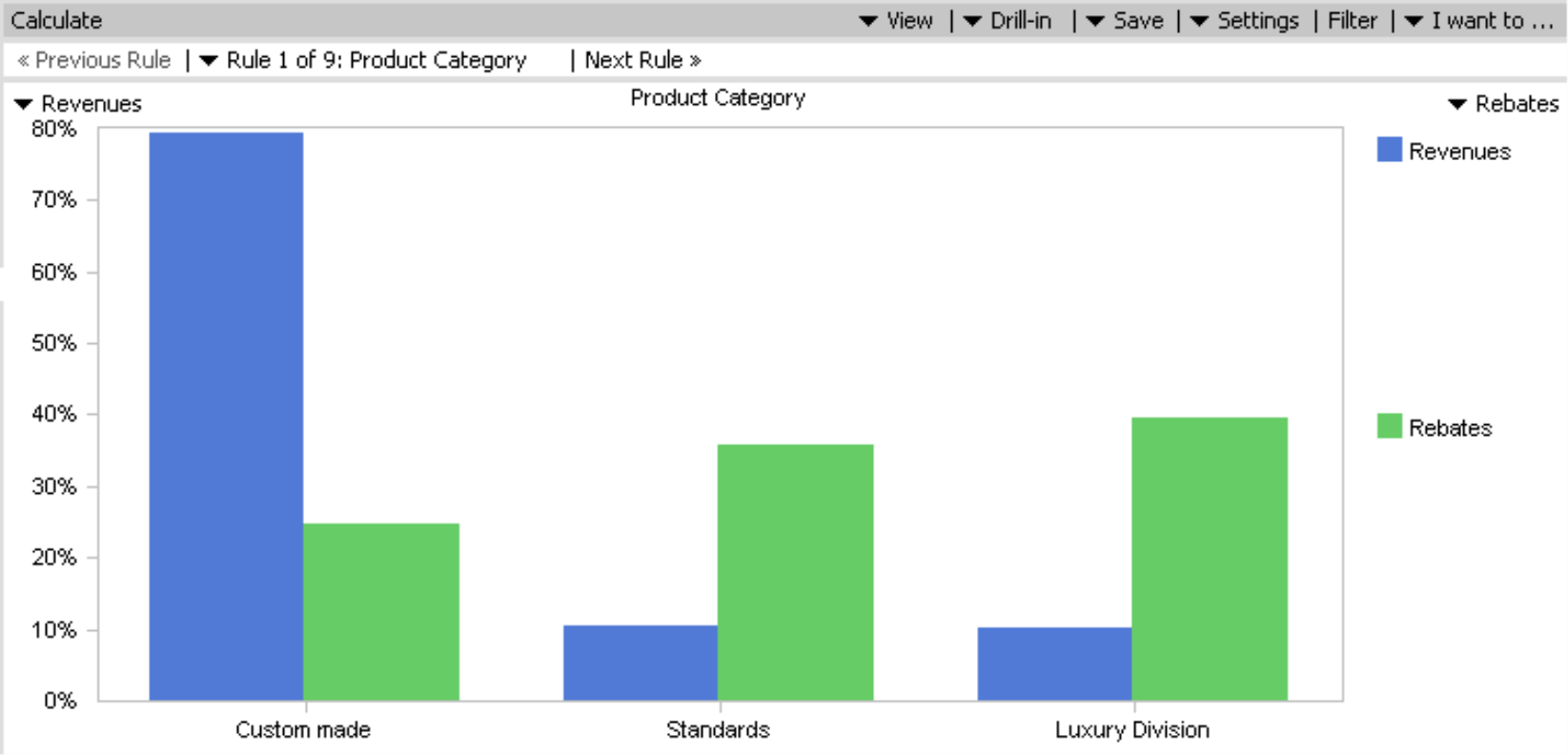
In order to explain how you should interpret the chart, let’s use a typical sales analysis scenario comparing revenues with discounts.
DeltaMaster uses blue and green bar charts to represent the measures. In our example, blue stands for revenues and green for discounts as seen in the screenshot above. The X axis contains the members of the level (in this case, the Product category) for which the rule applies. The Y axis shows which percentage each member contributed to both measures in the current view. The blue bars will always total 100%, as will the green ones. Based on our sample screenshot above, it appears that the Custom-made line generates a significant percentage of revenues despite receiving a relatively small portion of discounts. (This is good news.) The Standards and Luxury division, however, have a relatively low contribution to revenues and a rather high percentage of discounts in the current view. (This is bad news. Can we only sell these product lines with large discounts?) If you mouse over this chart, DeltaMaster will display the exact value and percentage as a tooltip. By double clicking the bar chart, you can change the view to zoom on that member and eventually apply another built-in analysis method on the information (“Threaded Analysis Technology”).
You could have created the same chart using a pivot table or pivot chart, but chances are that it would have taken you a long time until you found such a divergence in the product dimension between the comparative values. This is the advantage of using Comparator.
Using the navigation toolbar above the chart, you can easily switch ahead to the next rule, back to the previous rule or select a rule directly from the list. To switch back to the list of rules, simply click Overview in the View menu.
Keeping everything in the right place
DeltaMaster’s default setting sorts the pairs of bars based on the first measure (blue). In the case of ordinal attributes whose members follow a “natural” sequence, this could produce charts that diverge from normal reading habits. In other words, a week should read from Sunday through Saturday (or Monday through Friday, depending on your business), months should be listed from January through December, and classifications for age or income should always appear in their designated order. In cases like these, simply switch the way you Sort to Standard in the context or I want to… menus.
The following screenshot shows a comparison of order intake and packing performance by workdays, which is a common analysis in the transportation and logistics industries.
If you sort the bars by absolute variance, the bars will be positioned so that the pair with the largest difference is placed on the left, while the smallest is placed on the right. DeltaMaster also takes the algebraic sign into account. If the first value is higher for some objects and the second is for others, the middle objects will then contain those with the smallest differences. The Significance weighs the differences using absolute values.
Views
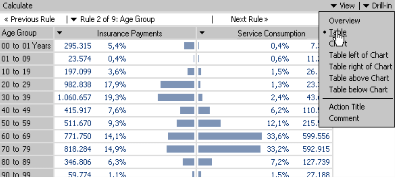
As in other DeltaMaster modules, you can choose to view your data as tables, charts or a combination of the two. Unlike in pivot tables, however, a “table” in Comparator refers to a graphical table that helps you visualize the comparison of the two measures. The table option is a good alternative to the standardized chart, particularly at times when you are observing a large number of objects. From this point, you can also access the sorting options (context or I want to… menus) or use the Threaded Analysis Technology (double click on a row or highlight the area and click on the Drill–in menu). The example above shows a typical scenario for payments and service consumption of insurance customers by age groups. The analysis shows that there are grave differences based on age groups.
Choose your values carefully
In general, you can use Comparator to search for differences in distribution among all types of members including filter values such as “Revenues, North” and “Revenues, South” or “Number Polled, Male” and “Number Polled, Female”. Please remember, however, to use non-additive values such as quotients, averages or percentages with caution. Comparator generally makes observations of percentages and not only are percentages of percentages difficult to interpret correctly, but they also have the tendency to produce outliers.
Questions? Comments?
Just contact your Bissantz team for more information!


