![]()
Greetings, fellow data analysts!
Although we devoted the last edition of clicks! entirely to tables, by no means did we want to play down the importance of charts. To the contrary! Creating meaningful charts is a central part of analytical reporting and a major challenge as well. It is not always easy to find the appropriate visualization for a given question. In fact, international experts such as Edward Tufte, Gene Zelazny and Stephen Few have written insightful books and host informative seminars on this very topic.
DeltaMaster clicks!, of course, is not the appropriate medium to debate the do’s and don’ts of data visualization. But it is an ideal platform to explain how you can efficiently and effectively showcase your data using the vast chart features of DeltaMaster. On that note, we wish you both the creativity and concentration necessary to keep your charts focused on what is really important!
Sincerely,
Your Bissantz & Company Team
Pivot tables provide the most important structural foundation for pivot charts. They determine which analytic values should be displayed, what should be shown on the chart’s axes and how the data should be sorted. The Cockpit Definition has the same effect on both pivot tables and charts.
You can display pivot charts and tables separately or side by side. Simply select the visualization of your choice in the View menu.
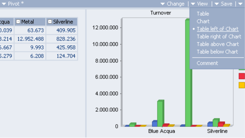
When you switch to the chart view, you will instantly notice that no wizard appears and nothing forces you to dictate in advance what the outcome should look like. Instead, DeltaMaster automatically displays a chart in the most logical configuration. If you have a different chart type in mind, you can modify the view with a few clicks of a mouse.
Toolbars, chart properties and general properties
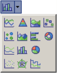
Once the pivot chart is visible, you can display the toolbar using the context or I want to… menus. Here you can choose from various chart types using the Gallery button on your far left. The chart types, which will be described in more detail below, can all be customized through the other buttons in the toolbar and the individual dialog boxes.
Using the Toolbar buttons, you can show or hide chart components such as Point Labels, Legends and the Data Editor and even display your chart in 3-D. Under Palettes you can color coordinate your charts using one of the predefined color schemes.
![]()
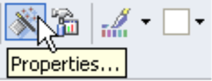
The most important functions for formatting charts are located under Properties and Chart Properties.
To edit the Properties, you can either click on the magic wand symbol in the pivot chart Toolbar or navigate through the context menu of the chart’s axes. Here you can modify the chart’s structure and formatting, for example, through axis scaling (minimum, maximum, spacing) and color palettes.
By clicking the General tab, you can group or stack related elements. This will be illustrated in detail in the section on column charts below.
You can edit the Chart Properties by opening the context menu of the pivot chart, the I want to… menu or by pressing F4 on your keyboard. This dialog box contains multiple properties for labeling and formatting your chart. Here you can also dynamically access the current view and other terms from your analysis model. Therefore, you can use the selected elements (My View window) for the chart headline, integrate
dimension names in the legend or even name the axes after the current measure.
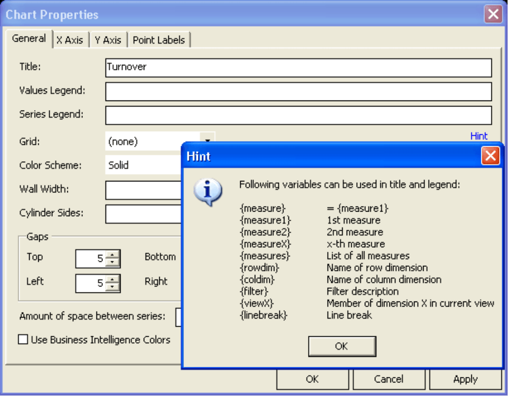
The respective context menus for axes, chart backgrounds, data series, etc. have different instructions depending on where you click.
In the following section we will highlight different chart types and some special features. There is, of course, no set rule saying which chart type is best suited for your individual needs. We hope, however, that the following examples will illustrate how you could utilize different charts in your daily work. As with technical issues, simply contact the Bissantz team for assistance if you have any questions.
Line Charts  , Line Curves
  , Stair Charts
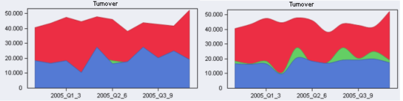
  , Area Charts
  , Area Curves
Lines are well suited for displaying time series, where the X axis displays time and the Y axis shows the measure. Some of you may object here, since most business applications use non-continuous time frames (such as months) instead of a continuous time bar. In this case, a line could be seen as a random presumption of the course between points. Alternatively, you can use columns, which display separate values as they are. Despite their downsides, lines serve as helpful visual guides which display historical patterns more clearly. Columns, on the other hand, are the better choice if you would like to compare and contrast the difference among neighboring values.
Each row in the pivot table generates a line (or area) in the pivot chart; the columns (or better said, their values) make up the points on the line. If you want to create a classic time series chart, simply place the time dimension on the column axis.
How you “connect the dots” (e.g. as a straight line, curve or step) is generally a matter of taste. The straight line, however, is the most common – and formal – choice.
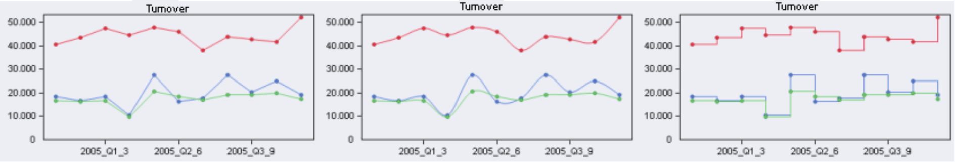
Area charts, which fill the space between the line and the X axis, are another variation. When you visualize time series in this manner, however, keep in mind that parts of the area may be hidden if your lines cross. In this case, you can try to improve the situation by clicking Order in the Cockpit Definition.
Be careful not to confuse the pivot chart cockpit with the Time Series analysis. Some chart options may be identical, but the analytic capabilities are only available in the analysis module.
Column Charts  , Cube Charts
As mentioned above, column charts are often used to illustrate time series. Here, the dimension elements are located on the X axis with the measures on the Y axis.
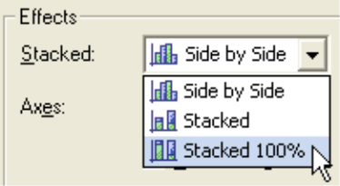
Each row in the pivot table is displayed as a column in the chart. The columns of the table determine the categories of the X axis. The columns are grouped or stacked depending on the property settings. The three examples below illustrate grouped, stacked and standardized bars (100% stacked) respectively.
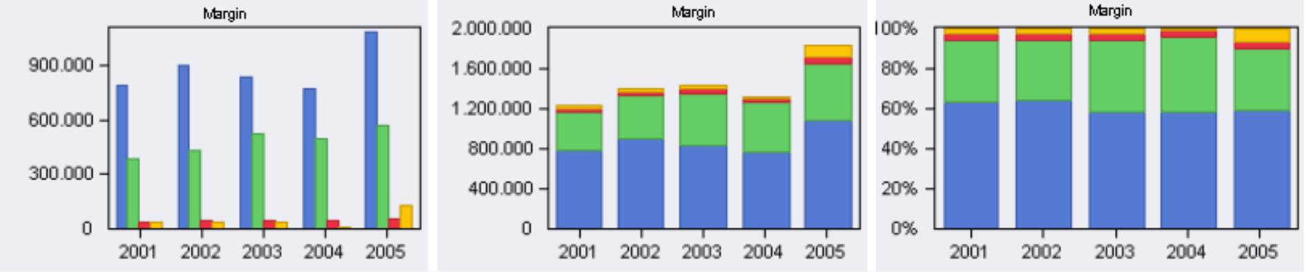
Stacking clearly shows the total sum of the individual parts, while regulating the height of the columns helps visualize the relative size of the individual parts.
Cube charts, which only depict the top of the chart as a small cube, offer a playful take on column charts.
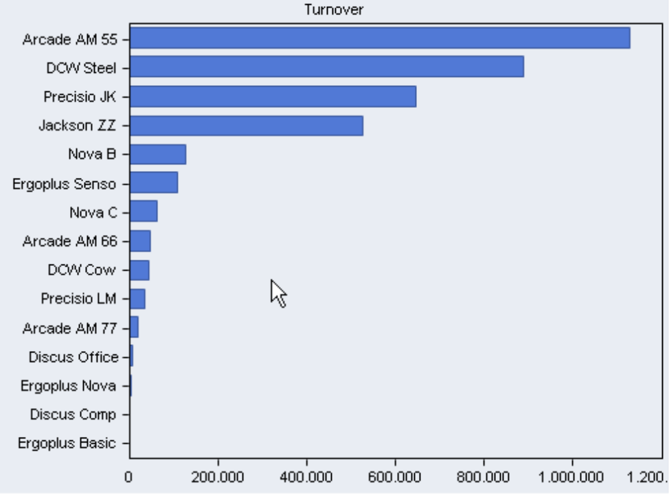
Bar Charts 
Horizontal bars are most commonly used for rankings and other general comparisons. Since elements names tend to take up more space than numbers, the dimension elements are usually placed on the Y axis with the measures (numbers) on the X axis to simplify labeling.
Each data row in a pivot table is displayed as a horizontal bar in the chart. The columns in the table determine the categories of the Y axis, which are then grouped or stacked.
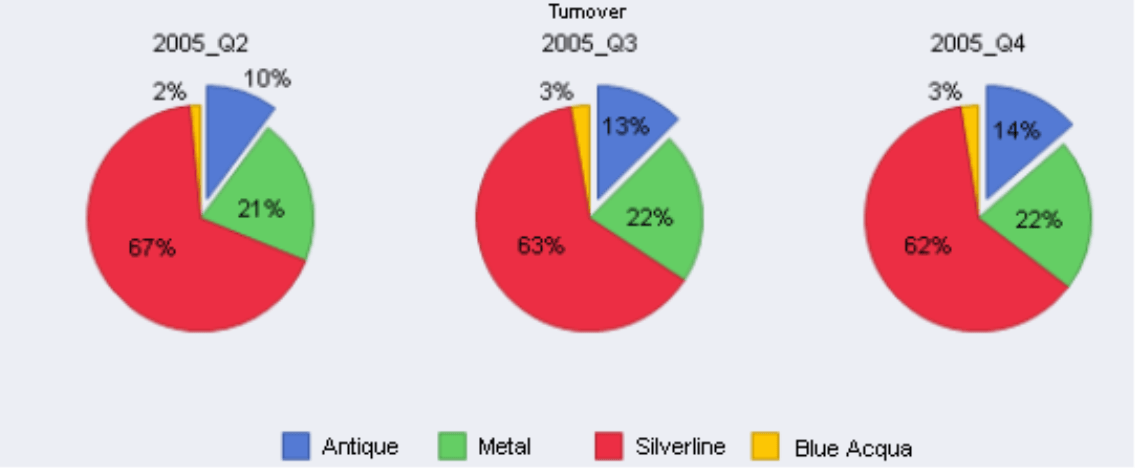
Pie Chart  , Doughnut Chart
  , Pyramid Chart
Pie charts are commonly used to visualize a percentage of a 100% total sum. They are controversial, because they compare sizes using a geometrical form that is hard to judge with the human eye. In general, we recommend using horizontal bars in place of pie charts. Yet we also understand that many people still use pie charts because their report recipients like to see them. Here moderation is key. After all, even the biggest pie lover shouldn’t have more than 6 pieces in one sitting!
Doughnuts or pyramids are minor variations of the pie chart. The message is the same, but they are even harder to interpret. But again, if the situation fits, if you like them, then use them – but sparingly.
DeltaMaster creates a chart (pie, ring or pyramid) for each row and a section of the chart for every column in a pivot table. Row and column axes are usually occupied with a dimension apiece. Since the pivot chart creates the percentages by summing up the value to 100%, it is extremely important that all elements are on the same level so that they are not calculated more than once. The outcome of “Sales Group 1“, “Sales Group 2“ and “All Sales groups”, for example, is incorrect. By using the Drill Across function in the context menu, you can easily align all elements on the same level of your pivot table.
Under Chart Properties (context menu or F4 key) you can access two popular design functions as well as many other options to fine tune the appearance of your chart:
- Under the Pie Chart tab you can Separate Slices, so they stand out from the chart as illustrated below.
- Using the Point Labeling tab, you can customize the template to list absolute,relative or both values. Since the pie chart primarily represents proportions, it makes sense to label the portions as relative or both values.
You could even show a calculated measure that is derived from different other measures on the column axis. For the classic gross margin calculation in our Chair demo model, for example, you might place discount, sales deductions, labor costs, material costs and gross margin in the column axis. Just be careful not to include the revenues, as these result from adding the components listed above. You’ll then see the “revenues compond” e.g. over regions or product groups. As mentioned before, however, other chart types can illustrate this just as well – if not even better.
Scatter Plot  , Bubble Chart
Scatter plots compare two variables to depict their relationship, e.g. in the sense of a linear regression. Special requirements apply to the Cockpit Definition; the column axis of the pivot table must be backed up by two measures. Each data row in the table is then entered as a point in the coordinate system. This creates a chart which resembles Portfolio Analysis and Regression. As with Time Series, however, the analytic functions, such as the threaded analysis technology, are only available in the analysis module and not in the cockpit.
Bubble charts are similar, but may use up to three data columns. The third value represents the size of the bubble.
Spider Chart 
The spider chart simultaneously displays at least three measures on individual axes. The axes are evenly divided in a circle around a common center. This chart type, for example, is used to visualize the level of goal achievement (e.g. in the different categories of a balanced scorecard) or ordinal grades (e.g. as used for school or surveys). Appropriately, the measures have the same unit, and the axes have the same scale.
The example on the right shows how the participants of a training course have evaluated their instructors in various regards. With the spider chart, each instructor obtains his individual profile. The Background was set to white in the Chart Properties.
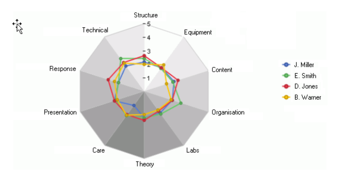
The axes of the web are generated from the rows of the pivot table; the columns of the table (or better said, their values) are depicted as points on the axis. The connected dots usually result in concentric, jagged rings. Due to the chart’s construction, the table must contain at least three data rows.
Emergency exit
Since DeltaMaster offers so many different chart options, it would be impossible to present all of them in a single edition of clicks!. Why not test the others for yourself? Simply edit a few parameters, click Apply, and see how the chart changes. When you click Apply, the dialog field remains open allowing you to try out multiple properties – with no risk of losing your work. To restore your Standard View, just click this option in either the context menu or using the I want to… menu. If you are not the adventurous type, don’t worry. We will take a closer look at other interesting chart features in the coming issues of clicks!.
Nice charts. Now what?
When you save your changes to the cockpit, DeltaMaster stores the options set for the pivot chart. Next steps might be
- to save them as reports in the Briefing Book so that your report recipients using the Viewer mode receive highly illustrated reports,
- to use the export functions to Microsoft Word, Excel or PowerPoint in case you prefer these output formats, or
- to arrange them in a Combi Cockpit (see DeltaMaster clicks! 12/2005 for more details), where you can combine multiple cockpits into a single Dashboard.
Questions? Comments?
Just contact your Bissantz team for more Information!
