![]()
Greetings, fellow data analysts!
You can only say how valuable information really is once you have it. That also means, however, that it is difficult to judge how much time and money you should invest in order to obtain it. This is a real information dilemma and like all dilemmas, there is no easy solution – not even with modern software.
Software can, however, offer clues as to where it might pay to take a closer look. DeltaMaster’s drill sparklines, which provide a glimpse at the details on the lower hierarchy levels of consolidated data, are a good example. If you are viewing the total revenues across all product divisions, for example, a drill sparkline previews the revenue breakdown for the different divisions in a compact, easy-to-maintain format – just as you would expect from sparklines. Besides also analyzing variances, you can use this feature to detect compensating effects – a problem particularly with consolidated data –, which are often leveled out on higher hierarchy levels.
Drill sparklines help you detect these undercurrents before they threaten to pull your business under. Just sail through this issue of clicks! for more interesting tips on working with drill sparklines.
Best regards,
Your Bissantz & Company team
Drill sparklines are a special type of sparkline. Instead of displaying a time series, they show the breakdown of a measure based on the values of its subordinate objects, for example, sales volume broken down by regions or product groups. This feature is very helpful in financial controlling because you can use it to detect compensating effects: You might only be able to detect a small variance in a measure on a highly consolidated level. If you look a bit deeper, however, you could uncover huge differences that level out as you move up the hierarchy. If you can spot these differences at any early stage, you can take action before these variances become larger and start impacting higher levels.
In this issue of DeltaMaster clicks!, we will show you how to use drill sparklines in your cockpits and reports, how to read and interpret them as well as how they can help you identify the notorious compensating effects in your data.
Inserting drill sparklines
You can insert drill sparklines into pivot tables if you are working in Pivotizer, Analyzer, or Miner mode. Depending on which version of DeltaMaster you are using, the menu will look a bit different.
In DeltaMaster 5.5.0 and previous versions, you can enable drill sparklines in the context menu of the pivot table and then select the desired scale in the cascading submenu – but more on that later.
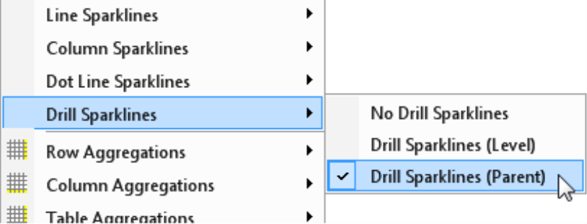
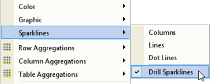
The context menu was reorganized in the recently released version 5.5.1. Drill sparklines are now listed as a type of Sparklines and you can set the scale in the Table properties. To disable drill sparklines, simply click on the option again so that the check mark in the context menu disappears.
You can combine drill sparklines with in-cell charts (bars/waterfalls, columns, circles, etc.) as well as with time-based sparklines.
On Miner level, you can also add a type of drill sparklines to the cells of Flexreports – but more on that later. For now, let’s just stick with pivot tables.
Structure instead of time
Drill sparklines look very similar to a column sparkline showing a time series. DeltaMaster draws both of these sparklines as a miniature column chart in the cells of pivot tables – but they refer to different types of data and you use them for two completely different scenarios:
- The (time-based) column sparkline represents the values of a measure from previous points in time. It shows how the measure has developed over time up until and including the value that is displayed as a number in the table. In this case, the sparkline places the number in a context so that you can classify and assess it more accurately. With time-based sparklines, you can also compare the patterns of the individual report objects with one another so that you can quickly detect different developments across different sales regions or product divisions. DeltaMaster places sparklines that show a time series in front of the number.
- Drill sparklines show hierarchical structures such as the breakdown of an aggregated value – not a time series. As a result, you can use only them in dimensions containing hierarchies and not in “flat” dimensions such as value types, currencies, etc. Drill sparklines show a preview or summary of the members located in the hierarchy directly below an aggregated member. DeltaMaster places drill sparklines behind the number – and, if present, behind any bar, column, or waterfall elements as well.
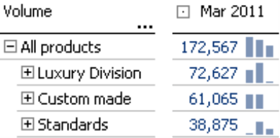
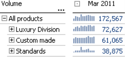
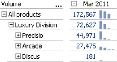
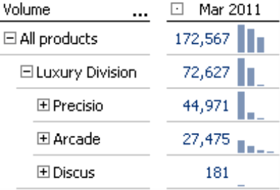
Drill sparklines provide a preview of the values on the next-lower level even if the branches have been “collapsed”. The screenshot on your right, for example, shows the sales volume for “All products” in the four sales regions of our Chair reference model. You can see that “All products” is broken down into three subordinate members (i.e. the product main groups). The sales volume for the North region was similar for two product main groups while the volume for the third main group was much lower. If you mouse over a column, DeltaMaster displays the name and value of the respective member as well as its percentage share of the displayed aggregated value as a tooltip. In the example above, the third column in the North region refers to “Standards”, which had a sales volume of 22,103 units or 16.8% of the total of 131,340 units that were sold in the region altogether.
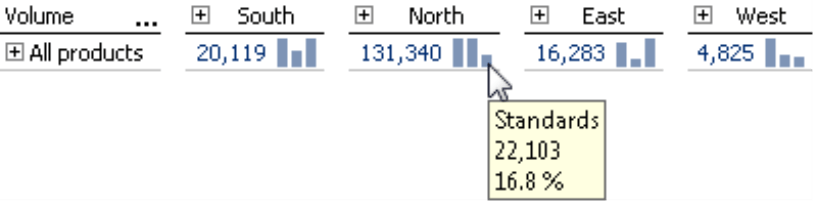
Drill sparklines always refer to the dimension on the row axis. In the screenshot above, the miniature columns represent the subordinate members in the product dimension – not the regions or areas in the customer dimension on the column axis.
The preview function is especially very helpful when you are working with larger tables. Here, the drill sparklines can provide valuable clues as to where you should drill down on the pivot table because the breakdown of the underlying values deviates from the norm. Where appropriate, you can use other DeltaMaster cockpits or analysis modules to examine any unusual values more closely. Drill sparklines were not designed to replace detailed analyses of structures or cause-and-effect relationships but they can indicate where potential problems might be lurking.
Column order
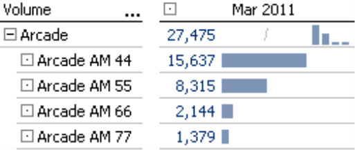
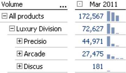
In a drill sparkline, DeltaMaster displays the columns in the same order that it would show the subordinate members in a drill down. If a ranking option is activated in the axis definition, therefore, this will also affect the drill sparkline, as you can see in the screenshot on your right. The Arcade product group contains four models. Since the SortDescending option was enabled in the Axis definition on the Ranking tab, the pattern of the horizontal bars in the rows “Arcade AM 44” through “Arcade AM 77” is reflected in the columns of the drill sparkline in the “Arcade” row. For clarification, we have declared the value in this row as an Outlier by average value (Table properties, Graphical elements (2) tab or Graphic (2) as of DeltaMaster 5.5.1). As a result, DeltaMaster displays a slash instead of a bar. In addition, it does not display drill sparklines for the products “Arcade AM 44” through “Arcade AM 77” because they are base members of the dimension and, therefore, have no subordinate members.
Scale – Parents or level
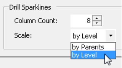
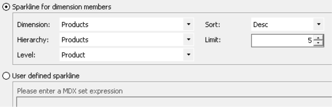
Since scaling is always an issue when coding data in a graphical manner, it also plays a role in drill sparklines. DeltaMaster offers two scaling options: by parents or by level. In DeltaMaster 5.5.0 and prior versions, you can select the scale directly in the context menu of the pivot table (see screenshot on page 2). Starting in DeltaMaster 5.5.1, this option is located in the Table properties (context menu, I want to menu) on the Sparklines tab (see screenshot on your right).
DeltaMaster does not offer scaling options such as global/individual or by column/row/table here. Since drill sparklines are supposed to shed light on the structure of subordinate members, the scaling options are designed to support this task. If you want to compare sizes within columns, rows, or the entire table, you can use other graphical elements such as bars or columns.
If you choose to scale by parents, DeltaMaster will view the “children” of the same parent member as a group and draw them using a common scale. The screenshot on your right, for example, displays the members below Precisio, Arcade, and Discus as members of one group. The smallest and largest values of this group determine the scale of the columns. DeltaMaster combines the members below DCW and Softpad into a second group. Here again, it uses the smallest and largest values of the subordinate members to calculate the column heights.
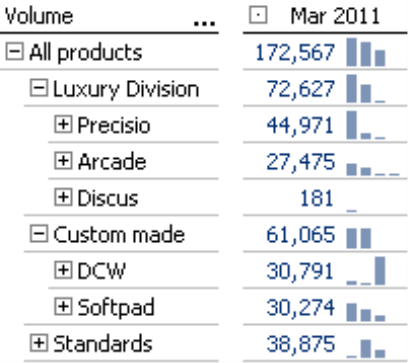
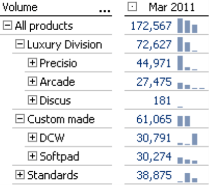
Scaling by level comes into play when you want to display the members of a level below multiple parent members as a common group. This is the case in the screenshot on your right. The luxury division and custom-made models are expanded. If you choose to scale by level, DeltaMaster will combine the subordinate members into a single group irrespective of their parent members. It will then calculate the column heights based on the minimum and maximum values of these subordinate members.
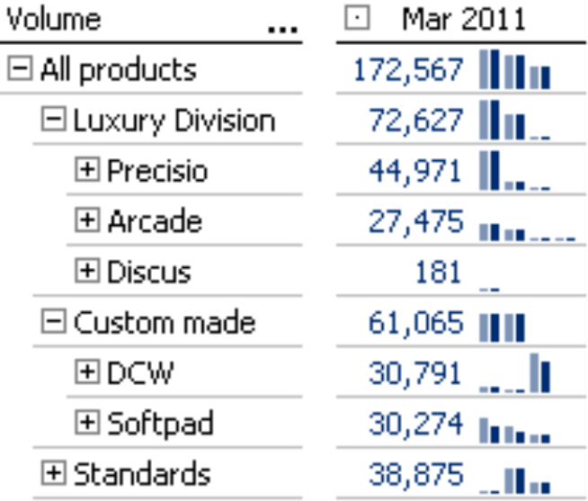
Depending on the data at hand, you might not be able to detect the difference between the scaling options by parents and by level immediately. The collage on your right, which shows both options next to each other as column pairs, illustrates the difference. The light blue columns on the left are scaled by parents and the darker columns on the right are scaled by level. You can see the difference in the right column pair of DCW and in the left column pair of Softpad, for example. If you choose to scale by level, some of the columns are shorter than if scaled by parent. The reason is that DeltaMaster includes the members of the other parents when scaling by level. As a result, the proportions may vary as you can see in the screenshot. Since a member of the luxury division has a large value, this affects the size of the columns below the custom-made models as well.
How high? How wide? How many?
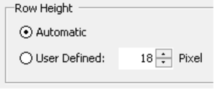
Speaking of size, you can specify the column height, width, and spacing individually for each report in pixels. You can define the Column width and Column distance in the Table properties. That standard values are set at 5 and 2 pixels respectively.
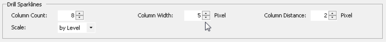
The Column count places a limit on how many drill sparkline columns DeltaMaster should draw. This way, you can ensure that the sparkline (and, therefore, the column and the entire table) doesn’t become too wide if a member has many children. If DeltaMaster has to hide some objects due to this limit, it will display an ellipsis. If you mouse over the ellipsis, you can then view the number of missing objects as a tooltip. To ensure that you don’t miss out on any important objects due to the limitation, you should sort the axis hierarchically (Axis definition, Ranking tab).
![]()
The maximum height of the columns depends on the Row height, which is defined in the Table properties on the General tab. In general, you should only increase the default values with caution because in-cell charts shouldn’t be too large, so that you can still see and analyze their patterns as a whole.
To better differentiate the values, we have varied the row heights in the screenshot below starting with the default setting of 18 pixels on the left followed by 20, 22, and 24 pixels respectively. For more ideas and examples on using size settings, please read DeltaMaster clicks! 04/2011.
 |
 |
 |
 |
Sparklines for dimension members in a Flexreport
Sparklines for dimension members in a Flexreport are very similar to drill sparklines in a pivot table. As is the case with drill sparklines, they visualize the distribution of a value within a hierarchical structure, and not a time series. This option is located in the Cell properties (context menu, F4 key) on the Sparkline tab. The Level you define here is the member level that DeltaMaster should draw as a separate column. In contrast to drill sparklines, however, sparklines for dimension members consider only the members on a set hierarchy level. They do not drill down on the next-lower level.
Analyzing variances and detecting compensating effects
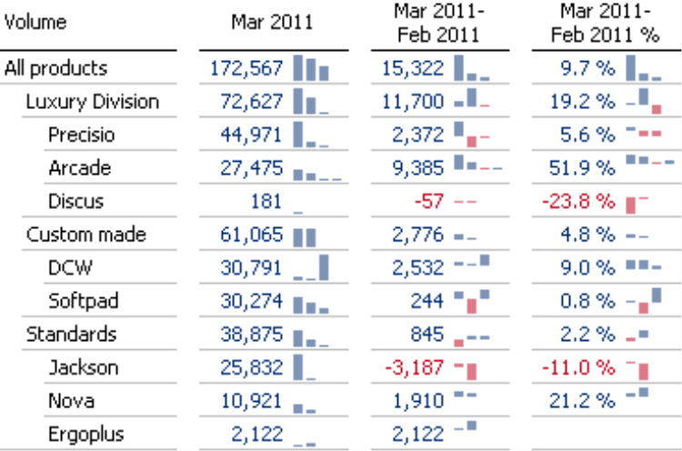
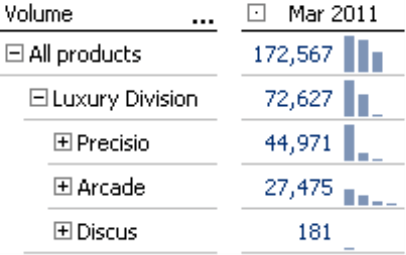
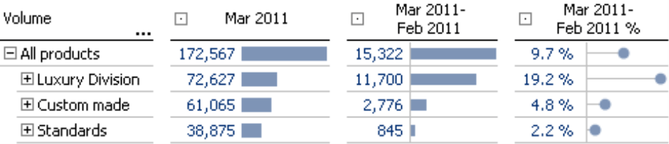
This feature is really interesting when you are working with variances and changes. Using the same example as before, let’s now add the absolute and relative change versus the previous month to our view of the current month (March 2011) – and start just with bars but without drill sparklines for the time being. The numbers are very positive. The sales volume has increased across all product main groups in comparison to the previous month. The numbers were especially good in the luxury division, which grew by 19%.
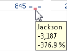
If you now show the drill sparklines, the situation looks a bit different. There wasn’t growth everywhere! Although the sales volume for luxury models increased by 19% as a whole, sales actually fell in one of its three product groups. In addition, one of the product groups for standard models booked fewer sales as well.
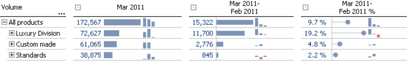
Without making a single mouse click, you can see in the tooltip that the sales volume for the product group Jackson fell by 3,187 units. The growth in Ergoplus and Nova models, however, compensated that loss. On a higher consolidated level, you would never have seen this development. Nevertheless, the variance “below the surface” is large enough that you should take a closer look with the aid of further analysis modules in DeltaMaster, such as Pivot Navigation, Ranking, or PowerSearch.
Questions? Comments?
Just contact your Bissantz team for more information.
