![]()
Greetings, fellow data analysts!
Fulfilling some of the analytic requirements from business departments is often easier said than done. Let’s assume that your new marketing director wants to know what the current demand profile is and how it has changed over time. But what is a demand profile? How would you describe it or show its development? A little business sense is helpful to begin with. A demand profile could be the revenue breakdown by article groups. You could then also formulate the task as follows: Which article groups generate which share of revenues and how have those shares changed over time? That is where DeltaMaster 6 comes into play. With just a single mouse click, you can calculate shares as well as visualize them and their development. We’ll explain how below. You’ll see that some analyses are even easier done than said!
Best regards,
Your Bissantz & Company team
Automatically calculating shares in lists
Many reports on business operations are created as simple lists that contain just a single data column displaying, for example, volumes or revenues for customers, articles, or materials.
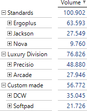
In DeltaMaster 6, you can easily display the shares of the total as an additional column – with a single click on the Share/% Magic Button.
![]()
![]()
This function recognizes and supports multilevel lists. In other words, you do not need to worry about which level the calculation is based on. If you wish to rename the column, you can enter an alias in the Axis Definition.
The filters (view) are decisive for the summation. Whether subordinate members are visible or hidden in the Axis Definition (e.g. due to a Ranking or filter rules) does not make a difference. If these types of limitations apply, DeltaMaster indicates this in the status bar of the report.
The additional column has no effect on the analysis model and, in this sense, works like Row, Column, and Table Aggregations. That makes it very easy to use; however, you cannot use these shares to make other calculations somewhere else. If the Share Magic Button is not available, this is due to the underlying data: DeltaMaster does not offer this function if this presentation is not possible with the current table structure.
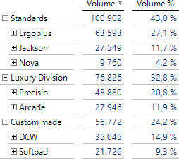
A further mouse click, this time on the Graphic/Auto Magic Button, visualizes the shares as segments. In the screenshot on your right, the values determine the intensity of the color as well. This feature in the Options on the Presentation tab is available as of DeltaMaster 6.1.5.
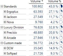
These segments are not to be confused with pie charts. Normal charts would slice the pie and leave the slices on the “plate” so that you cannot compare the slices. DeltaMaster, in contrast, shows a segment for each object so that each slice gets a separate plate. To be precise, we really should be speaking here of sectors, as this is the geometric term when pie pieces have their points in the center. Segments, on the other hand, are cut off from the circle by chords. You can completely break a circle down into sectors but not into segments (with the exception of a semicircle). For business scenarios, however, that is basically just quibbling. When you talk about markets, you talk about segments. Period.
Now let’s take a look at the options for visualizing shares.
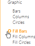
Visualizing shares: Fill Bars, Fill Columns, Fill Circles
If you want to visualize shares as charts, the Graphic Magic Button is the place to get started – and a click on Auto is always worth the effort. When you click on this button, DeltaMaster creates the right visualization for the data automatically.
![]()
In the example above, DeltaMaster has automatically recognized that we are interested in shares. With a simple click on Auto, the software will present the segments to emphasize this.
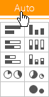
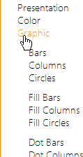
For special types of share views that cannot be generated automatically or deliberately need to vary from the automated design, you can work with the menu of the Graphic button. This menu contains six different chart types, which you can recognize by the icons with partially filled graphical elements. You can combine these charts into three pairs: bars, columns, and circles, each with shapes of the same (constant) or different (variable) sizes.

The shares are already calculated
The chart types with shapes of the same size are intended for visualizing shares that are contained in the table’s structures as percentage values – in other words, as a Measure or through (Calculated) Members (see DeltaMaster clicks! 07/2008). You can also use the Share Magic Button to visualize these calculated values.

The shapes with the same sizes everywhere represent the constant, maximum share of 100 percent whereas the filling indicates the respective share. In other words, the presentation is normalized. The list above with the calculated share column is an example.
If the table does not contain percentage values, all three chart types will be deactivated in the Graphic menu because the visualization cannot be used. DeltaMaster does not display any elements as charts for values exceeding 100 percent; after all, it cannot do more than fill the shape’s entire border. This is why you should only use fill elements when you are working with genuine shares – and not with other percentage values such as relative variances, load capacity, or goal achievement rates, which can exceed 100 percent.
Calculating, displaying, and visualizing shares
The chart types with variable shapes represent absolute and relative sizes at the same time: the absolute ones on the outside (as the border of the shape), the relative ones on the inside (as a filled segment). In contrast to the variant explained above, the shares do not already have to be in the table. Instead, DeltaMaster calculates them automatically, displays them in the respective cells as a second value, and visualizes them as charts.
![]()
Since the scale is very important in this type of presentation, DeltaMaster regulates it automatically and documents it in the report’s status bar.
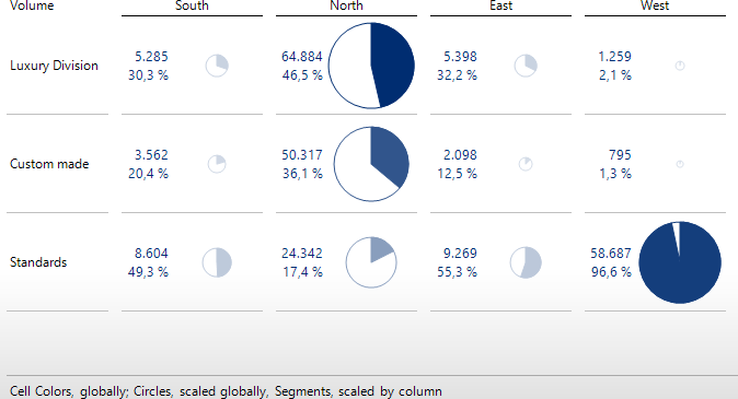
- Shapes, globally scaled
In order to illustrate relationships in absolute terms, DeltaMaster views all of the values from the table together and draws the bars, columns, and circles to the same scale. Since the length, height, and area (of the circle) are proportional to the absolute values, they are comparable throughout the table. - Segments are calculated based on the typical reading direction and are drawn cell by cell
The shares on which the size of the filled segments depends are calculated row by row for columns, and column by column for bars and circles. This means that DeltaMaster adds up the total for each column or row and calculates the share of the individual values in relation to the column or row totals respectively. DeltaMaster displays these shares in the cells and highlights them as filled inner segments of the bars, columns, or circles.
What is so ingenious about this visualization is that it displays the absolute size and the share at the same time.
This logic implies that these segments cannot be viewed additively. That is obvious with circles because you cannot combine circular segments with different radii into a whole. That also applies to bars and columns: Small values result in small bars or columns – and small shares as well. This is why only a small part of the small bars or columns is filled. If you placed the parts end to end, you would not get a length of 100 percent because each section is measured in relation to its own absolute value. When interpreting the chart, take a close look at the outer dimensions to compare the absolute sizes. The filled inner segment gives you a feel for the share of an object.
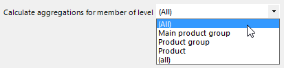
If multiple hierarchy levels are displayed on the axis, you need to ensure that the calculations refer to the correct level. You can define this level in the Axis Definition on the Options tab; this setting is also valid for Row, Column, and Table Aggregations.
The chart types with a variable size are ideal for absolute values. Since DeltaMaster calculates the shares automatically, you no longer need to model measures or calculated members in order to create a share analysis. This presentation also works with percentage values. Reading them, however, takes some practice because each cell contains two percentage values – the original value, which is treated as a percentage point, and the (unweighted) share calculated from the total.
Adding charts
As with all chart types, you can add graphical elements for shares to a report in one of three ways:
- By clicking on the icon in the Graphic menu
To show the chart in all (suitable) columns or rows at once, click on the corresponding icon in the menu of the Graphic Magic Button. - By dragging the icon from the Graphic menu and dropping it in the table
To show the chart in only specific columns or rows, drag the icon from the menu and drop it in a row or column – either on the headers or directly on the values in the table. DeltaMaster automatically recognizes where the charts should be displayed (i.e. bars and circles in columns, columns in rows). You can follow these steps several times to add charts to multiple columns or rows in succession.
A subtle change in the menu indicates that you can use the drag-and-drop function: When you hover over an icon with your mouse, the menu’s frame border opens and invites you to drag the icon out.
- By activating the Graphic in the Edit menu (on the right)
As an alternative to option a), you can also use the menu to the right of the report to display a specific chart type in the entire table. Clicking on the Graphic entry opens and closes the list of chart types. By clicking on a chart type, you activate and deactivate this chart type for the entire table. From the Edit Menu, you can activate the chart types, as described here with a constant size, as Fill Bars, Fill Columns, and Fill Circles. The variants with a variable size are available only through the Graphic Magic Button. (These share values that are calculated and displayed in addition are part of the magic, as it were.)
Each table supports only one chart type so the report stays easy to read.
To remove the charts, follow these same steps in reverse. If you want to remove all charts, click on the icon highlighted in orange on the Graphic Magic Button or the bold entry below Graphic in the Edit Menu (on the right). If you merely want to remove charts from specific columns or rows, drag one of the elements that you want to remove from the report and drop it either back in the bar with the Magic Buttons or in the empty space next to the table.
Settings
The Properties of the table include options for defining the size settings: the width (or length) for Fill Bars; the width, height, and alignment in the cell (i.e. the position of the columns in relation to the values) for Fill Columns; and the radius for Fill Circles. These parameters are valid for charts with constant and variable sizes alike (for variable sizes, the parameter applies to the extreme value; all others are measured proportionally). In most cases, you don’t need to worry about these parameters: The default values are designed to create an appealing presentation and enable good differentiation.
You can find an abbreviated form of these settings in the Edit Menu (on the right). By clicking on the gear icon next to the active chart type, you directly open the respective tab in the Table Properties. DeltaMaster also offers this icon for Color and Sparklines, provided that color and/or sparklines are activated in the report.
Analyzing changes in shares
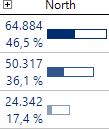
You can run a very productive analysis simply by letting DeltaMaster take charge automatically. This also allows you to intuitively visualize how the shares have changed over time.
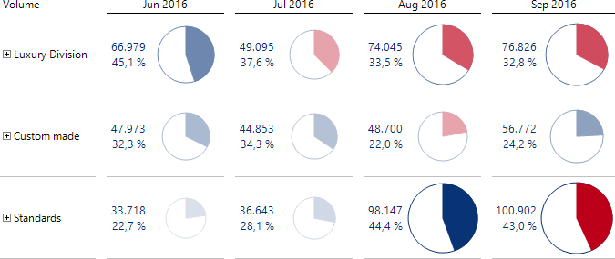
What makes this presentation so special is the coloring of the segments. The colors show if a share is greater than or less than it was in the previous period. This is very helpful because shares rarely change rapidly, the values are typically close to each other, and the segments otherwise are almost impossible for the naked eye to differentiate. Take a look at the Standards in the screenshot above. The 44.4 percent from August seems to be just as large as the 43.0 percent from September. The color clearly shows, however, that the share has dropped! The color of the shape depends on the Business Intelligence factor of the Measure (in this case, blue for units sold). The color of the segment depends solely on the difference with respect to the previous month. A smaller share is colored red for revenues as well as for costs, whereas a larger share is colored blue.
Otherwise, the structure of the Graphical Table closely resembles those of the other automated share analyses. The circles have variable sizes and are globally scaled so that you can compare the absolute values row by row over time, and column by column in the structure. The shares are calculated by column; each column (period), therefore, adds up to 100 percent. That is how you show how the demand profile has changed! The marketing director that we mentioned in our introduction would be very pleased.
You can generate this presentation with a single mouse click on the Graphic/Auto Magic Button. Your only prep work is to put together the data you need in the report. That is not hard at all because the task at hand defines it: one KPI (Measure), the time, and the profile-forming attributes. You merely need to pay attention to a few details regarding the way the report is structured:
- The Measure is located in the filter (the “slicer”) and thus listed in the top-left part of the table.
- The time members are located on the column axis. Calculated Members, including Time Analysis Members, or other dimensions cannot be used there.
- The dimensions that create the profile and for which the shares are to be calculated are located on the row axis.
The presentation displayed above can only be created using automation and not through individual settings in DeltaMaster. You can also interpret that this way – with DeltaMaster, you get the best results automatically!
Compatibility
The calculated share column described at the beginning works in DeltaMaster 5 as well, but without the show/hide option. You can also use DeltaMaster 5 to define and display Fill Bars, Fill Columns, and Fill Circles with a constant size for shares that are already in the table. Fill elements with variable sizes and the one-click capabilities to show share values are only available in DeltaMaster 6. In DeltaMaster 5, they are displayed as simple bars, columns, or circles and without the share values.
