![]()
Greetings, fellow data analysts!
The movie “The Matrix” became famous, primarily due to its special effects. Many viewers, for example, were amazed by “bullet time”, which made it possible to slow down actions almost to the point of stopping – and even reverse them. This technique freezes even the fastest movements so that you can observe them from any imaginable angle. The film sequences were created using individual pictures taken by hundreds of cameras as well as intermediate images from a computer. This time effect displays events in a way that you could never normally see because they happen too quickly or slowly. As a result, the film narrative showed sequences in detail – not just the result as a snapshot would have done.This kind of time lapse can also be useful in financial controlling. Some developments are easier to see when you can observe their movements and can push time back or forth as needed. To experience this for yourself, try the Dynamic Portfolio Analysis in DeltaMaster. This analysis method is also awe-striking. But unlike the movies, what you see is real and the only special equipment you need is the scroll wheel on your mouse.
Best regards,
You Bissantz & Company team
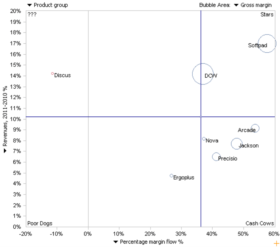
A portfolio analysis is a tried-and-true analysis method that is often used to answer strategic business questions such as product lifecycles. The most famous model is the four-field matrix from the Boston Consulting Group (BCG). This approach uses two criteria (i.e. market share and market growth) to categorize product groups or business areas into four classes (i.e. stars, cash cows, poor dogs, and question marks). A generally recommended course of action (e.g. investment – yes or no) is then assigned to all products within each class.
You can use a portfolio analysis, however, to compare other measures as well. Many DeltaMaster users, for example, want to assess growth and profitability by examining last year’s percentage change for revenues and margin. To help you explore these types of relationships, DeltaMaster offers a separate module for Portfolio Analysis. This module works with either two or three measures: one on the X axis, one on the Y axis, and an optional third one represented by the bubble size. On the upper left-hand side of the chart, you can choose which objects (e.g. product groups) you want to display in the portfolio.
The position of these objects, however, changes with the course of time. As of DeltaMaster 5.5.0, you can follow these movements using a special module for Dynamic Portfolio Analysis. With this module, a portfolio analysis is no longer just a snapshot of a point in time. Instead, you can observe how the different objects have developed over time.
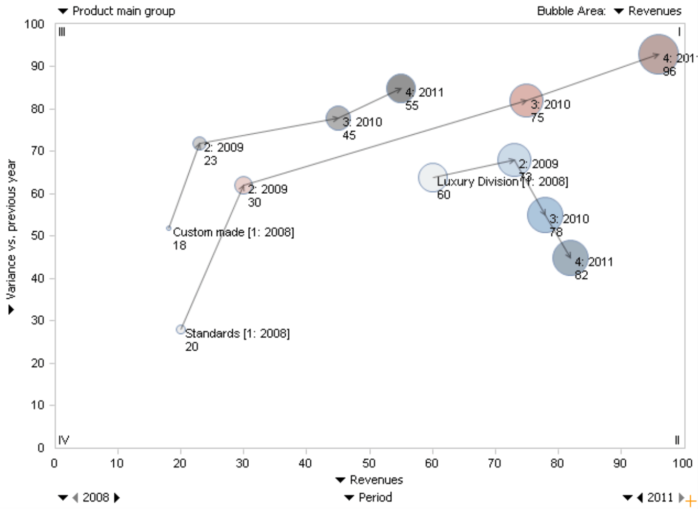
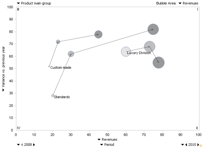
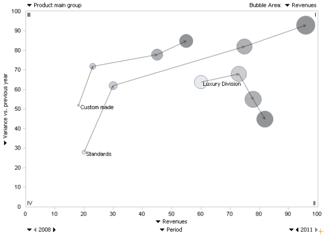
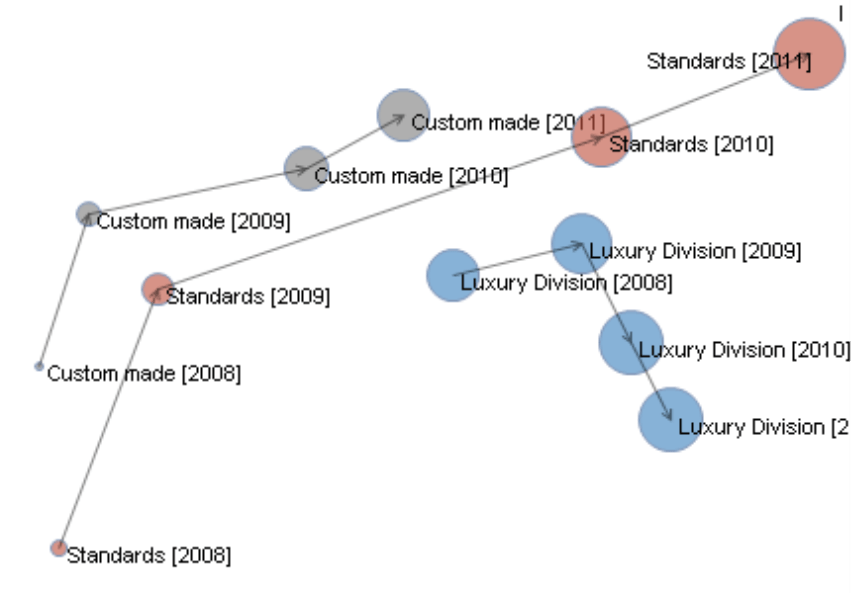
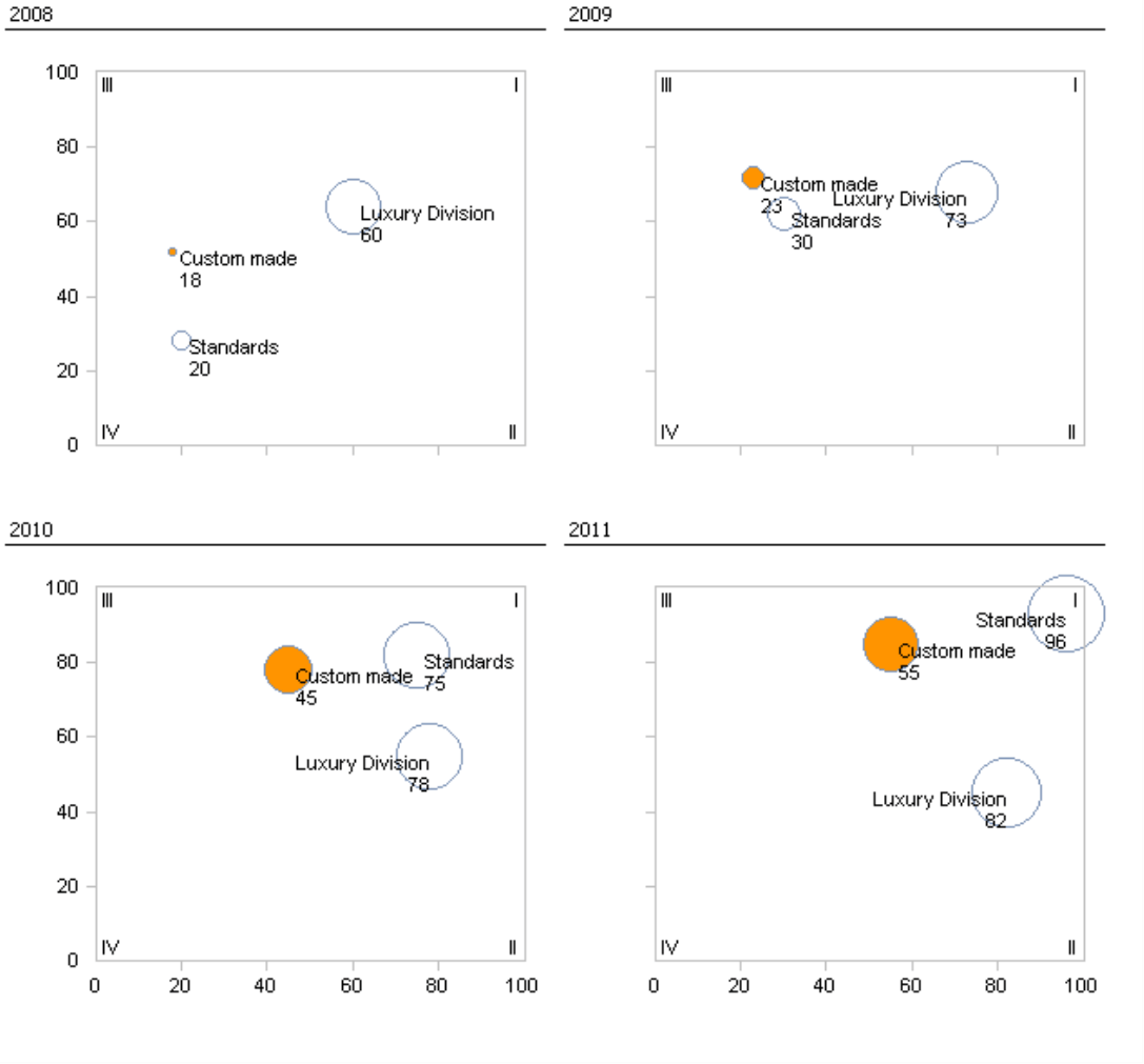
The result could look like the screenshot on your right, It shows (with different, more simple data than shown above), how the position of three product categories has changed from 2008 to 2011. The oldest value, which also contains the caption, always stands at the beginning of the line. The years are numbered: “1” stands for 2008, “4” for 2011. A few navigation elements, which you may already know from the Times Series Analysis module, are located at the bottom corner of the chart. Here you can select which time frame you wish to examine. The start period (i.e. 2008) is on the left, the end period (i.e. 2011) is on your right, and the time level (i.e. Year) is in the middle.
Interactive time lapse
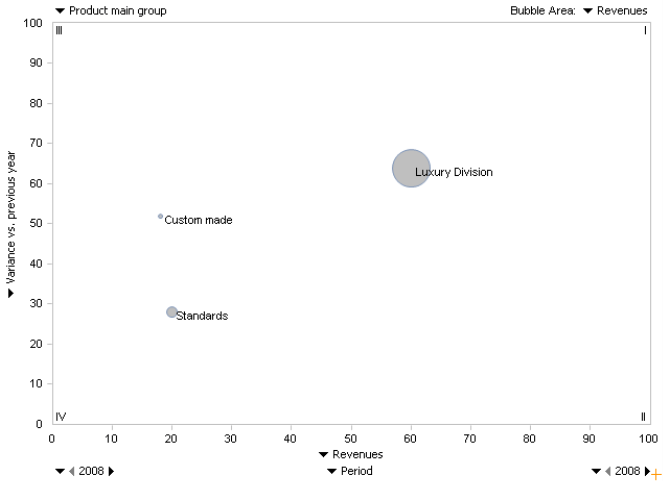
On paper or in a PDF file, you can only guess what makes a Dynamic Portfolio Analysis so special. But on your screen you can display the developments over time in motion and control them interactively! By scrolling the wheel of your mouse, you can make the desired time frame longer or shorter, and observe how the objects move through the chart. The four screenshots on this page are snapshots from a sequence that you can run through with your mouse wheel. Let’s start by observing a single year. In this case, the start and end periods would be identical.
To change the start or end period with the wheel of your mouse, you must first click on the selection field containing the year as a number. This will switch the field to entry mode so that the chart reacts when you scroll the mouse wheel. You could also enter the time period using your keyboard or select it from the menu. Using the wheel of your mouse, however, is more comfortable especially when you want to examine a certain point in the movement more closely by quickly scrolling back and forth.
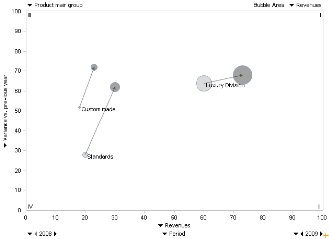
When you scroll the wheel of your mouse, DeltaMaster will immediately show or hide the bubbles (i.e. you will not need to Calculate the analysis each time). In the screenshot on your right, the bubbles are linked and displayed in grayscale due to the selected Properties – but more on that later.
The dynamic, “animated” presentation can provide valuable information on movements that would be difficult to obtain through statistical observations alone.
Familiar usability
The Dynamic Portfolio Analysis is available in Miner-Expert mode. Although you need a valid Miner Expert license to create and save a Dynamic Portfolio Analysis, you can access these reports on any level without needing an additional license. If you wish to try this functionality for yourself, simply contact us to receive a test Miner Expert license.
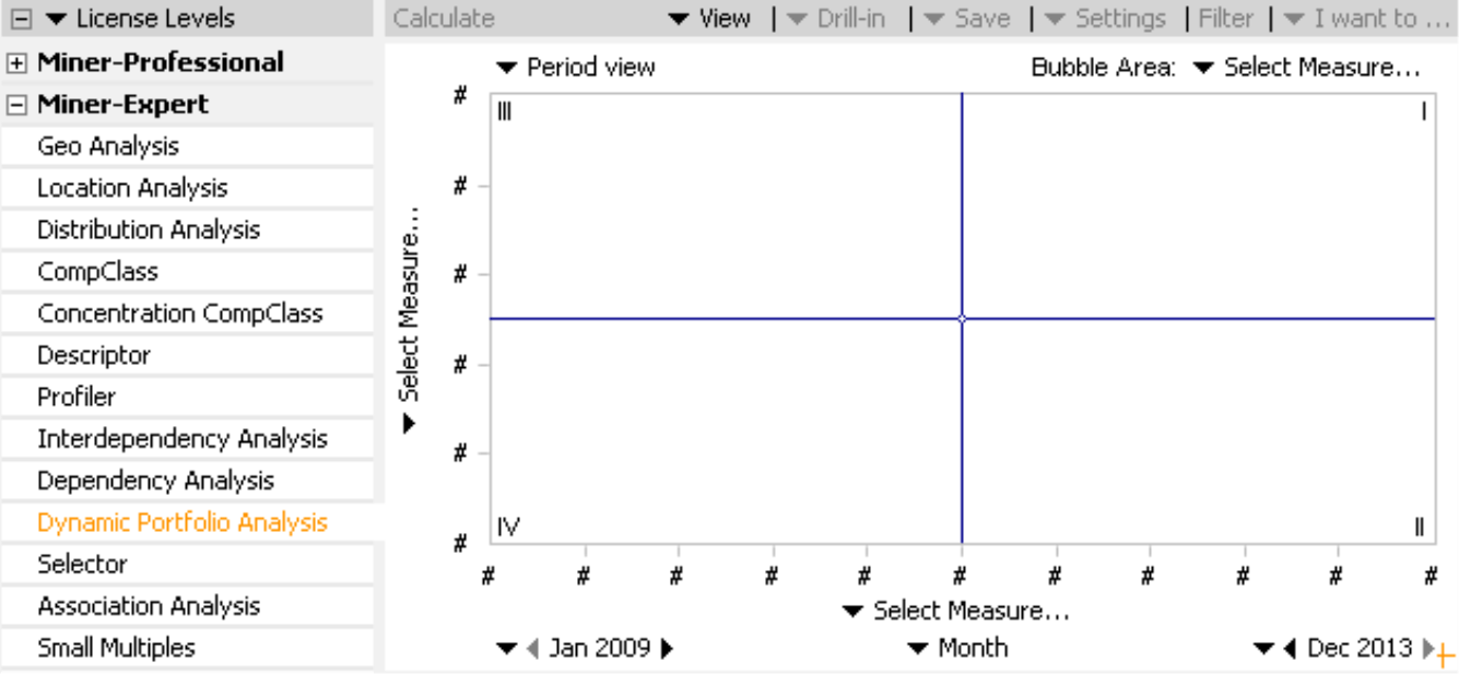
You can modify a Dynamic Portfolio Analysis using the same controls that you know from other analysis modules. Similar to the “static” Portfolio Analysis, you can select the measures for the X axis, Y axis, and bubble area (if desired), and enter the dimension or hierarchy level of the objects you wish to display. For the most part, the options in the context menu, the I want to… menu, and even the Settings are almost identical to those offered in a normal Portfolio Analysis. In addition, the time axis of a Dynamic Portfolio Analysis uses the same navigation (e.g. start time, end time, level) that is used a Time Series Analysis.
Chart properties
You can edit the properties of a chart in either the context menu or I want to… menu on all user levels from Reader to Miner. Here, you can change the Connector Type between the data points of the objects, the Point Colors as well as the Point Labels.
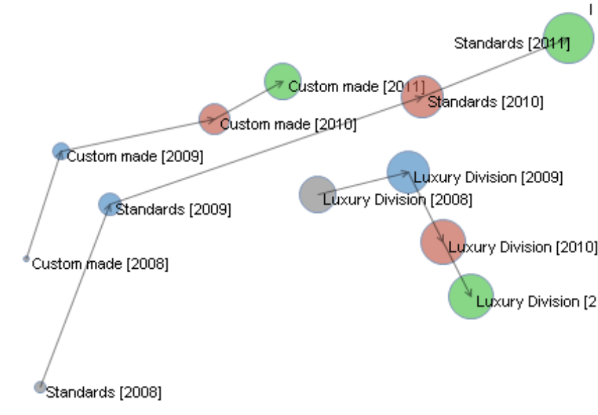
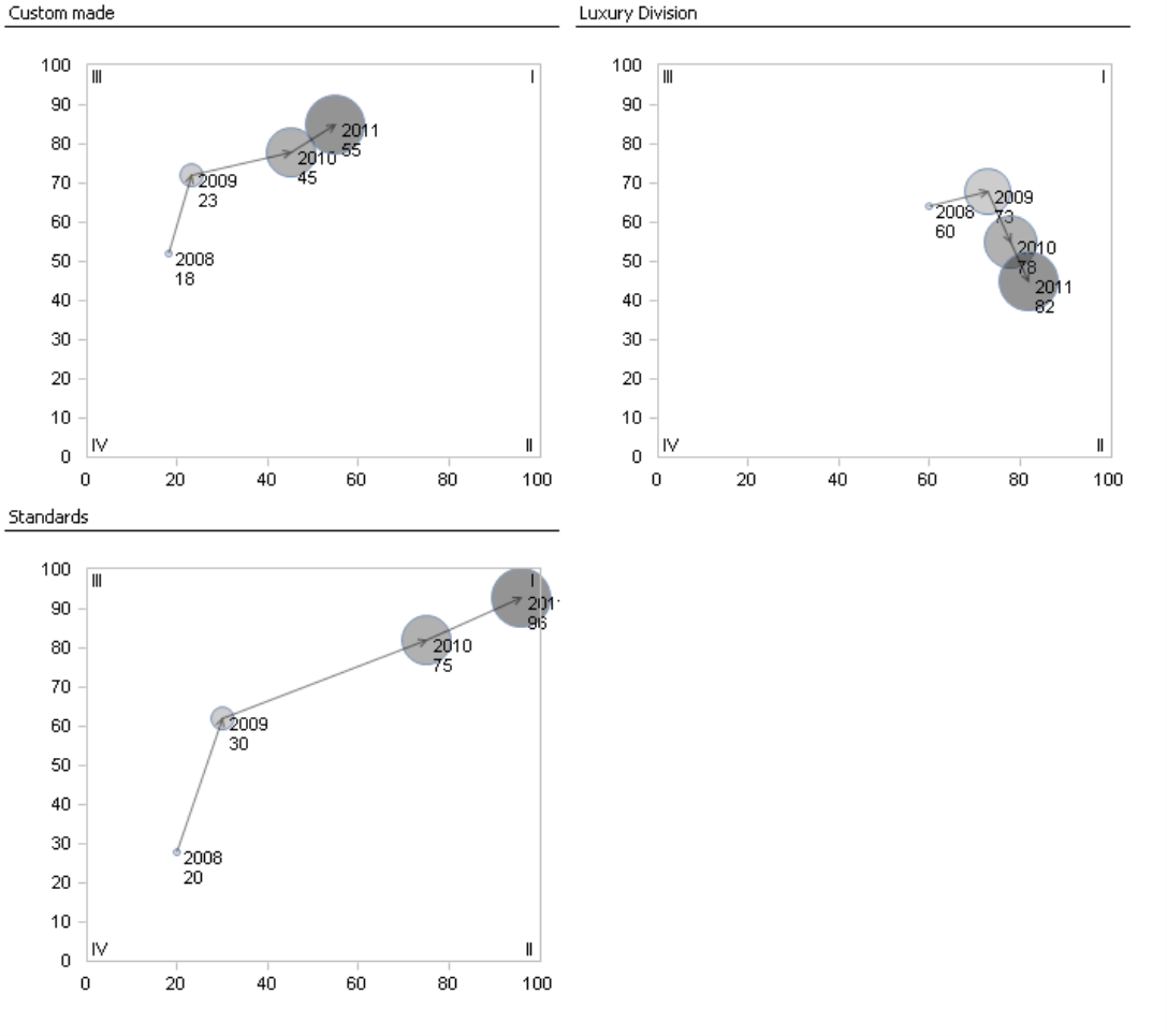
Using the Connector Type, you can determine if and how DeltaMaster should connect the individual data points of a certain object. Arrows were used in the screenshots on the following page. If desired, you could also select a simple, solid Line or one ending with a single Arrow. The connectors hold together the bubbles that belong to the same object and further illustrate their chronological order.
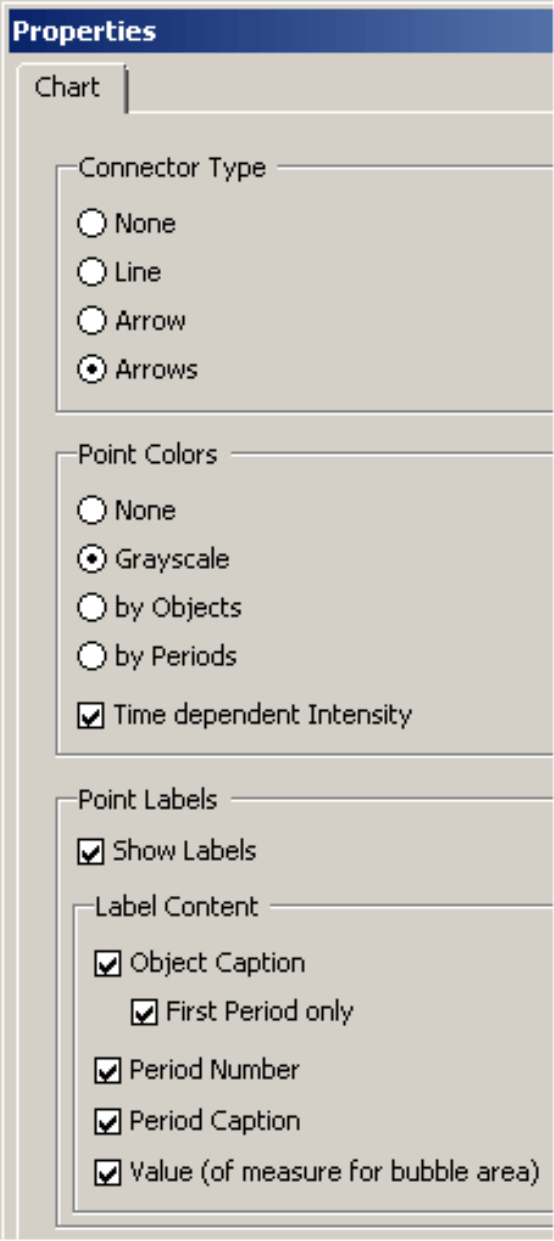
If you are working with multiple objects, Point Colors can add clarity to the portfolio. You can choose from the following options:
- None: The bubbles are displayed as hollow circles as in a (static) Portfolio Analysis.
- Grayscale: The bubbles are displayed as filled circles.
- by Objects: All data points of the same objects have the same color for all periods. In other words, the color also designates which point belongs to a given object (e.g. “Custom made” points are grey, “Standards” points are red, and “Luxury Division” points are blue). DeltaMaster will automatically assign the correct colors to the objects.
- by Periods: All data points of the same period have the same color for all objects. The color, therefore, signifies which point belongs to a period. DeltaMaster will automatically assign the colors to the periods (e.g. the year 2008 is gray for all objects, 2009 is blue, 2010 is red, and 2011 is green).
If you choose Grayscale or the point color by Objects, you could also activate a Time dependent Intensity, which applies the lightest shade to the first data point and the darkest to the last one. This way, the base color indicates which object you are viewing and the color’s intensity shows how “old” or “young” the respective data point is.
In the Point Labels section, you can define if and how DeltaMaster should label the data points. In most cases, you will probably just want to list the Object Captions (e.g. names of the respective product categories) for the First Period only as in the previous screenshot. With these settings, the chart contains less text and, therefore, is more legible in the process.
You can edit the Properties of a Dynamic Portfolio Analysis in all user levels from Reader to Miner. Changing the time period, however, is reserved for Miner users. For more information on other options, please read DeltaMaster deltas! 5.5.0, feature #9.
Converting to Small Multiples
In Miner mode, you can easily convert portfolio charts to Small Multiples. This action will “serialize” or break down the different sequences into several, individual charts. From the context menu or I want to… menu, you can start a conversion to Multiples either over periods or over objects.
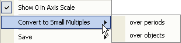
If you choose a conversion over periods, DeltaMaster will generate a multiple for each period. The multiples show how all of the objects are positioned in the individual periods. Each multiple shows a static Portfolio Analysis. DeltaMaster will automatically generate the necessary analysis template, which you can edit as usual (e.g. modifying the captions).
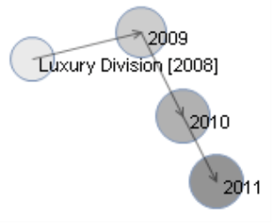
The over objects option generates one multiple for each object (e.g. each product category as shown in the screenshot on your right). The multiples show how the individual objects have developed over time. Each of these multiples shows a Dynamic Portfolio Analysis – but only for one object and without the interactive functionality of the mouse wheel. Here, too, DeltaMaster will automatically generate the necessary analysis template.
About the data
As is the case with every specialized analysis, the question at hand, the analysis method, and the data all have to fit together in order for a Dynamic Portfolio Analysis to be effective. A Portfolio Analysis, whether static or dynamic, is an instrument for answering strategic questions and, therefore, is designed for aggregated data. In most cases, you will use this method to examine developments over years or other longer periods of time, Daily values, specific customers, and individual articles react more erratically. As a result, viewing this type of data with a Dynamic Portfolio Analysis is the exception and not the rule.
Questions? Comments?
Just contact your Bissantz team for more information.
