![]()
Greetings, fellow data analysts!
Overview and detail are both important in management information – and especially a smooth transition between them. You probably already know that from the interactive visualizations and analytic methods in DeltaMaster. Distribution Analysis, a statistical method to investigate frequencies, is one example: It delivers more detail than a KPI such as monthly revenues and a broader overview than just a list of all customer or product revenues. It breaks down revenues (or another measure) into a manageable number of intervals. Then you count how many customers or products (or other objects) fall into each one. You can present the result as a histogram or table that is easy to understand and interpret. We will talk more about Distribution Analysis – both as an overview and in detail – in this edition of clicks!.
Best regards,
Your Bissantz & Company team
Time and time again, people who analyze data intensively will need an overview of the frequency distribution of the objects they are analyzing – for example, customers, products, materials, proportions, business units, etc. The Distribution Analysis in DeltaMaster does just that. It shows how often the objects that interest you occur in different consecutive intervals and calculates statistics (e.g. mean, median, range) that describe the distribution of their values.
While some users value the graphical presentation as a histogram, others prefer the fast access to figures. A Distribution Analysis can also break down objects based on their values into classes – for example, customers with revenues under 20,000, between 20,000 and 40,000, between 40,000 and 60,000, and so on – which, in turn, can be used as a filter for further analyses.
You can only create distribution analyses in Miner Expert mode, but users in Reader, Viewer, Pivotizer, and Analyzer modes and, of course, the new DeltaMaster Navigator can all access them. In the following section, we will explain how to configure the analysis, read the histogram, interpret the statistics, and reuse the results as a virtual hierarchy.
Getting started
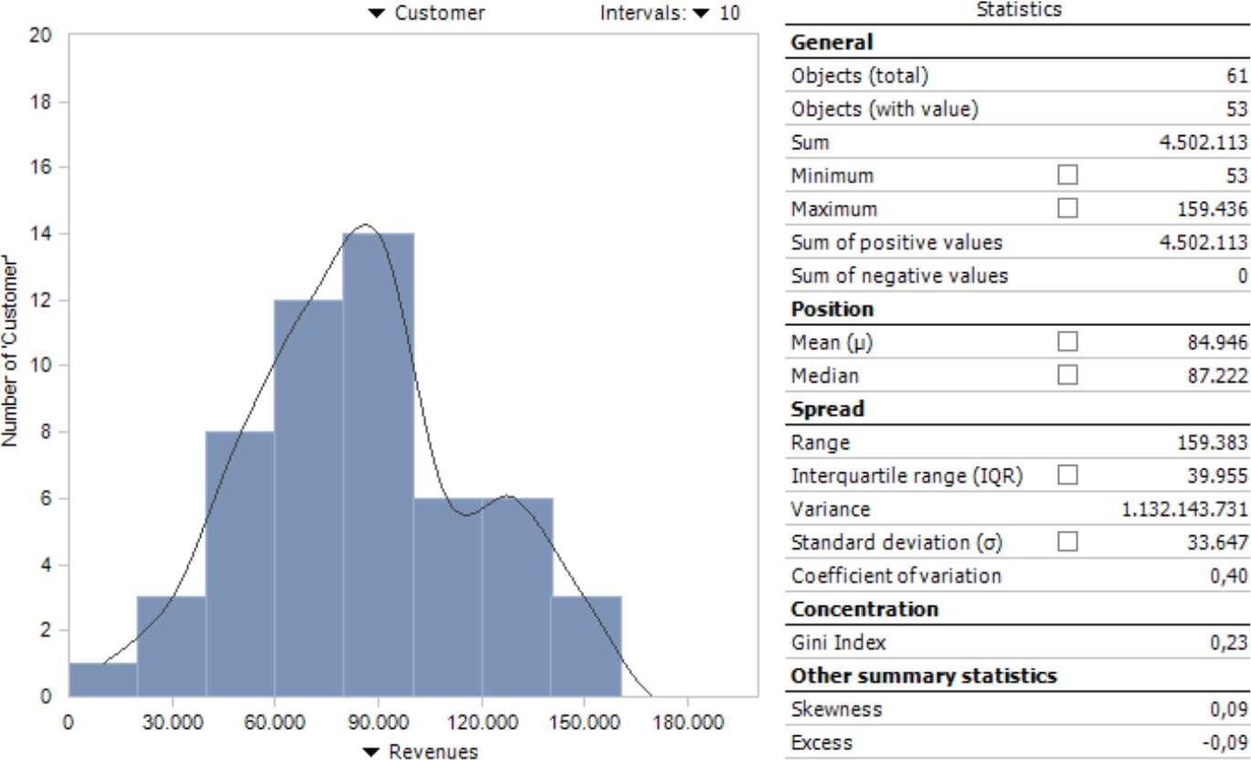
The Distribution Analysis is grouped under the Statistical Methods in the Analysis menu. It only requires two parameters: a dimension level and a measure. We will use an example from our reference application “Chair” using customers (i.e. the lowest level of the customer dimension) and revenues to identify the revenue classes of these customers.
- Select the dimension level from the menu above the chart (or the empty grid). DeltaMaster will include all members on this level that match the current selection in the View window and, if applicable, the Filters in the Settings. Using the View and Filter, you can limit the count of objects you wish to analyze. You can modify the View – but not the Filters – in Viewer mode.
- Select the measure using the menu below the chart. Alternatively, you can drag and drop it from the Cockpit.
When you calculate the analysis, DeltaMaster will draw the distribution as a histogram and generate statistics about it as shown in the previous screenshot. If outliers disturb the presentation, you can use a Filter (menu in the Analysis window) to remove them.
Now let’s take a closer look at the histogram. We will delve into the Statistics further below.
Histogram
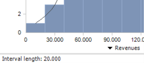
DeltaMaster breaks down the measure (in this case, revenues) on the X axis and automatically creates intervals. These intervals are characteristic for the Distribution Analysis, which breaks down the value range in consecutive segments and investigates how many members fall into each one. The intervals all have the same width. You can define the number of Intervals and, accordingly, the width in the selection list on the upper-right side of the chart. There are no general guidelines regarding the number of intervals. A large count makes the presentation more granular but at the risk that you can no longer recognize the essence of the distribution amidst more or less random peaks. A smaller count reduces the influence of ranges and outliers, but also creates a rougher visualization and possibly even a less sensitive summary of objects. Many times, you can easily recognize the structure of the distribution with five to twenty intervals. If in doubt, try using a different number of intervals.
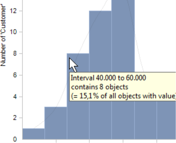
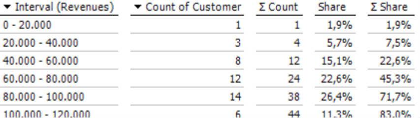
The Y axis breaks down the number of objects, in other words, how many customers lie within the respective revenue class. The tooltip of the columns shows the borders of the interval as well as the number of members it contains; the members as an absolute value and as a percentage of all members that have a value (please read the hint regarding the number of objects in the General section below for more information).
The tabular View (menu in the Analysis or Report window) contains the same information: the interval boundaries, count of members in an interval, and which share they constitute of the whole. The count and share are added from top to bottom in the columns containing the sum symbol in the heading. This provides a cumulative view, similar to that in a Concentration Analysis, to show how many objects are in each class and which share they comprise together.
Statistics
DeltaMaster will display statistics that characterize the distribution to the right of the histogram. You can display some of them in a histogram by activating the respective check box.
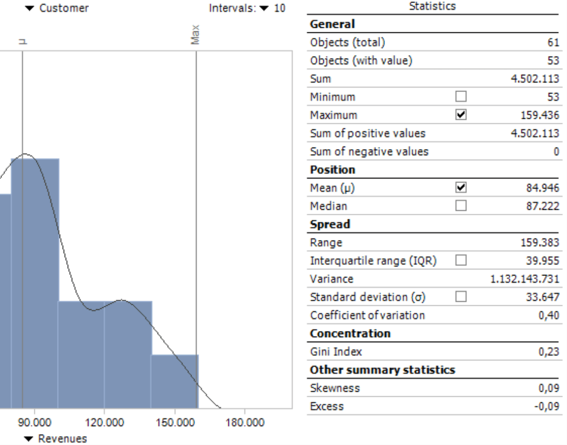
General
The general statistics hardly need any explanation. They describe the scope of the data base and the range of values.
Objects (total) |
Count of members in the viewed distribution (e.g. number of customers or products) |
Objects (with value) |
Count of members in the viewed distribution that have a value. DeltaMaster will count members with a value of 0 but not those without any value (i.e. “empty members”). When calculating the mean or other statistics that require the count, DeltaMaster will always use the number of objects with a value. |
Sum |
Sum of all members (e.g. total revenues with all customers in the distribution) |
Minimum |
The smallest value of the distribution (e.g. lowest revenues with one customer) including 0 |
Maximum |
The largest value of the distribution (e.g. highest revenues with one customer) |
Sum of positive/ negative values |
Sum of all values that are larger or smaller than 0. The separate sum based on the algebraic sign is particularly interesting for variances (e.g. plan-actual variances or changes from the previous year). You can then quickly see if the distribution contains compensating effects (e.g. when higher revenues with certain customers balance out lower revenues with others). |
Position
In statistics, we often use a “middle” value as a way to describe a series of values.
Mean |
Unweighted arithmetic mean. Calculated as the sum of values divided by the count of members with a value. One disadvantage of using an arithmetic mean is that it is very sensitive to outliers. If a single value varies greatly from the others, the mean does not adequately describe the distribution. |
Median |
Central value. In your mind, you can arrange the values of a distribution as a list in ascending order. The median divides the list into two halves: one with values that are smaller than the median and the other half with values that are larger. When there is an odd number of members, the median is the middle value in this “list”. If the count is even, the median is calculated as the mean of the two middle values. The median is not sensitive to outliers and often more meaningful than the mean. |
If the measure that you use is not additive (e.g. variance as a percentage or a quotient such as market share or discount rate), DeltaMaster will calculate the unweighted mean and median (i.e. without knowing the absolute base values). If you offer a 4-percent discount rate for domestic customers and an 8-percent discount rate for international customers, the mean is 6 percent regardless of how high these revenues and discounts are nationally or internationally. As a result, you should use means and medians with caution in this case. DeltaMaster will explicitly warn you of this by placing these statistical values in cursive type and classifying them as unweighted in the status bar of the report. DeltaMaster classifies a measure as being non-additive when the Additivity (Measure Properties, General tab) has been configured as such.
Spread
The spread shows the proximity of the values in the viewed distribution to the mean.
Range |
Difference between the maximum and minimum. In other words, the “distance” between the smallest and largest value. The range is the easiest way to measure the variability of a distribution. |
Interquartile range (IQR) |
Difference between the upper and lower quartile. As with the median, you can think of the values as a list in ascending order. The interquartile range is then the range of the midsection (i.e. the mid 25 to 75 percent). The quartiles with the smallest and largest values are not important for this index. This limits the influence of outliers. |
Variance |
Average of the squared differences from the mean. Since this statistic is squared, the variance is difficult to interpret in a business sense and often unbelievably high. It is, however, significant for further calculations. |
Standard deviation |
Average spread around the mean. Calculated as the square root of the variance. Standard deviation is often used to create classes with the most common attributes provided that the measure is subject to a normal distribution (i.e. a bell curve ). If this is the case, 68 percent of all values will lie in the range of the mean plus/minus one standard deviation, and 95 of all values will lie in a range of the mean plus/minus two standard variances. Standard deviation is also suitable for forecasting: If the value is low, there is a high probability that future results will lie around the mean. |
Coefficient of variation |
Relative measure of spread. Calculated as the quotient of the standard deviation and the mean. This makes standard variances of distributions comparable – for example, so that you can compare group revenues with those of the subsidiaries even when they are very different in absolute terms. |
If the measure is non-additive, the same hint that applies to the mean and the median is also valid for the variance, standard variance, and the variation coefficient – namely, that the calculation is unweighted (see above).
Concentration
Two extreme forms of distribution are uniform distribution and the distribution concentrated on a single point. Concentration statistics describe the distribution that you are observing in this spectrum.
Gini index |
Measurement for the variance of the observed distribution to a uniform distribution. The Gini index has a range from 0 to 1, whereby the concentration grows from 0 (uniform distribution) to the maximum value 1 (concentration on a single point). A Gini index cannot be calculated when the distribution contains negative values or only one member. DeltaMaster users especially know the Gini index from the Concentration Analysis. |
Other distribution statistics
Skewness |
Measures the level of symmetry in a distribution. A normal distribution is a completely symmetrical distribution and has a skewness of 0. Positive values suggest distributions that skew to the right while negative values suggest those that skew to the left. |
Excess |
Shows the differences to a normal distribution with the same variance. Excess is a measure of how steep the distribution is. Distributions with a low excess have a relatively even spread. When distributions have a high excess, the spread results from extreme but rare values. |
Threaded Analysis Technology: Using classes or intervals as a virtual hierarchy
The Distribution Analysis in DeltaMaster is unique in that you can place the members (e.g. customers, products) that you are analyzing into new groups and use them as a virtual hierarchy for further analysis in DeltaMaster. You can create the hierarchy using either the intervals or classes which additionally break down the range of values.
Classes, in particular, are useful when you have configured a large number of intervals that should not all be members of the virtual hierarchy or when you want to define the class borders explicitly or differently from the interval boundaries. In the default setting, DeltaMaster automatically creates four class borders with equal intervals for each Distribution Analysis.
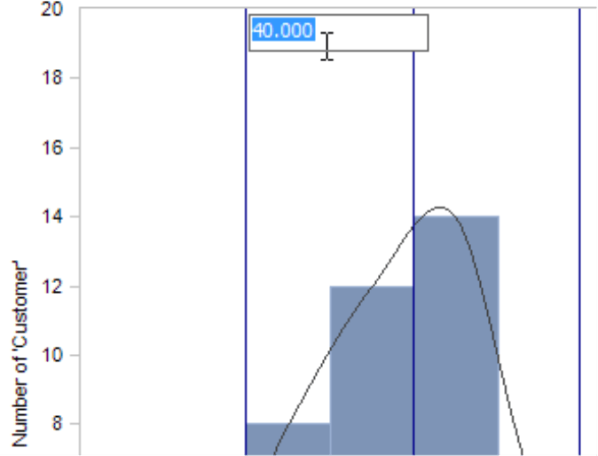
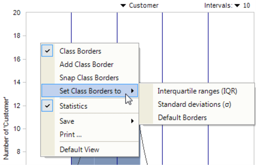
You can recognize the classes in the histogram by the vertical lines as soon as you activate the class borders (I want to menu or the context menu of the chart). You can move these borders using drag and drop. On the context menu of a line, you can set the class border numerically by entering the exact value next to the line in the small entry field that contains the current border. Percentages are entered including percentage signs.
From the context menu of the chart, you can also Add class borders. Snap means that the class borders that run through an interval will be pushed to an interval border. As a fast default setting, you can Set class borders to frequently used borders: the Interquartile range (see explanation under the section Statistics/Spread), the mean plus/minus one and two Standard deviation(s) or the four Default borders of DeltaMaster. All three options will reset the previous class distribution; they will not be applied in addition to individual classes. Setting the borders based on the standard deviation is often a good way to manage outliers. In the case of values with a normal distribution, 95 percent of the values lie within the range of two standard variances around the mean. The rest you can treat as outliers and ignore.
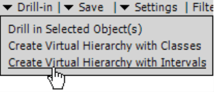
Once you have set the intervals or classes, you can create a Virtual hierarchy with classes or intervals using the functions in the Drill-in menu. If you are interested in a particular interval, there is even a faster way: When you double click on a respective column, DeltaMaster will create a virtual hierarchy based on the intervals and automatically select the one you clicked in the View window.
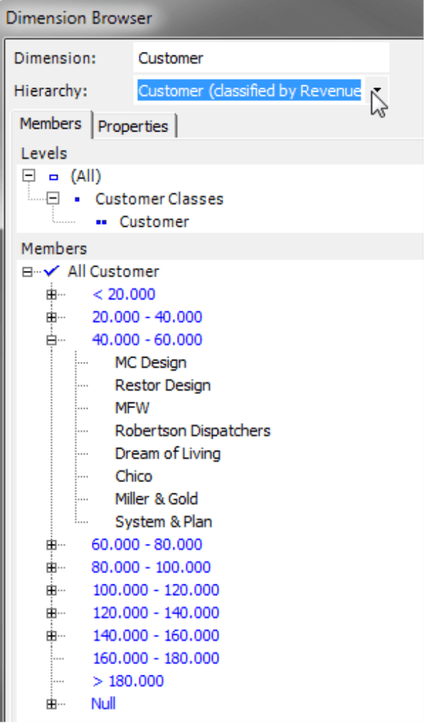
You can immediately access the new hierarchy in DeltaMaster without changing the database as you can see in the Dimension Browser on your right. The customers are now arranged by revenue classes instead of regions. You can use these classes as the starting point for further analyses.
To arrange the members in the virtual hierarchy, DeltaMaster uses MDX statements that determine the class membership based on the measure, View, and Filter that were set when the analysis was calculated. Virtual hierarchies are based on dynamic descriptions (not static lists) so that they automatically include any changes made in the database. In the Settings (menu in the Analysis window) on the Classification tab, you can manage where DeltaMaster should place Null Values (i.e. members without a value): in a regular class including members with a value of 0 or in an additional class that was previously added for “empty” members. DeltaMaster automatically combines members that were removed by Filters in the Settings into a separate class.
If a virtual hierarchy has already been created for the current view of the Distribution Analysis, you cannot save another one. The functions for editing class borders will be deactivated, and the status bar will state that a virtual hierarchy has already been created. To create further virtual hierarchies, calculate the analysis again.
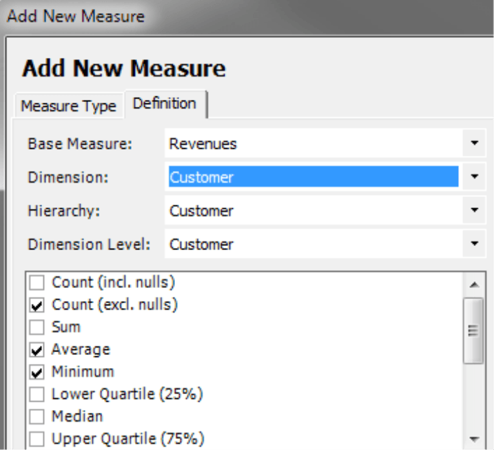
Further analyses with statistics
Aside from the intervals and classes, you can also reuse the measures that are listed in the field Statistics. You could, for example, compare them, track their development over time using sparklines, or integrate them as additional information in comprehensive reports. Although you cannot transfer them directly from the Distribution Analysis, you could easily define almost all of the statistics presented above as individual measures. Use the wizard in the Measure Browser (Model menu) to add Univariate statistical measure. Only the interquartile range, Gini index, skewness, and excess are not included. For more information, please read DeltaMaster clicks! 07/2009.
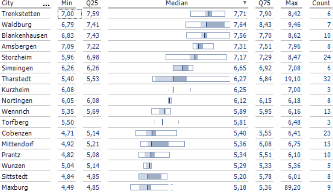
Alternatives: Box-whisker plots and box plots in graphical tables
DeltaMaster also offers box-whisker plots and box plots as a presentation form for comparing distributions. Both visualize the position and the spread of values using five univariate statistical measures: the minimum, lower quartile, the median, the upper quartile, and the maximum. A box-whisker plot in DeltaMaster is a pivot chart while box plots are graphical elements that are embedded in pivot tables.
For more information on box-whisker plots, please read DeltaMaster clicks! 12/2010.
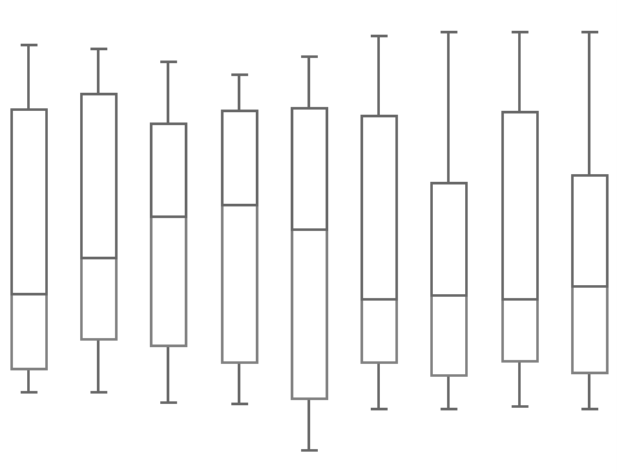
The box plots embedded in pivot tables are horizontal. In place of their antennae, which designate the minimum and maximum, the boxes are enclosed in a frame. This easy-to-read visualization is also very easy to create and update. For more information on how to configure and interpret box plots, please read DeltaMaster deltas! 5.5.9, feature #11.
Questions? Comments?
Just contact your Bissantz team for more information.
