![]()
Greetings, fellow data analysts!
Who wants to simply follow the next trend, when being a trendsetter is so much more interesting! Or if you prefer to stay on the safe side, you can simply label something a trend – in this case then, something really big: a megatrend. Although the term was originally coined by sociologists to characterize social or technological changes, trends apply just as easily to hairstyles or fashion. Although it’s very alluring to be the one to spot a new development and run with it, you first need to take a very close look to ensure that something that looks like a trend is truly one.
Methods, such as regression analysis, can help you spot trends much more easily than you might think. Using the Trend barometer, you can even integrate these analyses right into your graphical tables. We’ll show you how you can transform DeltaMaster into a trend scout in this edition of clicks!
Best regards,
Your Bissantz & Company Team
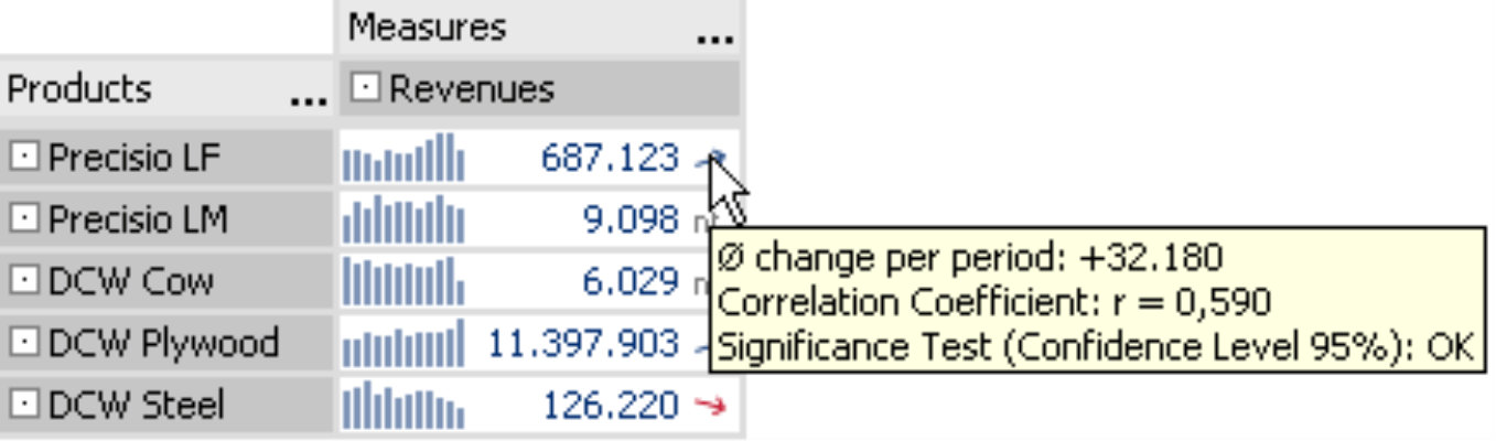
![]() Take a good look at this section of a pivot table.
Take a good look at this section of a pivot table.
As a DeltaMaster user, you have probably become accustomed to the sparklines, which in this case explain product revenues in the context of time. But what about the arrows behind the numbers?
These elegant trend arrows explain if the time series displayed as a sparkline shows a trend in the statistical sense. If yes, the arrow shows the direction as well as its correct geometric strength. “nt” means that there is no trend – which is information in itself if you think of typical planning tasks. After all, how should a development carry on in the future if it really isn’t one to begin with?
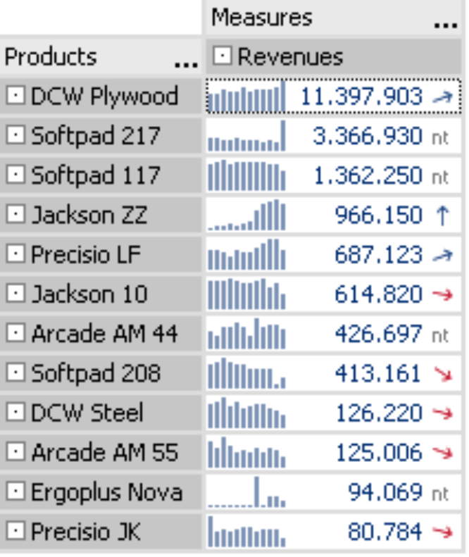
Although these arrows may look inconspicuous at a first glance, they are really quite spectacular. They don’t just signify a simple change of plus or minus as you often see in the papers, where they use one of two symbols – regardless of how significant this change is – to explain an increase or decrease from the previous day. DeltaMaster can, of course, replicate this type of functionality using conditional formatting in a Flex report (see DeltaMaster clicks! 01/2007). But the Trend barometer, the function that creates these trend arrows, can do so much more. It is one of many options, in which DeltaMaster can transform conventional pivot tables into graphical tables to display a high level of information in very little space.
This edition of clicks! will explain how you can use Trend barometers as well as how they work. Although detailed information on statistical techniques is probably better suited for a textbook, we will touch upon this background briefly to help you better interpret and evaluate the results in DeltaMaster.
Regression analysis
When statisticians search for trends, they tend to use regression analyses. Generally speaking, this technique analyzes one dependant and one or more independent variables in order to recognize and explain relationships and forecast the values of the dependant variables.
DeltaMaster uses the principles of regression analysis in many of its built-in analytical functions. The most obvious is Regression, in which you can observe the possible correlations between two given measures. DeltaMaster, however, also uses these principles in the trend lines of a Time series analysis, the regression lines of a Portfolio analysis as well as in the Trend barometer of a pivot table.
Integration in a pivot table
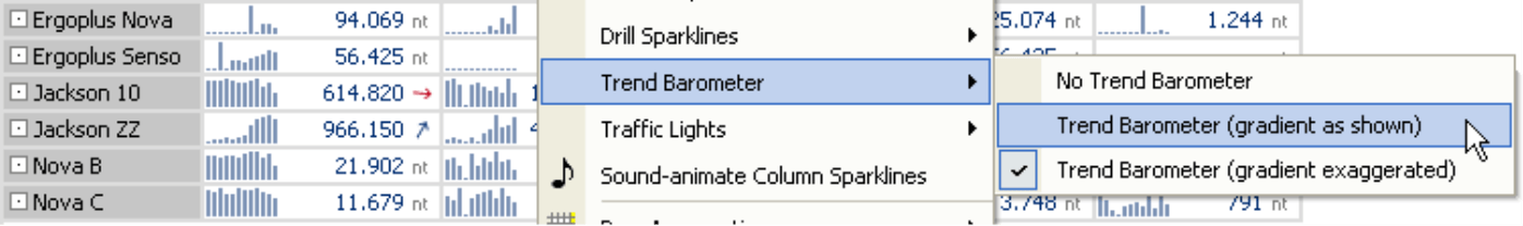
Adding a Trend barometer to a pivot table is very easy. Just select one of the display options from the context menu. (These options will be explained in detail below.) The only requirement is that the column or line sparklines must be activated in the pivot table. In addition to displaying the graphical elements, DeltaMaster also accesses the time series that comprise the sparklines so that you can use them for further analysis.
When you use this approach to embed trend arrows in a pivot table, you already have all of the parameters you need to run the analysis, because each cell contains a dependent variable (i.e. the individual measure) as well as an independent one (i.e. time). Since the historical values displayed as a sparkline serve as the control sample, you can immediately start the calculation.
Testing marathon
In order to test the existence of trends, DeltaMaster treats each cell in the table (i.e. the current value and the historical values stored as a sparkline) as a separate data record. It then runs a regression analysis and further tests for each cell or data record.
The first step is to estimate the mathematical regression, a linear function based on the formula y = a + b*x. This is based on the method of the least squares. As a result, you will receive two parameters for each cell: the constant axis intercept “a” and the regression coefficient “b”. This allows you to create a line that runs through the points of data in our record. Sometimes it intercepts the points exactly and sometimes it is very close or far away from them.
You can clearly see this step in a Time series analysis, which is basically nothing more than an enlarged sparkline. By double clicking on a sparkline in a pivot table, you can open the same data record as a Time series analysis.
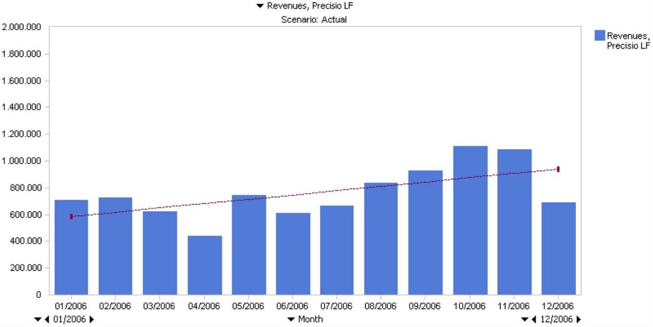
You can view the formula expression in the trend line tooltip.
After DeltaMaster determines the regression function, you will need to determine its quality. In other words, you need to know if the mathematical function describes our data records vaguely or accurately. In particular, you need to see how well the model explains the dependant variable.
The correlation coefficient “r” explains how the actual values are scattered around our line. The value of “r” always lies between –1 und +1. If the value is exactly –1 or +1, all of the values lie exactly on the line and the function is an exact description of the actual value allocation. The closer “r” is to 0, the weaker the correlation is. The value of “r” is also displayed in the tooltip. This value, however, is a standardized, purely statistical indicator that cannot be interpreted from a business perspective. Our data record then runs a third examination: a significance test. Using F-statistics, you can then determine if the relationships found are coincidental or not. The result of this test also appears in the tooltip.
Back to the trend arrows in the pivot table: the line is now shown as a small arrow and accounts for all of the measures discussed above. Instead of using the formula, DeltaMaster refers to the average change per period, which is equivalent to the regression coefficient “b”, as you can tell from the numbers. The color of the arrow signifies the measure’s business factor. If a measure has a positive effect on revenues, it will be blue if the trend is positive and red if negative. When you are working with cost measures, however, a rising trend will be marked red and a falling one blue.
Exaggerations allowed
The trends that you will observe in day-to-day use are usually weak, especially when you are dealing with compact KPIs. You shouldn’t really expect more than a plus or minus of a few percentage points. Presenting this type of line geometrically is not very enlightening, because it would only be a slight change from the level state. With trend arrows, this is even more so the case. To ensure that you can make any differentiation at all, DeltaMaster offers an option in the context menu to show the Gradient exaggerated. In this model DeltaMaster amplifies the arrows so that the one with the starkest slope is displayed perpendicularly – in other words at a 90 or 270 degree angle – and the other arrows are adjusted accordingly.
Questions? Comments?
Just contact your Bissantz team for more information!
