









































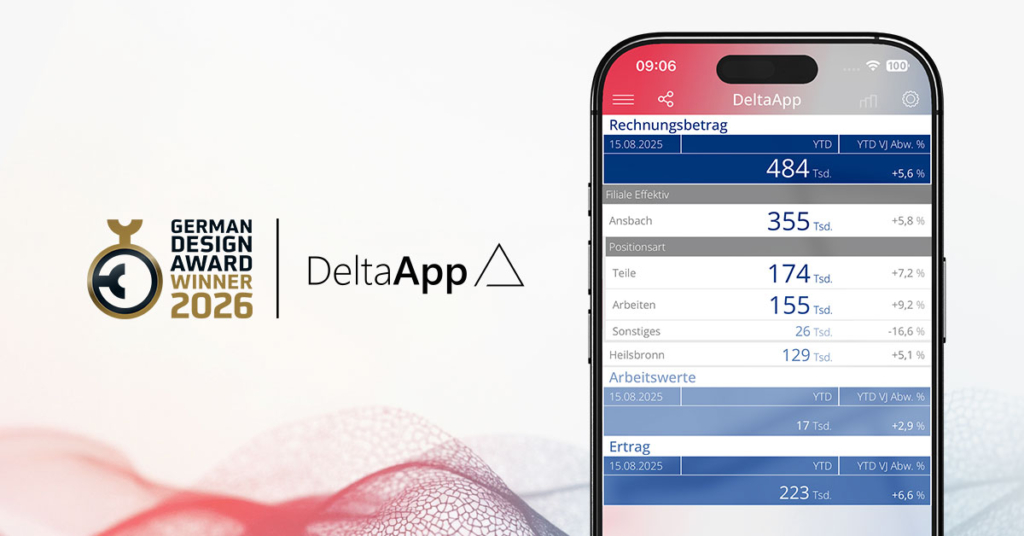
When people see DeltaApp for the first time, they notice its visual design: clear areas, two colors, large and small numbers. Everything appears calm, almost self-evident. Yet this is precisely where a possible misunderstanding lies. What becomes visible here isn’t a new interface, but a fundamentally different conception of how business intelligence can work.
“Business intelligence rarely fails because of data,” says Dr. Nicolas Bissantz. “It fails because numbers don’t have impact.” That’s why design isn’t aesthetic embellishment, but the functional core of modern analytics: the element that determines whether numbers are seen, understood, and actually guide action in daily practice.
Lots of data, little orientation
Many companies face a similar starting point. Data is abundant, as are reports, yet the scarce resource is attention. Tables, dashboards, and Excel sheets deliver information, but often don’t answer the simple questions that matter in everyday work: What’s going well? What isn’t? And where should we look more closely?
“The problem isn’t that people don’t understand numbers,” says Dr. Fabian Rossi, “but that we show them too many at once and treat them all the same.” Where everything looks the same, little stands out. Information remains available but is rarely perceived as clear signals.
From numbers to signals
This is where DeltaApp comes into play. It treats analytics as a guided process. It directs attention to where decisions are needed. Numbers aren’t just displayed but consistently placed in context—with time, with targets, and with structure.
“A number by itself remains abstract,” says Bissantz. “Only through comparison does meaning emerge, and with it, orientation.”
Typographically scaled numbers show relevance before we consciously read them: large is more important than small, bold more urgent than pale. The color palette is deliberately reduced: blue and red stand for direction and impact, not for categories, but for consistency in representing values.
“Ambivalence is the enemy of decisions,” says Dr. Fabian Rossi. “That’s why we have no ‘maybe’ in presentation—only direction and strength.”
Sparklines integrate time series directly into tables. Developments become visible without disrupting the natural flow of attention. You start with the most important number and progressively go deeper, while context is preserved and the focus becomes ever more precise.
Perceptual design: perception as starting point
The most important user of DeltaApp is therefore not the CFO or controller, but the human brain. “That’s why we build BI systems from the perspective of perception.”
This perspective is the result of years of work: long-standing collaborations with renowned brain researcher Prof. Gerhard Roth and with people who make critical decisions under intense pressure as part of their profession, such as racing driver Hans-Joachim Stuck or Champions League referee Deniz Aytekin. The insights from this are clear and point the way: working memory is limited, seeing isn’t a neutral image but a selective process. Complex, visually overloaded interfaces consume precisely the resources we need for thinking.
“Every unnecessary visual element costs cognitive energy,” Rossi says. Reducing complexity is therefore not a stylistic device but a functional prerequisite.
DeltaApp consistently uses the strengths of perception: contrast, pattern recognition, comparison. Reduction isn’t a stylistic device but a functional necessity.
Two roles, one common view
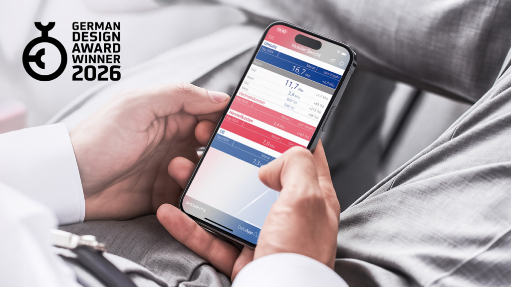
In practice, DeltaApp is primarily used by two groups. Decision-makers need quick orientation. They must recognize deviations without working through details. DeltaApp provides this condensed overview. Drill-downs are available through simple gestures but are not always necessary.
Controlling and BI teams benefit from a different quality: a common, consistent presentation. One logic, one language, one view of the data. This reduces friction, lowers error rates, and shifts focus from justification to analysis, interpretation, and management. “When controlling spends time defending numbers, something is fundamentally wrong,” says Dr. Nicolas Bissantz.
Design as a prerequisite for good decisions
Technologically, DeltaApp is a modern cloud product, but technology is a means to an end. “Therefore, we’re less interested in what’s technically possible,” says Rossi, “but what’s cognitively sensible.”
That this approach has been internationally recognized multiple times, most recently with the German Design Award 2026, is recognition, but not the goal. “For us, a design award isn’t an aesthetic judgment but an indication that design was taken seriously—as a prerequisite for understanding, trust, and better decisions.”