![]()
Greetings, fellow data analysts!
A general rule of writing says that the most important message belongs at the top, for example, in the heading or at the beginning of an explanation. That’s how we learned it, and that’s how we do it – in writing as well as reporting. When you analyze customers, products, materials, etc., you probably also sort them by a measure so that the most relevant objects appear at the top of the table. Yet in the case of variances, which are probably the most important information of all, the top items only reveal half of the story. The largest positive variances are at least just as significant as the largest negative ones that lie at the very bottom – unless, of course, you take special precautions. So how can you design reports so that both types of variances get the attention they deserve? In DeltaMaster, you can configure reports to automatically unveil positive and negative factors. We personally recommend starting with the good news first*. The choice, however, is up to you.
Best regards,
Your Bissantz & Company team
*www.bissantz.de/bissantz-ponders/neurocontrolling-1
Making management decisions rarely requires a complete understanding of all clients, all products, all cost centers, or other influencing factors. Usually, just the most important ones suffice. For absolute measures such as revenues, you can easily find the most relevant factors in a sorted list. (That, too, can get tricky if you need to sort objects across different levels or hierarchies, but we won’t delve into that here.) When you are observing variances (for example, between actual and budget values or the current and previous year), a simple, sorted list is not very helpful. Since variances can be either positive or negative, the list shows the most important things at the very top and the very bottom – with many less interesting items in between. So how can you display the most relevant variances, whether positive or negative, together in a concise report? DeltaMaster offers many options, which we will explain below.
Top and Bottom in pivot tables
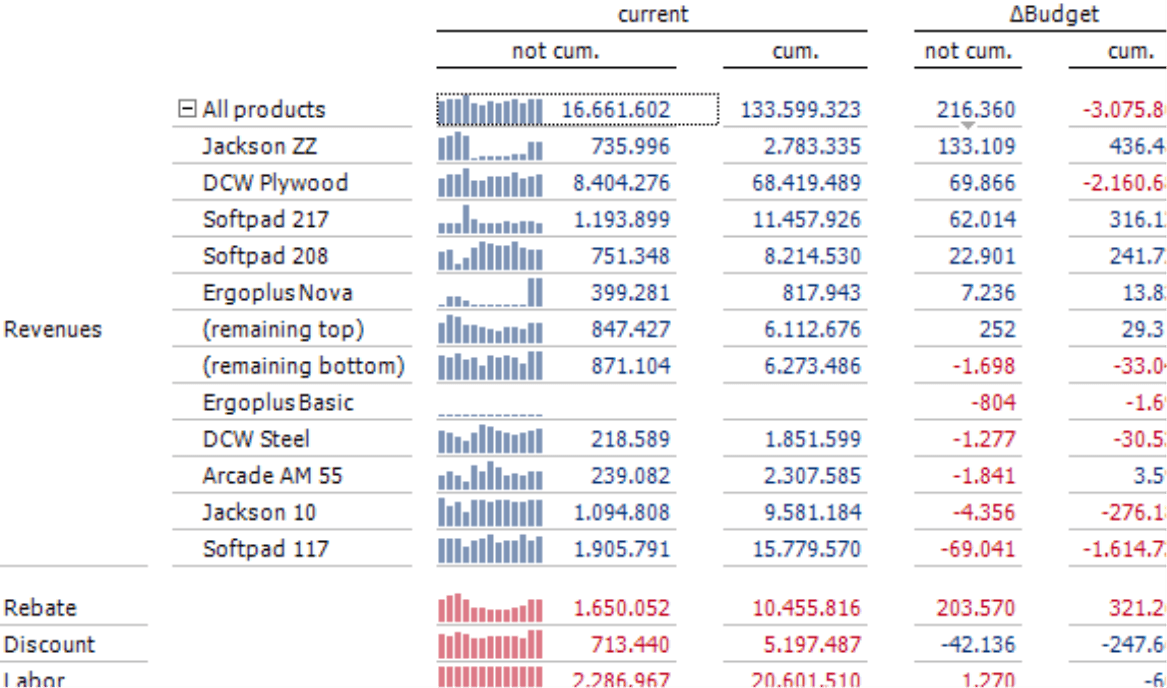
Pivot tables are the most important format for standardized reports. Using a special sort order, you can display the most important positive and negative values next to or on over each other in the pivot table. DeltaMaster will automatically pool the residual, non-listed members and display them as “(remaining top)” and “(remaining bottom)” between the two groups.
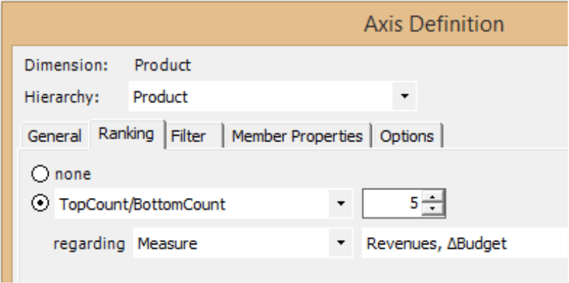
In the Axis Definition on the Ranking tab, you can specify if DeltaMaster should sort the members by TopCount/ BottomCount or BottomCount/TopCount. For the parameter, you enter how many top and bottom members should be included. If you choose 5, for example, DeltaMaster will display the five most important positive and the five most important negative results as well as the remaining top and bottom members. For more information, please read DeltaMaster deltas! 5.5.8, feature #15.
Top and Bottom in the Pivot Navigation
DeltaMaster can automatically focus on the most important positive and negative members when you analyze variances step by step in a pivot table.
If you want to make this function available to users in Navigator or Viewer mode (with the Navigator option), you must configure the Pivot Navigation in the respective pivot table from the Change menu of the Cockpit window (Miner mode).
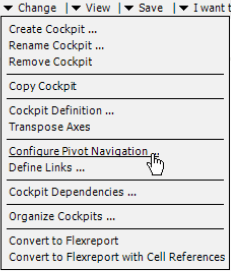
As one of the options, you can define that DeltaMaster should only show top and bottom members, including remaining members. This setting is valid for every kind of use of the Pivot Navigation:
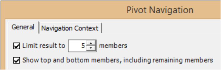
- For the automatic navigation where DeltaMaster automatically selects the attribute to be examined in the next step based on a data mining method.
- For the predefined navigation where you predefine a certain sequence of attributes. In this case, the sort order of the top and bottom attributes is the default setting for each step.
- For the user-defined navigation, where users click on a small arrow below a value to open a hierarchy menu and then select the next step themselves (according to the defined Navigation Context).
For more information, please read DeltaMaster deltas! 5.5.8, feature #13. Both functions described above only work in combination with MDX OLAP models (e.g. Microsoft Analysis Services or SAP BW).
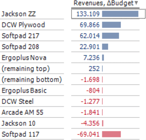
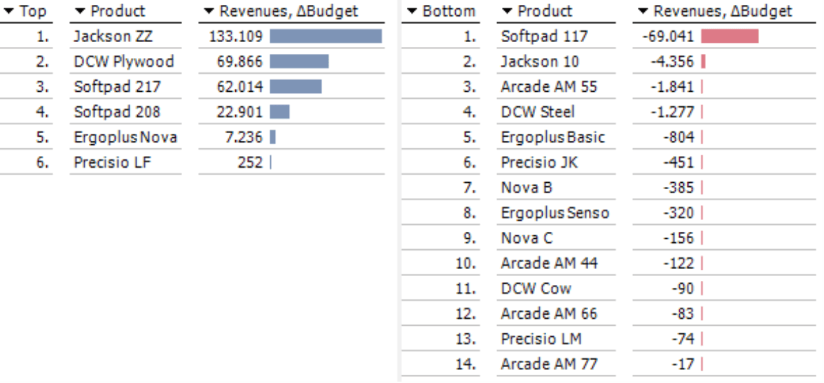
Ranking with separation by algebraic sign
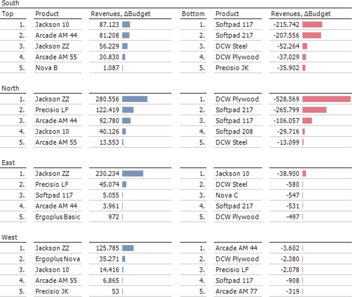
As an alternative to pivot tables, you can use a Ranking report. When you configure this analytic method, you can specify that DeltaMaster should sort the elements of the selected dimension and display them in two groups next to each other. These types of reports show the top performers as well as the biggest flops. Since DeltaMaster applies a common scale to the in-cell bars on both the left and right sides, the readers can easily compare values just by looking at them. In the screenshot above, for example, the positive bar of the second-best product “DCW Plywood” is just as long as the negative bar for “Softpad 117”.
To create these types of reports, you only need to configure two settings in Miner mode:
First, you will need to select the option to display Top and Bottom members (column header or I want to menu). This will divide the report layout into two sections.
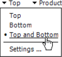
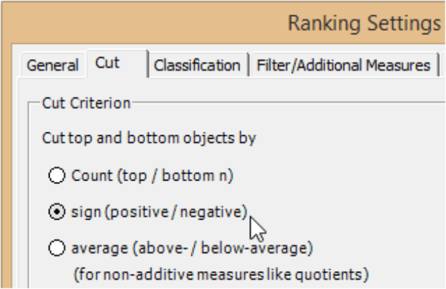
Secondly, you will need to activate the rules for the algebraic sign in the Settings. On the Cut tab, you select if DeltaMaster should separate the top and bottom objects based on their sign (positive/negative). On the Filter tab, you have the option to select further measures that should be visible in the report. Nested dimensions, as you know from pivot tables, are not supported. On the General tab, you can limit the result to display a certain number of objects. This number applies to the top and bottom members, similar to the Count in the Ranking options of a pivot table. Since a report created as a Ranking can be scrolled and usually only displays a limited number of other measures, it can generally handle a larger count of objects than a pivot table. Setting a reasonable upper limit in a Ranking report ensures faster processing and is easier on the readers, who rarely need hundreds or even thousands of members in a list to support their decisions.
An analysis can be even more when it presents several rankings next to each other instead of just one. To do that, you save the settings as a so-called analysis template. You can then access this template in the method Small Multiples, which iterates them over and over with different report content. The results become part of an automatically formatted “multi-report”.
![]()
The screenshot on your right shows an example of this type of Small Multiples report (with a different view than in the past examples). Instead of one, this report contains four rankings, one for each region. The bars are globally scaled so that you can easily compare the different regions to each other. If you wish to discuss the results within a particular region, you can switch the scales to individual, for a better differentiation.
For more information on Small Multiples, please read DeltaMaster clicks! 12/2012.
Waterfall Analysis
You can also use visualizations to compare and contrast positive and negative variances. A Waterfall Analysis, which specializes in these types of presentations, displays a variance as a transition from a start value to an end value (e.g. from the value of the previous year to the current year or from the budget to the actual value). DeltaMaster will arrange the objects (e.g. customers, products) from start to the finish to show their contribution to the growth or decline. In contrast to the methods described previously, the variance in a Waterfall Analysis does not need to be defined as a measure. You select the start and end value, and DeltaMaster will calculate the variance on its own.
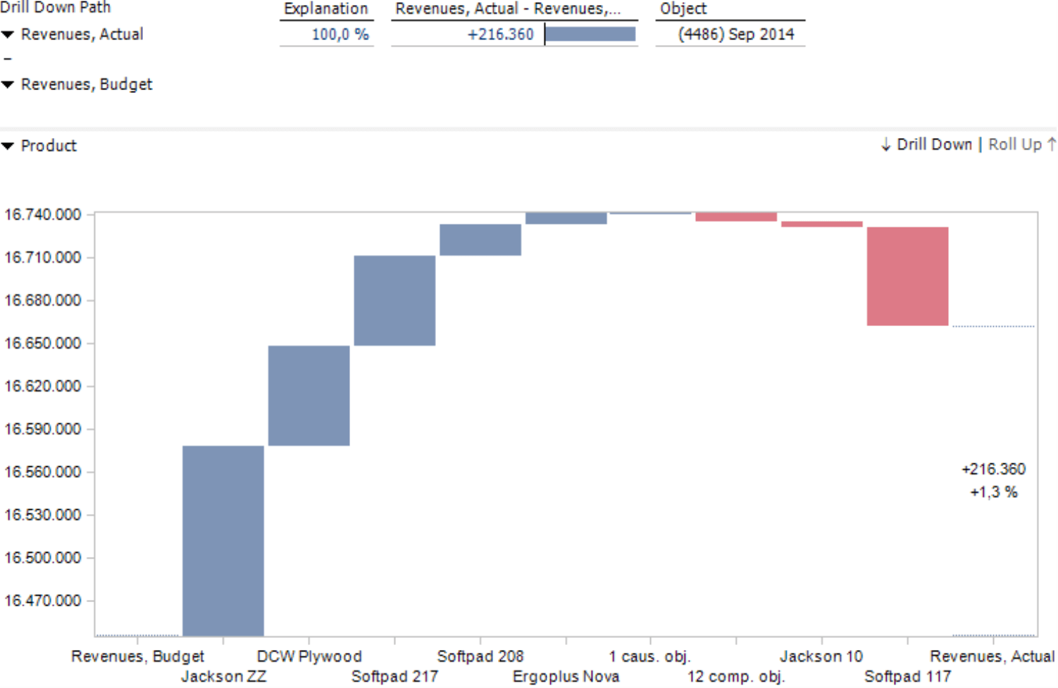
As often is the case with charts, choosing the right scale can be tricky, especially when the values of the individual objects are relatively small in comparison to the start and end values. In this case, you may want to hide the columns for these values using the respective function in the context menu or the I want to menu as we did in the screenshot above. Although the first and the last column have been “cut off”, the visualization is still an honest representation because the changes remain proportional to each other and to the total change. Similar to pivot tables, DeltaMaster will combine the smaller values into groups with causing or compensating objects. You can adjust these groups in the Settings.
Knowing when
These and other refined options make the Waterfall Analysis a good tool for specialized visualization and analytic needs. For standardized reports and (guided) analysis, graphical tables such the sorting options in a pivot table or Ranking reports are the better choice. Using pivot tables has its advantages, especially when you need to view attributes in different (nested) dimensions or levels, wish to use graphical elements as signals, or offer integrated analytic functions to your readers. Although a Ranking report has a relatively simple structure in comparison, you can intuitively display both lists next to each other, support larger numbers of members, and create highly informative comparisons in combination with Small Multiples.
