![]()
Greetings, fellow data analysts!
The circle is a powerful symbol that dates back to ancient times. It has no beginning and no end – an allegory for the sun, completeness, and even perfection. When it comes to serious information, however, circles are often seen in a dubious light. Someone who talks in circles, for example, is neither getting ahead nor to the point. In data visualization, using circles in charts is questionable as well. The readers would have to compare values as areas, which are very difficult to interpret correctly.
Nevertheless, there are situations where you can integrate circles into tables to clarify a given context and add value to the report as a whole. This is because you can compare circles in two directions: vertically and horizontally, or, thinking of a report grid, by rows and columns. This edition of DeltaMaster clicks! contains several tips on how you can add circles to pivot tables to help keep your inner circles perfectly informed.
Best regards,
Your Bissantz & Company team
Starting from version 5.5.1, you can now add circles as an in-cell chart type in order to visualize relationships among values in pivot tables. DeltaMaster draws the circles so that the cell’s value is proportional to the circle’s area. In addition to showing how you can use these circles in reports and cockpits, this edition of DeltaMaster clicks! will compare circles to bars, columns, or other in-cell charts and outline a few scenarios for using them.
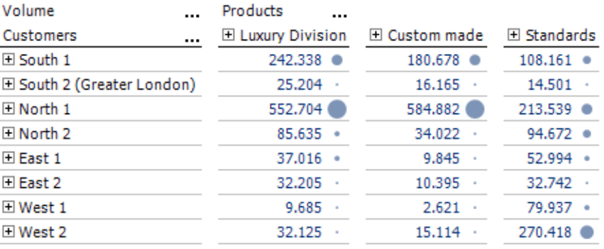
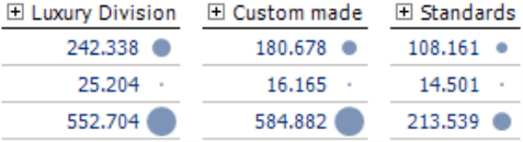
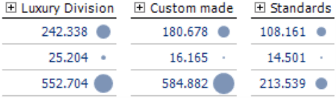
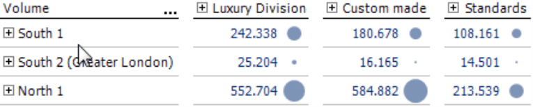
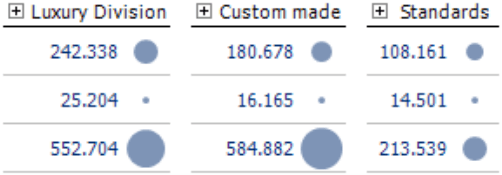
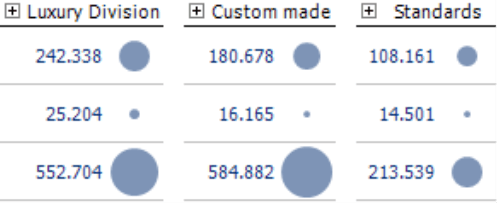
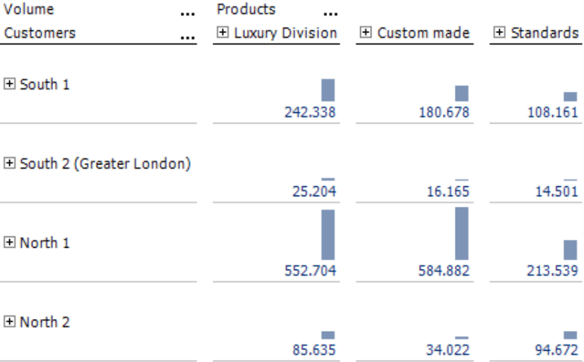
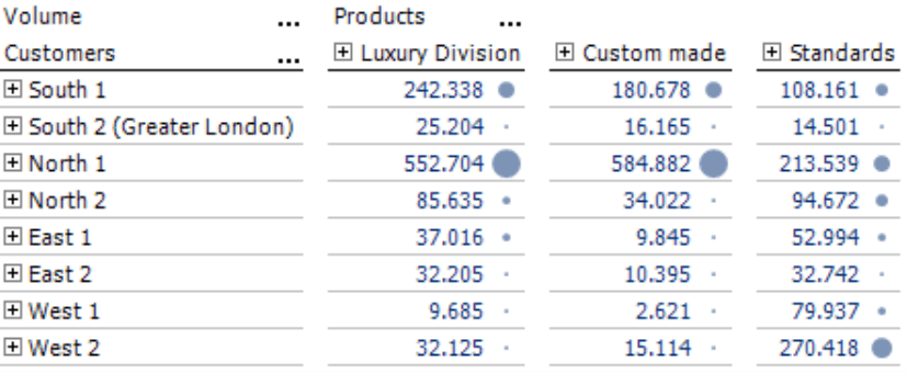
The screenshot on your right shows a typical sales analysis from our “Chair” reference model. The row axis contains the customers aggregated into customer regions and the column axis shows the products aggregated into product categories. By viewing the different areas of the circles, you can make visual comparisons of these sales statistics – from column to column as well as row by row. That’s what makes this visualization so unique.
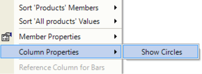
You can activate this new visualization with circles from the context menu of the pivot table under Graphic, Circles in Pivotizer, Analyzer, and Miner levels.
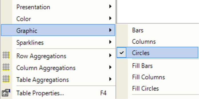
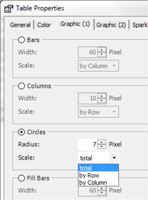
To ensure that your report consumers can correctly interpret and compare the report’s content, you must first adjust the scale in the Table properties (context menu, I want to… menu, F4 key) on the Graphic (1) tab. As you already know from bars, columns, and other in-cell charts, you can choose from the following options: total, by column, or by row. If you select total, DeltaMaster will apply a common scale to all circles in the same table. The table in the screenshot above, for example, uses the scale option total, which ensures that you can compare the circles’ areas across all columns and rows.
If the table contains positive and negative values (for example, in the case of variances), DeltaMaster will calculate the absolute values and color any circles containing negative values red.
You can set the size of the largest circle in the Table properties as well. In the default setting, DeltaMaster applies a maximum Radius of 7 pixels so that the circles would fit perfectly into the standard row height.
We have applied different sizes to the examples below to illustrate how these settings affect the legibility of the report.
| 7 pixels | 8 pixels | 9 pixels |
 |
 |
|
| 10 pixels | 12 pixels | 15 pixels |
 |
 |
 |
Once again, less is more. As you can see, the circles with a smaller radius fit well with the font size, keep the table compact, and are easier to read as well. Since smaller circles are more subtle, they don’t draw as much attention away from the numbers as larger ones do. This makes the table appear more balanced, elegant, and legible. For more information and tips on choosing the size settings for graphical elements, please read DeltaMaster clicks! 04/2011.
When you set the radius, you also determine the row height as well. As soon as the circles are activated, DeltaMaster will automatically set row heights (Table Properties, General tab, Row Height: Automatic).
Like all in-cell charts in DeltaMaster, you can hide the circles in specific columns (Column properties in the context menu of the column headers). If a table contains the top member “All products”, for example, you can suppress the circles in this column so that the sum value doesn’t affect the scale.
Comparing values through areas?
Experienced DeltaMaster users might be surprised to see this new visualization type because we generally view circles with skepticism. All types of visualizations with circles – regardless if they are “grown-up” ones in charts or “pint-sized” ones in table cells – display values as areas and not as lengths or heights. The human eye, however, is not particularly good at gauging areas. People cannot accurately assess area charts and it is difficult to estimate the value because it is encoded in the displayed area.
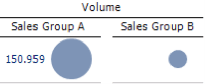
See for yourself:
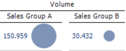
This screenshot shows the circle’s value on the left but not on the right. What value do you think this circle represents? The answer is on page 5.
Criss-crossing circles
If the human eye does such a poor job of estimating areas, you might be wondering why you would even want to add circles to pivot tables. What can they do that bars or columns can’t? Circles have the advantage that you can read them in both directions: vertically and horizontally, by rows and by columns. That doesn’t work very well with bars and columns. You can only compare bars in columns well if they all have the same starting part and lie underneath each other. Similarly, you can only compare columns in rows well if they stand next to each other and have a common base line.
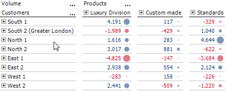
In the screenshot on your right, we have replaced the circles from our first example with bars that use a common scale for the entire table. Although we have used this scale option, you will probably automatically focus most of your attention to the columns. Within a column, you can differentiate the bars well and can see how the sales volume breaks down across different customer regions for each of the product categories (e.g. Luxury Division, Custom made, and Standards). This isn’t as easy to judge in a row-by-row comparison.
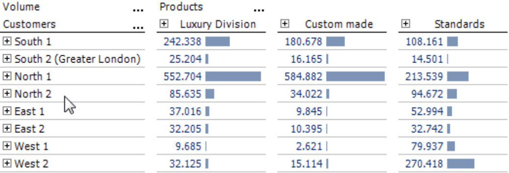
A column visualization, as shown on your right, is suitable within the individual rows read from left to right – but not within the columns. In addition, this table has a low information density because the text and numbers require space horizontally while the columns need room vertically.
In this case, circles are a viable solution because you can compare them in two directions. Although you generally cannot estimate areas as accurately as lengths or heights, you can roughly estimate which objects are smaller or larger based on the size of the circles.
When you are selecting the right type of in-cell chart, you will need to consider the nature of the objects that are displayed in the rows and columns. The examples above show two equally important dimensions: customers and products. Most readers will probably treat them the same as well and won’t focus on just one or the other while reading the table. The case would be different if the table displayed hierarchal structures like a P&L statement or the columns showed different scenarios (e.g. budget, actual, variance), time calculated members (e.g. current, previous period, previous year), or even different measures (e.g. units sold, revenues, gross margin). Most people would read these types of tables in a typical top-down fashion based on a “dominant” column. In certain rows, they might occasionally glance on the neighboring columns to the left or right. In cases like these, a cautious report editor should use bars because they are easier to classify. If the time dimension is located on the columns, sparklines would be the better choice in most cases.
To enable comparisons in both directions, you should scale the circles in relation to the Total table as described on page 2 (Table properties, Graphic (1) tab). You can export the circles as an image to Microsoft Office applications except for Microsoft Excel.
Other examples
Let’s go back to our little guessing game on page 2. The circle on the right stands for approximately 30,000 or 20 percent of the 150,000 shown in the left one. Were you close? If your guess was in the general vicinity, you have good visual judgment. Please remember, however, that you can’t expect that from every person who reads your reports.
If you wish, you can try another interactive test which we published in our blog post “Are you a good manager?” (https://www.bissantz.de/bissantz-ponders/test-good-manager). This post talks more about the problems of area charts and comes to the conclusion: “One stipulation for a good chart is that observers can read it accurately. One requirement for good managers, on the other hand, is that they demand the information that they need. As our little test shows, charts based on areas and good management do not go hand in hand. Therefore, when wedon’t need anything else to understand management information, we prove that our (visual) judgment is good.”
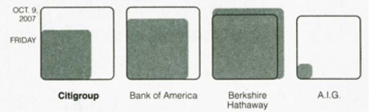
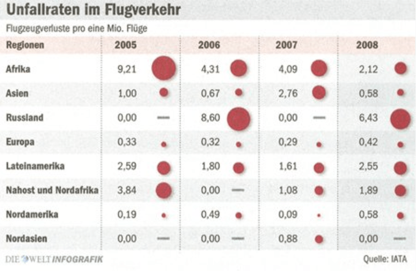
In the post “Criss-crossing circles”, we also took a closer look at a newspaper graphic, which showed that circles can sometimes beat the odds despite their known deficits (www.bissantz.de/bissantz-ponders/criss-crossing-circles). The visualization discussed in that post can definitely compete with bars, columns, lines, and sparklines.
And for all fans of industrial reporting, graphic tables with circles are compact and easy to automate in DeltaMaster as well.
Questions? Comments?
Just contact your Bissantz team for more information.
