![]()
Greetings, fellow data analysts!
As a graphic designer, Otl Aicher has shaped the image of modern Germany. His pictograms didn’t just define the look and feel for the 1972 Olympic Games in Munich. Decades later, they still guide travelers through train stations and airports throughout the world. Aicher was one of the founders of the Ulm School of Design, which similar to Bauhaus is one of the most prominent schools of its kind. The real art of his work was how he dealt with things that were not printed. Everything fits and stays together – without needing borders, lines, or embellishments such as bold or italics. Gaps and alignment suffice to give the eye the footing it needs. That is minimalistic, timeless, and comfortable for the brain. Seeing is difficult enough and if we have to filter out more and more unnecessary things, it just gets harder.
We can learn a lot from Otl Aicher when it comes to designing reports. To clearly structure tables so that you can found your way around them, you don’t need lines and boxes – gaps and alignment suffice. That’s why you can now automatically add additional gaps to the pivot tables in DeltaMaster. Best of all, you can apply the design without needing a Flexreport or investing any work on your part. In this edition of clicks!, we will show how you can use this new function to shape your reporting as well.
Best regards,
Your Bissantz & Company team
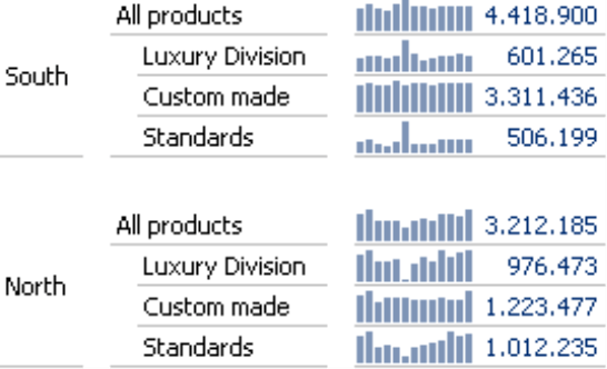
When you are working with a table containing nested axes, you often need to emphasize its structure so that the reader can quickly see where a given number belongs. For example, the table below has five dimensions – three on the column axes (e.g. “Sales Groups”, “Value type”, “Cumulation”) and two on the row axes (“Customer Regions”, “Products”). To make this structure clearer, you might consider drawing frames and lines around the rows and columns or marking them in bold type – as is common practice in Microsoft Excel. In DeltaMaster, you could apply this type of formatting using a Flexreport. But now there is an even better option. Starting in DeltaMaster 5.5.3, you can display the table’s structures directly in the pivot table by adding additional gaps.
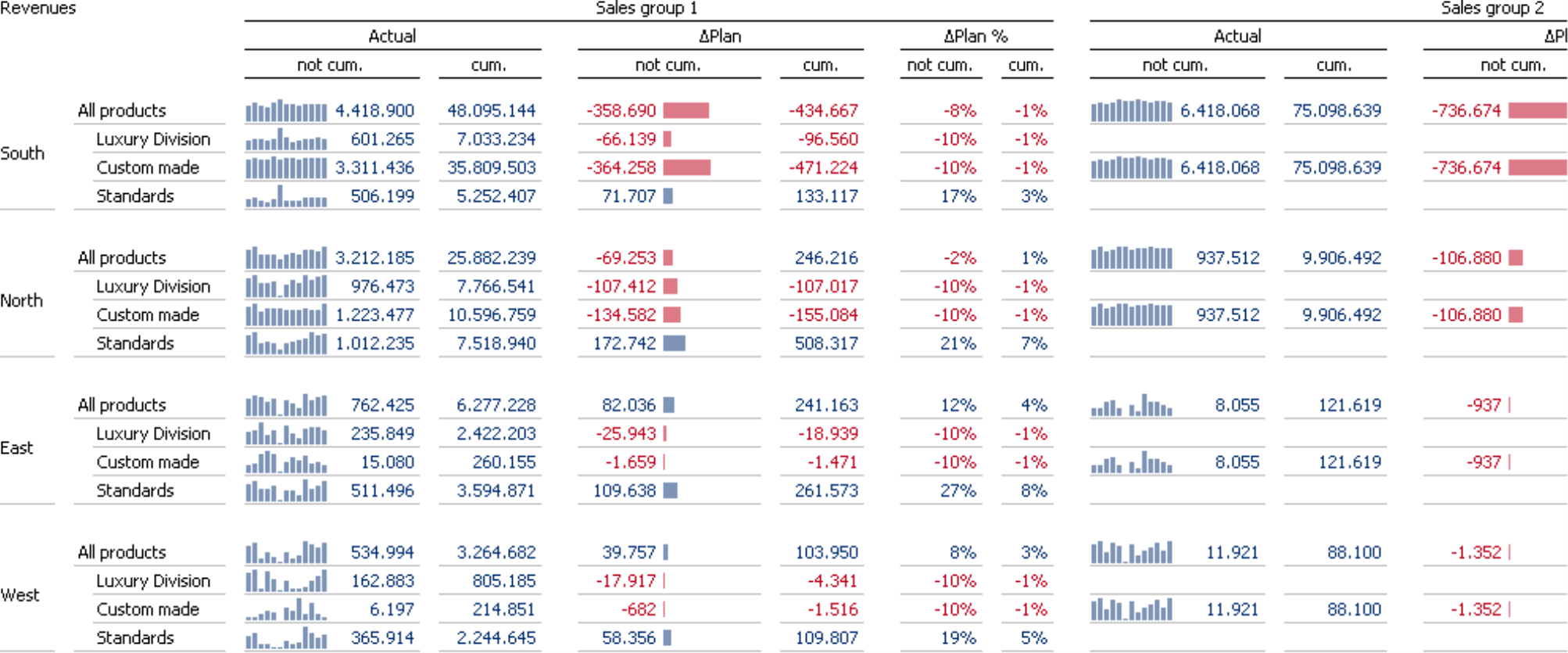
Although this table is rather complex, it is still very easy to read because of its clear structures – and this, in turn, is due to the use of gaps. Take a closer look: Between the columns “not cum.” and “cum.”, you can see a small gap. The gap between the “Actual” and “Plan” columns is larger, just as the one between “South” and “North”. These larger gaps group the subordinate members so that you can differentiate and classify them. The gaps in the rows, in turn, help you quickly see where a new member begins in the product dimension.
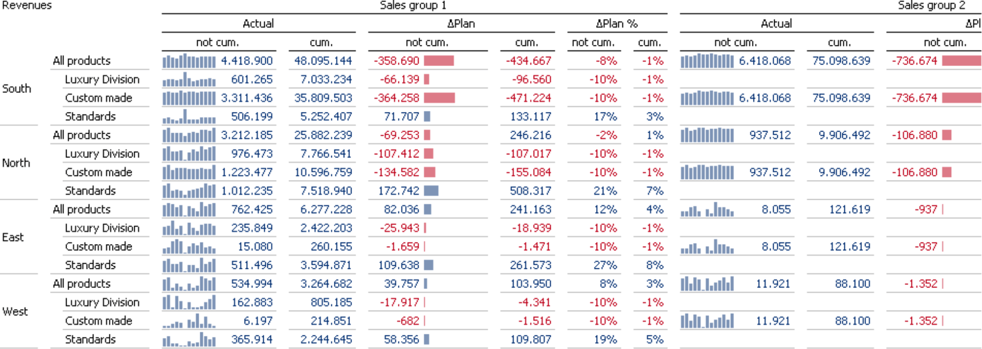
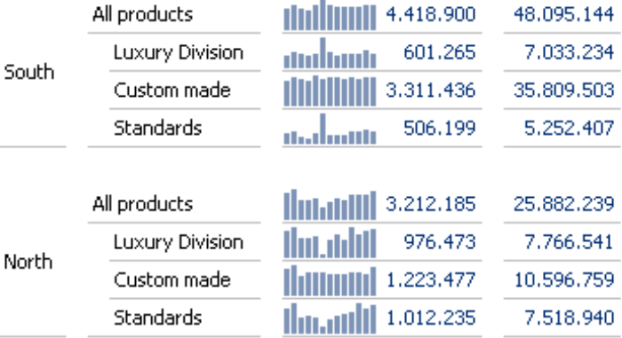
Now compare the table above with this one that does not apply gaps:
Adding gaps
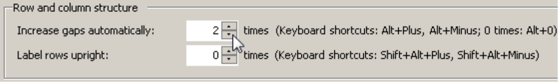
If you are working on Pivotizer, Analyzer, or Miner level, you can add additional gaps in the Table properties of the pivot table on the General tab. This option is called Row and column structure to remind you that these gaps aren’t just a superficial format but also outline a structural characteristic of the pivot table.
With the “X times” setting, you can define how many hierarchies should have a larger gap size. In this case, DeltaMaster counts the hierarchies from the outside in, in other words, starting with the furthest nested dimension. This option for increasing the gap size applies to the column and the row axis provided that both axes contain the same number of hierarchies. Otherwise, DeltaMaster will only increase the gap for the axis containing more hierarchies until there is an equal number remaining on both axes. At that point, it will apply the changes to both axes at the same time.
In the screenshot above, we have applied the gap five times. In comparison to the first screenshot on page two, the gaps between the column and row members are even larger. We recommend that you simply try out different factors with your own tables. As is often the case when you are dealing with design, less is more. Most times, you will achieve the best results if you keep the factor as small as possible.
You can also change the gap using keyboard shortcuts. That way, you can immediately see the effects when you change the factor. These shortcuts are:
Alt+Plus Increase gap
Alt+Minus Decrease gap
Alt+0 Reset gaps
These keyboard shortcuts are also listed in the Table properties; these shortcuts do not work, however, in Reader and Viewer modes.
Adjusting the row height
One design option is only supported through the keyboard shortcuts. If you change the gap by pressing Alt+Plus or Alt+Minus, DeltaMaster will change the row height in each second step and switch between the Automatic row height and a larger, User-defined one.
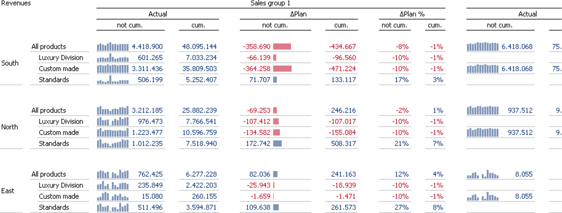
The screenshot on your left shows a section of the previous example in which the gaps are increased 2 times. In the screenshot on your right, the row height was increased using a keyboard shortcut.
Requirements
In order for DeltaMaster to create the additional gaps, several conditions must apply:
- The pivot table must use row and column axes.
- At least one axis must include more than one hierarchy.
- White style must be activated (Extras, Options, Presentation tab).
- The option to Merge row members and column members must be activated (Table properties, General tab).
When you export a pivot table to Microsoft Office as an image, DeltaMaster will include increased gaps. WebClient does not currently support this option and will simply display the rows and columns using the standard gaps. When you convert a pivot table to a Flexreport, DeltaMaster will not transfer these gaps.
Pivot tables instead of Flexreports
What is so nice about this type of table structure is not just how the result looks but also the way that it has been created. By using gaps to format the table, you get a light, elegant, timeless look. This makes it easier to read and understand because nothing blocks your view and everything has a meaning. Since the formatting is directly linked to the pivot table (instead of a Flexreport), you can edit the cockpits and reports as easily as you can edit any pivot table in DeltaMaster. To format them, you simply adjust a single “screw”, which determines the entire table layout. The pivot table’s analytic capabilities (e.g. drilling down, sorting, showing/hiding bars, circles, and sparklines) remain intact.
Questions? Comments?
Just contact your Bissantz team for more information.
