![]()
Greetings, fellow data analysts!
In the world of data visualization, tables are a prime example of “oldies but goodies” – especially when you can twist and turn them any way you’d like. We’re talking, of course, about pivot tables! Pivot tables allow you to transform multidimensional data models so that you can create multidimensional views, slices or partial cubes and even reorganize dimensions or measures to answer your most probing business questions.
In addition to these typical OLAP functions, DeltaMaster provides a series of additional features that help you quickly identify and visualize relationships within your data. In this issue of DeltaMaster clicks!, we will explore and explain these functions. Since the described features are available in the Pivotizer level and up, you can fascinate even more colleagues with the power of data analysis!
Sincerely,
Your Bissantz & Company team
Pivot tables are a very practical and popular way to present data in multiple dimensions. In DeltaMaster you can create and modify pivot tables in the following levels:
- Pivotizer – in the My Report window
- Analyzer – in the My Analysis window, where Pivotizer is listed as a Basic Method
- Miner – in the My Cockpit window
The Pivotizer und Analyzer modules within DeltaMaster’s pyramid-shaped user concept are designed for “inquiring minds”. Users can quickly start their own investigations without being bogged down by the sophisticated functionality offered in the Miner level. Since the usability is similar to that in the Reader und Viewer levels, users can quickly upgrade to the additional functionality without the need for additional training.
In the following section, we will show you how the pivot table’s additional graphical and analytic functionality can help you create concise, meaningful reports as well as pinpoint peculiar trends during your data analysis. To keep this section as compact as possible, we will assume that you are already familiar with the general concept, usability and functions of pivot tables, and will focus primarily on visualization and analytic features.
Create new tables easily with wizards
Creating a new pivot table is a quick and easy process. In the Miner level, you simply select Change, Create Cockpit, and the type Pivot Table or Chart. If you are working in the Analyzer level, select Change; this will take you directly to the Report Definition. The Pivotizer level has its own link for creating a New Report. In all three instances, this will open the wizard for creating a pivot table. You can later alter the definition at any time using this dialog, the menu bar or the context menu.
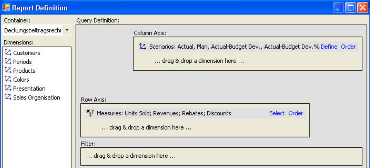
Simply drag and drop the dimensions (including nested ones) into the desired axes. Please keep in mind that you must select at least one measure in the dialog box.
Interactive definitions
You can redefine an existing pivot table at any time in the same drag and drop manner:
- Add additional dimensions by dragging the name of the desired dimension or hierarchy from the My View window into the table.
- Remove dimensions by dragging the unwanted row or column headline back into the My View window.
- Change the existing or add an additional measure by dragging it from the My Analysis window into the table. If the measure is placed on an axis of the table, DeltaMaster will add the new measure to the axis. If the measure serves as a filter, the filter will be changed accordingly.
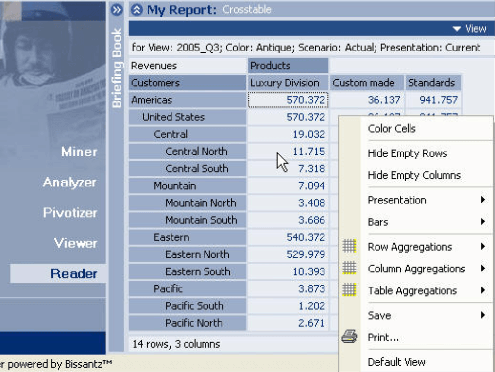
You can also drag other elements such as the column and row headlines and drop them on the right, left, top or bottom edges of the table or on another row or column. This allows you to change the order of a nested dimension or even move a dimension from the column to the row axis. Try it for yourself! If you would like to switch the dimensions of the row and column axes, choose the Transpose Axes option from the context menu or the I want to… menu.
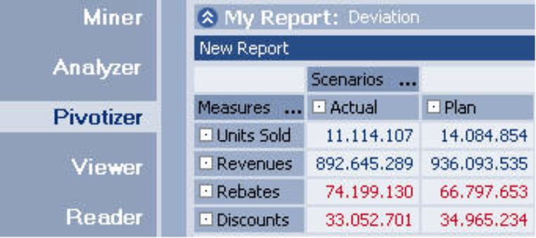
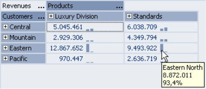
Take a look at the right-hand table. The “Time” , “Sales Group” and “Measure” dimensions are nested. In addition, the table is color-coded (see options in the context menu) to show the relationships in size. You can hide the empty row (i.e. 2005 revenue for the Sales Group B) by clicking the appropriate button in the context menu.
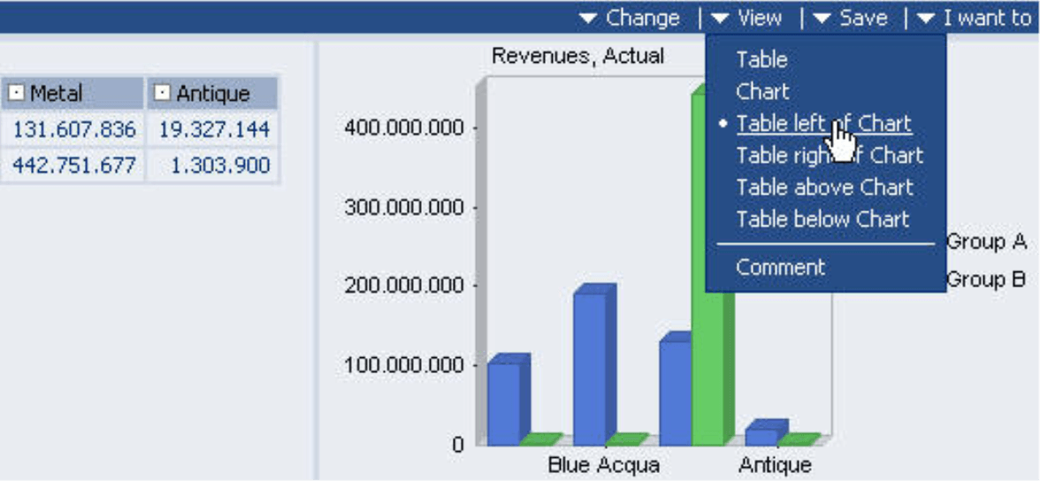
Your personal view
By changing the View, you can display each pivot table as table, chart or both in a variety of layouts.
In the pivot chart Toolbar (context menu), you can also choose from a large collection of bar, line, pie and other charts. Stay tuned for the next issue of DeltaMaster clicks! for more information on standard and customized charts!
Speak, cell. Speak!
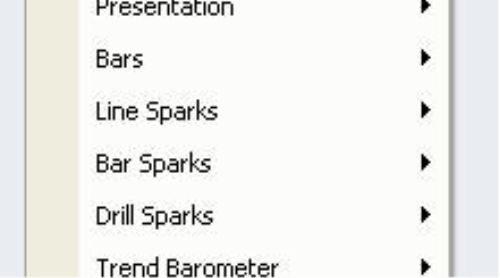
To help your numbers speak for themselves, you can display explanatory charts in the cells of your pivot table. This ensures that others can view and compare your numbers in the proper context. DeltaMaster currently uses four types of cell visualizations: Bars, Sparklines, Drill Sparks and Trend Barometers. These can be turned on or off for a given cell using the options in the context menu.
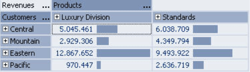
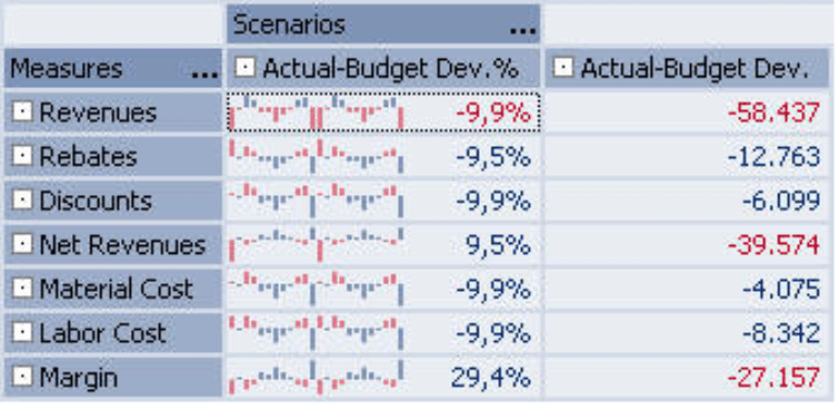
Bars allow you to easily compare values among cells. In the context menu, you can set the properties for the length of the bar chart. The Total option uses a common scale, so that you can easily compare the cells. This option is particularly useful when the values have a similar size and the measures are comparable. The Row and Column options measure the length of the bar for each individual row or column. For example, if you create a column for revenue and a column for the discount rate (discount divided by revenue), you would display the bars in columns to show the individual values in the proper proportions.
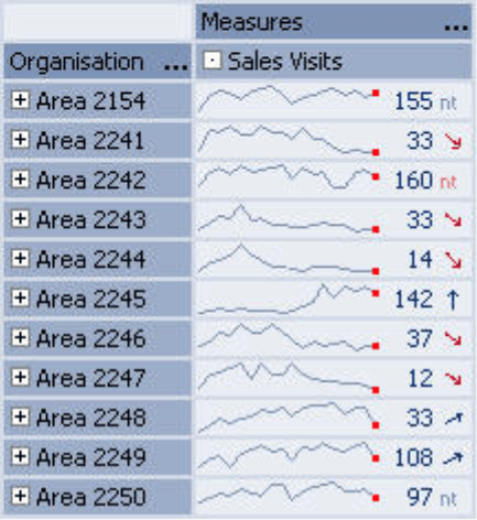
- Sparklines[1], word-sized line or bar charts, show the development of a given value over a period of time. Here, the current value is displayed as a number, while the historical values appear as a miniature time-series chart.These are called Line Sparks or Bar Sparks in the context menu. Here again, you have three options for scaling the miniature charts: Total creates the word graphics in a common scale. Column creates a common scale for all values within the column. Cell creates an individual scale for each sparkline. You can set general parameters such as the length of the chart or the width of the tolerance corridors (e.g. in line charts) under Table Properties.
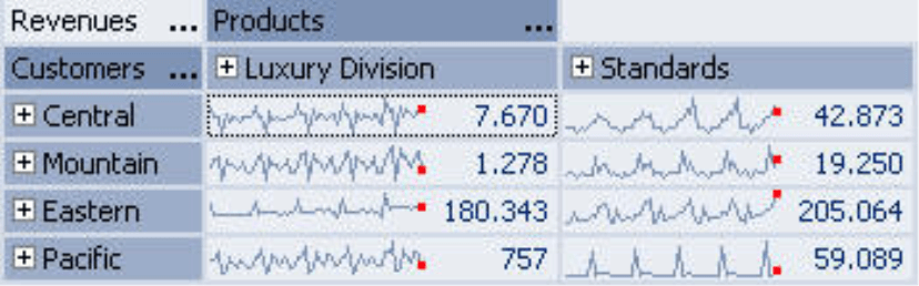
The Cell scale particularly emphasizes the trend for that particular value and allows you to compare trends across several cells. If, for example, you are primarily interested in the differences in size, you could use the Column or Total scale or even display a bar chart in addition to the Sparklines. This wonderfully compact and concise visualization helps you maintain an overview on both trends and size.
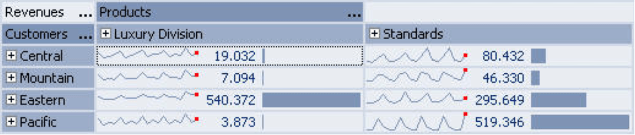
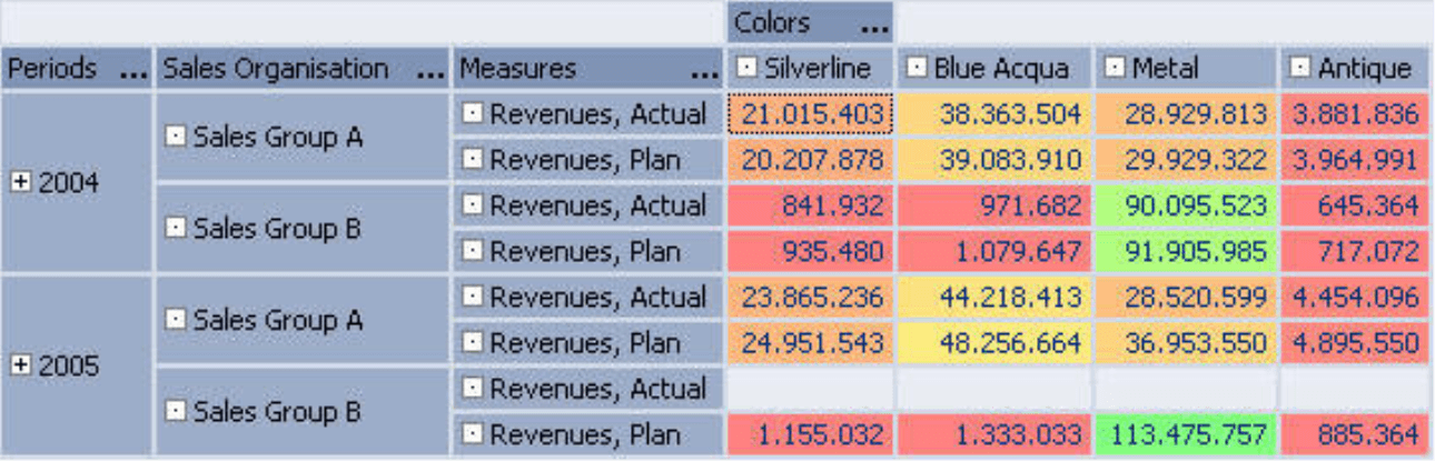
Drill Sparks show how a value is derived from its subordinate report objects. To avoid possible confusion with Bar Sparks, Drill Sparks always appear after (i.e. to the right of) the number, while the time- series word charts always appear before. In the table on the right, for example, you can immediately see that each customer region is comprised of two subordinate objects. While revenues in the “North” are for the most part evenly divided, the differences in the South are much more extreme. At this point, it would make sense to drill down to more details by clicking the “+” -symbol to display the sales regions “South I“ and “South II”. Drill Sparks are an excellent example of analytic previews, a unique feature in DeltaMaster. The software always offers helpful hints where it makes sense to dig a little deeper – without major contemplation or even a mouse click on your part.
- Similar to Sparklines, the Trend Barometer also uses historical values. As a result, this option will only be displayed in the context menu, if you have already activated Line or Bar Sparks. With the help of a so-called “F test”, DeltaMaster searches each time series behind the displayed values to determine whether a trend exists or not. If a trend has been discovered, an arrow will appear, showing a geometrically accurate depiction of the direction and the strength of the trend. Since in practice most trends are subtle and you might not even notice a difference among the arrows, DeltaMaster offers the Gradient exaggerated option to rescale all trends from a vertical upward to a downward arrow. The abbreviation “nt“ means there is no trend from a statistical point of view.
When activated, the miniature charts will appear in each cell in your table. You can, however, also hide the charts for a particular column. For instance, you can display budget-to-actual variances as a percentage in column 1 and as the absolute value in column 2. Since the historical pattern (shown as a Sparkline with a cell-based scale) is the same in both columns, it makes sense to only display the word-sized charts in one of the two columns, for example, the relative variance. To do this, you simply open the context menu of the column headline. Here, you can set the properties of this particular column (without overriding the general settings) so that no miniature charts are displayed.
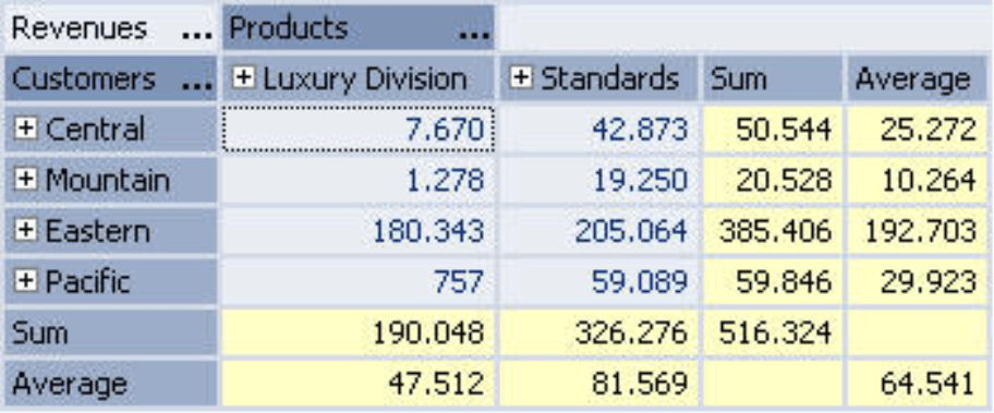
Aggregations
Using the Row, Column and Table Aggregations in the context menu, you can display additional statistical measures in the table, such as the sum of a given row or the arithmetic mean. This, of course, only makes sense when the elements on the axis all belong to the same level. If higher-ranking elements are displayed as well, these would be included in the calculation and lead to a misleading result.
Rankings
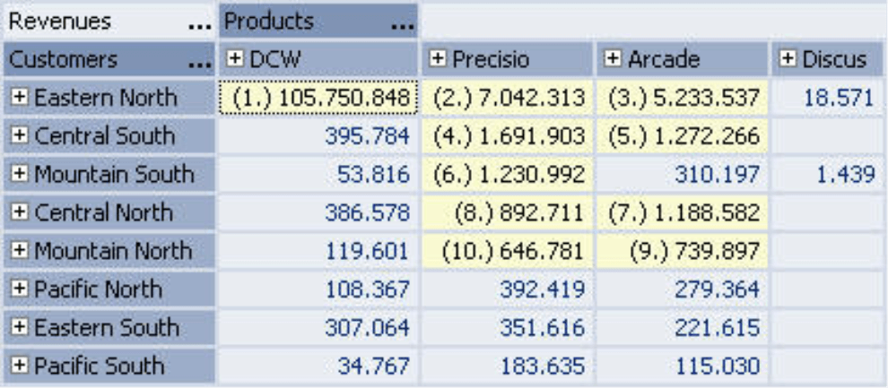
DeltaMaster helps you improve the readability of large tables by automatically ranking the top values. You can activate this Ranking in the context menu of the data cells. As the illustration shows, DeltaMaster first marks the highest values and then reorganizes the table so that they are placed at the top. Alternatively, you can also activate this search for the lowest values. Similar to the functions described above, you can use these features for the entire table or a given row or column.
AutoScan
The ranking described in the section above is a simplified form of DeltaMaster’s unique AutoScan feature. AutoScan automatically x-rays your pivot report for discrepancies using a series of sophisticated mathematical and statistical methodologies. To start a search, click on AutoScan in the lower right corner of the cockpit or report window. The different procedures run fully automated; you don’t even need to set the parameters! Once it has finished the search, DeltaMaster lists and describes the uncovered discrepancies in plain English. DeltaMaster simultaneously marks the appropriate cells or areas. With a mouse click, you can view additional information in the AutoScan window.
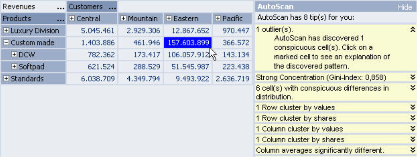
AutoScan provides an ideal gateway into the world of data analysis. DeltaMaster does the bulk of the work, pinpointing interesting constellations from a mathematical or statistical point of view. This gives you the time to examine the findings more closely using the familiar, built-in functionality.
Working with pivot tables – step by step
The functions described in the September issue of clicks! are all available in the Pivotizer level and up.
Users in Viewer or Reader mode can view finished pivot reports but cannot make structural changes. The reports, however, remain interactive. Users can hide or display rows, color code cells, create aggregations or export the findings to Microsoft Office applications.
Questions? Comments? Just contact your Bissantz team for more information!
[1] Read the December 2004 edition of clicks! for more information on Sparklines.
