Generic filters

How companies benefit from data analytics support during SAP S/4HANA implementation—and what’s really at stake.

With support for SAP ECC ending in late 2027, many companies have no choice but to migrate to SAP S/4HANA. What begins as a technological modernization project can quickly develop into a major transformation initiative—with significant implications for finance and management reporting.

At the latest during test migrations and functional acceptance testing, a crucial question arises in many S/4HANA projects: Are the numbers actually correct?

After all, CFOs and business functions rely on consistent reports and familiar KPIs, while auditors demand complete and traceable documentation. However, this is precisely what often becomes a challenge during and after an SAP S/4HANA implementation.

The Digital Core System

The new SAP generation is built on HANA and processes large data volumes in real time. The migration brings profound changes to the chart of accounts, master data and structure.

New Data Structure
Chart of accounts, master data and business partners are fundamentally rebuilt.
Many Migration Paths
On-prem or cloud, brownfield or greenfield, GROW or RISE.
Real Time on HANA
Large data volumes are processed with high performance in real time.
Focus Is on the Technology
Customizing ties up SAP consultants — figures, reports and history often fall by the wayside.

Your Partner for SAP HANA

Bissantz supports your S/4HANA migration as a data-analytics partner, ensuring your figures are correct during and after the transition. We take a pragmatic approach, without adding extra burden to your project.

Safeguard Data Quality
Analyze error clusters instead of checking 1,500 hits one by one.
Auditable Balance Reconciliation
Reconciliation reports across all aggregation levels.
Reporting Continuity
Old and new structures comparable at the push of a button.
DeltaMaster Directly on HANA
Reporting, analysis and planning in a single frontend.

The often-overlooked side of SAP S/4HANA implementation

The migration to S/4HANA starts out as a technology project. A new chart of accounts, the business partner concept, ACDOCA as the universal journal—plus the choice between greenfield and brownfield, on premises and cloud: These topics alone keep SAP consultants busy.

What often gets overlooked is the other side of the equation: the numbers, the reports, and the company’s ability to steer the business effectively. After all, technical migration alone does not ensure continuity from a business and reporting perspective.

While error logs and mapping lists do provide information, they do not answer the crucial question of what specific effects discrepancies have on key metrics, reports, and business processes. At the same time, new data structures make it difficult to compare with prior-year figures, and established reports from the legacy system often cannot be carried over to SAP S/4HANA without modification.

These challenges are not exceptions; they are typical of S/4HANA migrations. This makes it all the more important to incorporate the business perspective on data, KPIs, and reports into the migration project from the very beginning.

Why data quality is critical to project success

The migration to S/4HANA fundamentally changes data structures. Anyone who lacks a robust data foundation during this transition phase loses the ability to steer the company confidently. Reports that are inadequately prepared may yield inconsistent results after the migration or may no longer function as expected. Key figures, year-over-year comparisons, and time series may lose their informational value if definitions, data sources, or mappings have been changed. Decisions are then made on an uncertain basis—or postponed because no one knows whether the numbers are accurate.

What follows is tedious corrective work: manual adjustments, ad hoc analyses, and internal resources tied up for months in cleanup tasks instead of driving the company forward.

These challenges can be avoided if both the business and data analytics perspectives are incorporated into the S/4HANA project from the very beginning. This ensures that technical and business continuity is maintained throughout the entire transformation process.

How Bissantz supports S/4HANA projects with data analytics

While SAP implementation partners drive the technical transformation, Bissantz helps companies ensure the quality, consistency, and traceability of their data throughout the entire migration process. This helps ensure that finance and management reporting remain reliable both during and after the transformation.

Our service portfolio includes, for example:

  • Mock-load analyses to evaluate errors in a structured manner and prioritize them based on business needs.
  • Balance reconciliation dashboards that provide transparency across all aggregation levels.
  • Master data mapping to identify missing, ambiguous, or inconsistent mappings early on and ensure high data quality.
  • Historical data management and reporting continuity to preserve year-over-year comparisons and existing reports.
  • Cutover tracking, which ensures a clear overview during the transition.
  • Hypercare for data quality to identify, analyze, and resolve discrepancies quickly after go-live.
  • Test case validation to verify and validate business process chains.
  • Interim planning to ensure continuity in planning and business performance management throughout the transformation.

For many years, Bissantz has supported SAP projects where data, finance, and business performance management come together. We bring this experience to S/4HANA transformations. In doing so, we support various migration scenarios, such as a greenfield implementation of SAP S/4HANA Cloud Public Edition or a migration from a third-party system to SAP S/4HANA on premises. We are familiar with a wide range of transformation starting points and create a robust foundation for analysis, planning, and reporting—before, during, and after the transformation.

Without adding complexity to the project

A valid question: The project is already complex enough—why do we need another partner?

The answer lies in the role Bissantz plays. We do not add another implementation workstream. Instead, we bridge specific gaps between migration and business validation—pragmatically, quickly, and without creating new dependencies.

After all, at the end of the transition to S/4HANA, it’s not just about whether the system is technically up and running. What matters is whether your finance and reporting processes can continue seamlessly after go-live. Whether your reports are accurate. Whether you can reliably steer your business.

Companies that address these questions early are better prepared. Bissantz helps turn a successful technical migration into a successful business transformation.

Are you planning an S/4HANA migration or already in the middle of one? Get in touch! In an initial conversation, we’ll identify the key risks to your data, reporting, and KPIs and show you how we can address them.


For many companies, Excel is the first tool used for planning, budgeting, and analysis – and for good reason: Excel is flexible, widely available and well-suited for simple tasks. However, those who use Excel as their central controlling tool quickly reach its limits as company complexity grows. Version chaos, error-prone formulas, and insufficient automated data updates are just some of the disadvantages that professional business planning software avoids from the start.

This article shows the five typical Excel limitations that controllers experience in practice, when switching to a dedicated planning tool makes sense, and what modern business planning software like DeltaMaster delivers.

How Excel became the central controlling tool in many companies

Planning cycles are getting shorter, data volumes larger, coordination processes more complex. Excel has remained what it always was: a flexible spreadsheet program. Not a planning system, not an integrated controlling solution—but in many companies, both in one nonetheless.

Excel is part of standard equipment in many companies and immediately ready for use without barriers. Especially for manageable data volumes, simple ad-hoc analyses, or initial budget drafts in small teams, Excel fulfills its purpose. This independence is a real argument for many controllers.

But what happens when the company grows, the data landscape becomes more complex, and suddenly five departments are working on the same file simultaneously? What happens, when no one can say with certainty which version is current or whether the formula in row 847 is still correct? In this context, a question arises that many companies have long suppressed: Is Excel still appropriate as a central controlling tool?

The five limitations of Excel in corporate planning

The limitations of Excel compared to professional business planning software are numerous and have immediate business consequences.

Limitation 1: Lack of central data foundation

Consistent planning requires that all participants work with the same data foundation. In Excel, planning data is often stored in multiple files or spreadsheets and maintained decentrally. “Budget_final_v3_new_FINAL2.xlsx” is not uncommon. This increases coordination effort and creates the risk of contradictory data statuses that must be manually reconciled.

Limitation 2: Error-proneness with complex formulas

Errors quickly creep into complex Excel models and are difficult to detect. Hidden formula errors, overwritten cells, or faulty links between worksheets can lead to incorrect planning results—with immediate impacts on business decisions.

Limitation 3: Scalability and technical limitations

With growing data volumes, Excel quickly reaches technical limits. Large workbooks become sluggish, calculations take a long time, and crashes endanger data integrity. Excel is structurally not designed for company-wide planning processes with hundreds of thousands of data records.

Limitation 4: Inconsistent planning logic

When planning models are created decentrally in Excel, different users often develop their own calculations, metrics, and assumptions. This creates different planning logics that complicate comparison and consolidation.

Limitation 5: Limited collaboration capabilities

Planning is rarely a solo project. When multiple departments need to input their partial plans simultaneously, coordination becomes a bottleneck. Role and rights concepts and workflow control cannot be adequately represented in Excel.

Excel or professional planning tool? When does switching make sense?

Not every company must switch to dedicated business planning software. The following signals show that Excel as a controlling tool for planning has reached its limits:

  • More than two to three planning levels: Group, company, and cost center planning can hardly be kept consistent in Excel.
  • Multiple parallel planning versions: Scenarios, forecasts, and budgets exist in different files without a clear data foundation.
  • Manual data transfer from ERP: Every planning cycle begins with time-consuming data export and import.
  • No continuous, audit-proof audit trail: Changes to plan values are not traceably documented.
  • Growing coordination efforts: Consolidation of partial plans ties up considerable capacities in controlling.
  • Time lag in forecasts: Current data is not available promptly for rolling planning.

Planning with Excel vs. Bissantz: A comparison

Excel is not a sufficient planning tool for many companies. It was never built as one. DeltaMaster from Bissantz was. This difference shows at every point that matters in controlling.

The following comparison illustrates the central differences between conventional planning with Excel and the integrated business planning software from Bissantz:


Criterion Planning with Excel Planning with DeltaMaster
Data foundation Decentralized, file-based Central, database-supported
Versioning Manual, error-prone Automatic, traceable
ERP integration Manual export/import Automatic
Collaboration Limited Integrated, role-based
Scalability Limited Suitable for large data volumes and many users
Audit Trail Not available Fully documented
Szenarios/Forecasts Manual and time-consuming Integrated, AI-powered
Reporting Static Dynamic, interactive

Excel or business planning software: An either-or?

A common misconception about business planning software is the assumption that Excel must be completely replaced. With DeltaMaster, Bissantz offers a solution that helps companies overcome typical limitations of Excel-based planning and professionalize their planning processes according to their needs. Which tasks continue in Excel, and which are mapped in the planning software depends on the individual processes and requirements of the company.


If you’d like to learn more about the integrated planning solution by Bissantz, check out the quickguide „Integrated Planning.“

Many companies today don’t have a data problem—they have a decision problem: data and dashboards are readily available, yet decisions are made too slowly, based on uncertainty, or, at worst, not made at all. The bottleneck is often the gap between numbers and action. Bissantz & Company has expanded its concept and services in business intelligence consulting to bridge this gap: with decision intelligence. This helps companies shorten the path from data to decisions and turn analyses into effective action.

Why BI initiatives often get stuck between numbers and action

Business intelligence projects are considered successful when they deliver reliable KPIs, reports, and dashboards. But the mere existence of reports does not mean they lead to better day-to-day decisions. In practice, several points of friction often arise between a metric and the concrete action taken:


  1. Different stakeholders interpret the same number in different ways.
  2. There is no clear benchmark for judging whether a value is good or bad.
  3. Engaging with the metric requires significant effort to interpret it, and that effort has to be repeated each time.


As a result, decision-making becomes slower or varies depending on the person or department, even though the underlying data is identical. The more dynamic markets and processes become, the more pronounced this gap becomes. When decision paths are long, time is lost and the likelihood of inconsistent action increases. That is why at Bissantz & Company we do not measure the success of our consulting projects by the volume of reports, but by their real-world impact.

From analysis to action with data intelligence and decision intelligence

To enable us as a service provider to close the gap between data and action for companies, we have expanded business intelligence with two new concepts:

  • Data Intelligence describes the ability to use existing data in a way that enables faster and more effective action. This includes the entire framework (people, methods, data, and reporting structures) that makes effective management possible, creates a structured path from data to decisions, and establishes the framework as a strategic asset.
  • Decision Intelligence is the conceptual core that addresses the decision problem itself: it closes the gap between numbers and action by systematically contextualizing data and making it immediately understandable. Instead of pure analyses, it produces informed assessments that reduce interpretation effort and lead to consistent, transparent decision recommendations and specific actions.

Data intelligence is the „operating system“ for management – decision intelligence is the „decision logic“ that reduces the gap between numbers and action.

Business intelligence consulting: How it changes projects

By aligning our business intelligence consulting with data intelligence and decision intelligence, the perspective in projects changes: success is no longer measured by the number of reports, but by whether decision-making processes become shorter, clearer, and more consistent.

In practical terms, this means we view BI as an end-to-end process from data access to contextualization to use in day-to-day management and decision-making. The goal is to reduce interpretation effort, derive actions directly from data, and provide better direction so that decisions don’t have to be “read between the lines.” This improved orientation is often the biggest lever for achieving impact, without building more reporting complexity.

Bissantz & Company has the required domain and technology expertise, right through to practical software solutions. On this basis, we offer a clearly structured consulting and service portfolio to close gaps in a company’s existing business intelligence concept:

Depending on their needs and project status, Bissantz customers draw on the knowledge and technical experience of a well-coordinated consulting team to use their data intelligently beyond planning and reporting.

Artificial intelligence opens up new possibilities in controlling while simultaneously bringing new requirements. Alongside technical feasibility, companies must also ensure that analyses remain reliable and decisions can be made responsibly. The focus is particularly on BI approaches based on consistent data models, clearly defined key figure logic, and traceable analysis processes—the approach taken by Bissantz.

AI in controlling: from experiment to productive use

Artificial intelligence is already being used in real business processes in many companies, including in controlling. In reports, forecasts, or ad-hoc analyses, results are generated quickly. At the same time, questions are being raised about their reliability and technical foundation.

Part of this uncertainty arises outside of controlling. Eerly experience with generative AI shows how quickly answers can be generated and how convincingly they are formulated. These impressions also shape expectations in controlling.

However, controlling places different demands on AI. Analyses are based on defined data models, clear key figure logic, and established reporting processes. They form the foundation for decisions and retain their central role even when using AI. At Bissantz, these structures serve as the starting point for the use of AI.

For BI and controlling professionals, this changes the focus. Alongside the potential comes the question of reliability. AI should support analyses without impairing traceability and control.


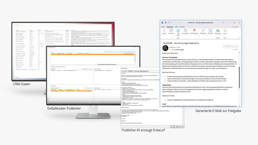
Compliance and transparency in the use of AI in Business Intelligence. The figure shows an audit trail in DeltaChat, part of the DeltaApp from Bissantz & Company. Information on the AI’s data sources ensures transparency and traceability for controlling and management.

Audit Trail: AI source information ensures transparency and traceability for controlling and management

Compliance and risks when using AI in controlling

Compliance in AI deployment encompasses more than adherence to legal requirements. Legal security, organizational control, and economic responsibility closely interconnected.

In controlling, three central risk areas can be distinguished: liability risks through erroneous or non-traceable results, reputational risks through lack of trust in analyses, and economic risks through wrong decisions based on insufficient data.

When using AI, multiple regulatory frameworks often apply simultaneously. Considering individual requirements in isolation rarely provides a complete solution. It becomes particularly critical when results can no longer be traced. In such situations, existing control and governance processes reach their limits.

Many of these uncertainties are closely linked to expectations of AI deployment.

Myths about AI in controlling

Numerous expectations of AI in controlling arise from experiences with generative AI and can only be transferred to technical applications to a limited extent.

A common misconception concerns the evaluation of Excel files. While spreadsheets can be processed, complex data structures and business logic are not automatically interpreted correctly.

Forecasts are also frequently overestimated. AI can include additional influencing factors and recognize patterns, but remains dependent on assumptions and models.

Additionally, there is a structural difference: language-based systems formulate answers but do not perform independent, verifiable calculations in the sense of business metric logic. As a result, plausible statements do not necessarily stem from reliable analyses.

In controlling, what matters is the derivation of results from traceable data and defined calculations. At Bissantz, this derivation from fixed data models and key figure logic is the foundation of every analysis.

Transparency and control in BI

For the use of AI in controlling, transparency and control are central. Explainable AI describes the ability to make analysis results traceable.

In the BI context, this means that the analysis path can be fully reviewed. Results arise from defined data, queries, and calculations and not as isolated system responses.

A suitable architecture separates data storage, calculation logic, and AI functionality. Bissantz systematically implements this separation. The underlying metrics and data models remain unchanged. AI accesses these structures, orchestrates the analysis process, and presents the results in a transparent and understandable way. The calculation itself still takes place within the existing logic.

For each analysis, it is possible to see which data was used, which queries were executed, and how the results were derived. This ensures that the results remain reproducible and can be verified retrospectively.

To safeguard this, these steps are documented. An audit trail describes the analysis path of a specific query, while an audit log records the system’s overall use. Only together do they create a complete picture of usage and results.

Human-in-the-Loop ensures that responsibility remains with humans. AI supports analyses, but evaluation and approval remain the responsibility of domain experts.


“Human-in-the-Loop” is an important application principle for ensuring compliance and transparency when using AI in business intelligence and controlling. The image shows an example of how this can work in practice, for instance, through the interaction between AI agents and Bissantz's DeltaMaster.

Human-in-the-Loop: Agentic AI in DeltaMaster Publisher – Drafts for approval

Data, security, and regulation

A key aspect is how data is handled. Company data remains in existing systems, and the information needed for analyses is provided in a targeted manner. The data foundation remains consistent, existing calculation logic continues to be used without change.

This also allows better control of requirements for data protection and data security. This approach is also relevant from a regulatory perspective. The EU AI Act pursues a risk-based assessment. Systems with transparent functionality, clear documentation, and human control can in many cases be classified as limited-risk applications. The approaches taken by Bissantz meet these criteria.

AI as an extension of business intelligence

Under these conditions, AI extends business intelligence specifically where conventional systems reach their limits. Analyses can be accelerated, questions formulated more flexibly, and connections recognized more quickly, without changing the technical foundation.

Metrics remain authoritative, calculation logic remains consistent, and data models remain the basis of every analysis. At Bissantz, these principles form the foundation for AI to meaningfully complement existing systems rather than replace them.

Conclusion

AI in controlling is not purely a technological question. At the center are reliable analyses, traceable results, and clearly assigned responsibility.

This is precisely where BI approaches come in that are based on consistent data models, clearly defined key figure logic, and transparent analysis processes. They create the prerequisites for AI to be used in a controlled manner and to fit into existing structures. Bissantz consistently pursues this approach, thereby providing the foundation for the productive use of AI in controlling.

How AI extends the application of business intelligence – and why controlling and management benefit from it.

After the initial wave of attention surrounding generative AI, more concrete questions are arising in many companies today: Which expectations are realistic? Where does actual added value emerge? And how can AI be meaningfully and reliably integrated into existing processes and systems—particularly in business intelligence and controlling?

Business intelligence has long been established in many companies. Metrics are evaluated, deviations analyzed, reports automatically generated. For controlling and management, BI is a central instrument of corporate management. At the same time, demand is growing: decisions should be made faster, be better informed, and address causes rather than symptoms.

This is where artificial intelligence comes into focus. However, the sensible use of AI in controlling is less a question of additional technology than a question of consistent further development of business intelligence.

Proven controlling methods and their analytical limits

Controlling today has a broad toolkit of proven analytical methods. Contribution margin flow calculations, driver analyses, variance analyses, as well as structural and time series analyses provide well-founded insights into financial developments and economic relationships. These methods are powerful and form the backbone of modern corporate management.

At the same time, they are limited in their analytical scope. They presuppose structured data, explicit models, and known causal relationships. However, many questions that controlling and management face today arise outside this framework: in customer interactions, service processes, sales activities, employee conversations, or market reactions.

Such information exists in the company but often in unstructured form—as texts, comments, conversation notes, or reviews. With number-centric BI, these sources can only be systematically evaluated and linked with metrics to a limited extent. Underlying causes, patterns, and early indicators thus remain analytically invisible—not because they’re unknown, but because they lie methodologically outside the framework of BI.

AI extends the analytical scope of business intelligence

This is where AI unfolds its added value. It extends proven controlling methods with additional analytical perspectives. AI makes it possible to systematically link quantitative metrics with qualitative knowledge, thereby making connections visible that were previously inaccessible to BI.

Large Language Models (LLM) in the BI context bridge the gap between metrics and meaning. They help interpret causes, present relationships comprehensibly, and put analytical results into a decision-relevant context. Business intelligence thus evolves from a pure information system toward active decision support.

Explainable BI: explainability as a prerequisite for trust

Particularly in controlling and management, trust in analytical results is crucial. AI-supported analyses must be traceable, verifiable, and reproducible. What matters is not only the explainability of individual AI models, but the explainability of BI results overall—from the data foundation through calculation logic to action recommendations.

Explainable AI thus becomes Explainable BI. AI supports analysis; responsibility and decision authority remain with humans. Human-in-the-Loop is not a technical safety net, but a conscious leadership principle.

Agentic BI: from analysis to continuous decision support

A further development step lies in agent-based BI workflows. BI systems no longer just respond to specific queries but work proactively. They regularly analyze developments, detect anomalies, explain causes, and provide recommendations for action.

The decisive difference lies in the shift from reactive to proactive operation, rather than mere automation of individual evaluations. Analysis is evolving from a one-time event to an ongoing process that supports corporate management. Controlling and management are alerted to relevant developments at an early stage, instead of having to react to deviations retrospectively.

Particularly in complex organizations, from medium-sized businesses to international corporations, tangible benefits emerge: more orientation, more consistent decisions, and significant relief in daily operations, without giving up control or responsibility.

Conclusion: greater impact from data

Controlling 2026 means achieving greater impact from existing data. Artificial intelligence helps advance business intelligence and embed analytical insights more deeply into decision-making processes. This gives companies of all sizes a stronger foundation for corporate management and enables closer, more effective collaboration between controlling and management.

How effective information design, DeltaApp, and AI enable management to act.

Why is information available but has no impact?

Companies rarely lack metrics. Dashboards, reports, and KPI cockpits are abundant. Yet in daily work, what leadership needs is often precisely what’s missing: clarity, prioritization, and clear guidance for action.

Leadership today rarely fails due to missing data, but because information has no impact. Numbers must be designed to provide orientation, focus decisions, and trigger action. This article shows how effective information design, DeltaApp, and AI evolve proven business intelligence from reporting to management systems.

Seeing is not understanding: Why charts fail

Charts are still considered a proven means of conveying numbers. But from the perspective of perception research, this is deceptive. A chart is not a picture, but a visual scene that must be interpreted. Colors, shapes, legends, and numbers compete simultaneously for attention.

Since seeing and thinking access the same limited resources in the brain, overload doesn’t lead to better understanding but to cognitive paralysis. Decisions are delayed, meetings become explanation sessions. More visualization therefore doesn’t automatically mean better information.

Information design reimagined: See, understand, act

Bissantz has pursued a consistent approach for years: it’s not about omitting information, but preparing it so that even complex matters can be shown completely and without overwhelming the brain. What matters is not the available screen space, but the bottleneck of attention.

The basic principle is: Seeing, understanding, and acting must be designed as a connected process. Information must not only be correct, it must be effective.

DeltaApp: Sequential instead of simultaneous

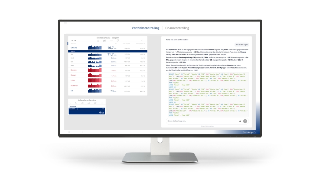
DeltaApp expresses this approach—and the principle of haptic reasoning. Instead of showing everything simultaneously, it guides step-by-step through decision-relevant information. Reduction to two columns prevents visual overload; clear prioritization replaces competition for attention.

Numbers are depicted using typographical scaling: Larger values are shown in larger type, smaller values in smaller type. Color is reduced and clearly deployed, carrying meaning—not decoration. Perspective changes occur through simple gestures; drill-downs reveal causes where they’re decision-relevant. This creates an analytical dramaturgy that follows thinking instead of blocking it.

How Leica leads with DeltaApp

At Leica Camera AG in Wetzlar, DeltaApp was established early as the primary leadership instrument at board level. The then-CFO Dr. Thomas Riegler consciously decided against conventional, static reports and for a radically focused approach to numbers.

In management practice, this meant: no piles of reports, no prepared presentations. Instead, DeltaApp was used live in meetings. Anomalies were identified together, causes immediately analyzed, and decisions directly derived. Confidence emerged not through completeness, but through clarity.

One sentence captures this attitude: “I see more when I see less at once.” Focus on the essential here isn’t just a design principle, but a conscious leadership decision—in harmony with Leica’s DNA.

Key takeaways for decision-makers

  • Leadership is based directly on the numbers: Decisions emerge live in meetings, not subsequent to reports.
  • Clarity replaces coverage: Focused view of essentials becomes the foundation for responsible decisions.
  • Meetings lead to results: Discussions shift from understanding numbers to consequences and next steps.

How auto dealerships manage with DeltaApp

Large and medium-sized automotive dealerships in Germany also use DeltaApp as their central access to corporate management.

The focus is on making decisions earlier, closer to operations, and thus able to act while room for maneuver still exists. DeltaApp serves as a handheld management tool: usable between appointments, in the dealership, in conversation. Conspicuous developments become immediately visible, causes can be analyzed with a few gestures and translated into concrete next steps.

Particularly in the demanding environment of auto retail, sequential, haptic thinking unfolds its strength. Complexity isn’t reduced, but made manageable so that action is motivated and effective.

Key takeaways for decision-makers

  • Management is possible anytime: Relevant metrics are available where decisions are made and action is taken.
  • Earlier detection creates room for action: Leadership can intervene while options still exist.
  • Complexity becomes actionable: Causes can be analyzed step-by-step and measures can be derived.

BI with AI: From management information system to management system

Artificial intelligence can effectively extend business intelligence—when properly deployed. Language models are very well suited for text processing, but not for calculation. In controlling, this is a hard boundary.

Bissantz therefore insists on a clear architecture: AI doesn’t work directly on numbers, but rather on results that have been fully and reproducibly calculated beforehand. This is made possible by the Deterministic Analytics Engine (DAE). It ensures that results are calculated rather than guessed—traceably and without hallucinations.

OOn this basis, AI shows its true strength: it links metrics, condenses complex situations, makes risks visible, and translates analysis results into concrete, situation-specific action recommendations. This transforms BI into a management system that doesn’t just inform, but prepares decisions and supports action.

Effective information as a management system

In the end, it’s not about more data, more dashboards, or more automation. It’s about a management system in which information is designed to provide orientation, focus discussions, and enable consistent action.

Or put differently: Success doesn’t emerge because people see more numbers, but because numbers are designed so people can hardly help but act correctly.

Design today faces a new, urgent demand: it’s less about form, style, or aesthetic distinction, but about orientation – in a world that has become more complex, faster, and more contradictory. This shift was clearly evident at the German Design Award 2026, which took place on February 6 in Frankfurt. The recognition of Bissantz’s DeltaApp fits into this context.

Overview of the German Design Awards 2026 ceremony hosted by the German Design Council.

Award ceremony on February 6, 2026 in Frankfurt (© German Design Council 2026)

Above all, the question arises: How can companies and people succeed in an environment shaped by geopolitical tensions, technological disruptions, artificial intelligence, sustainability requirements, and growing decision-making pressure? The answer running through many awarded contributions was remarkably clear: through good design—understood as a tool for thinking and acting.

The right question is crucial

One of the key strengths of designers is asking the right questions. In complex systems, what matters is not the quantity of information, but its relevance. Design thinking as a working principle describes precisely this ability: highlighting what’s essential, bringing perspectives together, and making complexity manageable. For users, this means understanding more quickly what matters, deciding more confidently, and acting more coherently. This benefit becomes especially visible in the context of business intelligence. Drawing the right conclusions rarely fails due to missing data, but because relevant signals are lost in the noise when everything appears equally important.

Reduction creates orientation

A central motif of many awarded works was therefore conscious reduction: less visual noise, clearer structures, more intuitive interaction. In product design, service design, and digital applications, it repeatedly became apparent: orientation doesn’t emerge through more information, but through better weighting.

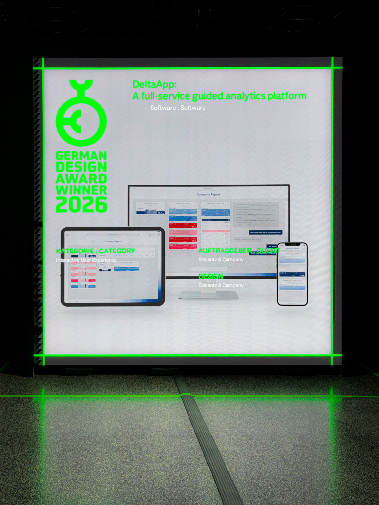
The DeltaApp by Bissantz, awarded the German Design Award 2026, on a large display at the award show in Frankfurt.

The DeltaApp by Bissantz, awarded the German Design Award 2026, on a large display at the award show in Frankfurt

AI-generated content may contain errors. Against this background, the jury recognized DeltaApp by Bissantz & Company in the category Excellent Communications Design – Interactive User Experience. Highlighted were, among other things, the reduction to essentials, typographically scaled numbers, sparingly used color, intuitive gesture navigation, and meaningful sparklines. These elements are guided by a simple question: What can a person grasp at a glance—and what supports them in making coherent decisions?

Good design brings order to numbers

This question crystallized for us in an encounter with designer Naoto Fukasawa, honored by the German Design Council as “Personality of the Year.” His statement that design should counter nature’s chaos with human order, without completely dissolving this chaos, led us to ask a follow-up question: How does this idea apply when designing the abstract, namely numbers, which only gain meaning in context?

Panel talk with designer Naoto Fukasawa, the personality of the year at the Gerrman Design Award 2026.

Panel talk with designer Naoto Fukasawa (© German Design Council 2026)

After brief reflection, Fukasawa’s answer was surprisingly simple: Design should give the user a feeling of happiness.

What sounds poetic at first describes a very concrete relationship. Good design empowers. It helps people see and understand information in ways that correspond to their cognitive and emotional prerequisites. When connections become clearer, decisions more confident, and actions more comprehensible, self-efficacy emerges. And self-efficacy becomes visible in everyday work as a sense of achievement, as a form of “happiness” that is quiet but effective.

Design is part of analytical intelligence

In this sense, we understand the award not just as a design prize. It confirms an approach we’ve pursued at Bissantz for many years: design is an integral component of analytical intelligence. Anyone who analyzes and visualizes data must understand how perception works, where its limits lie, and how human attention is directed.

Blog News: German Design Award Winner 2026

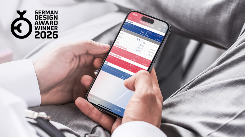
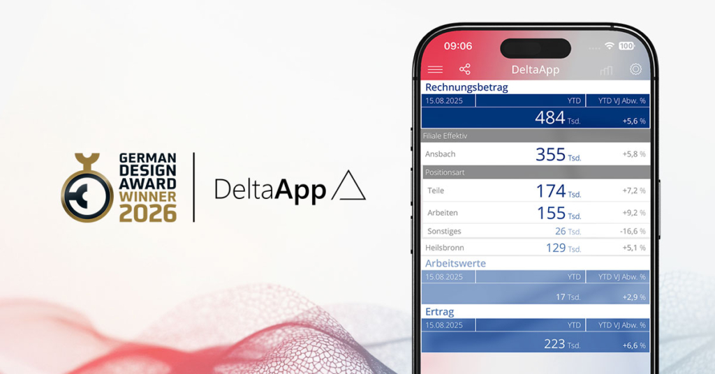
The most important metrics at a glance on smartphone

The design of DeltaApp follows precisely this understanding and aligns with users’ ways of thinking. Typographically scaled numbers replace chart areas, color codes relevance, gestures follow the logic of thought. We speak of haptic thinking: numbers are designed so that they naturally lead to the next thought.

In this sense, DeltaApp translates analytical questions into a visual and interactive logic that deliberately sets signals: What’s relevant? Where is action needed? And what next step follows from this?

The German Design Award shows: The standard for good design has shifted. It’s about orientation in complex environments. The most convincing works are often those that aren’t loud, but that lead—design that steps back to send clear signals and enable coherent action.

Award as a confirmation and mandate for Bissantz

The German Design Award joins a series of international awards for Bissantz & Company. Together they mark a clear stance: we develop analytical systems where design is part of the solution from the start.

At the same time, we understand this award as a mandate. Complexity will remain, data volumes will grow. All the more important becomes design that places people at the center—in their thinking and acting in a complex world.

When people see DeltaApp for the first time, they notice its visual design: clear areas, two colors, large and small numbers. Everything appears calm, almost self-evident. Yet this is precisely where a possible misunderstanding lies. What becomes visible here isn’t a new interface, but a fundamentally different conception of how business intelligence can work.

“Business intelligence rarely fails because of data,” says Dr. Nicolas Bissantz. “It fails because numbers don’t have impact.” That’s why design isn’t aesthetic embellishment, but the functional core of modern analytics: the element that determines whether numbers are seen, understood, and actually guide action in daily practice.

Lots of data, little orientation

Many companies face a similar starting point. Data is abundant, as are reports, yet the scarce resource is attention. Tables, dashboards, and Excel sheets deliver information, but often don’t answer the simple questions that matter in everyday work: What’s going well? What isn’t? And where should we look more closely?

“The problem isn’t that people don’t understand numbers,” says Dr. Fabian Rossi, “but that we show them too many at once and treat them all the same.” Where everything looks the same, little stands out. Information remains available but is rarely perceived as clear signals.

How data becomes signals: the design philosophy behind DeltaApp

From numbers to signals

This is where DeltaApp comes into play. It treats analytics as a guided process. It directs attention to where decisions are needed. Numbers aren’t just displayed but consistently placed in context—with time, with targets, and with structure.

“A number by itself remains abstract,” says Bissantz. “Only through comparison does meaning emerge, and with it, orientation.”

Typographically scaled numbers show relevance before we consciously read them: large is more important than small, bold more urgent than pale. The color palette is deliberately reduced: blue and red stand for direction and impact, not for categories, but for consistency in representing values.

“Ambivalence is the enemy of decisions,“ says Dr. Fabian Rossi. “That’s why we have no ‘maybe’ in presentation—only direction and strength.”

Sparklines integrate time series directly into tables. Developments become visible without disrupting the natural flow of attention. You start with the most important number and progressively go deeper, while context is preserved and the focus becomes ever more precise.

Perceptual design: perception as starting point

The most important user of DeltaApp is therefore not the CFO or controller, but the human brain. “That’s why we build BI systems from the perspective of perception.”

This perspective is the result of years of work: long-standing collaborations with renowned brain researcher Prof. Gerhard Roth and with people who make critical decisions under intense pressure as part of their profession, such as racing driver Hans-Joachim Stuck or Champions League referee Deniz Aytekin. The insights from this are clear and point the way: working memory is limited, seeing isn’t a neutral image but a selective process. Complex, visually overloaded interfaces consume precisely the resources we need for thinking.

“Every unnecessary visual element costs cognitive energy,” Rossi says. Reducing complexity is therefore not a stylistic device but a functional prerequisite.

DeltaApp consistently uses the strengths of perception: contrast, pattern recognition, comparison. Reduction isn’t a stylistic device but a functional necessity.

Blog News: German Design Award Winner 2026

Two roles, one common view

In practice, DeltaApp is primarily used by two groups. Decision-makers need quick orientation. They must recognize deviations without working through details. DeltaApp provides this condensed overview. Drill-downs are available through simple gestures but are not always necessary.

Controlling and BI teams benefit from a different quality: a common, consistent presentation. One logic, one language, one view of the data. This reduces friction, lowers error rates, and shifts focus from justification to analysis, interpretation, and management. “When controlling spends time defending numbers, something is fundamentally wrong,” says Dr. Nicolas Bissantz.

Design as a prerequisite for good decisions

Technologically, DeltaApp is a modern cloud product, but technology is a means to an end. “Therefore, we’re less interested in what’s technically possible,” says Rossi, “but what’s cognitively sensible.”

That this approach has been internationally recognized multiple times, most recently with the German Design Award 2026, is recognition, but not the goal. “For us, a design award isn’t an aesthetic judgment but an indication that design was taken seriously—as a prerequisite for understanding, trust, and better decisions.”

A conversation with Dr. Nicolas Bissantz and Dr. Fabian Rossi about design, research, and data-driven decisions.

Design as part of analytical intelligence

Murat Suner: Nicolas, Fabian—congratulations on the German Design Award 2026. For DeltaApp, this is already the fourth major design award after the UX Design Award 2023, the London Design Award, and the French Design Award 2025. What does this accumulation of awards mean to you?

Nicolas Bissantz: Thank you. For us, this is actually more than a nice collection of trophies. The awards come from very different juries, from different countries and design cultures—Berlin, London, Paris, and now Frankfurt. All these panels independently say: This way of dealing with numbers is something special. It confirms a conviction we’ve held for many years: Excellent design isn’t a fig leaf over technology, but an integral component of analytical intelligence.

Dr. Nicolas Bissantz with the French Design Award 2025. The German Design Award for the DeltaApp will be presented on February 6, 2026, in Frankfurt.

Fabian Rossi: For my team, it’s a real boost. We’ve been investing for years in something that’s sometimes hard to explain from the outside: perception-oriented design in a highly specialized business context. When a jury then writes that the “consistent reduction to essentials” creates an “impressively clear user experience” and elevates the interactive user experience to a new level, that’s a strong signal, also to our customers.

Why design matters in business intelligence

Murat Suner: Many people initially associate business intelligence and controlling with tables, charts, and Excel. Why does design play such a central role in this environment from your perspective?

Nicolas Bissantz: Because our brain is mercilessly limited. (laughs) When we started 30 years ago, our software looked like a textbook example of “more is more”—menus, tables, charts, numbers everywhere. It was functionally impressive, but visually, to put it mildly, not an award winner.

Through collaboration with renowned brain researcher Gerhard Roth, it became painfully clear to us: seeing is an illusion, thinking is expensive. Our working memory can only process a few units simultaneously. When we overload it with complex, colorful charts, we block precisely what we actually want—clear thinking with numbers.

That’s why we say today: In business intelligence, design determines whether a person gains knowledge from data or drowns in noise.

Fabian Rossi: And that’s precisely where DeltaApp comes in. We design numbers so they can be read like images. Typographically scaled digits, reduced color palette, sparse accents—all of this isn’t styling, but an answer to the limits of human perception. When you see a table and your eyes jump to the most important deviation without thinking, then design has fulfilled its purpose.

How numbers become readable

Murat Suner: The German Design Award jury particularly highlights the “consistent reduction to essentials,” color-marked trends, scaled digits, hierarchical gesture navigation, and concise sparklines. What’s conceptually behind this?

Fabian Rossi: Behind it are a few simple but hard principles. The first is: We start with the most important number. In many companies, people work through page-long reports. We’re initially interested in: What’s the one number that best describes the current state? For example, total revenue or results. From there, we drill down step by step in DeltaApp—segment, product group, customer.

The second principle is typographic scaling. We turn numbers into graphical elements by deliberately using size, weight, and form. The largest deviation literally yells at you without having to read every digit.

Third, we use color extremely sparingly. There are only two poles – blue and red – with graduated intensity. We don’t code categories with this, but relevance and direction: What works positively, what negatively toward my goal? This doesn’t create colorful dashboard fireworks, but a clear field of tension.

And fourth, we integrate sparklines as word-sized graphics directly into tables. You don’t just see how large a metric is, but also how it has behaved over time—in a tiny but meaningful trend pattern that can be read almost incidentally.

Haptisches Denken: Mit Tippen, Wischen, Zoomen folgt die DeltaApp in der Interaktion dem logischen Denken der User.

Nicolas Bissantz: I’d add what we call “haptic thinking.” We try to place the next thought at your fingertips through a gesture: tap, swipe, zoom. If I want to know what plus eight percent means in absolute values, I simply swipe over the number. If I want to switch from revenue to margin, I open the next level of the gross margin scheme with one finger.

For us, design means: Interaction follows the logic of thinking, not the other way around.

Perception, research, and decision pressure

Murat Suner: You often speak of universal laws of perception. How did these principles emerge, and how much research is in DeltaApp?

Nicolas Bissantz: A lot—and to some extent also biography. I come from research, earned my doctorate at one of Germany’s first AI institutes, and founded the company to bring these ideas into practice. Nevertheless, for a long time there were things in the BI world that felt wrong to me, like the famous traffic light logic with red-yellow-green. In theory that sounds nice, in practice it leads to information catastrophes through ambivalence.

At some point I didn’t want to just set gut feeling against best practice, but have hard evidence. So we worked with Gerhard Roth, with eye-tracking experiments, with top athletes like racing driver Hans-Joachim Stuck or referee Deniz Aytekin, with the German Sport University Cologne. We wanted to see how people see under high pressure, in the truest sense of the word.

From these studies and many projects with customers, rules emerged that are now in DeltaApp: How do I direct the gaze? How much can a person grasp at a glance? What belongs in the fovea, what in peripheral vision? Where the jury attests “outstanding design quality,” we look at many years of fundamental work.

Fabian Rossi: And we didn’t leave these fundamentals in the lab. We tested, discarded, and adapted them in hundreds of real analytics and controlling projects. Users get used to almost anything, even bad interfaces. A new interface must therefore be significantly better, otherwise no one will engage with it. This friction is part of our daily work.

Interaction follows thinking

Murat Suner: DeltaApp is described as a “mobile-first analytics platform” but also works on desktop and tablet. How does this shape the design?

Fabian Rossi: The smartphone was almost the natural starting point for us. Haptic gestures, limited space, high distraction—that’s the toughest school for clear design. If you can still navigate safely through complex corporate data on a small screen without legends, without a chart zoo, and without a maze of menus, then the concept works.

The big challenge was translation to desktop. There, people have different reflexes: right-click, context menu, keyboard shortcuts, multitasking. So we had to anchor our principles in two interaction cultures without diluting the visual grammar. Today you can experience the same number sense on all devices, just “touched” differently each time.

Nicolas Bissantz: And that’s strategically important for many companies. Data doesn’t belong in the IT basement, but in the everyday practice of executives and departments—in the office, on the go, in meetings. Consistent design across all devices is the prerequisite for analytical excellence to actually arrive in the organization.

Artificial intelligence needs clarity

Murat Suner: Another topic is artificial intelligence. How does AI fit into your design approach, and where do you draw boundaries?

Nicolas Bissantz: We’ve been enthusiastic about AI from the very beginning. Our very first award was actually for AI functionality, long before there were large language models. Today everyone talks about chatbots and natural language. That’s exciting, but in controlling there’s a hard truth: numbers must not be wrong.

We work with AI to recognize patterns, find anomalies, and generate explanations. But we’re extremely strict when it comes to numerical statements. Every recommendation, every automatically formulated message must be measured against the reality of the data. In this context, design also means: clearly showing what’s fact and what’s interpretation or suggestion.

Fabian Rossi: From a design perspective, AI is an additional sensory channel for us. We complement visual design with language, such as when a text field explains what’s happening in a table. The goal is for people not just to see data, but also to understand and remember it. But here too: clarity before magic.

Award and aspiration

Murat Suner: When you look at the big picture: To what extent is the German Design Award recognition for you—and to what extent a mandate?

Fabian Rossi: For me it’s both. Of course we’re pleased with the wording “elevated excellence of interactive user experience to a new level.” At the same time, there’s a promise in it to fulfill this claim in every new version and every new feature. Design in business intelligence is never finished because data, questions, and working methods are constantly changing.

Nicolas Bissantz: I see it similarly. The German Design Award, the UX Design Award, the awards from London and Paris together mark a differentiation we’re proud of. We’re not a software house that adds design later. We’re a research lab for better decisions that builds software.

If you will, each of these awards is a friendly reminder: to remain uncomfortable, to question charts, and to think from the human perspective. Because in the end it’s not about awards, but about a controller, a sales manager, or an executive thinking faster and more precisely in everyday work – with data that’s designed to be truly understandable.

From September 15 to 18, 2025, Vienna became the European hub for the global Microsoft Fabric community. For four days, FabCon Vienna 2025 was all about data platforms, analytics, AI, and Power BI – and one big question: What role will Fabric play in the corporate steering of tomorrow?

As a Gold Sponsor, we took the stage to showcase our approaches to planning, modeling, and visualization in Microsoft Fabric – and to gather firsthand feedback from the community.

Innovations in Focus

Expectations for Fabric are high. Microsoft positions the platform as the new standard for data integration, analytics, AI, and business intelligence. But in day-to-day controlling and decision-making, one thing quickly becomes clear: planning, governance, and reliable visualization require more.

That’s where Bissantz makes the difference. In Vienna, we introduced a complete package of innovations designed to bridge Fabric with practical, real-world performance management:

  • Bissantz Modeling Framework – standardizes and automates modeling, accelerating projects that otherwise demand heavy manual effort.
  • Bissantz Planning Engine – extends Fabric with write-back, governance, and proven best practices for planning. Fabric becomes not only a platform for analytics, but also for robust corporate planning.
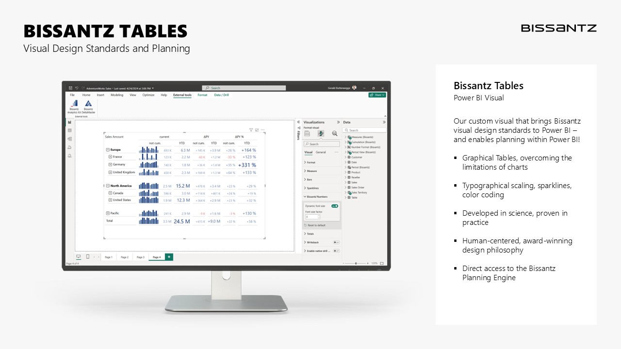
  • Bissantz Tables – enable planning directly in Power BI, using a visual that also incorporates our award-winning design standards.
  • Bissantz Analytics Kit – turns existing models into powerful controlling applications at the push of a button, enriched with business best practices.
  • DeltaMaster and DeltaApp – our frontends run natively with Fabric: DeltaMaster for advanced planning and analysis, DeltaApp for mobile dashboards and fast insights.

Visitors repeatedly told us: the combination of Fabric + Power BI + Planning Engine + Bissantz Tables closes a long-standing gap in practice.

Live Demo on the Inspire Stage

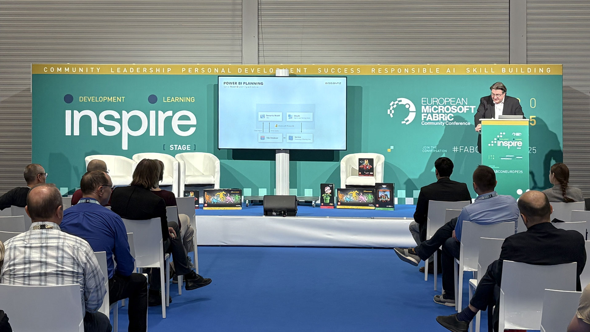
One highlight was our session on September 17 at 4:45 p.m. on the Inspire Stage. Dr. Gerald Butterwegge, Head of Communications, demonstrated live how a Fabric model can be transformed into a production-ready planning application in minutes.

Vortrag von Dr. Gerald Butterwegge

“Planning in Power BI – with the same standards that Bissantz has set for years – was a real eye-opener for many,” said Butterwegge. “Governance features like locking, permissions, and monitoring were visible right away, out of the box. And the seamless switch between analysis, planning, and reporting clearly impressed.”

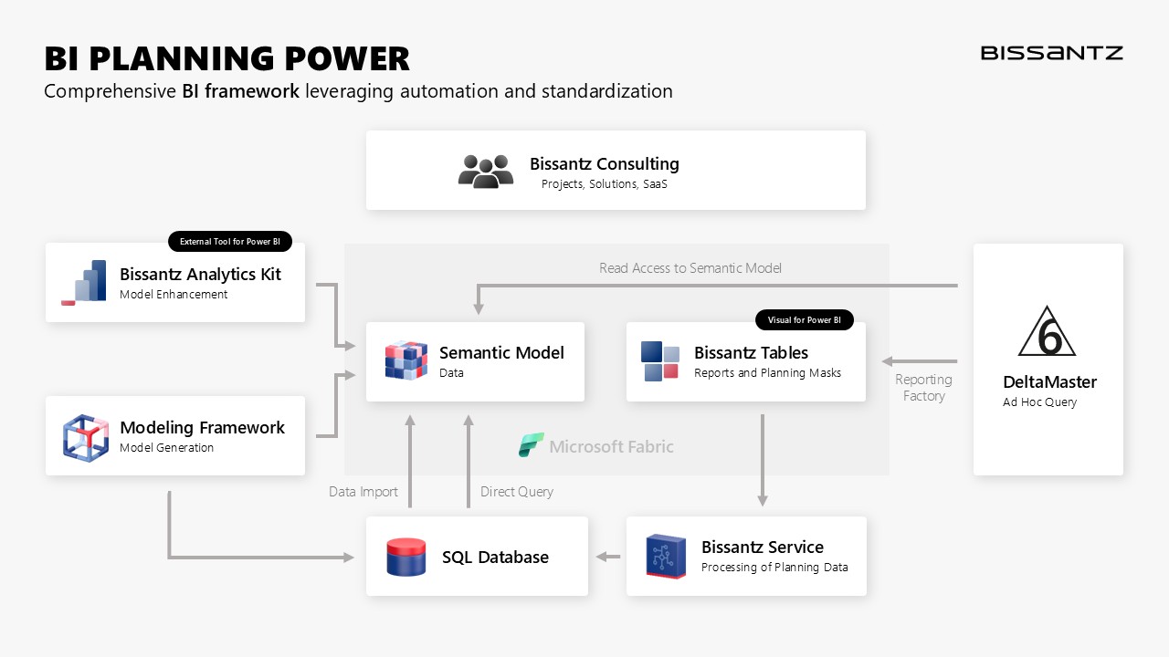
Rather than relying on Power BI’s typical, limited planning approaches, we harness the full power of BI for planning. By linking Power BI with our Modeling Framework, we provide all the essential planning functions in the backend.

At the core lies the Planning Engine, delivering indispensable features like write-back, transactions, locking, splashing, permission management, and monitoring. These components turn Fabric into a platform that doesn’t just analyze, but also enables planning of a new quality.

Typische Planungsarchitektur in Microsoft Fabric mit Integration der Bissantz Planning Engine Typical Planning Architecture in Microsoft Fabric with Integration of the Bissantz Planning Engine

Strong Response at Our Booth

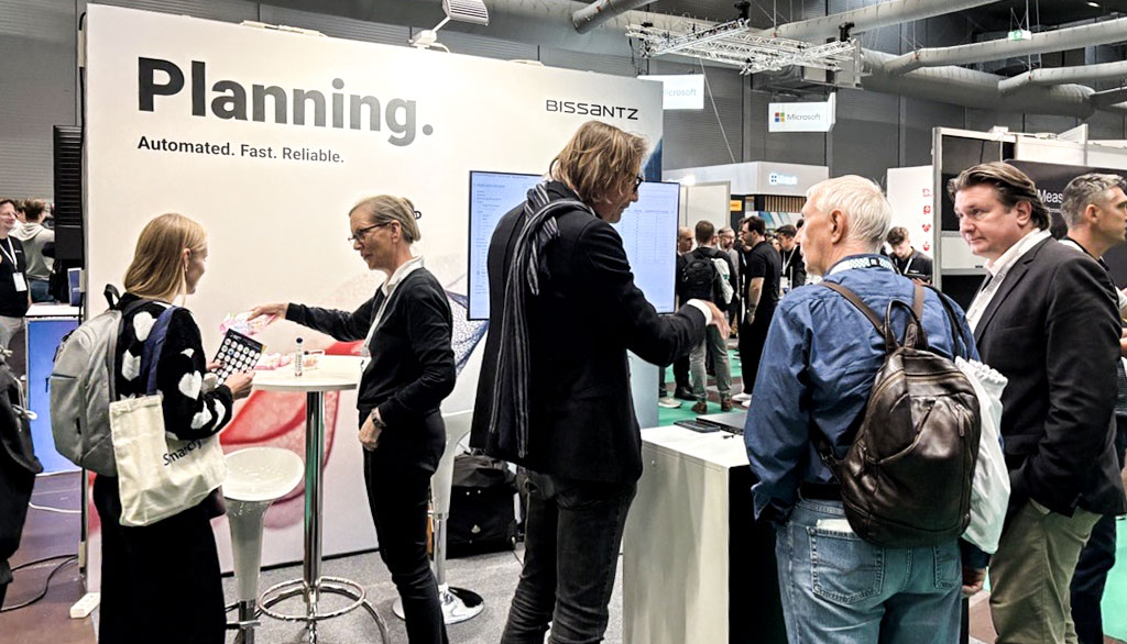
Our booth, right next to the Inspire Stage, was buzzing with activity throughout the event and quickly became a hub for expert discussions. Our six-person team – Michael Westphal (Consulting & Management), Dr. Gerald Butterwegge (Communications), Torsten Krebs (Consulting), Aleksandra Pushkina (Consulting), Heike John (Sales), and Murat Suner (Storytelling) – engaged the FabCon community from multiple angles: technical modeling, visual standards, market perspectives, and customer needs.

Team Bissantz auf der FabCon Vienna 2025

Many visitors stopped by right after our talks to dive deeper into the live demo. Others used the chance to ask about concrete projects and use cases. Topics in especially high demand included combining Fabric with planning, Power BI integration, and our Analytics Kit.

Austausch am Bissantz-StandWhat became clear in these conversations: companies are already investing heavily in Fabric but still seek guidance on how to build productive controlling and planning solutions. Our approach resonated strongly with that need.


Visualization: Clarity Over Show

Many sessions dazzled with colorful dashboards and 3D effects. “The community celebrates 3D charts that look spectacular, but they don’t actually reveal what’s happening in the data,” observed consultant Aleksandra Pushkina.

This is where Bissantz stands apart: our visualization follows the principles of human perception. “You don’t need to be a super-controller to immediately spot the biggest variance in DeltaMaster,” added Dr. Butterwegge.

Bissantz Tables in Power BI for Planning and Visualization Bissantz Tables in Power BI for Planning and Visualization

Fabric Impresses – With Limits

“With Fabric, Microsoft really has brought everything together in one integrated whole. The breadth is impressive – from data integration and AI to real-time processes. At the same time, Fabric is still a construction kit: it offers many components, but not yet complete solutions,” noted Michael Westphal, Head of Consulting and Managing Director.

Planning: The Missing Piece

One key learning: planning is absent in Power BI. “Many use Power BI, but they don’t plan with it – simply because it’s not possible,” emphasized consultant Aleksandra Pushkina.

That’s why the response to our solutions was so strong. “With Bissantz Tables connected to our Planning Engine, we proved that planning in Power BI works – and works with the same standards our customers have relied on for years,” explained Torsten Krebs, Senior Manager.

Real-Time and Translytical Task Flows

The real-time analytics examples impressed many attendees. “More and more decisions will be made in real time, not after monthly reports,” summarized Westphal.

But realism is important: not every industry needs real time. “For many, daily or even monthly updates are sufficient – corporate culture often dictates how steering actually works,” he added.

Data Security: Trust Remains Key

Amid the excitement, one topic kept surfacing: data security. “Our customers are cautious – where are the servers located, who can access the data?” reported Sales Manager Heike John. Microsoft responds with tenant isolation and clear commitments, but trust remains a sensitive issue.

Our Takeaways from Vienna

FabCon Vienna 2025 made one thing clear: Microsoft Fabric is becoming the standard for data integration and analytics. But only with extensions such as our Modeling Framework, Planning Engine, Bissantz Tables, and Analytics Kit does it become an environment that meets the high demands of controllers and planners.

For us, the conference was an invaluable opportunity to showcase our innovations – and to take home the questions and expectations of the community.

We return to Nuremberg with three key insights:

  • Fabric is established – now it’s about delivering value beyond analytics.
  • Planning must be integrated – not handled separately in Excel, but embedded in the same model.
  • Design remains decisive – only when data is made truly understandable will it gain acceptance.

Or, as Michael Westphal put it: “Fabric offers a lot – but you still need someone to put the building blocks together in the right way.“

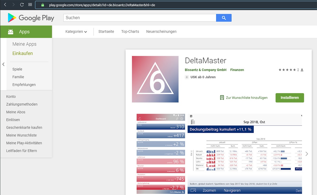
DeltaMaster-App for Android is now available at Google Play store. From now on it is possible to use applications and reports of the Business Intelligence software DeltaMaster with current mobile operating systems.

DeltaMaster app on Google Play

Setup, functionality and operation fo the Android app mostly correspond to the iOS version. For example, users can update (recalculate) reports, set filters, zoom and navigate in Graphical Tables, export reports or download them to the device for offline use.

Bissantz also offers – apart from the DeltaMaster-App – the DeltaApp, which is exclusively designed for mobile management reporting. Sales manager Michael Nordhausen explains „our mobile solutions respect the characteristics of the various devices. The DeltaMaster-App is made to be used on tablets. the presentation resembles the desktop client but the handling is different. The DeltaMaster-app respects this point and provides a simple interaction. However, even within the daily hectic management routine, a smartphone is mostly kept vertical and a thumb must be enough for operation. This requires special concepts for information and interaction which are delivered by the DeltaApp. 

  DeltaMaster im Apple Appstore   DeltaMaster bei Google Play  

We would be happy to grant you access to our demo system for the trial of the DeltaMaster-app.


Take a look behind the scenes or better, into our BI laboratory with a new series of articles. We have plenty of ideas on how we want to further develop our products. Creating user-friendly features from them is often an exhausting but always an exciting process. In selected projects, we will tell you how we make up our minds during this process. You will also learn which features you can look forward to in the next releases as a DeltaMaster user.

BI lab at Bissantz

Performance speedometer?

Uncertainty is an unpleasant thing while waiting. But is there any way to shorten waiting? How long does which step take? DeltaMaster is to answer these questions! How do we display this information and where? Can we use the cursor as a stopwatch? In this case, you would see the waiting time at the point where your eye has looked at recently. The cursor could easily turn into a number and we could count in seconds or tenths as most of the processes take less than one second. This sounded like a good idea, however, first tests quickly revealed a flickering of the cursor while working in remote area. Further, there was no display for performance, so we decided to disregard this idea due to inconsistency. A notification on the edge of the screen was a more decent idea, so we decided to use this option.

Priority at geographical overlapping?

It is hard to read overlapping labels even with numbers for locations on a map, e. g. locations of customers and their deviation in sales. Locations which are close to each other, quickly lead to an overlapping of numbers and the more locations are nearby, the more unreadable it gets. But how can we avoid these overlappings? DeltaMaster should help to solve this problem and to calculate the location for a value automatically within a certain radius of the location, where no other label is placed yet. The value could surround the location and stop on a free spot. Nevertheless, our tests revealed that overlappings occur on many values which are very close to each other and at some time all of the free space of the map will be used. Another problem is the dedication. if the label of a location has no fixed position, the dedication is missing and it is not clear, which label belongs to which location. Therefore, another solution is to be found.

The finding: We can only avoid overlapping by reducing the labels and prioritize them. For example, If there are sales deviations of several customers, DeltaMaster should only indicate the value for the customers with the highest deviation. You can use this option from now on with the geo analysis-tool of DeltaMaster.

Fixed report list!

Until now, the position of the report list depends on the filter bar. This leads to inconvenient jumps to the top when switching the reports. How often this effect takes place depends on the loading time of the report. Also, reports with high filter bars clinch the report list. To solve this problem, we have to fix the report list. But where? Independent of the filter bar, on the upper left margin of the screen and always on the same position, seems to be a good idea. The same applies to the menu on the right margin due to the symmetrical presentation and better use of space.
Also, there are questions about the user interface-design: Do the symbols for the drop down menus need a change? Until now, the triangles for expand and close direct into the inner report area. Will it be irritating when these triangles direct to the filter bar and do we need three points in addition to indicate that there is something to expand? No! After turning the triangles to all cardinal points it gets clear, that we will stay with the same symbols as things will still work well how they did until now. We also have to avoid the overlapping of the triangle by the filter bar when the report list is closed with the following solution: the button will direct in the opposite direction. The new report list will work like it should from now on and will be available in the next release of DeltaMaster.

Exception reporting, a.k.a. alerting, is a common response to the “No news is good news” attitude of stressed-out managers. Perhaps, it is a sign of pessimism to say that when top managers receive a message, it has to be something bad. Wait…or is it optimism in the sense that if they haven’t heard anything, nothing THAT bad could have happened? Maybe, too, it is just the desire to receive less – or even no – news for a change in light of the information overload that managers battle each day.

At any rate, exception reporting is designed to suppress information. Instead of regular intervals, the report consumer should only receive information in certain circumstances that are defined in advance. Thresholds, however, are dangerous in this lump sum approach. If a variance exceeding 5% is relevant, does that mean that a 4.98% variance is not? Which cutoff should we make on which level of aggregation?

The information systems expert Norbert Szyperski already warned of these problems back in 1978:

“Fixed thresholds are dangerous in combination with the fiction of management by exception. Managers should be curious, in other words, should proactively seek out new relationships among information and not just dose off attentively like a person monitoring a switchboard.” (translated from Mertens/Griese, Integrierte Informationsverarbeitung 2, Wiesbaden 2002)

My personal preference? Design standard reports that are so attractive and information dense that the readers enjoy receiving them and would never even consider trying to suppress them.

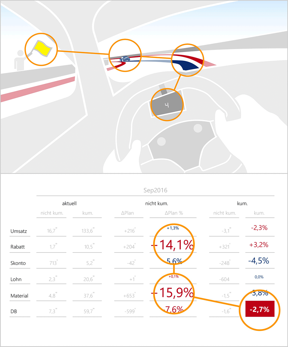
Adored by the software industry and hated by visualization experts – those colorful little controlling speedometers that are supposed to, at a glance, tell executives whether the company is headed for a brick wall or staying on course. Is the dashboard metaphor really a suitable approach for visualizing key business figures?

he numbers at-a-glance, just like when you’re driving a car. A well-designed dashboard is an example of “Small Multiples” design, i. e. the same design principle is repeated for several things you want to display. If you understand one display, you’ll understand them all. In a car, the displays warn of potentially dangerous situations for the vehicle and its occupants. Any company executive wants the same.

But that’s where the similarities end.

While driving, we should and do have the road in our field of vision. This is where we get the information we need to steer the vehicle successfully. Since this information changes rapidly, we can only devote a small amount of time to the state of the vehicle itself. This means the dashboard has to supply all the important information we need within one or two seconds. A company executive, however, doesn’t spend all of his time looking out of the window and every now and then casting a glance at his computer screen. He’s equally unlikely to go rushing down corridors, trying to take on indicators pinned to the wall as he goes speeding past.

When we look at a speedometer, we can then either accelerate or slow down. There is no third option. Therefore, you only need to be told the speed in order to decide which action to take. The results of an enterprise, on the other hand, depend on a multitude of factors which also have a bewildering network of connections to one another. And these factors need to be shown. But the dashboard metaphor wastes space on the screen. It shows a single figure in the amount of space it would take to show a dozen figures if you were using a table. A prohibitive undertaking, when you consider the thirst for information an executive has due to his difficult job.

Information systems must support the thinking tasks for which they are built. A few figures that just show the last up-to-date value, without any context, do not do this.

Other Voices

“If ‘dashboard’ is interpreted to mean information presented on a page in a highly concentrated fashion, then I think it’s very helpful. If, however, any old speedometers or thermometers are supposed to represent a ‘dashboard’, then I think it’s a load of nonsense. Executives want their data condensed, their information all on one page.” Prof. Rolf Hichert, is report, 6/2005

“‘Dashboards’ and other such things are gimmicky, they obfuscate the relationships between multiple data, and are not necessarily appropriate for the data they intend to describe.” Malcolm, July 10, 2003

“I cannot imagine an executive staring out of his office window and only glancing at his computer screen for a second or two to evaluate the status of his business at that particular time.” Craig Pickering, September 23, 2003

Links

You’ll find an intensive discussion of this subject on our favorite forum for data analysis topics, Ask E.T..

Read more:
Part II – Dashboard vs. sparklines
Part III – Road signs, not red lights

Artificial intelligence deals with the automation of human behavior. It reaches its highest form when all types of automation merge into one: the automation of evaluation, modeling, visualization and perception and operation.

Sie sehen gerade einen Platzhalterinhalt von YouTube. Um auf den eigentlichen Inhalt zuzugreifen, klicken Sie auf die Schaltfläche unten. Bitte beachten Sie, dass dabei Daten an Drittanbieter weitergegeben werden.

Mehr Informationen

In this video, Dr. Nicolas Bissantz explains how this finding was harnessed for the development of our business intelligence app (English subtitle available).

Dr. Nicolas Bissantz explains the haptic reasoning presented in the video in detail in our webinar about the DeltaApp (in German).

Our attention is limited, and diagrams waste attention with complicated eye movements and unreliable image scaling. The typographically scaled Bissantz’Numbers are the solution: number and image become one, making messages from controllers unambiguous. The trend of universal “app-ification” is advancing and has reached managers. These were the key messages at our sixth Executive Forum in Berlin.
(mehr …)

Measuring men

Drove past this on holiday. Shows the price of a room. For one or two. Unambiguously and instantly. Black on white. Have a look.

I already liked signs with multiple men in the past. I would like dogs in a motel even more, single or double.

Bad weather had initially seemed to delay our research schedule but in the end, precarious track conditions offered new insights.

As you may have heard, we love motor racing – to improve management reporting. Sounds strange? Human eyesight is different from what we think and on racetracks, lap times clearly reveal which visual strategies can deal with the limitations of our perception successfully and which ones can’t. We build the successful strategies into our software in a way that ‘forces’ our eyes to behave like the well-trained eyes of a good race driver. Our typographically scaled Bissantz’Numbers are an example of this type of research.

This time, we had set out to improve our understanding of peripheral vision. However, when driving on slick tires and partly wet, partly dry tarmac, the eyes focus on every meter of the road to find the line with the best grip. Peripheral vision does not help in this process of ‘reading the road’.

In the end, after many laps, the concept of ‘contrast dynamics’ came up: the key to smart behavior in time and space is to always have an exact idea of ‘where you are’. Our eyesight constructs this idea. Well-designed reports help to construct this idea more rapidly. But how do we help our eyes to adjust to ‘where we are’, as we navigate through our data along a path around bends and corners?

Join us at our Executive Forum in Berlin, where we explain our findings.

PDF Download

Greetings, fellow data analysts!

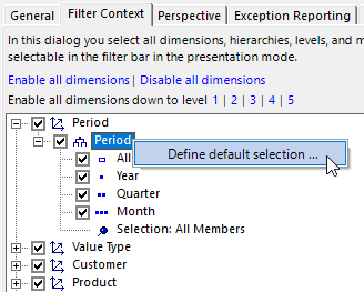
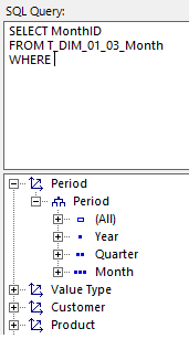
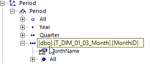
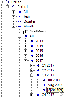
One of the big changes in DeltaMaster 6 is a significantly expanded backend for relational applications. These do not require a cube; instead, they make do with tables from a relational database such as Microsoft SQL Server, Oracle, SAP HANA, IBM DB2, or MySQL. This often goes unnoticed by report recipients at management level because it works largely in the same way as DeltaMaster usually does. Of course, there are some differences below the surface – not least in terms of language, as relational databases are queried using SQL rather than MDX. This has consequences for the dynamic configuration of the filter context, for example. In the last issue, we described this configuration for OLAP. This time, we are turning our attention to relational applications – and getting more technical. Our target audience is the report editors who set up such applications. That said, the result is not technical at all. Rather, it represents another component of automated reporting: individual default settings that meet users‘ needs.

Best regards,
Your Bissantz & Company team

Standard (default) selections can also be defined in relational applications. The effect in Presentation Mode is the same as for OLAP databases and as described in DeltaMaster clicks 155: When a report is opened for the first time, DeltaMaster runs the queries for the default selection and sets the corresponding filters in each dimension (view). This allows filters to be pre-filled automatically, including based on dynamic criteria, depending on the current date, the current user or the available data in particular.

Different languages, different structures

The differences relate to syntax but they are also conceptual. Unlike MDX databases, SQL databases have no hierarchies, no levels, and hence no standardized expressions for describing hierarchical structures. However, these are precisely what management information needs in order to derive findings from data! DeltaMaster closes this gap by offering mechanisms for realizing multidimensional ways of thinking and working even when using relational databases. This is achieved using SQL and a few additional rules, according to which DeltaMaster transfers the results of a relational query into the desired multidimensional constructs.

Report Properties, Filter Context

Default selection forms part of the Filter Context. This can be edited in its own tab in the Report Properties (context menu of reports in Modification Mode) in the same way as for MDX databases. You can define the Default Selection in the hierarchy context menu.

This opens the familiar SQL Editor. Enter the query in the upper section of the dialog. The lower section shows all of the dimensions, hierarchies, levels and members as well as the measures.

If you move the mouse pointer to an item while holding down the Alt key, DeltaMaster displays technical information as a tool tip. This is required in SQL queries and can be added to the input field by dragging and dropping or double-clicking.

For levels, DeltaMaster displays the qualified name of the key field. This comprises the schema (in the illustration: dbo), the table name (T_DIM_01_03_Month) and the field name (MonthID).

For members, DeltaMaster displays the ordinal number of the hierarchical level, i.e. essentially its depth, and the key. In the illustration, the month is level 3 (the top level is always 0) and the key is 201709.

SQL queries

The way in which queries are formulated for the default selection is based on the respective dimension. We make a distinction between

  • regular level-based dimensions generated from the columns of one or more tables and
  • virtual time dimensions based on a date field, e.g. data types such as date or date time.

The virtual time dimension is one of DeltaMaster’s specialties. In relational applications, it removes the need for some of the typical steps in data preparation: Instead of distributing stored dates across separate columns for days, months, quarters, years, etc. as would be required in a regular hierarchy, DeltaMaster can process the data field directly and construct a corresponding virtual hierarchy inde-pendently in a similar way as for the so-called server time dimension of Analysis Services.

For both types of dimension, the query result depends on the first column only; additional columns are ignored. This first column contains the values to be interpreted as the member key in the form of strings (e.g. data types such as char or varchar) or numbers (e.g. integer).

In most use cases, the default selection should be exactly one member, not multiple members. Accordingly, the query must return exactly one value (one column, one row). To ensure that a query returns exactly one row, and hence that exactly one member is selected, you can restrict the number of result rows (in Microsoft SQL, for example, using a query like “SELECT TOP 1 FROM …”) if this does not already follow from the query logic, e.g. the WHERE clause.

If multiple rows are returned, DeltaMaster treats this as a multi selection. In this case, the members must belong to the same dimensional level; different levels are not permitted. Duplicate rows can be prevented in Microsoft SQL Server using the suffix DISTINCT (“SELECT DISTINCT FROM …”).

Regular dimensions

One important aspect of syntax in regular dimensions is whether a hierarchical level is specified. In turn, this depends on how many levels the dimension has.

  • In dimensions with one or two levels, you do not need to specify the level.

    If a dimension has exactly one level, DeltaMaster looks for the member at that level. Examples include value types (target, actual, …) and currencies. In these cases, selecting the member key is sufficient:

    SELECT ‚P‘ – “Target” member in the value type dimension

    A default selection could be defined in the value type dimension; “P” may represent the key for the “Target” (i.e. the plan) member. In practice, of course, you would not select a constant member but would determine the member dynamically (see following section); constant members are used here for illustrative purposes only.

    If a dimension has two levels, i.e. a top level and a primary level, DeltaMaster automatically looks for the member in the primary level; so that it is not necessary to specify the level. In this case, too, selecting the key is therefore sufficient. In our reference use case, “Chair”, colors and sales teams are examples of such dimensions.

  • In dimensions with more than two levels, the level must be specified.

    This means assigning an alias in the query or specifying the key field:

    SELECT ‚201709‘ AS MonthID

    or:

    SELECT MonthID
    FROM T_DIM_01_03_Month
    WHERE MonthID = ‚201709‘

    The name of the key field (in both examples: MonthID) and the table name (in the second example: T_DIM_01_03_Month) are determined in SQL Editor as described above (Alt+mouse pointer, drag and drop or double-click to add).

When formulating a query, it can be useful to take a look at the data. The tables and their key fields and characteristics can be viewed on the Data page in Modeling. The table name in caps (T_FACT_01_GrossMarginCalculation) also acts as a menu for switching to the other tables. A tool tip in the column header shows how the column is used (Alt+mouse pointer).

Date, user, measure

In the above examples, we have specified constant keys in order to keep things simple. However, the very purpose of default selection is to determine the key dynamically depending on changing conditions. The most frequent examples are the system date and the current user name. In Microsoft SQL Server, this information can be obtained using the GETDATE() and SYSTEM_USER functions; similar functions are available in other databases. The returned values must be transformed into strings that match the member keys in the respective dimension.

Examples:

SELECT CAST(YEAR(GETDATE()) AS VARCHAR) +
RIGHT(‚0‘ + CAST(MONTH(GETDATE()) AS VARCHAR), 2)
AS MonthID – – for period descriptors such as „201709“ in string form
SELECT SYSTEM_USER AS UserID – – including domain
SELECT SUBSTRING(SYSTEM_USER,
CHARINDEX(“, SYSTEM_USER) + 1, LEN(SYSTEM_USER)) AS UserID – – excluding domain

The last two examples require users to be modeled as a separate dimension so that the desired member can be taken over directly from the name of the system user. Often, however, the user name needs to be allocated, e.g. to the sales team, product group or customer group. In simple cases with few allocations, these can be recorded in the default selection, e.g. as follows:

SELECT CASE
WHEN SYSTEM_USER = ‚chairbaumann‘ THEN ‚V2‘
WHEN SYSTEM_USER = ‚chairhohlmaier‘ THEN ‚V1‘
END
AS SalesID

For more extensive use cases, it is advisable to store such allocations in the database table.

The default selection can also be made dynamic by including measures. The following query returns the last month for which (positive) actual revenue is already recorded. This means the default selection in the period dimension continuously adjusts to reflect the transaction data.

SELECT TOP 1 MonthID
FROM T_FACT_01_GrossMarginAccounting
WHERE ValueTypeID = ‚I‘ AND Revenue > 0
ORDER BY MonthID DESC

In this query, DeltaMaster accesses the fact table. This can be viewed in Modeling as shown above.

Virtual time dimension

For virtual time dimensions, DeltaMaster always requires the desired level (time granularity) to be specified, e.g. day or month. As this cannot be expressed using SQL, DeltaMaster supports its own syntax: The desired level is specified by adding a DeltaMaster-specific code before the date in text format, followed by an apostrophe as a delimiter. Example:

SELECT ‚3“04/28/2017 00:00:00‘

This sets April 2017 as the default selection in the period dimension based on the date April 28, 2017. Within DeltaMaster, dates are recorded using an invariant culture that is not region-specific or user-specific. The US date format (“MM/DD/YYYY”) is used as illustrated by the example. The first and last apostrophe are the string delimiters in SQL. Code 3 indicates that the desired level of time granularity is the month. The apostrophe after the code is duplicated because it falls within the delimiters and hence must be masked (escape).

DeltaMaster recognizes the following codes for time granularity:
[table id=3 /]In practice, of course, codes are not combined with a fixed date but with a dynamic SQL function like GETDATE() that selects the current date or the computer’s system time. The corresponding queries take the following form:

SELECT ‚5“‘ + CONVERT(CHAR(10), GETDATE(), 101) + ‚ 00:00:00‘ – – Select day
SELECT ‚3“‘ + CONVERT(CHAR(10), GETDATE(), 101) + ‚ 00:00:00‘ – – Select month

The internal structure of the virtual time dimension means the date can be easily derived from the system time, so the query is shorter than in the example shown in the previous section.
Instead of assembling strings, the system time can be converted into the required format using the CONVERT function; in Microsoft SQL Server, the code for this is 101. In order to make the query independent of the time of day, only the first ten digits of the system time are taken into account, i.e. the date, and a „neutral“ time of day is added.

An alias, field descriptors, table names, or similar are not required, as the virtual time dimension is not based on different database fields.

PDF Download

Greetings, fellow data analysts!

We are returning to the question of how to make business intelligence simpler – especially for the many report recipients who do not create their reports themselves, but instead are provided with interactive reports. One sticking point is filters which recipients can set themselves. A small number of filters that are well suited to the given task, user and situation helps to keep things simple. The more filters, the more freedom the user has and the more he has to deal with the complexity of the world. In the last issue, we discussed the filter context, which is particularly important for simplifying the user interface. This time round, we will show you how to dynamically define this filter context so you can customize the filter options for a report and the predefined default selection individually – and yet also automatically.

Best regards,
Your Bissantz & Company team

The so-called filter context (view context) is used to control which filter options are available in Presentation Mode in DeltaMaster. This makes life easier for report recipients: There is less for them to do because the most important settings are already selected automatically – and where they do have a decision to make, the selection available to them in the menu is limited to those properties that are actually relevant. An overview of how the filter context works can be found in DeltaMaster clicks 154 (08/2017).


This time, we will explain in greater detail how to dynamically shape the filter context so that relationships within the data and external factors, particularly the current date and the current user, are taken into account.

We will concentrate on two use cases:

a) dynamically restricting the selection options and

b) dynamic standard selection (default selection).

In other words, this is about two questions: Which members should be available to users for selection in Presentation Mode, and which member should be automatically selected as default when the user opens the report for the first time? Or, in figurative terms: Which entries should DeltaMaster offer in the filter bar menu and which of these entries should already be selected from the start?


In both cases, the dynamic aspect comes from the fact that the members for selection are not taken over solely from the analysis model or explicitly defined in Modification Mode; instead, DeltaMaster only determines which members should be made available or selected automatically when a report is used in Presentation Mode.

The selection options and the default selection can be described using a database query in the MDX query language (for OLAP databases) or SQL (for relational databases). We will turn our attention to the relational example in the next issue. This time, however, we are looking at MDX. As you will have gathered from these keywords, this is a matter for report editors and application administrators. The following section contains a summary for report recipients. Editors and administrators should read on – because what we are about to tell you will help you make things a whole lot easier for the recipients of your reports.


Management summary

DeltaMaster reports can be configured so that the filter options and default filters in Presentation Mode automatically adapt to changing data situations and use conditions. This makes it easier to use the application and helps to reduce the number of reports. The following relationships can be taken into account in particular.

a) Relationships between filters and measures

Example: In the time dimension, only months with values for actual revenue should be available for selection in the current report. Future months that only have target revenue values should be unavailable for selection.

b) Relationships between filters and other filters

Example: In the product dimension, only product groups or products for which the current sales team is responsible should be available for selection. The current sales team is the sales team selected in another filter property.

c) Relationships between filters and the current date (system time)

Example: In the time dimension, the current month should be selected automatically.

d) Relationships between filters and the respective user (name)

Example: When the user “chairbaumann” opens a report, the member “Baumann” should be selected in the sales team dimension; when the user “chairhohlmaier” opens the same report, the member “Hohlmaier” should be selected.

Other criteria from within and outside the DeltaMaster application can also be taken into account, including anything yielded by the query languages; however, the date and the user name are particularly common examples. The mechanism can also be used for folders, as discussed in DeltaMaster clicks 154 (08/2017); in this issue, we will focus solely on reports.


Settings: in filter context

Report editors make necessary adjustments to reports centrally on the Filter Context tab in the Report Properties (report context in the report list).

The context menu for Selection below the hierarchy levels allows you to Restrict Selection by MDX Expression. The option above this allows you to Restrict the Selection. But this is a static selection, meaning that the members offered in Presentation Mode are defined individually or on a level-by-level basis and made available identically in every situation. However, MDX is required for dynamic definition.

The second setting discussed here, Default Selection, can also be found on the Filter Context tab via the hierarchies’ context menu. A static variant without MDX is not available – and not necessary, as it would be nothing more than the report filter (view), i.e. the combination of selected filter properties with which the report was saved.


Multidimensional expressions

In both cases, the MDX expression is created and edited using the DeltaMaster MDX Editor. The requirements for the results returned by the query are also the same: DeltaMaster expects a member or a set of members from the respective dimension. A set, i.e. multiple members, is typical for a limited selection. The default selection is usually exactly one member. The default may also be a set; this corresponds to a multiple selection.

To express the desired dependencies, in the MDX expression you should reference objects or conditions outside the respective dimension. The following constructs are typically used for the four relationships described above. The MDX examples are based on Microsoft SQL Server Analysis Services.

  • Measures
    To take certain measures into account, e.g. revenue or gross margin, enter the corresponding members from the measure dimension. For example: “[Measures].[Revenue]” or “[Measures].[GM]”. In the MDX Editor, all available measures are shown in the Measures branch of the structure tree at the bottom left. Double-click or drag and drop to add them to the MDX expression in the upper section of the editor.
  • Selection in other dimensions
    To reference member(s) selected in another dimension, use the MDX function “CurrentMember”, e.g. “[Sales].[Sales].CurrentMember”, or the short keys (variables) in DeltaMaster, e.g. “”, where 13 is the ID of the sales dimension. The ID of a dimension can be found in the structure tree at the bottom left of the MDX Editor by holding down the Alt button and moving the mouse pointer to the dimension.

  • Date
    MDX functions can be used to read the system date, convert it into a string, and use this string to select or to reference members. This is accomplished by an expression like this:

    StrToMember(„[Period].[Period].[“ + Format(Now(), „MMM yyyy“) + „]“)

    Take care to ensure that the period format is correct. If it does not already match the system date formats, it must be transformed accordingly. For example: In German, March (“März”) is abbreviated as “Mrz”, not “Mär”; consequently, the month in the database must have the same format.

  • User name
    The name of the current Windows user can be read in the same way. The following expression uses MDX functions to read it, strip the domain name (before the slash), then use it to select a member in a dimension that contains the system users.

    StrToMember(„[User].[User].[“ + Mid(UserName(), InStr(UserName(), „“) +1) + „]“)

    In this example, the user name is used to select a dimension member directly. Alternatively, it can be used in conditions in order to select certain members, e.g. in an organization or customer dimension, depending on the user name.

When you restrict a selection while also setting a default member, this default member should be included in the selection so that the user can switch back to the default member after modifying the filters. Although these two settings are technically independent of each other, i.e. it would be possible to set a default member that cannot be selected by the user interactively, this makes it harder to use and is generally not advised.

The default selection should not reference any dimensions for which a default selection is also defined (i.e. no multi-tiered default selection).


Effect in Presentation Mode

The selection restriction and default selection only have an effect in Presentation Mode, like the filter context as a whole.

When a selection is restricted, DeltaMaster automatically adds the parent members (aggregated members at higher levels). For example, if the MDX expression only returns months, DeltaMaster also displays the corresponding quarters and years automatically.

The queries stored as default selections are run as soon as the user opens a report or a folder for the first time – and only this once. In doing so, DeltaMaster sets the filters according to the query results and retains them until the user modifies the filters or ends the session. As such, the reports behave in the same way as if a report editor had set and saved the filters like this. Users in Presentation Mode will not notice any difference, but they will appreciate the fact that reports always come with the “right” settings as default.


Example

Using the information on the structure of MDX expressions, we can suggest solutions for the tasks described above in our reference use case, “Chair”.

a) Restrict periods to months with actual revenue

The following expression restricts the time dimension so that only those periods containing revenue of greater than zero for the respective value type are available for selection.

Filter( [Period].[Period].[Month].Members,
([Measures].[Revenue], [ValueType].[ValueType].[ValueType].[Actual]) > 0 )

In principle, such filter expressions could also take analytical criteria into account, e.g. the ten biggest customers or only customers above a certain minimum revenue. However, typically, criteria like these should be put in the Axis Definition of the report rather than the filter selection.

b) Restrict products to selected sales team

The following expression restricts the product dimension so that only those products for which the current sales team is responsible are available for selection. The allocation of products and sales organizations is not mapped in this model but is implied by reference to which team generated revenue from which products.

Filter( [Product].[Product].[Product].Members,
([Measures].[Revenue], [ValueType].[ValueType].[ValueType].[Actual], [Period].[Period].[All Years],
<view13>)
> 0 )

As discussed above, „<view13>“ stands for the member currently selected in the sales dimension; „[Sales].[Sales].CurrentMember“ could also have been used.

This expression requires exactly one member to be selected in the referred sales dimension, not multiple members. To ensure that this is the case, Multi Selection should be additionally disabled for this dimension in the Filter Context (dimension context menu). In this example, the time reference is defined broadly to include all years; however, this could also be dynamically linked to the current report filter.

c) Set current month as default selection

The following expression, which is also shown above, makes DeltaMaster select the month corresponding to the current system clock date in the time dimension when the application is opened.

StrToMember(“Period].[Period].[“ + Format(Now(), “MMM yyyy“) + “]“)

Where the current period for a report is derived directly from the system date as in this example (and is not used as part of a condition, e.g. in larger expressions), DeltaMaster has offered an alternative since version 6.1.6:

In Graphical Tables where the Current Magic Button is enabled, DeltaMaster automatically sets the period every time the report is displayed – as defined in Modeling on the Logic page.

The option with the suffix “Current Period” causes a dynamic behavior, so that the current period automatically reflects the system date.

Evaluating the system date is especially practical for operational analyses and reports. However, this does not take into account whether the month is closed for accounting purposes. On closer inspection, it is clear that there may be differing interpretations as to what exactly constitutes the current month. One common variant is to use the last month for which (actual) revenue is recorded. This removes the need to update the report whenever newer data becomes available; instead, the report identifies the latest period autonomously in a data-driven manner. This enables the following expression.

Tail( Filter( [Period].[Period].[Month].Members,
([Measures].[Revenue], [ValueType].[ValueType].[ValueType].[Actual]) > 0 ), 1)

The MDX function Tail returns the specified number of members or tuples at the end of the specified set. As only the last member is queried, the number of tuples is 1; the set is a filter expression that returns months with actual revenue of greater than zero.

d) Set current user’s sales team as default selection

The following expression is similar to b) with the difference that the current sales team is determined not by the setting in the filter bar, but by reference to the Windows user name of the current user.

Filter( [Product].[Product].[Product].Members,
([Measures].[Revenue], [ValueType].[ValueType].[ValueType].[Actual], [Period].[Period].[All Years],
StrToMember(„[Sales].[Sales].[“ + Mid(UserName(), InStr(UserName(), „“) +1) + „]“))
> 0 )

If there is no matching member for the user name, this expression returns an error – one, however, DeltaMaster can deal with: by selecting the first member of the top permitted level in the filter context as the default selection; this is often the “All” member. If nothing else, this ensures that the default setting for the report works even if the request cannot be fulfilled.


Tips for report editors

What makes MDX expressions so appealing is that they respond very flexibly to the respective settings and help bring reports to life. With regard to report development, the following methods have proven effective.

  • Prepare query in Axis Definition
    Start by editing the required MDX expression for the filter context in the Axis Definition of a Graphical Table. This makes it easier to evaluate the result sets in changing conditions.
  • Save and reuse query as Named Set
    Named Sets can be used to maintain and reuse queries in a central location. For example, if you have defined a default selection based on a user name or date, you will probably want to reuse it in multiple reports, and you may wish to use a defined set of members in the Axis Definition as well as in the Filter Context. All you have to do when Editing is enter the name of the set as the MDX expression for the selection restriction or default selection. The maintenance of Named Sets forms part of Modeling: With DeltaMaster 6.1.6 and above, Named Sets can be edited via the corresponding item in the Model menu (right).
  • Define report as start report
    As stated above, the default selection query is calculated only when a report is opened for the first time. This means it is not enough to switch from Modification Mode to Presentation Mode or recalculate the report when developing and testing; instead, the application must be (re)opened in order to experience the default selection in action. When testing, you may find it easier to define the report you are working on as the Start Report (Report Properties, General tab), at least temporarily, so that it is always displayed automatically when the application is opened and you can review the default selection in the filter bar.

And perhaps the most important tip of all: If you have any questions, please don’t hesitate to contact our support team and your contact persons!

PDF Download

Greetings, fellow data analysts!

Complexity and flexibility go hand in hand in controlling applica­tions. For instance, think of the filters with which you set the month, customer group, product group, cost center, etc. to which reports are to refer: The more attributes, the more flexible you can be in configu­ring a report, but there are also more conditions to keep in mind and understand. DeltaMaster automatically eliminates some things that are created in the database but are not relevant to a report. In addi­tion, it takes business understanding and experience to decide which attributes should be available and which should not. This is a ques­tion of responsibility for design, and of leadership. After all, the criteria for control are not based on a whim, but already a decision that the team, the department, and the division have to follow. We explain how you can prepare reports with the filter context – thus managing complexity and facilitating flexibility.

Best regards,
Your Bissantz & Company team

DeltaMaster displays the filter bar above each report. It shows which attributes affect the report as filters, and you can also set the filters there, thus determining the data excerpt that the report is meant to show.
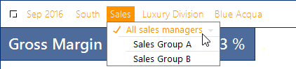
Critical factors in the efficiency of the filter function are which filter attributes are available – and also: how many. Especially in reports intended for many recipients, it is good to have simple settings options: There should be just a few attributes – the most important ones, not as many as possible! This particularly applies if the reports are to be used on mobile devices such as iPhones or iPads, which have to make do with relatively small screens and reduced operation.

Which and how many filter criteria are displayed depends on how the reports were set up. With DeltaMaster, you can determine precisely which attributes should and should not be available. That is good news for everyone who feels that there are too many filter criteria on offer: Report editors can control whether to make work as easy as possible for the report recipients or to grant them maximum freedom. The key to setting up the reports is the filter context. This should always be given special attention.

Dimensions in the filter bar

To explain the adaptation options, we will first explore which attributes are offered in the filter bar in Presentation Mode. Generally, all dimensions from the analysis model are eligible. DeltaMaster goes to great lengths to keep the display as clear as possible. To decide whether a dimension is displayed (and whether this is only in the detailed view or compact view), DeltaMaster applies the following criteria:

a) Linking of measures and dimensions in the analysis model

b) The perspective of the report

c) The filter context of the report

d) The filter setting (view) of the report, i.e. the stored selection of members

e) The setting for visibility of dimension members and levels

We explain these criteria below.

a) Linking of measures and dimensions

In Presentation Mode, DeltaMaster automatically hides dimensions that are not linked with any measure of the current report; they would have had no effect on the report anyway. In Modification Mode, these dimensions are grayed out in the filter bar.

b) Perspective

Since DeltaMaster 6.1.3, it has been possible to group dimensions, hierarchies, levels, members, and measures into “semantic perspectives” when Modeling, thus laying a kind of mask or screen over the analysis model. Then, instead of having to cope with the full complexity of the model, report editors can hide what they don’t currently need. The hidden attributes are no longer accessible to report recipients either, and are not displayed in the filter bar.

c) Filter context

The filter context works in a very similar way, although it is only effective in relation to report reci­pients. It is used to control which dimensions, hierarchies, levels, and members report recipients should have access to. The settings apply to the compact view and detailed view alike. The filter context is logically sub-ordinate to the perspective: What is already hidden in the perspective cannot be shown again by the filter context.

d) Filter setting (view) of the report

With dimensions that are not hidden because of the mechanisms described above, we distinguish between whether they only appear in the detailed view in the filter bar or also in the compact view (and can therefore be seen by everyone). This primarily depends on which members are selected in the dimensions.

As you will recall, the stylized square at the front in the filter bar is used to switch between the compact view and the detailed view.


In the compact view, DeltaMaster shows all dimensions in which something specific is selected – i.e. something other than the standard member. The standard member is usually the “All member“ of a dimension, for example “All customers”, “All products”, “All cost centers”, etc. So, if specific custo­mers, products, cost centers, etc. are selected (and not “all”), DeltaMaster also displays the dimension in the compact view, otherwise only in the detailed view.

The dimensions in the compact view often also include (but not in the screenshot) the “flat” dimen­sions whose members are all on the same level, such as value type, view of period, cumulation, and scaling. These dimensions have no aggregated members and no non-specific standard member. Instead, something specific is always selected; for example, the members “Actual”, “Current”, “Not cum.”, and “1:1”. Therefore, these members can also be regularly seen in the compact view unless they are hidden, as described in section e) – and as we generally recommend.

e) Setting for visibility of dimension members and levels

When Modeling, you can explicitly stipulate that DeltaMaster, in contrast to the rules in section d), should display or hide specific members. Typical cases for these options are:

  • Some specific members are so obvious that they don’t have to be displayed everywhere. With a budgeted income statement, for instance, you would have to point out that it is budgeted; by contrast, if the income statement contains the actuals, you don’t have to state this. Therefore, it is entirely possible to hide members such as “Actual”, “Current“, etc.
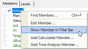
  • Sometimes, you might also want to display a non-specific “All member“ immediately to indicate that this property is avai­lable and can be changed. The default setting of not display­ing a dimension if nothing specific is selected is dispensed with, as an invitation to the report recipients to deal with this attribute and select other, specific members.
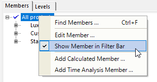
These options affect all reports in the application. If selected members and dimensions are only to be removed from the filter bar in individual reports, you can work with perspectives; see below.

Filter context of reports

Probably the best-known tool for preparing the filter bar for report recipients is the filter context. Many users are familiar with the concept from DeltaMaster 5 under the name “View context”. This is still in place in DeltaMaster 6. It has simply been renamed “filter context“ and linked with the per­spectives.

The filter context is one of the Report Properties. In Modifi­cation Mode when you edit, these can be accessed via the context menu of reports.
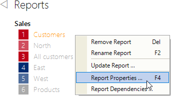
All dimension groups, dimensions, hierar­chies, and levels available for this report are displayed in the structure tree. Available means: All dimensions, hierarchies, and levels of the analysis model except those that are already hidden via a perspective.

You can use the checkboxes to stipulate which dimensions, hierarchies, and levels are to be visible and selectable in Presentation Mode (box checked) and which are not (box unchecked).
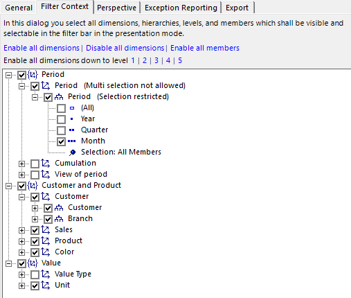
Take note of hierarchies

The customer dimension in the example shows that two hierarchies are enabled: customer and branch. Experience suggests that it is often because of parallel hierarchies like these that report recipients are confronted with more selection options than they would like. Therefore, our tip is this: When setting the context, take note of the hierarchies as well as the dimensions.

Selecting levels

In the period dimension in the example, only one specific level was allowed: month level. In Presentation Mode therefore, the only category of time that can be selected via the menu is months. Years and quarters are grayed out, and can be “drilled down on and rolled up”, but not selected.
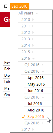
This setting is appropriate for reports with a typical monthly representation in which you want to ensure that the reader doesn’t switch to quarter or year level. Often, the time reference has a major impact on the structure and design of reports, so it is advisable to channel the variation options for the report recipients to reflect the intention of the report. In the standard reports generated by Delta­Master, the filter context is automatically set up in the relevant manner.

With many other attributes, too, it is worth adapting the granularity in the filter bar to the report type or report object. For example, Portfolio Analyses are part of strategic planning, so no daily values are processed in them. And if a Geo Analysis is based on a map that has a resolution of no more than three-digit zip codes, operating errors are prevented by a corresponding reduction in the customer dimension for this report. Adaptations of this kind simplify the interface for report recipients – and remind them that there are clear notions about what you can and can’t do with data.

If levels are excluded, DeltaMaster points this out in the dialog (“Selection restricted“ next to the hierarchy concerned).

Selecting members

In OLAP databases, the selection options intended to be available in Presentation Mode can also be defined as an individual group of members. The selection below the levels is used for this: Via the context menu, you can restrict the selection via member list (using the Dimension Browser) or via MDX Expression (using the MDX editor).
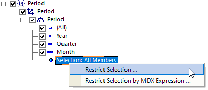
In principle, you know this logic from the Axis Definition of Graphical Tables: There, you can use Level selection, Member selection (“pick list“), or an MDX expression to determine which members are to feature in the rows and columns of the Graphical Table. The same three constructs can be used to stipulate which members are to be offered in the dimension menu of the filter bar in Presentation Mode.

If a selection of members has been defined, DeltaMaster points this out in the dialog (“Selection restricted“ next to the relevant hierarchy), and the context menus of the hierarchy and of the selection contain a further entry for canceling the restriction. If some hierarchy levels are disabled in addition to the selection of members, the intersection, i.e. only the members that are part of an enabled level, can be selected in Presentation Mode.

Allowing or preventing multi selection

A further, often convenient restriction can be stipulated via the context menu of dimensions: that only precisely one member may be selected in Presentation Mode, not multiple ones. This is ob­vious in the case of dimensions whose members are not suitable for addition due to their business logic; for example scenarios, value types, or currencies. In the time dimension, too, it is sometimes advisable to suppress multi selection, particularly if the report contains time analysis members that cannot be calculated for multiple periods or are hard to interpret. The standard reports of DeltaMaster with their cumulations and prior-year comparisons are an example of this – and they are also preconfigured accordingly by DeltaMaster in this regard. If Multi selection is not allowed, DeltaMaster shows this in the dialog next to the dimension.
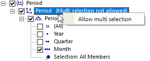
Preselecting filters dynamically

The procedures described above can be used to control which attributes are to be visible to report recipients and interactively selectable. But what should be selected in the starting configu­ration without users reaching for the mouse and setting a filter themselves, or before they do so? You can define a default selection for this (context menu of hierarchies). What is special about the default selection is that it is dynamic. In the filter context, you store an MDX or SQL expression that DeltaMaster evaluates when the session is opened in order to determine which members are to be (pre)selected at runtime. Various criteria can be taken into account here, such as the current date as per the system time or the current user. This makes the default selection a key tool for reducing the number of reports: Instead of preparing lots of reports that differ only in terms of the filter, you can determine the filter dynamically and apply it to a single report. We will address this in detail in the next issue of clicks!. If a default selection has been defined, DeltaMaster points this out in the dialog (“Default selection defined“ next to the hierarchy concerned).
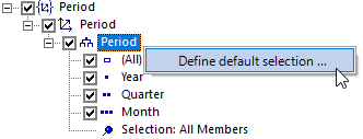
Perspective and filter context

As mentioned above, semantic perspectives have a very similar effect as the filter context – but in Modification Mode as well as Presentation Mode. In Presentation Mode, the perspective of a report is an additional restriction: Only the selection options that are allowed both in the perspective and in the filter context (tab in the Report Properties) are available to report recipients. In Modification Mode, the perspective affects not only the filter bar, but also, for instance, the definition of the filter context in the Report Properties: Only the dimensions, hierarchies, and levels that have not already been hidden by the assigned perspective can be seen there.

One aspect also makes perspectives particularly efficient when designing the application for report recipients: They can be reused. For instance, if the same dimensions, hierar­chies, levels, or members are to be visible and selectable in multiple reports, you can create the corresponding settings once as a perspective (Modeling) and assign them to all relevant reports (Edit, Report Properties, Perspective tab). In this way, the reports are permanently linked with the perspective, and they also adopt subsequent changes automatically.
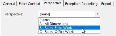
The dialog for defining a perspective (when Modeling) has a very similar structure to the one for the filter context: Perspectives allow you to enable and disable dimensions, hierarchies, and levels via checkboxes, and to select members. In addition, with OLAP databases, it is possible to Fix the selection (context menu of the members). A fixed selection cannot be changed in the filter bar in Modification Mode or Presentation Mode.
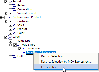
Dimensions that are disabled in the perspective are not displayed even if something specific is selected, for example a fixed member. In this way, filters can be made “invisible“ in selected reports.

Working with perspectives is described in DeltaMaster deltas! 6.1.3, feature 9; we will address this again in more detail in a future issue of clicks!.

Filter context of folders

As with reports, a filter context can also be set for folders (via Folder Properties in the context menu of folders). Please note that this initially applies only if the folder itself is selected in Presentation Mode (and not one of the contained reports). If a filter for a folder is amended in Presentation Mode, this change is passed on to all contained reports – a quick way of setting the filters for multiple reports in one go, e.g. to the current month. The attributes to be available for selection for a collective change of this kind are controlled via the filter context of the folder. If all dimensions are disabled, no folder-wide change is possible. This may also be desirable, for instance, in order to prevent inadvertent large-scale changing of the filter if the contained reports are very different.

In addition, the filter con­text of a folder can be used in order to set the filter context of the contained reports and (sub?)folders. The two additional options below the structure tree are used for this. A distinction is made here between disabling and restrictions on the one hand and enabling on the other. For instance, in the sub-ordinated folders and reports, you can enable (or disable or restrict) everything that is enabled (or disabled or restricted) in the current folder. The corresponding setting is transferred to the sub-ordinated objects when the dialog is closed, once rather than as a permanent inheritance or depen­dency – as would be the case with perspectives, which might well be the more elegant solution in many cases.
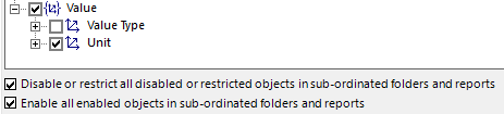
The outcome

With the described procedures, you ensure an uncluttered interface in Presentation Mode and decide which filters can be set. Browsing also relates to this – the dimensions and levels that the Hyper Browser takes into account arise directly from the filter context.

By contrast, the filter context has no direct effect on Navigating. It is possible to offer attributes for Navigating that cannot be selected in the filter bar. The Navigation context is used for designing the navigation attributes; it is described in detail in DeltaMaster clicks! 10/2016 (for reports) and 11/2016 (for measures).

A simple form of a permissions concept can be implemented indirectly through a combination of saved filters and the filter context: by saving a report with filters that users cannot change, or can change only to a limited extent, in Presentation Mode. The differences in relation to database-supported permissions are described in DeltaMaster clicks! 07/2017, including where these are superior.

Making additional selections is easier than deselecting

To finish with, here is some advice from experience: Particularly in larger applications with many dimensions and hierarchies, as a report editor, you can sometimes be unsure which ones should remain in the filter context and which ones should be hidden. In this situation, it is often easier if you first disable all dimensions (a link is specially provided for this on the Filter context tab) and then reenable the most important attri­butes – at least the time (period) and then the most important hierarchy in each case from the few dimensions that constitute the use case, for example customers, products, or cost centers.
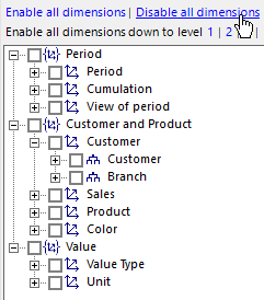
Conversely, if you work on the basis of a full selection and painstakingly check dimension by dimension and hierarchy by hierarchy to see whether it might still be needed one day after all for a special evaluation, a relatively large number of attributes are still left over at the end. The 80:20 principle applies here as well: For most users and most tasks, only a few attributes are required. It is therefore worth designing the central, distributed, frequently used reports in such a way that they work with just a few attributes. And for the few users or situations for which many attributes are required, it may be a good idea to generate an additional report as an “expert view”.


PDF Download

Greetings, fellow data analysts!

Different views for different users. In companies, when working with software and figures, people often need to work with the same type of information, but not necessarily with the exact same information or in the exact same way. Rights are the key to handling this. The same database or the same controlling application can have a different appearance and behave in different ways depending on who is working with it. In DeltaMaster, this applies to reports and folders in applications as well as to the applications themselves. We provide an overview in this issue of clicks! – with read rights for business users and the IT department alike.

Best regards,
Your Bissantz & Company team

First of all, good news: It is not mandatory to maintain internal rights for DeltaMaster. Each (server) database already has a rights concept. This is to ensure that everyone “sees” just the data intended for them. For example, it could be set up in such a way that each sales representative can access just the data of their own region, while the sales controller or Head of Sales can access all regions. For totals (aggregates), special rights can be defined in order to enable across-the-board comparisons (benchmarks). In many cases, data access is therefore already regulated in the database, and all that has to be done is assign the intended report recipients and report editors in DeltaMaster – the people allowed to read and the people allowed to write.

However, if the applications become bigger, if more people work with them, or if different tasks are to be performed, then it may be worth arranging the applications on a user-specific basis in terms of content. This is possible with DeltaMaster: by means of an internal rights concept.

You can see how this works by e. g. having a look at the report list of DeltaMaster. The same application is shown each time in the screenshot below, but from the viewpoint of three different user groups: a regional sales representative on the left, the Head of Sales in the middle, and Controlling on the right.

The report list sometimes includes fewer reports, and sometimes more. Another difference is the button with the pencil (at the bottom), which is used to switch from Presentation Mode to Modi-fication Mode. In the example, this button is available to just one user group, Controlling (on the right). The returned values are identical in all three examples.

DeltaMaster and the databases

As a matter of principle, permissions in the overall system of a DeltaMaster solution need to be defined at two levels: in the database and in the DeltaMaster application. The responsibilities are clearly assigned:

  • For the database, it is stipulated which data the users are allowed to access. Setting these rights is usually a task for the IT department. The relevant tools are part of database management and are of a technical nature.
  • For the DeltaMaster application, it is possible to stipulate which users are allowed to access it – and, if applicable, which parts, namely which reports and folders. Granting these rights is a task for the department that operates DeltaMaster, usually the business department. The relevant tools are part of DeltaMaster and are accordingly easy to use.

The database is decisive when it comes to maximum confidentiality, data protection, and data security. Common database systems provide sophisticated and tried-and-tested protection mecha-nisms for this purpose. These apply to DeltaMaster as well as to all other programs with which the database can be queried. DeltaMaster executes database queries with the rights of the current user or of the user stated at the time of logging in (with the WebClient, if this has been configured; i.e. impersonation). DeltaMaster cannot tell whether there are other users or which data they would see.

The rights concept of DeltaMaster is independent of that of the database. Its task is to control how the users can work in DeltaMaster with the data that they receive from the database in accordance with their database rights. The DeltaMaster concept in this case is geared towards the application. The focal points are efficiency, ergonomics, organization, delegation, guidance, and leadership – it is therefore more about who is and isn’t supposed to see what, and less about who is allowed to see what.

Corresponding to the division of tasks between database and DeltaMaster, rights for different types of object can be assigned with

  • the database objects for which permissions can be managed depend on the respective database system. With Microsoft SQL Server Analysis Services (SSAS), for example, permissions can be set for entire cubes, individual key figures (measures), filter properties (dimensions, hierarchies, dimension members), and even for specific cells (combinations of dimension members and measures).
  • In DeltaMaster, rights can be maintained for reports, folders, the report list, and applications. In this issue of clicks!, we are concentrating on reports and folders.

I see what you don’t see

In particular, the DeltaMaster rights are used so that the same application has a different appearance and behaves in different ways depending on who is working with it. Here are a few example scenarios in which rights are beneficial:

  • Taking account of different tasks in the business department
    The field-sales team uses reports as report recipients without creating them or changing their structure; by contrast, in-house staff must be able to do this. Some reports are only to be processed by Controlling.
  • Mapping different operational functions in the same application
    Reports for different tasks are stored in the same DeltaMaster application, e.g. for Purchasing and Sales. Some reports, for instance regarding development of the margin or analysis of price effects, are relevant to both areas, and some are only needed by Purchasing or Sales. It is easier and there is no unnecessary distraction for the other department in question if these reports are hidden on a user-specific basis.
  • Assigning administration and operational use
    In planning applications, most reports serve as an input screen for the planners. In addition, project managers, application-support staff, and administrators have access to reports with which they can manage and monitor the process. Only these people are allowed to have access to these reports.
  • Synchronizing visibility in DeltaMaster and access in the database
    Different rights apply in the database so that each sales representative can only access the data of their own customer base. By contrast, the Head of Sales can view all areas as well as the aggregated values. There is a report for each region in the report list. If someone opens the report of a region without having rights to this region in the database, the report remains empty, although it is still displayed in the report list. That is why it may be a good idea to reproduce the different rights from the database in the reports. (This situation often occurs if a report list contains a large number of static reports with an identical structure in which various members of the same dimension are applied across the board, for example all regions or branches. In these cases, it is often easier to use just one report but to structure it in such a way that it is dynamically dependent on the current user, instead of managing a large number of rights for a large number of reports.)
  • Developing, testing, and approving reports
    A report editor is working on new reports for an existing application, but does not want to make them available to other users until all the finer points have been resolved. Until then, the reports remain in a “working folder”, which is visible to report editors only. To make the report available to pilot users and ultimately the general public, it is sufficient to define correspond-ding rights or simply move the report to a folder to which suitable rights already apply.

Simple protection against unwanted queries can also be achieved through the resources in Delta-Master alone: Presentation Mode is the only mode available to users who are classified as report recipients. In turn, this mode can be restricted by the filter context in such a way that only highly specific data can be retrieved. However, this obviously only applies to DeltaMaster, not to other query tools. There¬fore, when it comes to insurmountable access control that also protects against malicious and technically adept users, the database is the first line of defense.

Streamlined management apparatus

Two tools are available for managing DeltaMaster rights: DeltaMaster Role Management and DeltaMaster itself. The respective tasks are clearly delimited and facilitate the division of work between the IT department and the business department, as well as within the specialist department.

Rights for applications

DeltaMaster Role Management (DeltaMaster 5: Repository GUI) relates to applications and user groups. This tool is used to assign users to groups, activate the applications that are meant to be available to a user group, and stipulate the role in which the group can work with this application, i.e. the scope of functions that DeltaMaster offers them.

Report Recipients can use the application in Presentation Mode only, while Report Editors can also use it in Modification Mode; Application Administrators manage access rights. The screenshot shows that the “Gross Margin” application is activated for the “Sales” user group and that this group can access the application as Report Recipients. Other (or no) roles can be set for the “Administrator” and “Controlling” user groups.

If DeltaMaster is to apply rights within an application as well, activate the corresponding check box in the Files section. This makes it possible also to set rights for the reports and folders in this application. If the option is not activated, a simplified rights concept comes into effect for this application: User groups can be associated with the entire application in predefined roles (Report Recipient, Report Editor, Application Administrator, etc.).

If rights are to be changed and saved in an application, open the application via the options dialog box (context menu of a tile on the dashboard) and additionally with exclusive write access. In DeltaMaster 6, this access is also granted subsequently if you switch to Modification Mode in the already open application and no-one else already has exclusive write access. If you are a member of multiple groups, go to the Options dialog box and select the group you intend to work as a member of.

Rights in applications

Directly in DeltaMaster, in the Windows client, set the rights that apply “within” the application, mainly for reports and folders. To do this, it is necessary to grant rights, as described above, and to have sufficient rights, for example because you are opening the application as the Application Administrator or have been given appropriate permission as a Report Editor.

When you edit in Modification Mode, you reach the rights via the context menu of the respective object: Report rights in the context menu of reports, Folder rights in the context menu of folders, and rights for the entire report list in the context menu of the Reports heading. In addition, the rights can be defined for the application in the application menu (top left, ).

The rights for the selected report or folder are displayed in a dialog box (see the following screenshot), separated according to user group, and can be edited there if you have the corresponding permission.

Entries in brackets arise from inheritance (passing on), and those without brackets are set directly for the relevant object. Entries written in gray cannot be changed. This is always the case when there is no permission to grant rights, and when there are user groups with the role of Application Administrator (no rights can be taken away from them).

The following Rights can be set:

  • All: Groups together all other rights.
  • Display: Relates to the display in the report list. If this right is denied, DeltaMaster does not display the report or folder to these users. The report does not exist for the search function either, and links to this report are not available.
  • Editing: Relates to the behavior of DeltaMaster in Modification Mode. If this right is denied but display is permitted, DeltaMaster behaves in Modification Mode in the same way as in Presentation Mode. For example, the structure and properties of Graphical Tables cannot be changed, and saving of the report is not possible.
  • Right Management: Relates to the setting of these particular rights. This allows delegation of the administrative tasks.

If you pass on the Assignment Mode, the settings are also applied to the contained reports and to (sub)folders. Passing on is not possible for reports.

Essential condition: Repository

To manage rights in DeltaMaster applications, it is necessary to have a central authority that checks which user is working with the system and, on this basis, decides which information and functions are to be offered to the user. This authority is the DeltaMaster Repository, a component for database-supported provision and management of DeltaMaster applications, rather than in the form of the familiar DAS files. No permission management is possible with these; only the Repository can do this. A general overview of the properties and tasks of the Repository can be found in DeltaMaster clicks! 01/2015.

Know what you’re doing before you do it

Many issues of clicks! end with an invitation simply to try it out yourself. Rights are an exception – there are reasons why only a few people in the company are entrusted with rights management. Although you cannot lock yourself out (DeltaMaster would warn against this), many and diverse interactions have to be borne in mind, and the more detailed the concept, the more interactions there are. As is so often the case, the simple solutions are the best. Just think of the database. In DeltaMaster, rights at application level are often enough – who is a Report Recipient in which application, who is a Report Editor, who doesn’t need to see them at all? If more detail is required, use a top-down approach. And this last tip is always useful: If there’s anything we can do for you, get in touch with us!

Diagrams dominate our times. The more image-like they are, the less we can control their impact on us. Pictures burn deep into our brains before our conscious mind can prevent permanent damage when they are wrong. Financial media is far away from taking the resulting responsibility as serious as it is. Arm yourself.

My thesis about data mining in financial controlling was very much inspired by the work of Gregory Piatetsky-Shapiro. This was back in 1993. Gregory is still one of the leading minds in knowledge discovery. Recently, he asked for contributions dealing with the use of data in fake news. Knowing that the format of our doom chart story would not fit into the scheme, we submitted a video clip.

Sie sehen gerade einen Platzhalterinhalt von YouTube. Um auf den eigentlichen Inhalt zuzugreifen, klicken Sie auf die Schaltfläche unten. Bitte beachten Sie, dass dabei Daten an Drittanbieter weitergegeben werden.

Mehr Informationen

Undooming the Chart of Doom – Do you know how?

Doom charts, again and again, are a common sin of financial publications. Our most current finding was in German newspaper Welt.

Believe it or not: Despite the knowledge financial media is claiming to have, the cheapest scaling tricks are used to unsettle the financial world. The mechanism is vicious: Stock markets react to sentiments. Even when you are aware of fraudulent scaling yourself, you have to take into account that others don’t and sell or hold stocks due to unfounded hysteria.

On marketwatch, an influential platform, another version was published a while ago, citing my beloved Wall Street Journal. It allegedly showed frightening parallels between the then current development of the Dow Jones index and the time right before the Great Crash. The comments on marketwatch prove that even professionals failed to identify the erroneous scaling.


Fake news in the name of the Wall Street Journal, which knew how to scale stock quotes correctly for decades. Source: marketwatch.com.

Actually, I hate to republish the original, because it will increase the damage. Processing of images are too fast to be controlled by our conscious mind. In our brains, we store images as undeliberately as deeply. Other than figures or text, it is hard, maybe impossible, to overwrite a wrong image in the brain. It rather seems that a correct version will be stored side by side with the wrong one and both tend to endlessly fight with each other with no winner.


See the animation for how far the scaling was bent to create parallels where there aren’t any.

In our animations we show how the trick is done: With no respect for the actual dynamic of the data, scales are stretched until the slopes look alike. You can do that with any two time frames that show some increase or decline. The Wall Street Journal itself promotes a textbook that warns in four places not to do so and explains how to scale fairly.


Fair scaling is easy: Same dynamic on both scales.

The Wall Street Journal is renowned for daily publishing of fairly scaled stock quotes, because with stocks fair scaling is most obvious as the order of magnitude of stock prices is irrelevant and no information is lost when prices differ much on both scales.

Gregory asked us to add a blog to our clip. We were happy to do that.

PDF Download

Greetings, fellow data analysts!

In the past, when there was still a number of different search engines on the Internet, they were divided into two different categories: catalog-based and index-based. Catalogs such as DMOZ, Yahoo, and web.de arranged websites into a given structure, whereas index-based services such as Google or Bing prepare websites for individual search queries. Catalogs barely feature on the Internet these days – perhaps because the Internet is too unstructured for them. In business intelligence applications, it is a different story: They have a structure, and the catalog is the dominant gateway to it. In lists and tree structures, you are presented with what there is, and you select what you need. With DeltaMaster, the other route is also open to you: If you already know what you need, a search query is usually much faster than the catalog. Everything worth knowing about this can be found in this issue of DeltaMaster clicks!.

Best regards,
Your Bissantz & Company team


A search function is always practical when you know what you want: which customer, country, product group, company, cost center, month, year, etc. is to be displayed. Instead of selecting the desired objects from lists or tree structures, for instance, you enter the name of the search object via the keyboard.

DeltaMaster provides a search function for the following tasks in Presentation mode:

Selecting dimension members (filter attributes) for report or folder Filter bar, menu bar
Displaying folder or report Menu bar
Finding members, member properties, and measures in the report Context menu of Graphical Tables


There are two further options in Modification mode:

Selecting dimension members for axis, named set, or virtual hierarchy Dimension browser
Selecting measures for axis or filter bar Measure browser

Simple member search in the filter bar

The search function in the filter bar is particularly easy to use – in the area above the report where it is possible to see and set which filters act on the report.

Right-click on the name of a dimension (of a filter criterion, for example customer or product) or of the previously selected members. A small menu with two buttons appears.

The left-hand button, the one with a simple magnifying-glass icon, leads to the simple search. If you click on the button, it is replaced by an input field. You can also access this input field if you hold down the Shift key and click on the dimension name or member name – users of DeltaMaster 5 are familiar with this shortcut.

Enter the desired name via the keyboard and press the Enter key. DeltaMaster then searches through the current hierarchy and compares the names of the members with the entered string.

  • If precisely one matching member is found, DeltaMaster selects it automatically.
  • If multiple matching members are found, DeltaMaster displays them in a list.
    • To select precisely one member from here, click on it once. The selection is adopted immediately and applied to the report.

    • To select multiple members, hold down the Ctrl key and click on the desired members one by one. Selecting a range is also possible with the customary key combination of clicking on the first or last member of the range while holding down the Shift key (after having selected at least one member with Ctrl+click). The selection is adopted and applied to the report as soon as you press the Enter key or right-click on one of the marked members.

    • To preserve the current filter settings instead of using the displayed members, press the Esc key or click anywhere outside the list.

The simple search works in the Windows client in Presentation mode and in Modification mode as well as on the web and in the App for the iPhone/iPad.

In the App, start the search by moving the dimension that you want to search through to the left. By doing so, you will reveal a Search button on the right-hand side.

In the hit list, tap on a check box to select the member. As soon as you cancel the search, the member is set as a new selection.

Options for text comparison

When searching via the filter bar, Delta­Master compares the entered search term with the member names. The Options (accessible via the gear wheel    in the menu bar) determine the relevant part of the name: the whole name (i.e. the search term must fully match the member name), the start, the end, or any part of the member name. The last option is the least specific and delivers the most hits. The default setting is: start of member name.

Extended member search and member selection in the filter bar

The right-hand button, the one with the magnifying glass and a plus sign, opens a dialog box that offers additional search options. This inconspicuous dialog box packs a punch!

Its functions include restricting the search to specific hierarchy levels. This makes the search more specific and occasionally faster, for example if customer or material groups are sufficient and the lowest level, at which there might be tens or hundreds of thousands of members in some applications, can be excluded.

Particularly interesting are the ways in which the search results can be used if there are multiple hits.

After you have entered a search term and confirmed this with the Enter key, DeltaMaster displays the number of members found, bottom-left in the dialog box, and opens the menu for member selection in the background. With the Find Next and Find Previous buttons, DeltaMaster moves from one hit to the next in the menu and highlights it in orange letters. Members on deeper, initially invisible levels are also taken into account; if necessary, DeltaMaster opens the corresponding branch in the menu automatically. However, the colored marking alone does not yet count as a selection – you have to click on a member for it to be selected and provided with a check mark to denote this. The customary key combinations apply: Ctrl+click for multiple selection, Shift+click for selecting a range. The search dialog box remains open while you are working with the menu behind it. Even when you close the dialog box, the member menu remains open. To close the menu and adopt the selection as a filter setting for the report, press the Enter key or click anywhere outside the menu.

The Selection button allows you to carry on working with the set of found members. The three available options refer to the relationship between the found members and the current member selection – i.e. the members already provided with a check mark in the menu at the back. Example:

Selected: Found: If you apply the following action to the Selection …, the following are selected:
Bath
Brighton Salisbury
Brighton, Preston Taunton Replace by all found members Brighton, Preston Taunton
Add all found members Bath,
Brighton, Preston, Salisbury, Taunton
Remove all found members Bath,
Salisbury


As the dialog box also stays open after replacing, adding, or removing members, the search and selection processes can easily be applied repeatedly in order to set the ultimately desired filter in stages.

If you expand the dialog box with the corres­ponding button, DeltaMaster accepts multiple search terms, not just one. Multiple members can be entered at once in the left-hand field (or, for example, copied and pasted from Microsoft Excel); the hit list is displayed on the right. This is very useful e.g. if the Sales requests an evalua­tion for a whole list of customer numbers or material numbers.

This multiple search, as it is known, is described in DeltaMaster clicks! 08/2010; we will address it again in one of the forthcoming issues.

Universal search in the menu bar

Another, very easy-to-use search function is accessible via the menu bar. This is shown if you move the mouse over the area at the very top of the window. The search function includes the icon with the magnifying glass as well as the input field to its right.

When you click on the icon or use the key combination Ctrl+F, a small dialog field opens. Enter the desired term there and use the check boxes to select which DeltaMaster objects are to be searched through: Folders, Reports and/or Dimension Members. Start the search by pressing the Enter key or clicking on the Search button.

The search results are displayed in the bottom part of the dialog box, grouped into folders, reports and dimension members. Click once on the results to display or select them. The dialog field remains open and in the foreground, enabling you to move from one report to the other or set various members as filters quickly, for example.

The search function is extremely thorough with reports: It takes note of the content of the reports as well as their names. For instance, the measures and dimension members found on the axes and even report comments (except database-supported comments) are taken into account. This way, for example, you can track down all reports that mention a specific cost center, a specific customer, or a specific key figure. An essential condition for this is that the reports are calculated. If needed, you can ensure this with the corresponding check box.

When searching in dimension members, DeltaMaster takes into account all dimensions and levels that are available in the current filter context (View context) or in the current perspective. It is irrelevant whether the simple filter bar or the expanded filter bar (via the  icon) is displayed. This way, expanded filters can be set without showing the full dimension selection – or without knowing exactly to which dimension (of several that sound the same) a member belongs. If you click on one of the found members, DeltaMaster selects it immediately and sets it in the corresponding dimen­sion as a filter. A prior selection is replaced in this case. Therefore, precisely one member is always selected; there is no provision for multiple selection here. As with reports and folders, the dialog field remains open and in the foreground after you have selected a member. In the default setting, dimension members are not included in the search and reports are not calculated (the check boxes are deactivated), in order to accelerate the search.

Instead of opening the search dialog box and entering a term, you can alternatively enter the term in the search field of the menu bar; the Enter key then opens the search dialog box with the entered term.

In addition, via the search field, it is possible to open a specific report or folder directly if you know its ID. To do this, enter “#Rx” or “#Fx” in the field, with “x” standing for the ID of the report or folder respectively. This ID is displayed as the report or folder ID in the Report or Folder Properties; alternatively, it is displayed as a tool tip, if you hold down the Alt key and point the mouse at a report or folder in the report list. The syntax for this direct retrieval is displayed as a tool tip for the search field. The abbreviations used in DeltaMaster 5 for report types can also be entered as a search term, for example „PIV“ for Graphical Tables (pivot tables) and „PFL“ for portfolio analyses.

The search field only exists in the Windows client, and not in the WebClient or the App.

Finding members, member properties, and measures in the rows of Graphical Tables

A search function also makes navigation within reports easier: In the Windows client, it is possible to search through the row axis of Graphical Tables. This is particularly useful in long tables with customer names, material numbers, account names, and the like. This type of search is started via the context menu of members, member properties, or measures in a Graphical Table.

At the very top of the relevant column, an input field then appears in which you enter the desired search expression. During entry, after each character is entered, DeltaMaster searches for the search term anywhere in the member names, the property values, or the measure names. Hits are highlighted in orange.

With the F3 key, DeltaMaster moves to the next row containing a hit, and with Shift+F3, it moves to the previous row containing a hit. To exit search mode, press the Esc key or click on the “x” on the right in the input field. The search term is always searched for as part of the member name, measure name, or property value, and is case-sensitive.

Searching in Modification mode

The above tips on searching apply to report recipients and report editors alike. The latter will find a search function in two further places in edit mode: in the Dimension browser and in the Measure browser.

In DeltaMaster 6, the Dimension browser is hardly ever needed – the most frequent work is now done with the menu in the filter bar. When you edit Graphical Tables, the Dimension brow­ser is used in the context of Axis definition in order to stipulate a member selection (“pick list”). For the corresponding task, it is also available when modeling, namely in the Editor for calculated members and in the filter bar, in order to create or edit custom hierarchies and calculated members. In the Dimension browser, the search is started with the key combination Ctrl+F, via the context menu, or via the I want to menu. The search dialog box described above is opened, giving you options including stipulation of the level to be searched through and adoption of the found members to define the selection.

The Measure browser also has a search function that is started with the key combination Ctrl+F, via the context menu, or via the I want to menu. Its operation and way of working are the same as with the search via members.

Searching with placeholders

Under specific conditions, you can use the familiar placeholders “?” and “*” when searching through members and when filtering member names and member properties. The question mark stands for any one character, and the asterisk stands for any number of characters of any kind, including no character or just one. To escape the effect of the placeholder characters, place them in square brackets: “[?]” or “[*]”.

DeltaMaster supports this function in conjunction with Microsoft Analysis Services and the ASSP (Analysis Services Stored Procedure Project, asstoredprocedures.codeplex.com) extension.

What I learned behind the wheel: When designing management reports there is a lot we have to learn from race car drivers. Part 1: From lap times to Neuroscience to the sudden death of diagrams.

Lesson one – Stucki’s eyes led me the way

The eye movements of world-famous race car driver Hans-Joachim Stuck taught me the first lesson: Together we went to the “Ring”, the legendary race track in Germany. Stucki put eyetracking glasses on his nose and we gathered 20.000 pictures of what he is focusing on while driving his superfast race car. Analyzing this big data set we found out: Movement and contrast direct the eye inevitably – even when it does not help to decide what to do next. Pros like Stucki however learn to strictly keep their eyes on only what is relevant, despite all distractions. There is a racing line for the car with more or less obvious points where to brake, corner, accelerate. And there is a corresponding gaze line with points to look at, in order to derive the racing line. See our documentary for more.

Lesson two – Gerhard defined the costs of thinking for me

From Germany’s most renowned neuroscientist Gerhard Roth I learned: Our conscious mind is terribly limited. It works only sequentially and holds merely four slots. I concluded: Understanding even the simplest table will force the brain to load and reload these slots hundreds of times. A bad sequence will be strenuous and ask for processing capacity that exceeds the time given between phone calls, meetings, and text messages. So, I asked myself, what is the racing line for human number processing, what is the corresponding gaze line for reports?
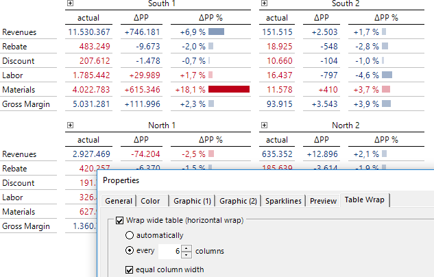
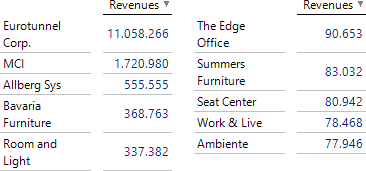
Lesson three – Diagrams are a detour

The Scottish scholar William Playfair invented most of the diagrams which are in use today: bar charts, line charts, pie charts. This was 200 years ago. We live in times that put pictures over words and tables. To guide the eye many reports rely on William’s picture-like diagrams. It is time to think new: A simple sketch of a cat provokes a real cat in the right side of our brain. A bar or a line remains geometry that has to be decoded. To understand numbers, we need the left side of our brain that is made for abstract and logic thinking. Seeing profit and loss in bars and lines brings the two sides of our brain in conflict.

Lesson four – Back to numbers

Everything we can count increases in size, space, volume, or weight when there is more of it. Why not numbers? Tag clouds make even letters bigger, when words appear more frequently. Why not numbers? Contrast is leading the eye. Bigger means closer, nearer, more contrast. Graphics size geometry to add contrast to a number. Why not scaling the number instead? This is what I suggest for numbers to guide the eye and leave its interpretation to the left side of the brain where they have to be processed anyway.

PDF Download

Greetings, fellow data analysts!

Management information is not about the decimal places – control¬ling is not accounting. Decision-oriented management reports make an impression when they report on an appropriate scale, i.e. in thousands or millions, whichever applies. That way, numbers are shortened to the key digits, making them easier to read and understand. We explained how this can be done in DeltaMaster some time ago. In DeltaMaster 6, it is even more elegant: The “whichever” is now dealt with automatically, too. Here, we present the new method and revisit the methods that you already know.

Best regards,
Your Bissantz & Company team

Three methods are available for displaying numbers in abbreviated form to the nearest thousand, million, or billion:

  1. Automatic compact display
  2. Formatting and scaling of measures
  3. Formatting using calculated members

The first method is the most recent in DeltaMaster and the easiest to apply: Just activate the respective option, and the numbers appear in the report or throughout the application in a concise, decision-oriented notation.

You can find a comparison of the display with the numbers written out in full and the new compact display on the next page.

Numbers written out in full  
Compact with K, M, B  
Compact with apostrophes  

The great thing about this automatic feature is that units can be entirely mixed: In the very same table, row, or column, some figures can be formatted in millions, others in thousands or billions, and the very small ones can be written out in full. This may seem surprising at first glance – but you will soon discover how easy on the eye these figures are, and how clear and distinct they look to us when the clutter of the less significant decimal places is removed.

In addition, if reports are scaled insensitively and indiscriminately with just one factor, strange num­bers often arise. We don’t talk of 0.1 million if we mean 100 thousand, or of 0.01 million or even 0 million if we mean 10 thousand. In this respect, formatting by DeltaMaster is in line with natural parlance: In the report, the numbers are set out as they would be pronounced in a meeting or on the phone.

The look of figures of different magnitudes can also be interpreted, for example amounts in the low millions and high thousands: The thousands have more digits, more digits means more detail, more detail means smaller values, and small values means less important. The large, important figures are short and simple. This makes the compact notation a wonderful, pragmatic tool for decision-oriented reports.

And the compact notation also makes life easier for report editors, as the formatting automatically adjusts to fit the respective values set out in the report. So if the user drills down from group to business unit, for example, the change of scale is automatically taken into account.

Compact for everyone, more compact for professionals

DeltaMaster provides two display variants, as shown above:

  • The variant in thousands (K), millions (M), and billions (B) is the preferred choice for reports that are aimed at a wider audience. The abbreviations are widely used, including outside of controlling, and need no further explanation.


  • The variant with apostrophes (one apostrophe for the thousand factor, two for millions, three for billions) is particularly compact. It is quite widespread among professionals: In meetings, it is common for a couple of figures on a flip chart to be appended with a little stroke, an apostrophe, to denote thousands, and with a second one to denote millions. What simplifies writing on a flip chart also makes the report easier to read and can be learned quickly, even though it is not yet standard everywhere.

No further settings or parameters are required. Percentages are excluded from the display regardless of how large they are. The display has no impact on the calculations: DeltaMaster always calculates with the exact values, including decimal places. The figures are exported to Microsoft Excel as num­bers written out in full to their original degree of precision, regardless of how they were displayed in DeltaMaster. Earlier versions of DeltaMaster do not support this formatting, but are not affected by the setting – the numbers are written out in full, as before. In planning applications, enter the numbers in full, not in compact notation.

To activate the display, switch to Modification mode.

Compact display as default in the application

As default for all reports in the current application, activate the display in the options (via the gear wheel  in the menu bar), on the Presentation tab. In appli­cations that you are creating with DeltaMaster 6.1.6 or higher, this is already the default setting.

Compact display in Graphical Tables

In addition, when you edit, you can set the display of numbers for Graphical Tables individually. You can find the options in the Edit menu (on the right) in the Presentation section. In this way for example, you can set the decision-oriented compact notation as the default and produce some “lookup tables” with accounting precision for other purposes. If none of the three options are selected, the general setting in the application options is applied.

An abbreviated display of numbers can also be attained with the following two methods. They are both based on the analysis model, one on measures and the other on (calculated) dimension members.

Formatting and scaling of measures

You can find all relevant settings in a central position: in the Measure Properties on the Format tab (see also DeltaMaster clicks! 02/2014).

Output of values in thousands or millions can be attained in two ways: via a Custom .NET formatting string or via Scaling.

  • Formatting strings come from IT. They describe how a numerical value is to be output as text. For example, they can be used to control which characters are to be used as thousands separators and decimal separators, how many decimal places are to be taken into account, and how negative numbers are to be displayed. This implicitly also means that it is possible to convert numbers to thousands or millions.

The formatting string can either be stated as a constant expression (in the Custom field) or determined dynamically by means of an MDX expression, for example in accordance with hierarchy levels. The link next to the input field for custom formatting opens a Microsoft website that explains the structure of formatting strings (see also DeltaMaster clicks! 02/2008, with an example of filter-dependent formatting with MDX).

  • Scaling is known in the business world as well, and relates to the numerical values themselves: They are converted (divided) and thus transformed. Here too, DeltaMaster calculates internally with the original values. Besides powers of ten, other factors can also be stated here as factors, for example in order to convert units of measurement. In addition, the factor can be calculated by means of an MDX expression. This must return a numerical value, for instance from a reference to the selected member in a specific dimension (for example currency, unit, value view) or in accordance with hierarchy levels.

Formatting and scaling work in parallel: Scaling transforms values, and formatting controls their notation. Scaling is easy to use, but additionally requires formatting (in case of doubt: Number with 0 decimal places). Formatting strings are not exactly intuitive, but if you understand how they work, you can often avoid the need for additional scaling.

The concise notation in K, M, and B set out above can also be achieved with formatting strings:

#,0, „K“ Scaling in thousands, no decimal places
#,0,, „M“ Scaling in millions, no decimal places
#,0,,.0 „M“ Scaling in millions, one decimal place

The comma between the hash and the zero means that group separators (thousands separators) will be output if required; in English, this is usually a comma. The commas after the zero result in the scaling – for each comma, the value is divided by 1,000.

The settings on the Format tab, including MDX expressions, can be saved as a format template for number formats and reused with other measures (I want to menu top right on the tab).

You can access the measure properties in DeltaMaster 6 when Modeling. If the key figure is displayed in the Filter bar, click on it once to edit the properties. Otherwise, click on the three dots after the measures to open the Measure Browser; then edit the properties via the context menu.

Formatting with calculated members

This case too is described in detail in DeltaMaster clicks! 02/2014. Formatting and scaling can be linked to (calculated) members as well as to measures. If applicable, an auxiliary dimension is often provided in the analysis model for this, for example unit or value view. In this way, a specific formatting can be applied to multiple measures, eliminating the need to format them separately. In addition, one measure can be combined with various members for formatting instead of deriving multiple measures with differing formatting from one basic measure.

One special feature is that the formatting members can also be set explicitly in Presentation mode – this is not possible with formatted measures, and neither possible nor necessary with the automatic compact notation.

Calculated members can be edited in DeltaMaster 6 when Modeling. In the Filter bar, click on the name of a dimension to open the Dimension Browser. It is possible to add and edit calculated members via the context menu and the I want to menu. The formatting options correspond to those of the measures, but an MDX expression is not possible here. Scaling is achieved via a calculation using an MDX expression in the Definition field.

The two structure-driven approaches (via measures and calculated members) are tried and tested and an efficient tool for special tasks, usually in larger applications. The automatic compact display is universal and easier, as well as being more effective by virtue of the clever, value-dependent scaling.

Compact in tiles and Sparklines

In the case of two special displays, DeltaMaster uses compact notations as a matter of course:

In zoomed Sparklines, where space is particularly tight, the columns or dots are labeled in a particularly readable manner thanks to the apostrophe short-form.

And on application and report tiles as well, Delta­Master automatically formats large, absolute numbers in a compact manner. Here, K represents thousands, M millions, and Bn billions.

PDF Download

Greetings, fellow data analysts!

Does this ring a bell? The report is long and the screen is wide. Scrolling is tedious and interferes with reading. Help is at hand with the Graphical Tables from DeltaMaster 6: They support table wrapping, which distributes long tables over multiple display columns and wide tables over multiple display rows – dynamically and automatically, depending on the data to be displayed and the available screen space. Some people call this “responsive design” – but it is not a discipline in controlling. Controllers deal with data and what they mean, and are happy to let the design take care of itself. That is why we have provided a brief description here of the check mark you can use to activate the table wrap so that you can quickly get back to working on the data. And we really do mean check mark in the singular: There is just one.

Best regards,
Your Bissantz & Company team

A before-and-after comparison makes particularly clear what a table wrap is – see the next page.

Before: A long, un-wrapped table – or rather an almost empty screen and a list whose length can only be gaged with the scroll bar. Well-versed readers will have a hunch that even though the table starts with good news, such as the pleasing changes at the customers SuperOffice, Bavaria Furniture, etc., at least one piece of bad news will be lurking at the end of the list – the short bar next to SuperOffice suggests this. If you scroll to the end of the table, you will lose sight of the beginning. There would actually still be space here, …

After (see below): The same list in the screen section of identical size, wrapped and readable in full, including the already feared sharp negative variance.

Further suggestions on how to compare positive and negative variances in the same report can be found in DeltaMaster clicks! 02/2015. – The above illustration is an example of a vertical wrap: A long table with one fixed column and one data column is wrapped across three display columns. DeltaMaster repeats the labeling of the columns automatically. The status bar points out the wrap so that you can see that the layout is a result of the formatting rather than of the structure (i.e. in the exam­ple, the revenue is always the same, and there are not three different measures with the same name, for instance).

The following illustration shows an example of a horizontal wrap: A table that was previously too wide, …

… fits entirely on the screen and is easy to read. Again, the screen section is the same as in the continuous display.

Give the wrap a try

You can activate the Table Wrap in Modification mode if you edit the properties of the Graphical Table (Edit menu, on the right) on the corres­ponding tab.

You have already encountered the two alternatives in the above examples.

  • The horizontal wrap is suitable for wide tables: After a number of columns automatically determined by DeltaMaster or predefined by the user, the table is wrapped to the right, and the further columns are shown in a new display row. In figurative terms, what no longer fits at the back of the screen is continued underneath from the front (in a line pattern like a Z).
  • The vertical wrap is suitable for long tables: After a number of rows automa­tically determined by DeltaMaster or predefined by the user, the table is wrapped at the bottom so that further rows are shown in a new display column. In figurative terms, what no longer fits at the bottom of the screen is continued at the side from the top (in a line pattern like a W).

Automatically wrapped is best

Where a choice can be made between automatic and custom in DeltaMaster, we generally recommend automatic. This also applies to the table wrap: In automatic wrapping, DeltaMaster derives the number of columns and rows dynamically from the available screen space in order to make optimum use of it.

In special data situations, you may wish to specify the number of columns or rows, for instance if the report needs to follow a specific symmetry. In the illu­stration on the right, the report already wrapped above is struc­tured with the sales areas in such a way that the sales areas of a region appear in pairs: South 1 next to South 2, North 1 next to North 2.

An essential condition for special cases such as this is normally that the structure of the data to be displayed is constant and the length and width of the report are independent of the Filters (View). In the case of nested axes, the columns and rows on the very inside are counted.

The options for equal column width or equal row height ensure a consistent grid in the wrapped table and therefore, in some cases, a more harmonious appearance of the report. This particularly applies if the labels in the column/row headings have differing lengths or have one row in some cases and multiple rows in others, as shown in the following example – without standardized row height on the left, and with on the right.


The starting point was a table with ten entries and a fixed column width (Properties of the Graphical Table, General tab); the wrap was forced after predefined five rows.

Editing a wrapped table

The table wrap is highly dynamic. An essential condition for that is a dynamic environment in which DeltaMaster has absolute authority over the output. This results in certain limits regarding use, namely by other programs (Microsoft Office, web browsers) and by other DeltaMaster functions that compete with the table wrap for control of the precious screen space. For instance, in the event of export, the table wrap is only retained if you export the table as an image; the WebClient does not support the table wrap currently. Automatic row and column structuring (separation) cannot be used concurrently with the table wrap. The analysis functions Zoom and Navigate, searching on the row axis, and displaying as Small Multiples are also not possible in wrapped tables. (Incidentally, the display of Graphical Tables as Small Multiples also adapts very well to the available screen space; despite different concepts, a certain similarity with the table wrap may be seen here.)

Apart from this, the table can still be adapted and structured in Modification mode. For example, you can:

  • change the structure of the table by adding, removing, or changing the sequence of dimensions and measures;
  • calculate and display variances (Magic Button Deltas);
  • display graphics and Sparklines (Magic Button Graphic or History or the Edit menu);
  • calculate and display shares (Magic Button Share);
  • drill down and roll up branches; and
  • display and hide member properties (context menu).

In particular in operational reports, e.g. evaluations of customers, products, or materials – you can make the reports much easier to read with the table wrap. Give it a try now!

Nicolas Bissantz

Diagramme im Management

Besser entscheiden mit der richtigen Visualisierung von Daten

Erhältlich überall, wo es Bücher gibt, und im Haufe-Onlineshop.