“Executives want their data condensed, their information all on one page.” Rolf Hichert* puts it in a nutshell. But people obviously like to misinterpret him, as the marketing offensive for management speedometers shows.
Good management reports compress the information required to direct the business into a single-page report. To do this, the information that is usually spread over several pages has to be brought onto one page without any loss. Management speedometers do not compress, they reduce.
Management speedometers need enormous amount of space.
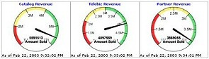
A typical dashboard display, scaled down
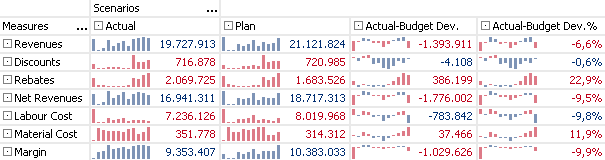
In the space taken up by just three (!) speedometers, the DeltaMaster pivot table cockpit in our example delivers around sixty times more information: seven parameters in four value types make up a data matrix containing 28 values. Since the last, up-to-date figure won’t tell you much without a time context, Sparklines add 12 monthly values in the form of a bar chart to each data cell. (The final, thirteenth bar represents the current figure and is therefore not counted as one of the twelve.) This makes a total of 364 values. 364 items of information as opposed to 6, if you include the speedometer’s statement of whether the current value is in the red, yellow or green zone.
And if you find a convincing means of representing where a value belongs on the color scale, this statement can also be integrated in an informationally dense report in a simple and space-saving way.
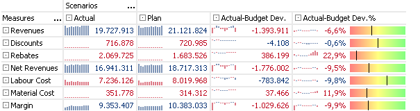
However, it is no easy task to develop a schema, understandable to everyone, that can carry out convincing context-sensitive allocation of figures to color areas. While high revenue in a month that is usually weak deserves a lot of green, the same doesn’t hold for the same value in a month that is normally strong. We believe that the best way to represent figures is still to actually show them.
* Prof. Rolf Hichert, is report 6/2005, p. 16
Our contribution to condensed and compact information design …
Read more:
Part I – Dashboard or trashboard?
Part III – Road signs, not red lights
