Do we have to falsify data?
We have to falsify data
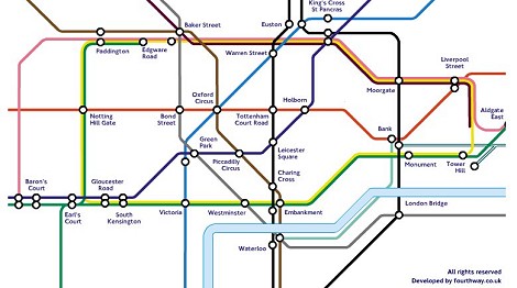
Please don’t take the headline too seriously. Nevertheless, one of the best examples of the necessity of having to falsify data in order to present it in a suitable form, is the map of the London Underground (the “Tube Map”). Its creator Harry Beck’s 1931 design is today rightly considered a classic of sound information design. Since a correct geographical representation of the network is irrelevant to the information purpose – quickly orienting oneself underground – Beck did without it. Instead, he concentrated on the idea of a simplified, straightforward aid to finding one’s way around. The map simply contains the names of the stations and lines connecting them that are either vertical, horizontal or at a 45 degree diagonal.
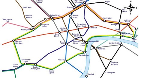
This is how complex the London Underground actually looks …
… and this is how it looks in the latest design.
We may not falsify data
According to Bild.de, when two planes passed very close to one another south of Greenland, it was not a “near miss,” but a “near catastrophe,” that “almost cost the lives of over 400 passengers and the crews.” According to Bild.de, the distance between the airplanes, according to airline information, was only 183 meters (the critical distance between two planes is approx. 300 meters).

The fact that this figure was the vertical distance and that the two airplanes had a horizontal distance of 1.8 kilometers between them was only mentioned in other publications such as Spiegel Online, Der Standard and n-tv.de.
An inexhaustible source of uncovered lies is the Guenter Wallraff-style Bildblog.de. Devotees of the truth contribute information daily with the aim of bringing errors to light.
