Diagrams dominate our times. The more image-like they are, the less we can control their impact on us. Pictures burn deep into our brains before our conscious mind can prevent permanent damage when they are wrong. Financial media is far away from taking the resulting responsibility as serious as it is. Arm yourself.
My thesis about data mining in financial controlling was very much inspired by the work of Gregory Piatetsky-Shapiro. This was back in 1993. Gregory is still one of the leading minds in knowledge discovery. Recently, he asked for contributions dealing with the use of data in fake news. Knowing that the format of our doom chart story would not fit into the scheme, we submitted a video clip.
You are currently viewing a placeholder content from YouTube. To access the actual content, click the button below. Please note that doing so will share data with third-party providers.
Undooming the Chart of Doom – Do you know how?
Doom charts, again and again, are a common sin of financial publications. Our most current finding was in German newspaper Welt.
Believe it or not: Despite the knowledge financial media is claiming to have, the cheapest scaling tricks are used to unsettle the financial world. The mechanism is vicious: Stock markets react to sentiments. Even when you are aware of fraudulent scaling yourself, you have to take into account that others don’t and sell or hold stocks due to unfounded hysteria.
On marketwatch, an influential platform, another version was published a while ago, citing my beloved Wall Street Journal. It allegedly showed frightening parallels between the then current development of the Dow Jones index and the time right before the Great Crash. The comments on marketwatch prove that even professionals failed to identify the erroneous scaling.
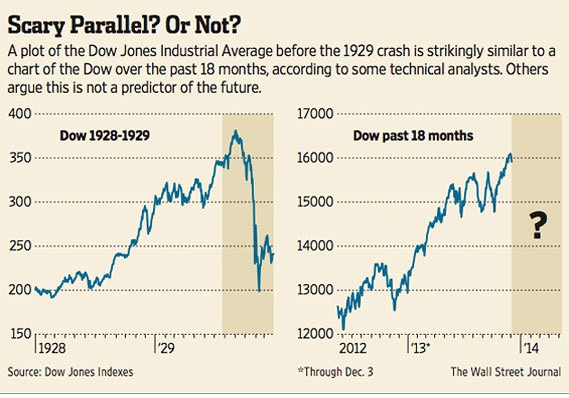
Fake news in the name of the Wall Street Journal, which knew how to scale stock quotes correctly for decades. Source: marketwatch.com.
Actually, I hate to republish the original, because it will increase the damage. Processing of images are too fast to be controlled by our conscious mind. In our brains, we store images as undeliberately as deeply. Other than figures or text, it is hard, maybe impossible, to overwrite a wrong image in the brain. It rather seems that a correct version will be stored side by side with the wrong one and both tend to endlessly fight with each other with no winner.
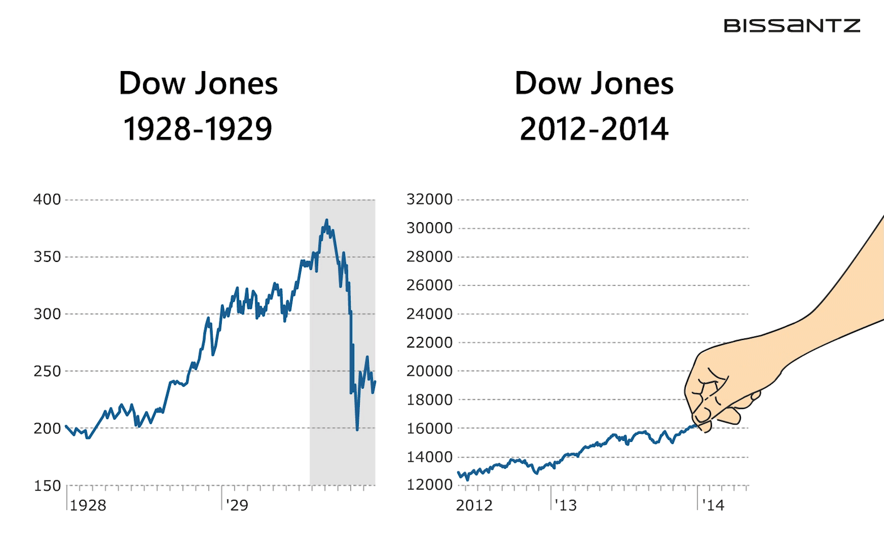
See the animation for how far the scaling was bent to create parallels where there aren’t any.
In our animations we show how the trick is done: With no respect for the actual dynamic of the data, scales are stretched until the slopes look alike. You can do that with any two time frames that show some increase or decline. The Wall Street Journal itself promotes a textbook that warns in four places not to do so and explains how to scale fairly.
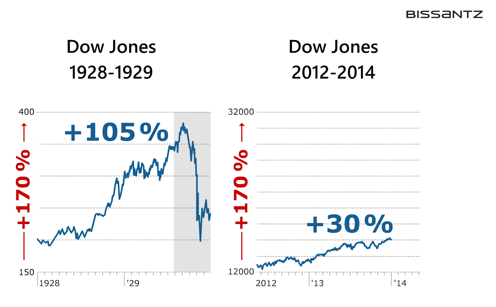
Fair scaling is easy: Same dynamic on both scales.
The Wall Street Journal is renowned for daily publishing of fairly scaled stock quotes, because with stocks fair scaling is most obvious as the order of magnitude of stock prices is irrelevant and no information is lost when prices differ much on both scales.
Gregory asked us to add a blog to our clip. We were happy to do that.
