The recent European Union’s summit was exhausting. Not just for politicians but also for information designers. Comparing two measurements is (in some cases) already tempting. Three is even harder. In the discussion about weighing of votes among members of the European Union it’s even been five: population, distribution of votes in the treaty of Nice, in the proposal for a European constitution and in the Polish proposal based on a square root model and finally the number of members in the European Union. The German newspaper “Die Welt” as well as the “FAZ” use graphic tables, the regional paper “Nürnberger Nachrichten” a business chart.
 |
 |
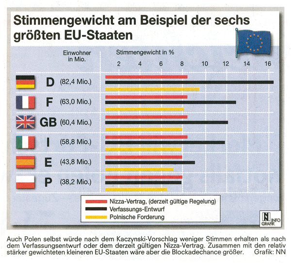 |
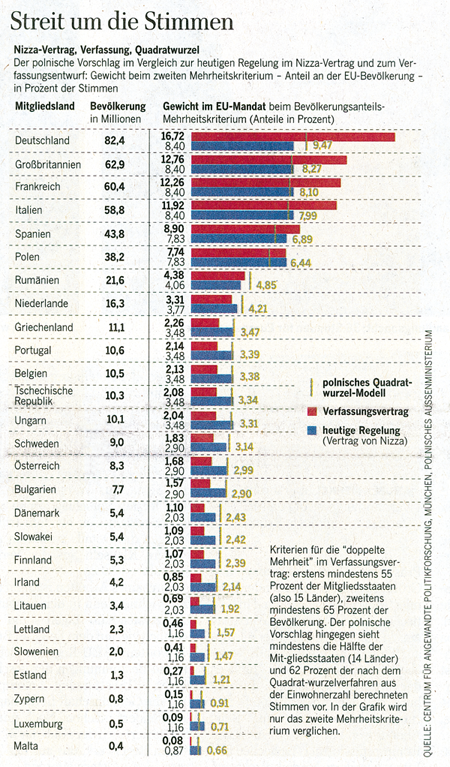
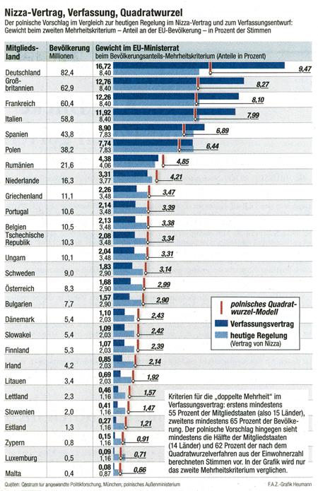
| Die Welt | FAZ | Nürnberger Nachrichten |
Die Welt is acceptable. However, the light green for the Polish model is hard to read.
The FAZ uses an iterating background. Needless and annoying. Really bad is the label for the Polish model. The lines in the label dominate the bars. The eye compares the lines’ lengths although these have no meaning.
The idea of the Nürnberger Nachrichten is o.k.: you easily distinguish the three distributions. But color is a catastrophe. The bars are flickering before my eyes. That it’s also the color of the German flag is odd. All explicit values are missing and the smaller countries are missing, too.
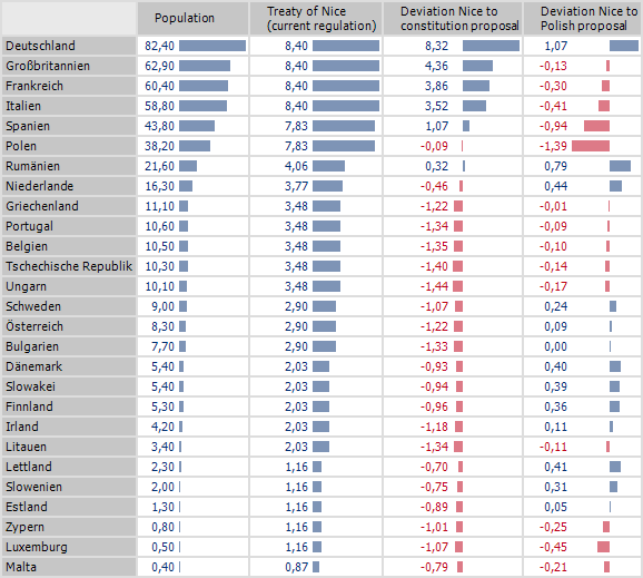
An alternative is to look at the deviations compared to the current regulation: