The stock market in the Financial Times is funny as well. Thanks to the headings. It gets even more funny when there is no heading at all. Have a look. A DIY-chart: You have to think about it what it’s supposed to say. Probably, that Indian Equities rose by 20 % (= (24-20)/20)? Or, that Indian Equities lately rose by 10 % (= (24-22)/22)?
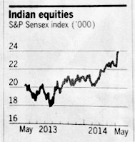
Source: Financial Times, 2014-05-16.
Also funny: Heading below, than look for the 10 %.
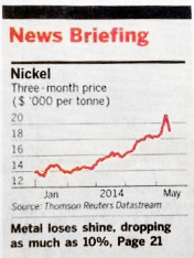
Source: Financial Times, 2014-05-16, page 1.
A legend within the chart would be great. With an arrow, for example. Funny: the arrow always points in the wrong direction. Because it’s not an arrow, it’s a sign.
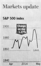
Source: Financial Times, 2014-05-16, page 21.
Very funny as well: scale and superscribe it, so that plus 1.57 and minus 22.50 look alike. Especially funny: at times, change is relative, at other times, change is absolute – all in one newspaper. Although the development of prices are compared. This has to be done in a relative way.
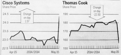
Source: Financial Times, 2014-05-16.