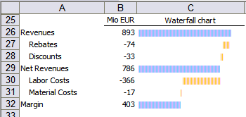
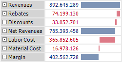
What is better: tables or charts? That was discussed in the past. Some said a chart is worth a thousand words. I think a picture is worth a thousand words. And most charts need a thousand words to be explained. They are so awful, mostly. Because it is so hard to standardize a chart and there are lots of things that can go wrong. Bissantz loves graphic tables. Me too. Charts are tightly integrated into tables. You have the best of both worlds in one concept. Graphic tables are easy to standardize and you can integrate almost every chart type in a table. Sparklines provide time-series. Horizontal bars are good for almost all types of comparisons. Graphic tables maximize data-to-ink ratio. They are fine grained and with high resolution. The graphical elements provide easy orientation for your eyes. The numbers provide all the details. Typical problems of legends and labeling never arise. I provided some examples in the “Radar chart trap” and in “Small things that make a big difference”. Today, I explain how to create waterfall charts in tables.
A waterfall chart is a variant of a bar chart. It shows how an initial value is changed through other values which lead to a final value. In Excel, you can use invisible columns but this is tricky. Rolf has a nice Excel template for free. Data entry is not so easy. Formatting is very nice.
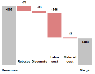
Jon has programmed an Excel add-in. Formatting is not so easy. Data entry is very nice.
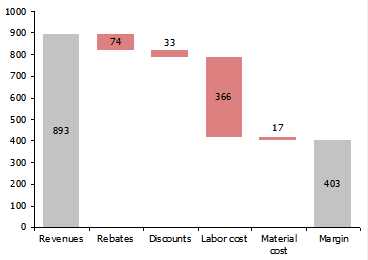
In both cases a chart is the result. If you turn it around it is still readable, perhaps even better.
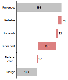
Turned around it fits perfectly into a graphic table. Subtotals are also easy. This is how Bissantz has done it in DeltaMaster.
It is possible in Excel, too. Just use the REPT function and a few tricks. I show you how in an example Excel sheet.
