The renaissance of table-form design
A picture says more than a thousand words. This charming expression is all about the magic of images. There is nothing that can cast more of a spell on us visual beings than a good picture, and nothing that can create such a lasting impression.

We can also try and make use of this fact for transmitting business-relevant figures. So by pictures, in this case, we mean business charts. What competition do they have? Not the written word, for starters: no one would seriously dream of trying to describe the progress of revenues in words rather than charts. It seems, however, that business charts have become the natural enemy of presentation in tables. And in many places there seems to be the maxim: a chart says more than a thousand tables.
Good information design demands a high density of information. The more information we have available at-a-glance, the easier it is for us to think analytically. The common business charts really eat up the pixels, though. This is a consequence of the way they work.
A business chart represents figures with the aid of lines or blocks. The block that describes a figure typically takes up more room than the figure itself. In addition, you also need to find room for labeling axes and for legends.
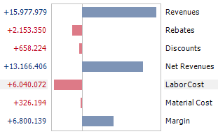
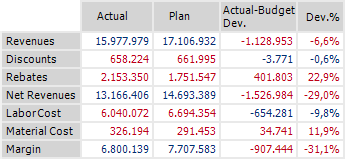
In a table, you can fit many times the amount of information into the same area taken up by the block. If you look at my example, you will see the graphical representation of a gross margin schema, with seven values shown in figures and bar charts. The same sized table contains 28 figures.
Having said that, we don’t want to do without graphical means of illustrating figures. There’s no faster way for the eye to orient itself. Relationships and changes to values are communicated much faster.
Anyone wanting to further develop information design for the depiction of business figures therefore needs to combine the strengths of charts and tables.
Tried-and-tested means of doing this are sparklines and cell bar charts.
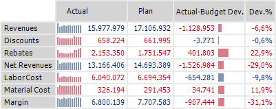
Although the table in our example only increases by roughly one and a half columns in width, the graphical equivalent of seven time series and a complete deviation chart can be integrated in the table.
