CiAgICA8IS0tIExpbmtlZEluIC0tPgogICAgPHNjcmlwdCB0eXBlPSJ0ZXh0L2phdmFzY3JpcHQiPgogICAgICAgIF9saW5rZWRpbl9wYXJ0bmVyX2lkID0gIjEyMzUwNzMiOwogICAgICAgIHdpbmRvdy5fbGlua2VkaW5fZGF0YV9wYXJ0bmVyX2lkcyA9IHdpbmRvdy5fbGlua2VkaW5fZGF0YV9wYXJ0bmVyX2lkcyB8fCBbXTsKICAgICAgICB3aW5kb3cuX2xpbmtlZGluX2RhdGFfcGFydG5lcl9pZHMucHVzaChfbGlua2VkaW5fcGFydG5lcl9pZCk7CiAgICA8L3NjcmlwdD48c2NyaXB0IHR5cGU9InRleHQvamF2YXNjcmlwdCI+CiAgICAgICAgKGZ1bmN0aW9uKCl7dmFyIHMgPSBkb2N1bWVudC5nZXRFbGVtZW50c0J5VGFnTmFtZSgic2NyaXB0IilbMF07CiAgICAgICAgICAgIHZhciBiID0gZG9jdW1lbnQuY3JlYXRlRWxlbWVudCgic2NyaXB0Iik7CiAgICAgICAgICAgIGIudHlwZSA9ICJ0ZXh0L2phdmFzY3JpcHQiO2IuYXN5bmMgPSB0cnVlOwogICAgICAgICAgICBiLnNyYyA9ICJodHRwczovL3NuYXAubGljZG4uY29tL2xpLmxtcy1hbmFseXRpY3MvaW5zaWdodC5taW4uanMiOwogICAgICAgICAgICBzLnBhcmVudE5vZGUuaW5zZXJ0QmVmb3JlKGIsIHMpO30pKCk7CiAgICA8L3NjcmlwdD4KICAgIDxub3NjcmlwdD4KICAgICAgICA8aW1nIGhlaWdodD0iMSIgd2lkdGg9IjEiIHN0eWxlPSJkaXNwbGF5Om5vbmU7IiBhbHQ9IiIgc3JjPSJodHRwczovL3B4LmFkcy5saW5rZWRpbi5jb20vY29sbGVjdC8/cGlkPTEyMzUwNzMmZm10PWdpZiIgLz4KICAgIDwvbm9zY3JpcHQ+CiAgICA8IS0tIEVuZCBMaW5rZWRJbiAtLT4KICAgIA==
Generic filters
Exact matches only
Search in title
Search in excerpt
Search in content

No norm? No comparison!

Last week, we showed that chopping chart axes is not necessarily a crime. More important is what these fluctuations mean for our intended audience. That, of course, also applies when a reader is supposed to compare several rows of information.

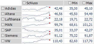
The table displays stock prices based on a scale of their respective highs and lows (sparklines display quotes from 2007-01-02 to 2007-05-03). This helps the reader to compare a stock’s unique volatility based on its price range. Without the minimum and maximum values, however, this chart would be very misleading.

Portfolio MinMax scale for each cell

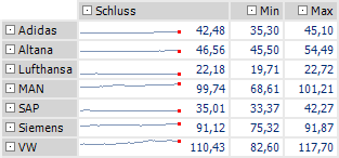
The following charts use a scale between zero and the overall high of all quotes. This chart is free from manipulation, but it doesn’t say much either.

Portfolio zero-Max scale for the whole column

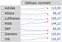
If we standardize the stock performance, however, the reader can truly make intuitive comparisons. Here, the stock prices have been converted to an invested sum of €100 (€100/opening price x current price).

Portfolio standardized values, MinMax scaling for complete column

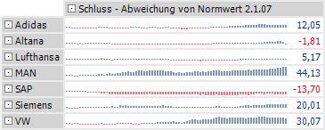
If we use column sparklines, we can clearly see where the portfolio made or lost money.

Portfolio standardized values, deviation from start, MinMax scaling for complete column

Wouldn’t it be nice to open the morning paper and enjoy this type of presentation for all DAX stocks?

Dax Top-Performer 2007
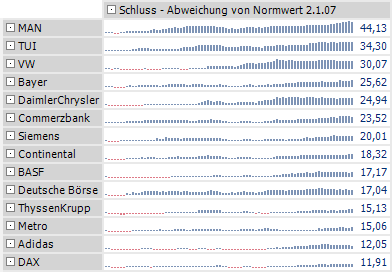
Top performers vs. DAX (since January 2007)

DAX Low-Performer 2007
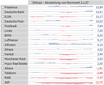
Low performers vs. DAX (since January 2007)