Variety is the spice of life. But sometimes Die Welt has too much variety. Three times from percent to percent. Three times different diagram types. Three times a new lesson to learn.
Column 1: Circles. From big to small is bad. Light is now. Dark next year. Circle is growth? Hm.
Column 2: Columns. Dangling. From short to long is bad. Agreed. Dark is now. Light next year. Hm.
Column 3: Lines. From low to high is bad. Disagreed. Other way round.
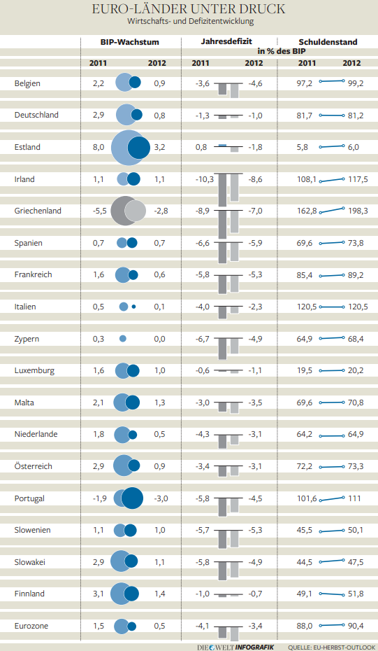
Euro countries under pressure (development of economy and deficit): GDP growth; annual deficit and debt level as % of GDP. Source: Die Welt, 2011-12-07, page 5. Click to enlarge.
Got a few mistakes as well. Portuguese circles. Finnish lines.
Problem was: Scales for -5.5 to +8 and -10.3 to +0.8, and 5.8 to 198.3. Scale globally? Doesn’t work. Big squashes small. Scale individually? How? With columns? Then everything looks alike. Lines would have worked. As in the right-hand column. Lesson learned once. Understood three times.