![]()
Greetings, fellow data analysts!
When people talk about ‘long-term means’, they almost always are referring to weather data. In most cases, however, they are not talking about means in their true sense but rather variances or extremes such as the hottest summer and the coldest winter. Today, it is also popular to use a similar comparison to explain the occasionally erratic events on the stock market. 52 week highs and lows or moving averages over 38, 90, 100 or 200 days – these are indicators that investors and speculators use to make decisions.
Both of the examples above come from fields that are marked with great insecurity. Nevertheless, the smallest, largest, and average values are always a welcome support when you are reflecting on a series of numbers. This also applies to the data which you use in analysis and reporting – and here, too, you need to think about variances. Fortunately, you don’t have to look back on past decades or ahead to future ones. Many times, you can either sense the reasons behind these changes or discover them with a little research and Analysis.
DeltaMaster can help you with all of that. And that’s why it’s the long-term ‘means’ of choice for many users around the world.
Best regards,
Your Bissantz & Company Team
Instead of isolating numbers, most DeltaMaster applications present numbers in context – particularly, in their chronological context – with the help of sparklines. Sparklines are miniature graphics which show how a value has developed over a certain period in time. In addition to the visualization, however, some readers wish that they could have further reference data. This information, for example, might help them understand the current value in relationship to previous values so that they could better classify and understand it. In the stock market, for example, it is common to compare the current price with the highs and lows of the last 52 weeks or to use a moving average over the last 38, 90, 100 or 200 days. In this edition of clicks! we will show how – not to mention how elegantly – you can integrate these and other types of additional information into your reports.
In the beginning there were sparklines…
Let’s start by using a pivot table with line or column sparklines as the starting point for each of the following scenarios. As you probably already know, you can display these sparklines starting with the Pivotizer level by activating the respective option in the context menu of the pivot tables. All of the procedures described below are also supported in Pivotizer or higher levels.
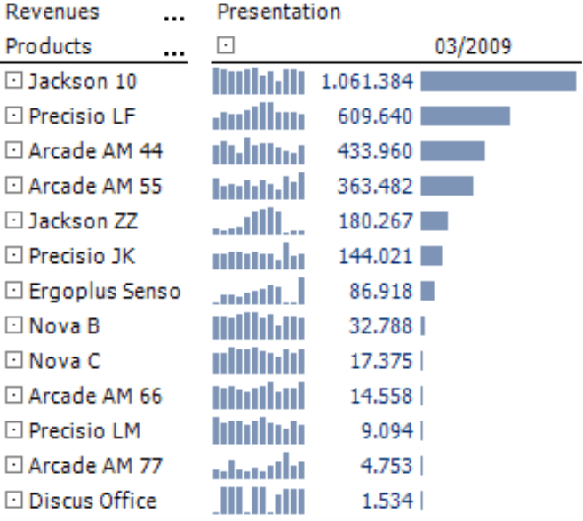
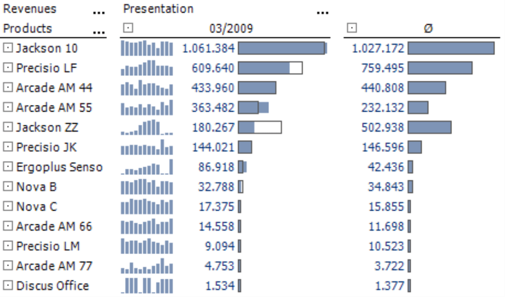
The screenshot on your right shows a product overview containing sales data for the current month as well as the previous 11 months displayed as sparklines for a total of 156 values. Report consumers can easily see the trends in this visualization. Their eyes glide over the sparkline from column to column and can feel the ups and downs, the growth and decline.
Sometimes, however, you don’t just want to observe the development as a pattern. Instead, you want to make a comparison with distinctive values from the time series. Is the current result particularly large or small? Does it lie close to the maximum or minimum of the values that are contained in the sparkline? Is it an unusual or average result? You can also extract this and other information from the sparkline. Depending on the data pattern, however, it can involve some time and effort. First, you must identify the extreme value and mentally place it next to the last column – even if other columns are located between it. That’s why DeltaMaster offers a special option called a Scale so that you can analyze this exact question regarding the ‘state’ of a value compared to the others in same range.
The Scale processes the values within the sparklines similar to the Trend barometer and the Sound animation. Since these three functions are based on sparklines, they are only offered in the context menu when sparklines have been activated. (A Trend barometer executes a regression calculation for the values of each sparkline, checks if there is a visible trend and, if necessary, notes this in the table cells. For more information on this feature please refer to DeltaMaster clicks! 12/2007.)
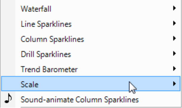
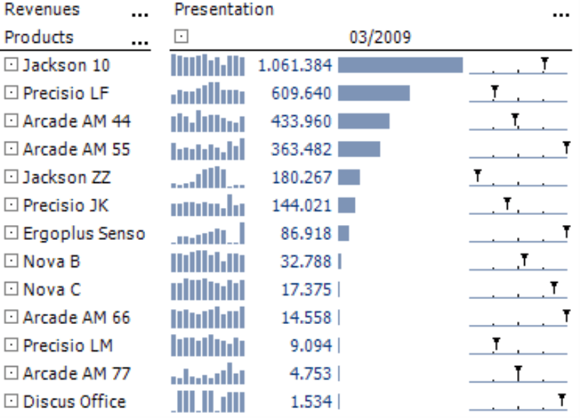
You can display the Scale in Traffic light colors, Business colors, Gray scale or as an Axis. If you choose the Axis option, your table will now look like the one in the screenshot below.
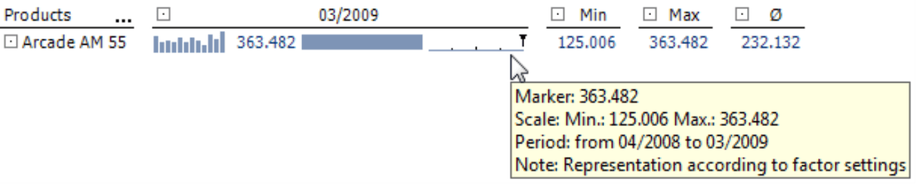
The span of the values from the sparkline has been scaled on a horizontal axis. The left end stands for the smallest value in the sparkline, the right end represents the largest and the black triangle shows the current value – the one which is displayed as a number in the pivot table. The axis is broken down into four sections. The three small points directly off the axis mark 25%, 50% and 75% of the span. Through the scaling, all axis markings of a column lie directly underneath each other. These, of course, represent different absolute figures.
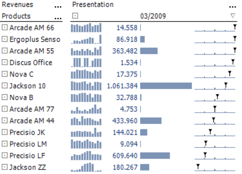
You can sort the table using the scale (context menu of the column header) so that objects that lie close to the maximum are arranged at either the top or the bottom of the table.
If you place your mouse on the scale, you can view the value, minimum, maximum and the represented time frame as a tooltip.
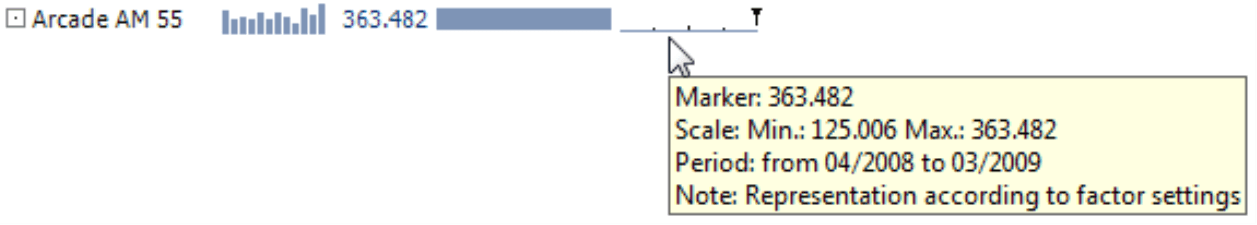
The graphic on your right shows an enlarged section from the table above for the product ‘Arcade AM 55’. You can already identify thecurrent (or last) value 363,482 as the maximum just by looking at it. The label and the tooltip – which by the way are also shown in DeltaMaster’s presentation mode (F5 key or Shift +F5) – confirm this observation. For more information on how to interpret the scale or use the Traffic light colors or Business colors presentation options, please refer to DeltaMaster deltas! 5.3.2, feature #19
Displaying the minimum and maximum in a report
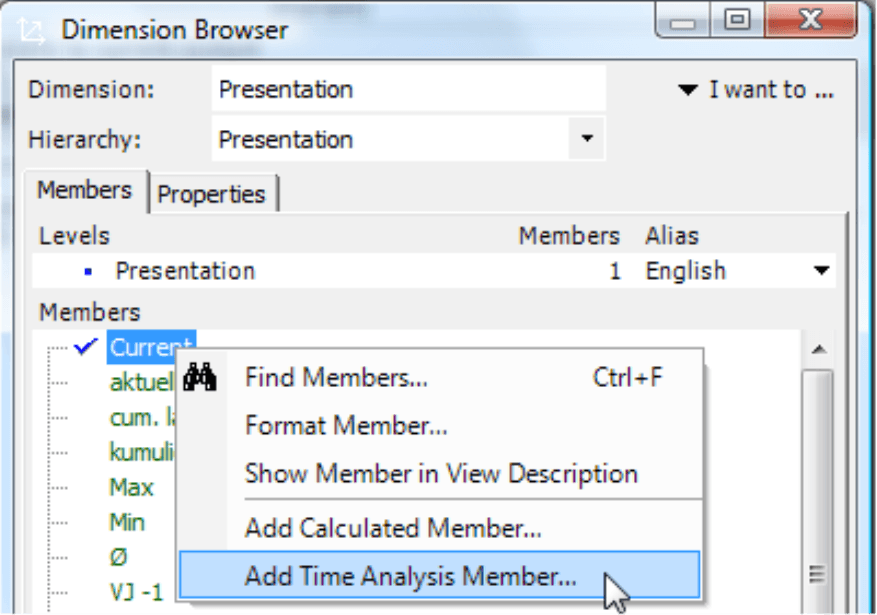
The explanations in the tooltip are useful as long as the user interactively works with DeltaMaster and only wants to access the span for select objects. However, if you want to print a report or export it, for example, to Microsoft Office, the better alternative would be to display this reference data directly in the pivot table. To do this, however, you need ‘access’ to this data – which you can get, for example, from moving aggregations in time analysis members.
Time analysis members, which we described in detail in DeltaMaster clicks! 8/2007, are a special type of calculated members. To start, simply create a new time analysis member in the presentation dimension or another helper dimension. Then, in the Editor for time analysis members, select Query as the Calculation type. Now, you can use Moving aggregations. An aggregation is a function that summarizes a number of data records or values into an object usually with a value – a number. In OLAP databases, the most common aggregation function is the sum. Averages, minimums, maximums, standard deviations, and variances, however, are also aggregations. They, too, summarize values – not to create a sum but rather an average, minimum, maximum and so on.
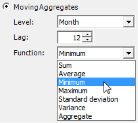
To return to the same values as in the sparkline and the scale where you started, simply choose ‘Month’ for the Level, ‘12’ for the Distance (the same number of months as in the sparkline; the current month was counted in the aggregation) and ‘Minimum’ as the desired Function. Later, you can follow the same process again for the Maximum and Average. (For more information on creating calculations across different levels, please read DeltaMaster deltas! 5.2.1, feature #25.)
Following these steps, you can create three new time calculated members which you can use in your analyses and reports.
![]()
DeltaMaster will then suggest a name which you can modify or shorten as you please. Afterwards, it will display the table as seen on your right.
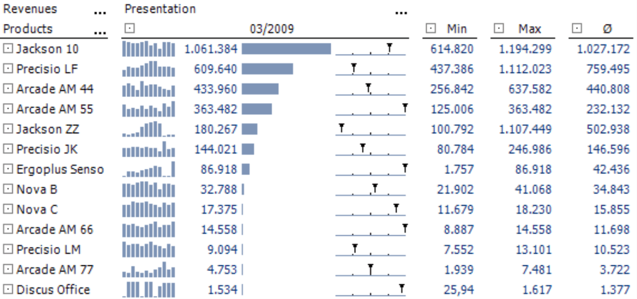
Since you have set your report to the proper level (i.e. Months) and used the number 12 both for the length of the sparkline and the distance in the moving aggregation, the extreme values from the tooltip are now identical with the numbers presented above.
Anything but average
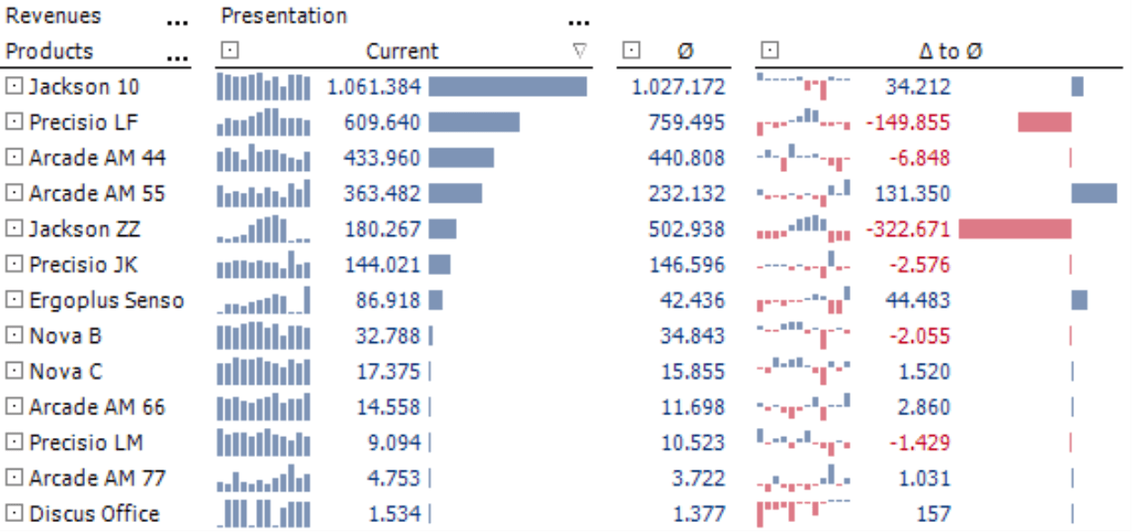
You can also use the average in a moving aggregation – a rolling twelve month average. With the help of this measure, you can create a few other enlightening analyses. To start, simply hide the scales and the extreme values and activate the visualization with bars for the average instead. This scale is the same for the entire table. The ranking is based on the ‘03/2009’ column. If you now designate the second data column with the average as a Reference column (context menu of the column header), the result will look like the screenshot on your right. Here, you can see the differences between the current month and the rolling average.
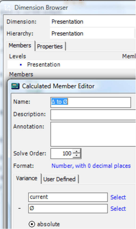
You can even capture this variance, the distance from the current value to its 12 month average, in its own calculated member so that you can use it in further analyses. To do this, you don’t need a separate time calculated member; all you need is the ‘normal’ editor for calculated members.
The result is the following table, which directs your attention to the variances from the average.
As always, you can further analyze these results in DeltaMaster, for example, from the Miner mode by dragging a variance value into a PowerSearch to search for the underlying causes.
Questions? Comments?
Just contact your Bissantz team for more information.
