![]()
Greetings, fellow data analysts!
As the old saying goes, all good things come back someday. We, for sure, certainly hope so! Back in the Sixties, for example, people almost always used logarithmic scales to draw statistical charts for revenues, prices or costs. After all, how else could someone see a percentage change – which is what matters in the first place? Back then, processing data was very time-consuming, and creating charts required lots of patience and special materials like logarithmic paper. In fact, software has made this process so much easier that no one even makes logarithmic paper anymore. But that is no reason to forget these tried-and-true practices.
In our seminars and presentations, we often make a case for logarithmic scales because they are the only way to make percentage changes comparable. We often feel, though, that our words are met with skepticism or even discomfort. In this edition of clicks!, we want to show you why logarithmic scales are so important and how DeltaMaster makes it easy to work with them. Here’s to the comeback of logarithmic scales – because they are good for the quality of our reports as well as our information culture in general.
Best regards,
Your Bissantz & Company Team
As unbelievable as it may sound, many of the time series charts that we see each day in management reports or even in the media are distorted. In fact, they are so imprecise that we can’t even really assess the things that should interest us most – namely, relative changes (i.e. in percent). The problem is the conventional use of a linear scale on the Y axis. In a line chart, for example, the same percentage change can produce slopes that are flatter or steeper. As a result, you cannot compare the slopes in charts. By switching to a logarithmic scale, however, we can make the slopes of two time units comparable.
Although the solution is relatively easy, we have found that that establishing this concept is anything but. Something about the word ‘logarithmic’ seems to frighten away many report consumers. That’s why we want to give you all the arguments you need to explain when to use a logarithmic scale and why it is so important in this edition of clicks!. This way, you can be well prepared for any questions or discussions as well as make a case for the better – and, often, only correct – way of visualizing data. And, of course, we will explain how easy it is to use logarithmic scales with DeltaMaster!
Fallacies with linear axis scaling
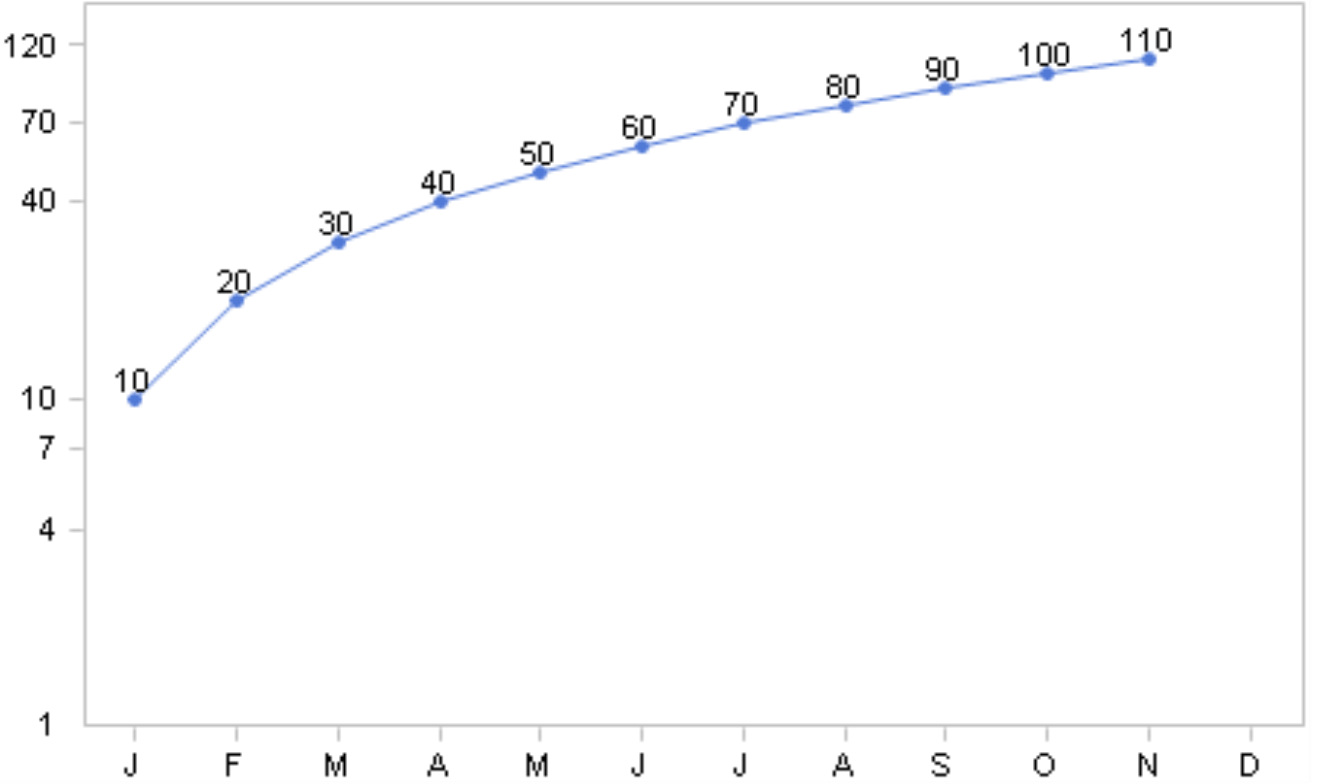
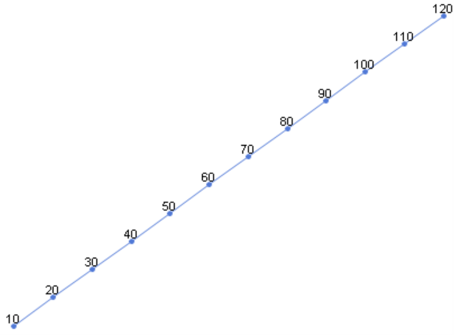
To demonstrate just how extreme a normal axis scale distorts relative changes, we have set up the following example. Our model contains a measure (e.g. a share price or revenues) and a time dimension with 12 members (e.g. the twelve months, which we have abbreviated as ‘J’, ‘F’, ‘M’, and so on). The time series begins in January with the value of 10 and grows by ten each month so that December has a value of 120.
The chart on your right shows the development of these values in DeltaMaster’s Time series analysis module. Just as you might expect, the line extends from the bottom-left to the upper-right corner, and the slope between the two months is always the same. As a result, you might make the conclusion that the value has grown steadily and that we are doing well.
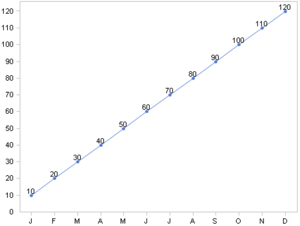
But are we? If you take the relative changes into consideration, the answer would be ‘no’.
To view the relative changes in DeltaMaster, you simply mouse over the section of the line to see the absolute and percentage changes as a tooltip.
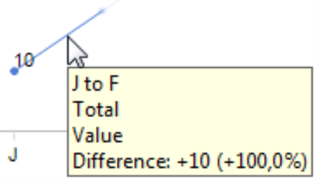
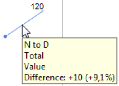
The same slope, which stands for a 100% change (i.e. from 10 to 20), shows a 9.1% change (i.e. from 110 to 120) as well. In our chart, however, this huge difference is nowhere to be seen. When you are analyzing relative changes, linear scales can be very deceiving because the same slope can stand for completely different developments of your values, depending on how large or small the comparative value from the previous month is. The other way around, the same relative change between two periods of time in the same chart can also appear very flat or steep depending on the starting value.
Considering the huge deficits of linear scales, it is really quite shocking that they are so well established. When we refer to growth in a business context, we are almost always talking about relative changes. Everyone knows that we can only judge a change in value when we know the initial value as well. As our example above has shown, common charts can’t do that. An increase from 10 to 20 Euros looks identical to an increase from 110 to 120 Euros or 1,000 to 1,010 Euros. A chart like this masks where the real change is or where an achieved value is basically holding steady.
Logarithmic scales enable comparisons
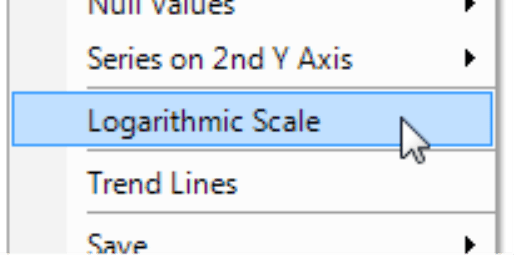
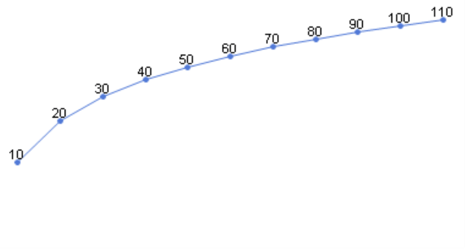
The solution to this problem is very simple – even if it doesn’t sound so at first. We use a logarithmic scale for the Y axis. As a result, the same percentage change always has the same slope in your chart. To activate a Logarithmic scale in DeltaMaster, simply choose the context menu or the I want to… menu in the Time series analysis.
As a result, the chart will appear as shown in the screenshot on your right. The line starts with a steep slope, which stands for a 100% change from 10 to 20, and the line will become flatter and flatter because the percentage increase of the value is getting smaller and smaller. Now, we can recognize that the growth at the end (9.1% from 110 to 120) is rather trivial. The falling spaces between the sections on the Y axis are characteristic for logarithmic scales.
Same slope = same change
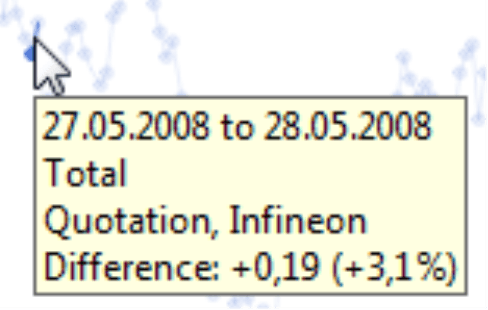
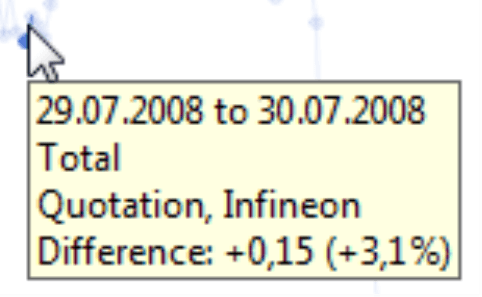
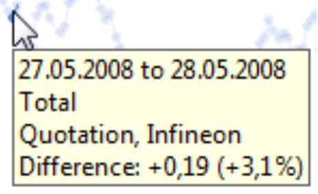
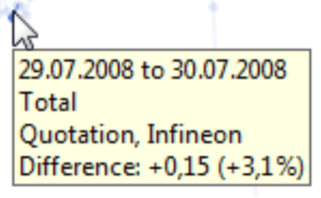
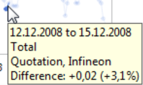
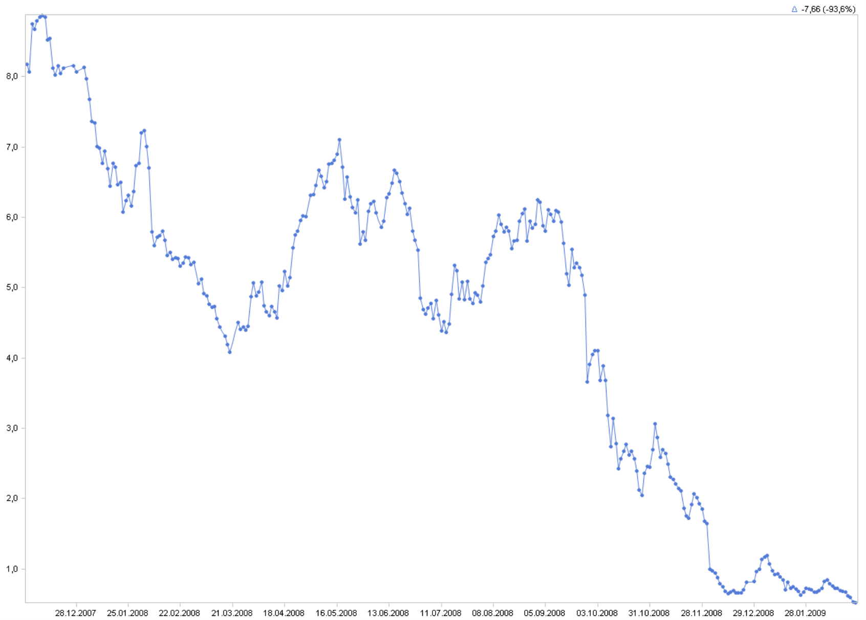
Let’s take a look at another example – the share price for Infineon. We have collected data from December 2007 to February 2009, loaded it into an OLAP cube using DeltaMaster ImportWizard, and analyzed the values using DeltaMaster.
Now, let’s take a closer look at the details. The share price grew by 3.1% on three different days in this given time period. The image below shows these three periods; each of these sections was taken from the same chart with a linear scale.
With a logarithmic scale, the same sections look like this:
Now, all of the slopes look identical. It’s the logarithmic scale that makes the relative changes comparable.
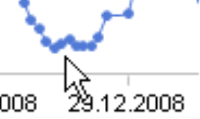
The charts on the following page show the long-term development – but you will get a completely different picture of the situation depending on which scale you are viewing.
Linear scale:
Logarithmic scale:
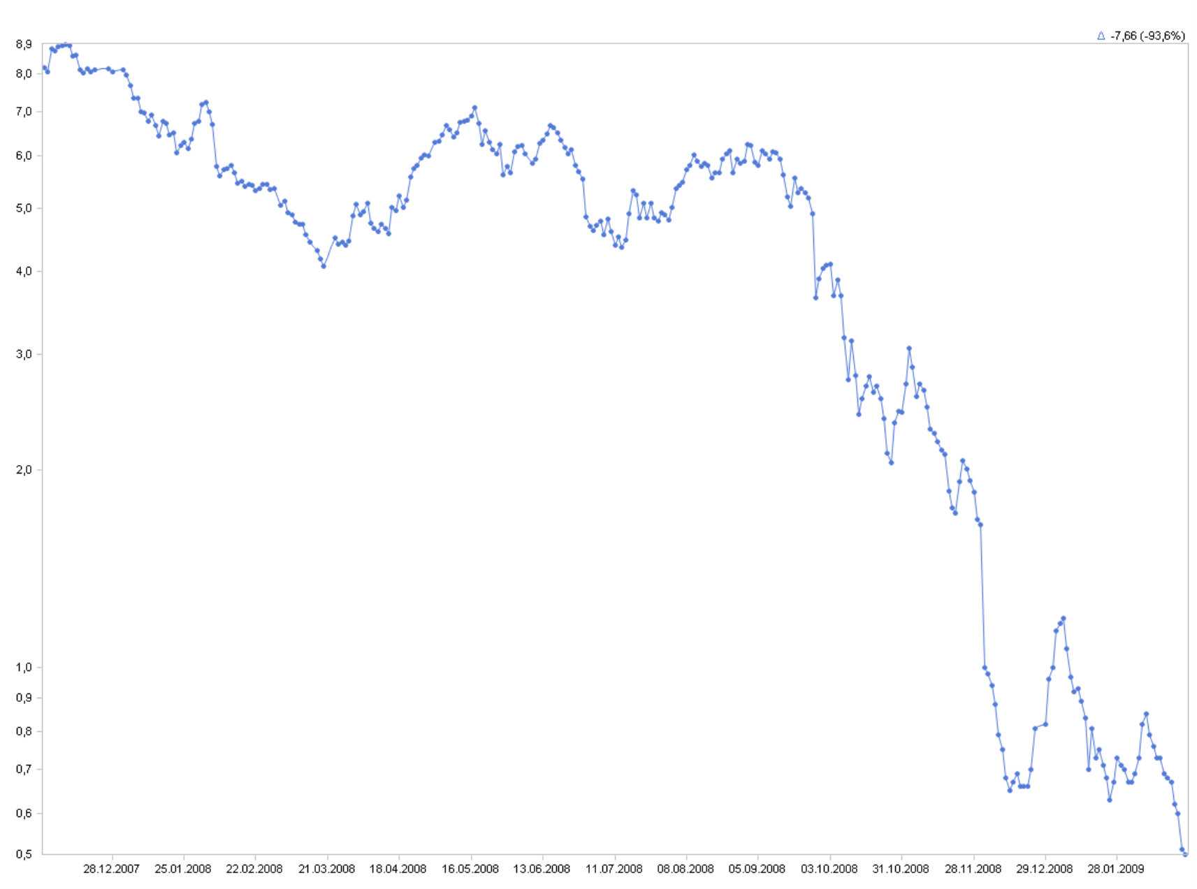
Now, take a closer look at the bottom-right corner. With the linear scale, you would think that the share price was just bobbling up and down at a pace that wouldn’t catch the attention of shareholders or short-term investors. If you are using a logarithmic scale, however, you can see that significant relative developments of the share price took place during this period. Of course, these were on a small scale, but with jumps of up to 17%, they still promised genuine capital gains.
Negative is different but still the same
Just like the stock prices, real-world data often has its ups and downs. And when you draw a chart of this data, you will see these positive and negative changes. Even logarithmic scales can’t visualize positive and negative changes of the same value without any distortion. It can present a change of +5% using the same slope throughout the chart. It can also present a change of -5% using the same slope throughout the chart. But a change of -5% is not the mirror image of an increase of +5%. In most cases, however, that is not so important because we are simply trying to compare the trends over several periods.
Logarithmic scales provide early warnings
If you go back and compare our first two charts with the fictitious numbers, you can quickly see another advantage of using a logarithmic scale for the axes – namely, that they serve as an early warning system.
If you look at the first curve, you definitely cannot see that the percentage of growth is continuously decreasing. Instead, it signalizes that we have no reason to worry. When you look at the second chart with a logarithmic scale, however, you can spot this trend immediately. We still have growth, but it is getting slower and slower. The slope is decreasing. What is even more amazing is that this simple type of early warning system doesn’t even require complicated algorithms for running forecasts or simulations. All you need to do is draw the chart correctly – in other words, with a logarithmic scale.
Chopping axes for lines is acceptable – and sometimes even necessary
Despite common belief, you can – and, in many cases, definitely should – chop the Y axis of a line chart so that you can only see the area which contains the range of the values (i.e. the series’ minimum and maximum).
That has to do with what we call ‘perceptive priority’. In a bar or column chart, the human eye observes the length of the bars or the height of the columns and, therefore, the distance between the points and the axis. By chopping the axis, you automatically distort the picture because the differences in value are no longer proportional to the differences in the lengths or heights.
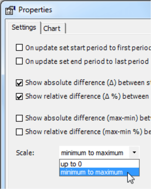
In line segments, however, this is a completely different story. Here, we don’t really notice the distance to the axis. Instead, our prime focus is observing the slopes of the individual line segments. The human eye literally glides from one point to the next and wanders above the line as if it were gazing over a mountain ridge. Even if you cut the axis, the slopes still correctly display the changes in values without distorting them – that is, of course, if you are using a logarithmic scale. That’s why when you are setting up the axes, you should display the changes with the largest possible differentiation. In DeltaMaster, you can set the scale to show the minimum and maximum values under Table Properties (context menu, I want to… menu). Since DeltaMaster automatically chooses the appropriate section, you don’t have to individually change the settings for the Y axis (context menu of the axis in a time series chart).
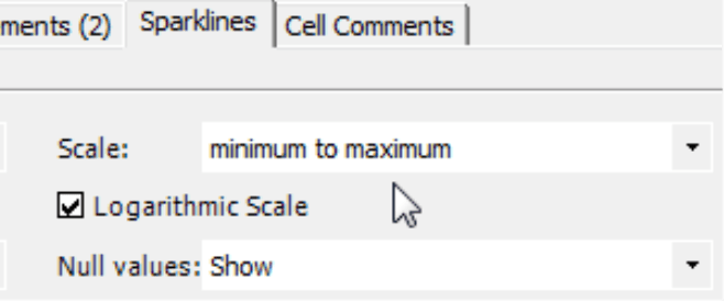
Sparklines with logarithmic scales
With a few clicks of your mouse you can also apply a Logarithmic scale to the sparklines in your pivot table. This option automatically adjusts the scale so that it only displays the area between the minimum and the maximum values. You can activate this setting under the Table properties (context menu, I want to… menu) of the pivot table on the Sparklines tab.
Mathematical background for non-mathematicians
Fortunately, you don’t have to delve in the secrets of mathematics in order to use a logarithmic scale. You can easily find the options that you need in DeltaMaster. Nevertheless, experience has shown that some users can better grasp the concept when they understand the mathematical background. So let’s take a short theoretical digression:
Logarithms are the inverse function of exponents. For example, 103 = 1,000; inversely, we say that he logarithm of 1,000 to the base 10 is 3. DeltaMaster also calculates the logarithm to the base 10 (i.e. decadic logarithm, ‘lg’) but any other base would also produce an undistorted chart that is true to scale. The logarithm is undefined for null and negative numbers. Although that’s a shame for business intelligence, there is nothing that you can do about it. If you have any negative numbers in a data series (e.g. in budget-actual variances), DeltaMaster will not display them in charts or sparklines, thereby creating a gap in the series.
One important feature of logarithms is that you can use them to perform multiplication using addition. This property was very useful, for example, back in the days of slide rules. Today, it is also very helpful when you draw charts and sparklines to compare relative changes in values. This way, you can see that the same relative changes in value are displayed as the same slope within a data series.
- A relative change in values can be viewed as multiplication. For example, if revenues increase 5% from May to June, you can say that ‘JuneRevenue = MayRevenue * 1.05’. To draw an appropriate chart on your screen, you must calculate where to place the point for June – in other words, how many pixels higher it should be from the starting value in May. That, of course, is addition.
- Mathematicians know that log(a*b) = log(a) + log(b).
- If ‘a’ stands for our revenues and ‘b’ for the growth rate (e.g. 1.05 for 5%), this expression would be ‘ log(Revenue * 1.05) = log(Revenue) + log(1.05)’.
- Now you can see that ‘log(1.05)’ always produces the same value. So if, for example, May revenues are up 5% from June, we can always draw the June value the same number of pixels higher than the May value – regardless if our May revenues were 10,000 or 10 million.
But how do I explain this concept to my report consumers?
The Wall Street Journal regularly uses logarithmic scales for creating stock charts. The explanation it uses is ‘The charts show the percentage change in each index’s or stock’s value, rather than the point change, for purposes of comparison.’ You see? It completely ignores the word ‘logarithm’. The Journal doesn’t let the argument that people don’t understand logarithmic visualizations stand in the way of correct visualizations. And the Wall Street Journal, by the way, sells 2 million papers each day.
Not always…
Although you can use logarithmic scales for line charts, they are not suitable for column or bar charts. Once again, the logarithms would distort this type of chart due to ‘perceptive priority’. As we have mentioned above, logarithms are undefined for negative and null values. As a result, you need to check how large the gaps that result from the logarithmic scale would be. A chart showing variances would suffer greatly if the underlying data contains too many negative values.
The distortion caused by a linear scale becomes more obvious when the values within the series vary greatly. If there are only minimal changes throughout the entire series (e.g. because they are only show a weak trend or they vary closely around an average), the distortion is so minimal that you can get by without using a logarithmic scale.
Further reading
We have been supporting the renaissance of logarithmic scales for quite some time now. For further examples and arguments, please refer to the following blog articles:
- Do time series charts really compare time series?
- Sailing under a pirate flag
- Presenting data correctly: perceptive priority
- No peaceful peaks
- Forbidden to forbid or by the book (in german) online here
- Log-a-licious or by the book (in german) online here
Questions? Comments?
Just contact your Bissantz team for more information.
