Presenting data correctly is tricky. That’s why we’ll never run out of stories for this blog. Today we’ll introduce a new term and two rules to follow if you don’t want to embarrass yourself the next time you present business data.
Let’s take a closer look at the example below from The Economist. Without much further thought, we assume that the chart is trying to show that the value from 2005 almost doubled in 2006. That is exactly what the height of the bar chart suggests because the column for 2006 is 1.7 times higher than the one for 2005.
_8606_S49_450px.png) |
_8606_S49_450px_Anmerkungen_EN.png) |
| The Economist 389 (2008), p. 49. A sevenfold exaggeration (click to enlarge) |
Lie factor: measuring the distortion (click to enlarge) |
That, however, is not the case. An increase from $83 to $94 billion dollars is only 13%. The chart on your right, however, calculates the largest distortion that The Economist made. What happened here? To explain that, I have coined a new phrase: perceptive priority.
The length and height of bar charts, for example, have perceptive priority. The human eye compares the heights and uses them to derive the differences among the values. Our first rule for today, therefore, is: Make differences in length proportional to the values that you are presenting. Since The Economist chopped off the base line, the columns are no longer proportional to the values – and now everything is wrong.
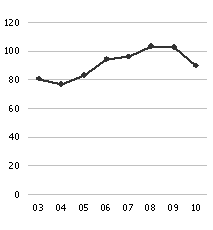
Now let’s take a look at the same numbers in a line chart. The example on your left uses a zero base line while the one on your right does not. What’s most interesting? Perceptive priority now ensures that the information that we have gained from the bar chart is totally worthless. Line charts contain line segments which we use to help assess the meaning of the chart. There, we especially focus on the angles of the line segments to each other. The distance to the base line, however, isn’t very interesting. You can’t find any distortion here.
 |
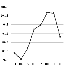 |
| Redesign with a zero-to-maximum scale | Redesign with a minimum-to-maximum scale |
Now for our second rule: The angles in a line chart must be proportional to the relative changes of the values. Problems with distortion only come into play when the values vary greatly in size. In that case, the same angles can show very different relative changes. We have already explored an example for that in detail. With the data we have here, however, the options above both work.
The concept of perceptive priority illustrates that we cannot simply apply a rule that works for bar charts to line charts. What catches our eye first in a bar chart is the distance between the x-axis and the data points, whereas in a line chart it’s the gradient of the connecting lines. In a line chart, perceptive priority is always given to slope, not altitude.
To decide which of the options works better, we need to take additional criteria into account. We’ll examine them more closely in one of the next issues.
