Some people place logarithmic scales on the same level as rabid tigers*. Without them, however, every second chart would have the wrong scale. In part one of this two-part series, we will show how you can tame the beast – and sit back and relax the next time someone rants about scales during a PowerPoint presentation.
My blog entry on the dangers of time series analysis ruffled a few feathers. I realized that most time series comparisons are futile because they don’t show what they actually should. A comparison of the price development for heating oil, electricity and gas from Germany’s “Welt am Sonntag” newspaper served as an example. It violated Bella’s iron rule of proportionality which states that graphical changes must be proportional to the displayed value changes – and the disobedience against Bella’s “dogma” was severe.
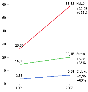
The absolute increase for heating oil was 32.25 (i.e. 58.63 – 26.38) units. Natural gas rose 2.96 (i.e. 6.51 – 3.55) units. Graphically, oil jumped 11 times (32.25/2.96) more than gas.
As a percentage, however, oil increased 122 % and gas jumped 83%. As a result, heating oil only really rose 1.5 times (i.e.122/83) more than gas.
The chart downplays this by a factor of 7.33 (i.e. 11/1.5).
In fact, we can measure the exact level of embellishment with the lie factor, which we can use to blame Excel’s chart wizards at least for part of the downfall of Western data culture. Chart wizards are notorious liars. They automatically chop off the ends of columns and bars. The resulting differences between the columns and bars have little in common with the value differences that they are supposed to be visualizing. If we measure how long one of the distorted bars is and how long it should be and divide the one by the other, we can measure this overstatement or understatement.
We can transfer this same principle to the visualized slopes in line charts. In the energy price chart, the increase of heating oil is either exaggerated seven times or the jump in natural gas is understated seven times – depending on how you look at it.
Why is that? A line chart shows the changes in values between two periods through the slope of the connecting line. We have learned that the steeper the slope is, the larger the increase (and, thus, the value change) is as well. In the energy price chart, however, that argumentation quickly brings us into trouble. Heating oil has a steeper slope than natural gas or electricity. But wait…is that really true? If we take a closer look, we can see that that is only the case when we observe the absolute values. But can we observe absolute values when we head off from different starting points? Of course not! The slopes are clearly not proportional to the percent change in price. If so, what do the slopes tell us at all?
This proves the point that we should only use slopes to express percentage changes in values. Otherwise, we would break Bella’s law of proportionality. In a best case scenario, someone will misunderstand us; in a worst case scenario, someone will accuse us of manipulation.
First alternative to riding a tiger: standardization
One way to solve this problem would be to standardize the values in a common starting value. We start by dividing all values of a row through the first value of that row. The first value of the row is then 100 and all other values are displayed in relation to it. This is a very good solution.
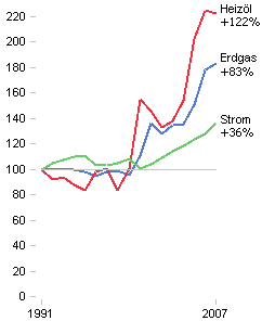
Newspapers are generally afraid to use standardizations. I can, however, understand the dilemma that the editors face. After all, the readers have to understand every conversion. The actual values aren’t shown anymore. It is apparent how important, yet how random, the selection of the starting point is. The presentation of the actual values looks stable in comparison.
Nevertheless, when people create charts that show a steeper slope for electricity than natural gas although electricity didn’t increase half as much, it is a sign that they desperately need alternatives.
Next week: Logarithmic scales
* This comment was posted in the blog entry “Logarithmische Skalen – Tagesgespräch zu Börse und Wirtschaft” on GoldSeiten-Forum.de
