![]()
Greetings, fellow data analysts!
In a song titled “Work” on his tribute album to Andy Warhol, Lou Reed quotes his former protégé saying: “You ought to make things big, people like it that way.” Warhol was a famous member of the pop art scene, which is characterized by themes and practices drawn from the popular culture of the masses. It blends art with real objects, often with sharp outlines and repeatable to the point of industrial production.
Good reports have little to do with pop art. Trendy colors are too distracting and elements should be small instead of large so that we can observe and assess them at the same time. What we can learn from this scene, however, is that when creation and reproduction go hand in hand, we can build reports more efficiently so we have more time to concentrate on what they say. The tools of this trade are DeltaMaster’s graphical tables. And when you use them to create information-dense reports, your readers will certainly pay them more homage than Warhol’s allotted fifteen minutes.
When reports are well done, they speak a clear message. Plus, your colleagues won’t need to sit around and ponder what “the artist” was trying to say. See for yourself!
Best regards,
The team at Bissantz & Company
To present and report your business data, you probably use charts to illustrate a certain context beyond mere numbers. Although the purpose of these charts is explanatory in origin, they often end as pure decoration and require a significant amount of manual work. As these numbers change month for month, you have to move the headline to the right position, adjust the colors, avoid overlapping, and manually fine tune many other aspects of the report. While pure tables are easier to format, they don’t visualize the data to give your readers a quick overview.
Graphical tables solve this dilemma by integrating small charts alongside the numbers. For example:
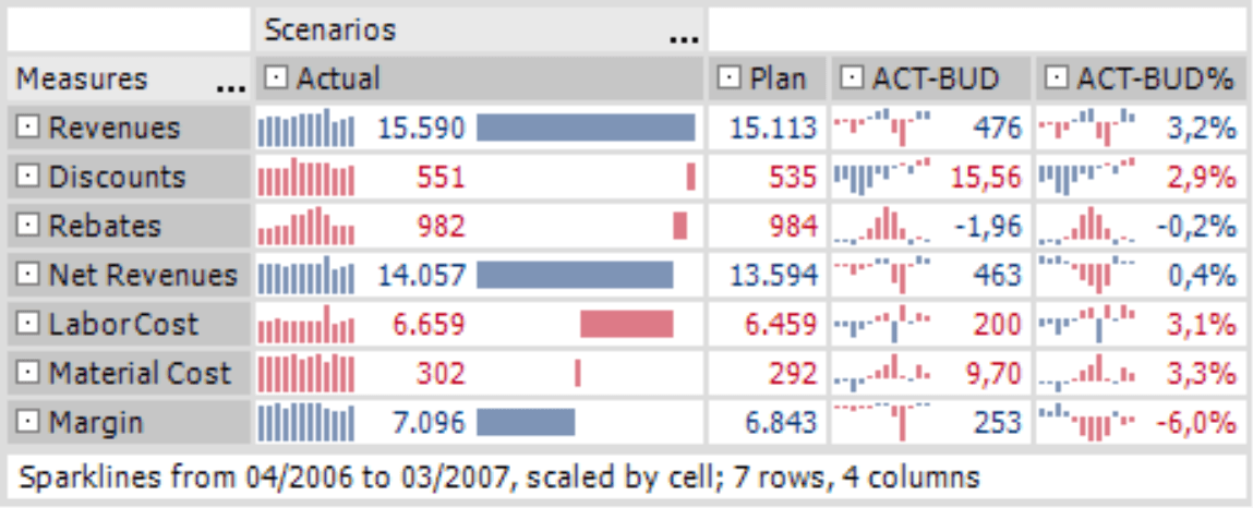
This pivot table has a row axis with the measures needed to calculate the margin and a column axis listing the scenarios (e.g. actual, budget and variances).
Beyond the data, the cells contain two types of charts. Thanks to the waterfall chart in the “Actual” column we can understand differences in size more instinctively than if we just read the numbers. The waterfall shows how our revenues (top line) are diminished by various costs and, finally, result in the margin (bottom line).
In the two columns showing variance, the sparklines explain the historical development between April 2006 and March 2007. This graphical context can be very important for the proper interpretation. In the current month, gross margin is about €253,000 higher than planned. Although this news sounds very positive, the sparkline shows that we rarely hit our targets in the previous months and that we still have to make up a large December variance.
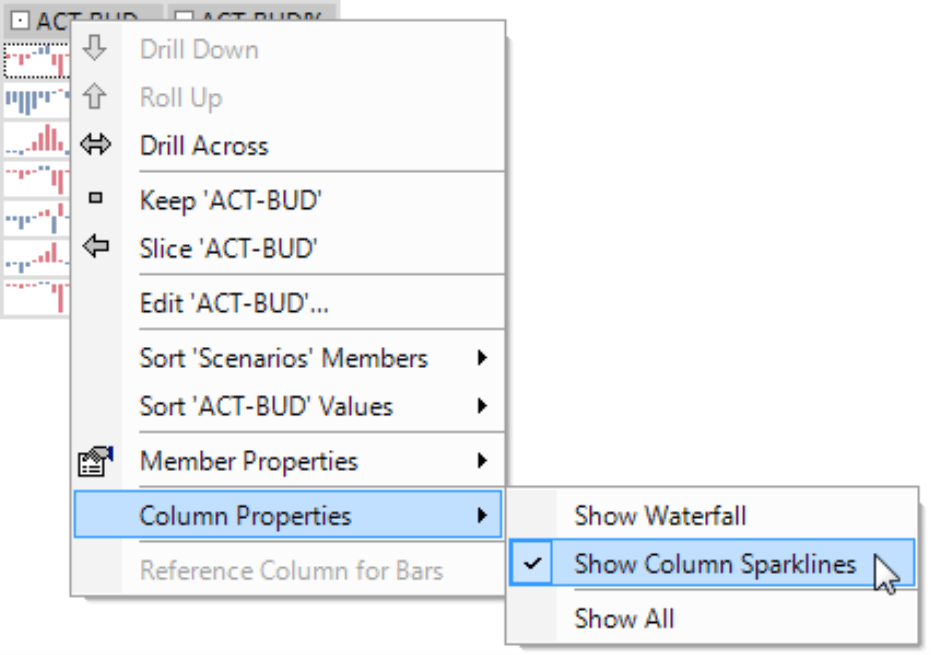
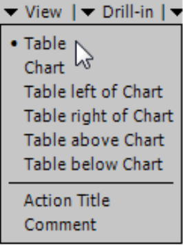
Using the context menu, as seen in the screenshot on your right, you can activate waterfall charts and the column sparklines which are scaled to each individual cell. If you don’t want to use these visualizations in a particular column, you can hide them easily in the context menu of the column header. In our example above, we hid the waterfall charts for the variances since these cannot be aggregated.
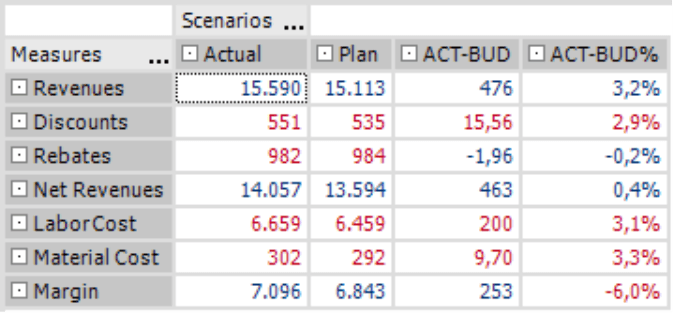
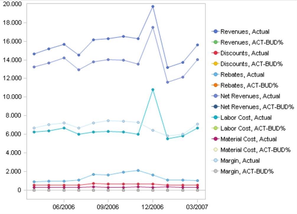
Alternatively, you could use a table in the Default view (context menu, I want to… menu) or a collection of pivot charts and time-series graphics. Although DeltaMaster supports these features, we personally think that graphical tables are the better choice. In addition to packing a high level of information into an easy-to-read format, graphical tables deal with value changes extremely well which makes them suitable for industrial reporting (see below). Just compare these alternatives below with the graphical tables on the previous page:
|
|
The plain table is more difficult to read and because it lacks visualization. The chart is a nightmare. And compared to the chart on the previous page, both only offer a fraction of the information. When you want to illustrate patterns over time, you need to use graphical tables because the other visualization forms just don’t cut it.
Industrial reporting
Industrial reporting transfers the concepts of industrial production into the world of analytical systems. Reports are produced in a series for a large group of recipients. Although each person does not receive identical reports, many elements are similar such as the dimensions on the table’s axes or the criteria that are used to create a Ranking. Since the authors need to produce these reports in frequent intervals, they shouldn’t be bogged down with repetitive tasks. Industrial reporting, therefore, streamlines the report creation process. ReportServer (see DeltaMaster clicks! 08/2005) is a great help here. Graphical tables also make a significant contribution because these standard, stable elements have predictable dimensions and a “self-building” core that can be used again without any reformatting.
Table views in the analytical methods
In pivot tables and almost all analysis methods, you can switch between table and chart views. You will notice that a few of these methods display graphical tables as the default setting.
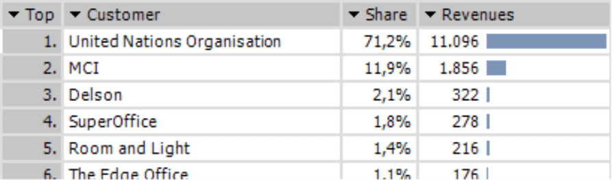
This is the case, for example, with Ranking and PowerSearch. Horizontal bars make any differences in size even more noticeable.
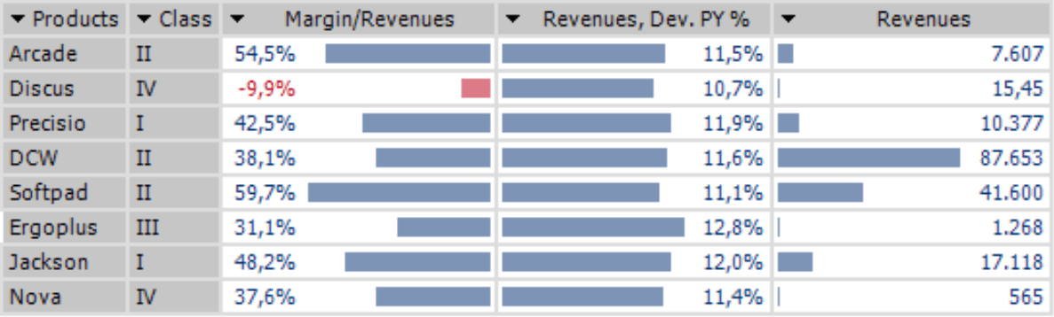
The Portfolio analysis with its four quadrants is also a well- known method. In the screenshot to your right, the different members are clearly labeled and easy to identify. When these numbers change and or there are more bubbles that are all very close and even overlap, however, this chart type has already reached its limits.
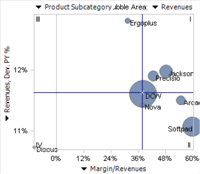
In this case, go to the menu and change the View to a Table. The chart will now look like the screenshot on your right. In addition to visualizing the relationships of the measures on both axes, it also displays the revenues without formatting bottlenecks. (Although this is possible, we didn’t display them due to the lack of space. See DeltaMaster deltas! 5.3.4, feature #15 for more information). The table view for a Regression analysis is very similar.
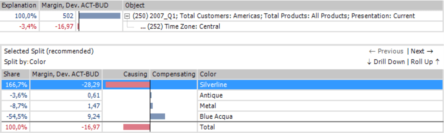
Navigation, which you can use to uncover the causes of variances, always uses graphical tables as the standard format.
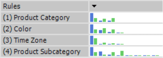
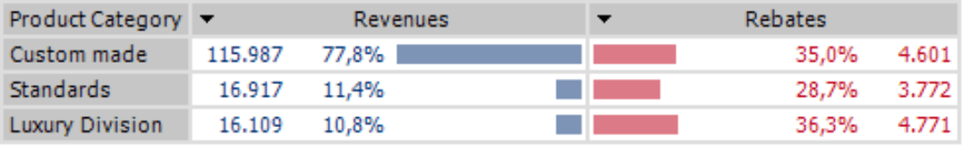
Comparator, which helps you analyze how and where two measures differ, uses this concept in the results overview as well as in the individual results (i.e. rules). The rules preview that DeltaMaster uses in this overview is very similar to sparklines. For more information on Comparator analyses, please refer to DeltaMaster clicks! 11/2007.
The renaissance of table designs
Although they contain graphical elements, the previous examples are tables and not charts. At Bissantz and Company, we personally hope that tables will experience a renaissance as design elements (see also https://www.bissantz.de/bissantz-ponders/1000-words). As you can see from the table on the following page, we can use them without compromise. Graphical tables combine the advantages of tables without any of the usual downsides.
| Table | Chart | Graphical table |
| +simple formatting | –complex formatting | +simple formatting |
| –difficult to identify relationships | +easy to identify relationships | +easy to identify relationships |
| +automatic | –manual | +automatic |
| +robust | –error-prone | +robust |
| Ideal for mandatory publications (e.g. stock information in a newspaper) | Ideal for specialized areas (e.g. geographical analysis, consultant reporting) | Ideal for industrial reporting |
Guerilla reporting
We know that some of your report consumers would surely object that “we never did that before” – which, for the record, is probably the weakest argument on the planet. But be daring and try it! This presentation style has countless benefits for both producers as well as consumers. For the initial strategy, try our guerilla reporting tactics. Here’s your starting game plan: https://www.bissantz.de/bissantz-ponders/guerillareporting1.
Questions? Comments?
Just contact your Bissantz team for more information!
