You can find time series comparisons in almost every newspaper, business journal and political magazine. Although they are frequently used in the media, these charts can be very misleading. What you should know about developments over time so that you don’t jump to the wrong conclusions.
Recently, it seems that I experience shocks like these quite often. Take the chart below. The lines suggest that the price for heating oil has exploded, while electricity and natural gas have increased moderately.
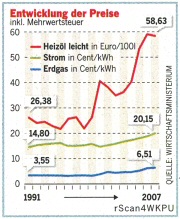
If you do the math yourself, however, you can also see that the blue line for natural gas has grown at about twice the rate as the green line for electricity and almost at the rate of the red line for heating oil. Apart from general inflation and the increase in value added tax over that period – honestly…do you see that?
| 1991 | 2007 | Δ | |
|---|---|---|---|
| Heating oil | 26,38 | 58,63 | +122 % |
| Electricity | 14,80 | 20,15 | +36 % |
| Natural gas | 3,55 | 6,51 | +83 % |
I don’t. As I recently sat with my son over a few geometry problems, I suddenly realized why this is. We observed two lines that run parallel to each other. We asked ourselves: Is ‘parallel’ equivalent to ‘similar’ – and learned that lines run parallel to each other when they have the same absolute slope. This is the case when the absolute changes per period have the same value and sign. Where they start is irrelevant.
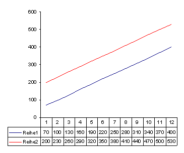
When two lines with absolute values run parallel to each other, it means that they have the same absolute growth (in this case: +30).
A relative observation gives a completely different picture. Here, we can no longer talk about parallelism. And although it has higher values, the red line now runs below the blue one and at a much flatter angle. Why? The relative value growth is different in every period and is smaller due to the cumulative values from the previous period.
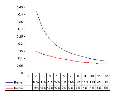
When we plot their relative growth, our parallel lines in the sample above don’t look parallel anymore. In this case, the +30 from 70 to 100 is 43 %, while the +30 from 370 to 400 is only 8 %.
And now for the shocking conclusion: When things change at the same rate, the development of the absolute values is anything but parallel. The same rate means the same relative growth. The greater the difference between the starting figures is, the greater the lines will spread apart:
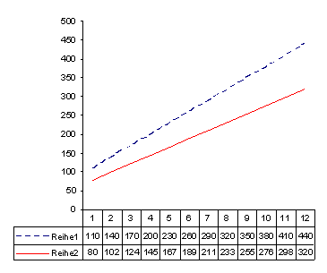
The paradox of our shocking conclusion: When developments are very similar, the respective lines will break apart. They change at the same rate, or in other words, they have the same relative changes as we can see in the chart below.
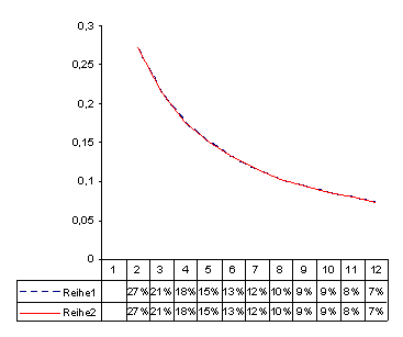
The values from the previous chart in a relative comparison: Both lines are now similar. Since the growth is identical, the lines are on top of each other.
The results of this observation are surprising and illogical at the same time. The typical lines that are often drawn to show absolute values for revenues, stock prices, temperatures, etc. are only similar in a single case. And that is when they increase or decrease by a very similar absolute value from period to period. But that is not normally the case. If the finance crisis had an influence on the stock prices of Commerzbank (€ 16.82 on 5 September 2008) and Deutsche Bank (€ 56.69), we would never expect them to both drop by the same absolute value.
Instead, we would be much more likely to expect dependencies that show a similar relative influence on developments – which from an analytical perspective would also be much more valuable. To identify these, we must plot the relative changes. The closer the slope is, the more similar the values are.
