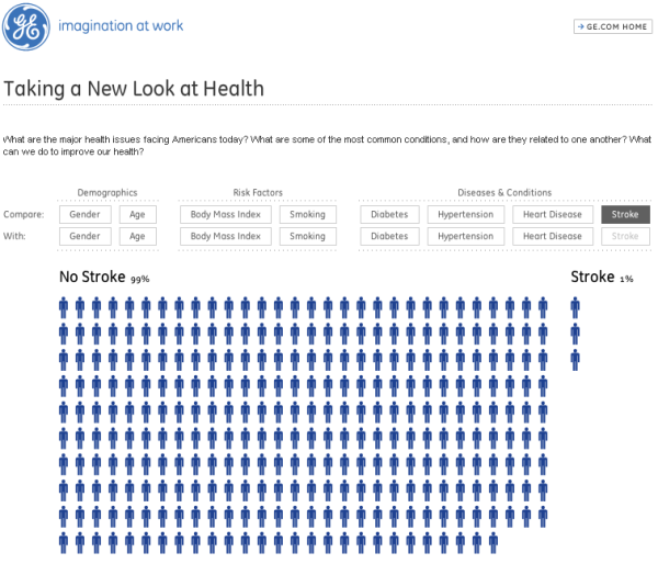
Apropos of resolution: General Electric has got a web page with health data. You can play with the data. 300 stickmen symbolize America. They are in every picture.
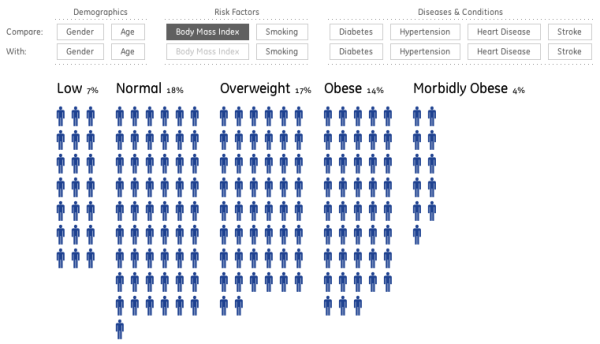
Depending on “Diseases & Conditions” and “Risk Factors” they stand in different formations. Well, sometimes they just disappear. Here 120 stickmen have left (or 40%).
For a stroke it looks like this. The thin ones on the left and the fat ones on the right.
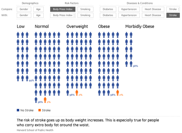
Maximum differentiation is 0.33% (1/300) if 300 stickmen symbolize America as a whole. Within the segments differentiation drops. For the thin ones it is 4.8% (1/21). But now listen: 1% of the thin ones have a stroke. That’s one-fifth stickman (1% of 21). But GE doesn’t paint this. Underneath the picture: The more fat, the more stroke. I can’t see that either. Everything is 2%. Except the thin ones (1%).
Play with it yourself. I believe: Painting absolute frequencies while talking about percentages goes wrong.
I don’t care about all that: I am a Labrador. I wouldn’t mind being fat.