Found this, the other day. In “Die Welt”. A national, daily German newspaper. It’s scaring its readers. With a dumb chart or, as they call it, “Chart of doom”. For stocks. Like in 1929.

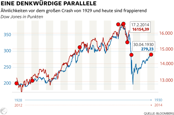
A memorable parallel: Similarities before the great crash in 1929 and today are striking. Dow Jones in points. Source: welt.de, 2014-02-18.
“Die Welt” says there are similarities. Because it uses the wrong scale. But look at the axes. Left: 200 to 350 (+ 75 percent). Right: 13,000 to 16,000 (+23 percent). That’s mean. Or dumb. Or both.
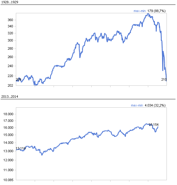
This is how it looks with the right scale:

Source: DeltaMaster, comparable scaling (in German).
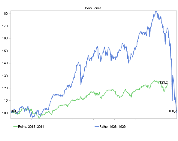
The chart below works, too. Both time series on top of each other. Both start with 100. That’s good, too. But you can’t see the values anymore.

Source: DeltaMaster, index time series.
