Worse than radar charts? Mosaic displays!
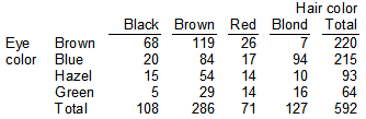
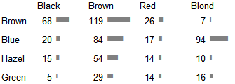
Data on hair and eye color of 592 students is transformed into this:
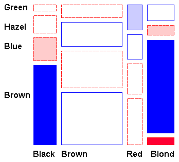
The relative frequency is displayed as an area. However, the eye isn’t good in comparing areas of different sizes.
All three areas are of the same size: 
The labels are hard to read, too. You have to count. To display the frequency a simple graphic table is enough: