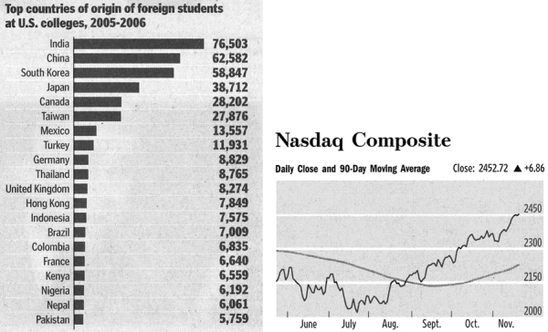
For the time being, the best data graphics come from the American elite papers. The New York Times, The Wall Street Journal and the Washington Post provide clean graphs, free of chart junk and information dense.

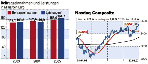
Welt am Sonntag is close. Only the alternating background colors are nonsense. They change contrast and message. What is the message? Is it nicer in the light areas? What do I do wrong when I enter the dark areas?

Nonetheless: Thank you WAMS! The others make me cry anyway.
