![]()
Greetings, fellow data analysts!
Statistical distribution wasn’t exactly a hot conversation topic a few years back. Yet in Germany, it was almost omnipresent – at least as soon as we opened our wallets. A portrait of Carl Friedrich Gauß, the inventor of the normal distribution curve, graced the front side of the fourth (and last series) of the ten D-mark bill.
Although this bill is now history, delving into statistical distributions of measures is still well worth the effort. Sometimes, we want to analyze distributions and statistical spreads beyond standard reports with dense measures: Are our processing times stable or do they vary in larger intervals? Can we minimize the outliers in our error rates? Do our delivery times vary greatly – or are they only satisfactory on average? Are our sales markets homogeneous?
To answer these and other complex questions, we need more than just a simple average. Statisticians often rely on box plots to describe and explain distributions. In this edition of clicks!, you will see how quick and easy it is to create them with DeltaMaster. Maybe, you’ll even add them to your standard reports and distribute them just as you normally would, for example, with ReportServer.
Best regards,
Your Bissantz & Company Team
Controlling and statistics sometimes have more and sometimes less common ground. The parallels are greater when we deviate from standardized list reporting and move more into analysis. A sorted list of customer revenues, for example, certainly has its value – but it can’t easily provide insight on how sales are distributed or if there have been movements in that distribution over time. In the next few pages, we would like to present the box plot, a type of visualization which many DeltaMaster users have long since added to their standard reports and cockpits. Box plots help you examine a large amount of values with regards to their distribution or statistical spread. Most likely, you have already seen these types of charts before.
Box plots visualize the position and spread of values in a distribution (a random sample). Unlike many other types of charts, they do not show individual objects such as customers, products, production orders, shipments, or service cases. Instead, the presentation is based on five statistical measures that characterize the distribution as a whole: the minimum, the lower quartile, the median, the upper quartile, and the maximum. (We’ll explain the statistical background in more detail below.)
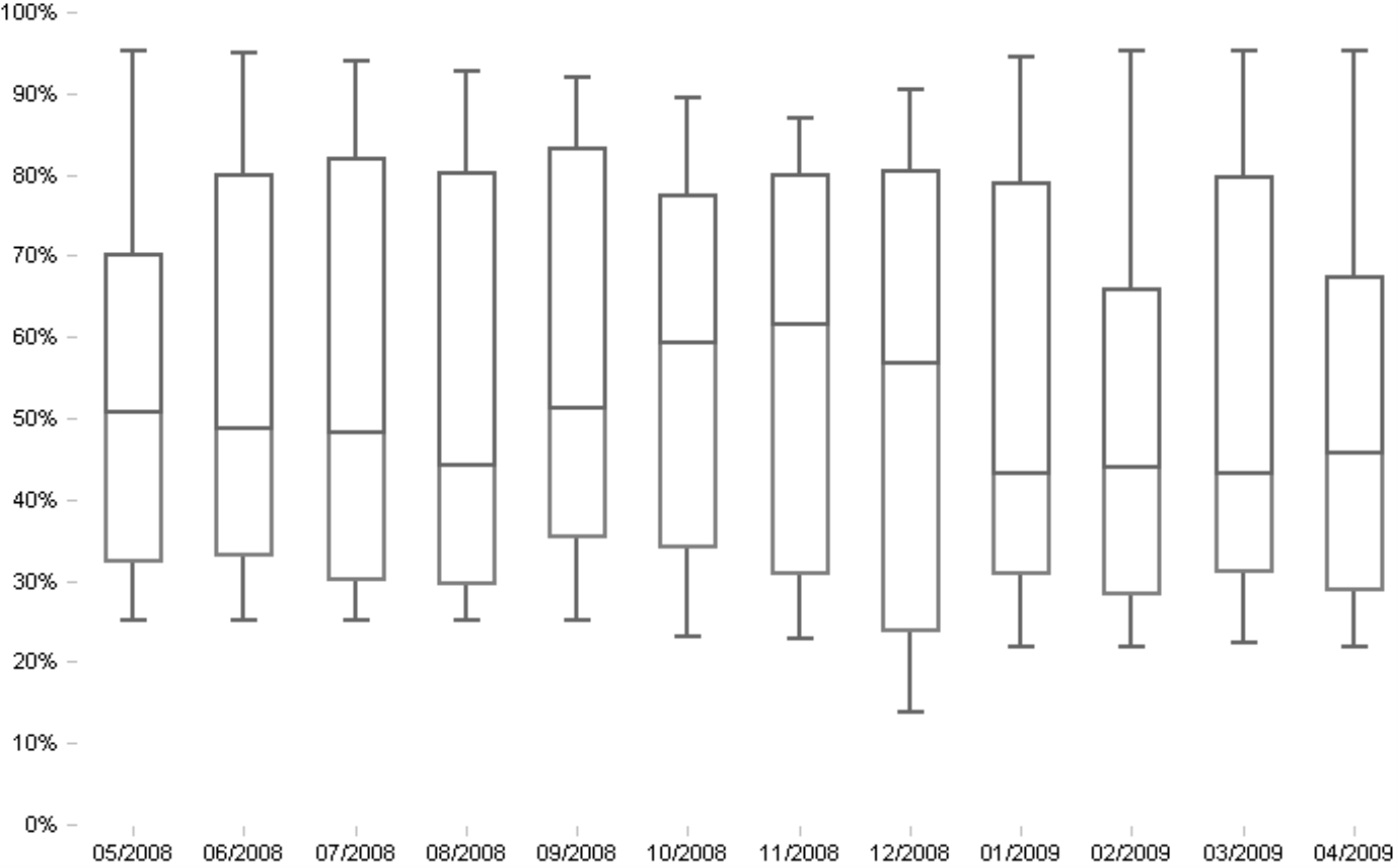
The visualization above shows the margin rates of products. You can either analyze each plot alone or observe the development of the distributions over time. As you have probably noticed, the range has barely changed but the median has increased from August to November. This means that more products were sold at a higher margin. In January, however, the margin of some products sank again. This should warn a product manager that costs might be getting out of control or that the price elasticity has changed.
To explain how to use box plots, let’s once again use our ‘Chair’ reference model, which contains financial and sales measures. You can, however, use box plots to analyze many other aspects of your business:
- In production analysis, you can evaluate processing times, error rates, maintenance intervals, or buffer stock. You could also see if changes in the process parameters have lead to more stable processes, for example, if the respective production measures weren’t as scattered or the outliers shifted closer to the box or median. How did the median move? Can you see improvements or declines ‘in the middle’ (see definition below)? How strongly are the measurements scattered around the middle?
- Many similar questions often arise in logistics analysis. erHHere, for example, you might want to know more about delivery times or availability. Major costs caused by inadequate or poor capacity utilization are often hidden in these processes.
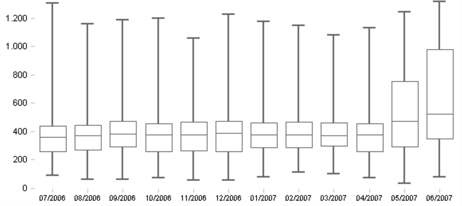
The example above, taken from an application for transport analysis, is used to examine the measure ‘Service costs per container by customers’. Here, you can see that the cost distribution was relatively constant over a period of several months. The median did not move much and the box with the mid 50% of the values only showed minimal changes in size or position. In other words, it was business as usual. In June, however, the costs per means of transportation for the customers were higher and, most of all, the range was much wider – a trend which started back in May. These developments are grounds for further investigation.
- Going back to our example in sales, you might ask yourself if different market segments react similarly. The reasons might be caused by the nature of the respective segments themselves or can be an indication of a very (or not so) effective segment management, which would be indicated by higher uniformity and a smaller spread.
Creating box plots
Box plots are also known as box-whisker plots, with the box being in the middle and the whiskers pointing up and down.
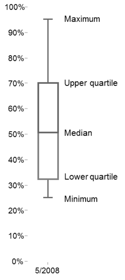
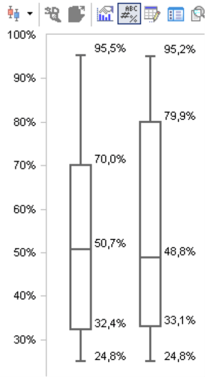
You can easily identify the five statistical measures in the screenshot on your right. The upper/lower corners of the box represent the upper/lower quartiles. The line in the middle of the box shows the position of the median. The bars on the ends of both lines mark the maximum and minimum values. The gaps between each of the five markings are important in interpreting the visualization; the width of the box, however, is irrelevant. You will also note that this chart displays percentage values on the Y axis. This has nothing to do with the method itself; the measure you are analyzing in this case (i.e. the margin rate) is a percentage. In other scenarios, the box plot would display this data using the measure’s units, for example, in Euros, pieces, minutes, etc.
Medians and quartiles – what were they again?
Although we don’t want to digress in the depths of descriptive statistics, a small recap of the basics can’t hurt either. After all, even if you can create box plots easily in DeltaMaster, you still need a bit more background knowledge to interpret them or respond to inquiries than with simple columns or bars in charts and graphic tables.
- The median lies in the middle of a sorted series of values. Half of the values are larger (or equally large) than it and the other half are smaller (or equally large). If you take the values 10, 20, 30, 40 and 1,000, the median is 30. Unlike an arithmetic mean, you cannot determine the median through addition and division; instead you simply ‘count down’ from the smallest to the largest values until you find the place where you can divide the series into two sections of equal size. In many cases, the median provides more information than the arithmetic mean because it is less sensitive to outliers. This is also the case in the series described above; a mean of 220 does a poor job of describing the four small values as well as the extreme outlier of 1,000. The one outlier raised the arithmetic mean to a value that has nothing to do with any of the other measurements. The median, in contrast, represents the surrounding values quite well and displays the outliers as such.
- Quartiles follow the same principle. They, too, are values that divide a sorted series – not just in the middle but also into upper and lower quarters. The lower quartile (25-percent quartile) is nevertheless a value that is larger than a quarter of the values and smaller than the remaining three quarters. The upper quartile (75-percent quartile) is a value that is larger than three quarters of the values and smaller than the remaining quarter. As a result, you can also describe the median as the mid quartile or the 50-percent quartile.
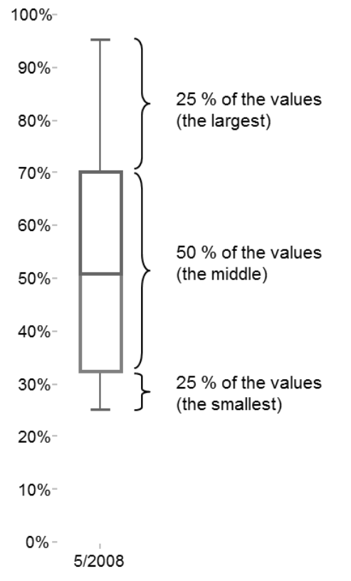
Based on these pragmatic explanations, you can determine that the mid 50 percent of the values lie between the upper and the lower quartiles (see diagram on the next page). This area is drawn as a ‘box’ in your box plot. A line within this box marks the median. Since the median is not the average, it does not have to lie in the middle of the box. Instead, the box and the median marking show how the mid 50 percent of the values are distributed around the median. The 25 percent of the smallest values lie between the minimum and the lower quartile. This is equivalent to the area between the end of the lower ‘whisker’ and the lower end of the box. 25 percent of the largest values lie between the upper quartile and the maximum. This is equivalent to the area between the upper end of the box and the end of the upper ‘whisker’.
How the values are calculated mathematically is a science of its own. It varies, for example, if the number of values is even, uneven, or divisible by four. The programming language ‘R’ uses nine different ways to calculate quartiles. For your reporting purposes, however, you don’t need to go to extremes. You can probably live with slight inaccuracies in decimal places and different nuances in the definitions if your series of values is large enough. In most cases, that already applies with 30 values or more – a relatively small amount considering the volumes of data that you use for analysis. Identifying distribution measures down to the exact decimal value is not relevant for management information. Instead, you simply want to visualize, assess, and compare the distribution with other ones.
How to create box plot Charts
You can create a box plot chart with DeltaMaster in three easy steps:
- You need to create five statistical measures as individual measures in the analysis model. You can do this quickly using the built-in wizards in DeltaMaster.
- You must transfer the measures into a pivot table. This, too, is simple. You simply select the measures as you normally would in the Axis definition.
- You need to change a few of the format settings of the graphical visualization of the pivot table (i.e. pivot graphic) to create the typical box plot chart. This, too, only involves a few mouse clicks which, at most, might be somewhat unaccustomed to you.
But let’s not get ahead of ourselves. The box plot is a pivot graphic and, like all pivot graphics, is based on a pivot table. As a result, you can already create box plot charts as well as the necessary measures starting on the Pivotizer level.
Creating measures
Before you can start, the five measures must be defined in your data model. If you don’t already have them, you can easily create these as univariate statistical measures in DeltaMaster (Model menu, Create new measure).
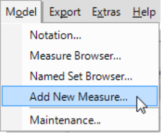
The respective wizard generates all of the desired measures at once. For the Dimension, simply select the one in which the members that you are examining are distributed, for example, products, customers, offices, or orders. For more information on working with univariate statistical measures, please refer to DeltaMaster clicks! 7/2009.
Creating a pivot table
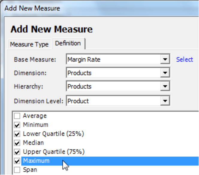
The box plot requires a standardized table construction with these five rows:
- Row 1: the minimum
- Row 2: the lower quartile
- Row 3: the median
- Row 4: the upper quartile
- Row 5: the maximum
The values were offered in the same order in the New measure wizard and are generally shown that way in the Measure browser as well. This makes it easier to select them.
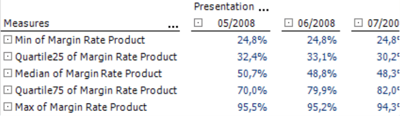
The column axis can remain empty. If you use it, DeltaMaster will create a separate box plot for each member and place them next to each other in the same chart. This makes it easier to compare differences in the distribution across various countries, offices, product lines, order types, or other report components. Now, simply place the time dimension or the time utility dimension in the column axis so that you can observe how the distribution has changed over a stretch of time.
Formatting data series
From your pivot table, go the View menu, switch your view to Chart, and open the menu bar (context menu, I want to… menu). On the bottom-right corner, you can select the box plot
from the different types of charts that are available. The visualization that you will see at first, however, will not look like a typical box plot chart.![]()
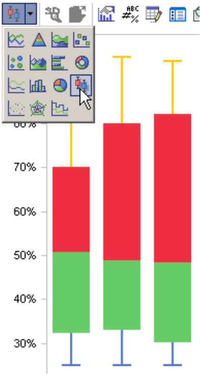
To create the typical outline form, you will now need to edit the Settings (context menu) of the data series. Let’s start with the red series. In the default setting, this stands for the median due to the standard table construction.
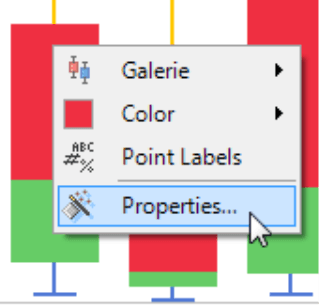
Under Settings on the Series tab, you can now set the Fill to the Color white. To create a Frame, you simply tick on the box and select No effect. Now, set the Color of the Frame to either gray or black. If you want the box plot to be very aesthetic, change the Width and select the second thinnest line size which best resembles the ‘whisker’ look.
Now, repeat the same steps for the lower quartile that was colored green in the default view: white Fill, Frame with No effect in the Color black or gray and a somewhat larger Width.
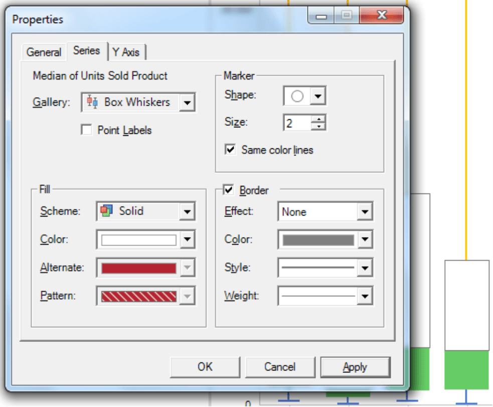
Formatting the whiskers is easier. Since you only have to change the fill and not the frame, you can open the context menu of the pivot graphic to apply a different color to the series. Here, you should use the same black or gray shade that you used for the frame.
If desired, you can also display the Values of the individual sections (context menu of the graphic). To format the labeling, simply open the Graphic settings (context menu, I want to… menu or F4 key) and change the Point labels on the respective tab. Here, you can also suppress the label for individual measures. In many cases, for example, you may want to omit the upper and lower quartiles but show the minimum, maximum, and median values. To do this, simply open your Chart properties, select the respective Series, deactivate the box to Show the point label, and Apply this change for every series.
For advanced users
If you use box plots regularly, you may sometimes wish that you could show the arithmetic means in your chart as well. You can do this by adding a sixth row to your pivot table. In this case, DeltaMaster will draw all other rows as lines in the box plot. Please note, however, that you should only offer this type of chart to more experienced readers. Some readers might be irritated by the additional markings – especially when the arithmetic means lies outside of the box. Before using this option, you may want to inform your audience that this occurs occasionally (and rightly so due to the statistical relationships).
Using box plots
You can certainly save box plots as reports and distribute them accordingly. This way, users on Reader and Viewer levels can assess the results as well. Viewer readers can even dynamically change which box plots should be contained in the chart depending on the setup of the pivot table. In this case, there are two important options which you can define in the Axis definition of the column axis from Pivotizer or a higher user level. If you define the axis by Level selection (General tab) and select the dynamic synchronization, Viewer users can select which members they want to display on the axis – as well as which and how many plots they would like to see in the chart – all from the View window (see DeltaMaster clicks! 4/2009). If you now go to the Axis definition on the Options tab, you can also Allow drill downs for Viewer mode so that your users can determine the contents of the chart themselves (see DeltaMaster clicks! 6/2009 for more information). Each user can then switch the View (menu in the Report window) from Chart to Table, drill down as desired and then switch back to the Chart.
Just like all other pivot tables and charts, you can also integrate box plots into Combination cockpits. This is especially helpful when you want to create a visual comparison of multiple measures. In addition, you can multiply this visualization as well using Small multiples as described in DeltaMaster clicks! 11/2010.
Questions? Comments?
Just contact your Bissantz team for more information.
