![]()
Greetings, fellow data analysts!
Back in mid February, many newspapers and business magazines reported on what they soon dubbed the “Chart of Doom”. This chart circulated quickly and was discussed intensively in Internet forums and social media. It appears to show that the Dow Jones is reacting almost exactly as it did from 1928 to 1930 and, therefore, suggests that the next major stock market crash is imminent. Whoever has experience in working with charts, however, can quickly spot the trick: Once again, the scale determines if the stock market developments look similar or not. In the twenties, the Dow Jones jumped from 200 to 380 while in recent times it rose from 12,500 to 16,500. We do admit that the data in question is tricky and such immense differences in size pose a problem for the visualization. If the chart had been made by DeltaMaster, it would have never caused so much excitement. DeltaMaster always applies the correct scale – even if the underlying data is complicated. This method, which we call Comparable Scaling, is even patented. In this edition of DeltaMaster clicks!, we will introduce this feature and show how you can apply the analysis methods of DeltaMaster to spot deceitful diagrams.
Best regards,
Your Bissantz & Company team
In February 2014, the “Chart of Doom” haunted both the Internet and the press. The chart showed two overlapping time series. Both showed the development of the Dow Jones – one from 1928 to 1930 and the other from 2012 to 2014. The lines run almost congruently. The first series ends with a sudden dramatic crash: Black Tuesday, the start of the Great Depression. The second series is a bit shorter than the line from the twenties and ends abruptly at the strong state of the present day. The similarity of the development of the two lines leads to the obvious questions: What will happen next? Will history repeat itself? Will the Dow Jones react like it did in the twenties? And are we racing full speed ahead towards another era of global depression, massive unemployment, and even war?
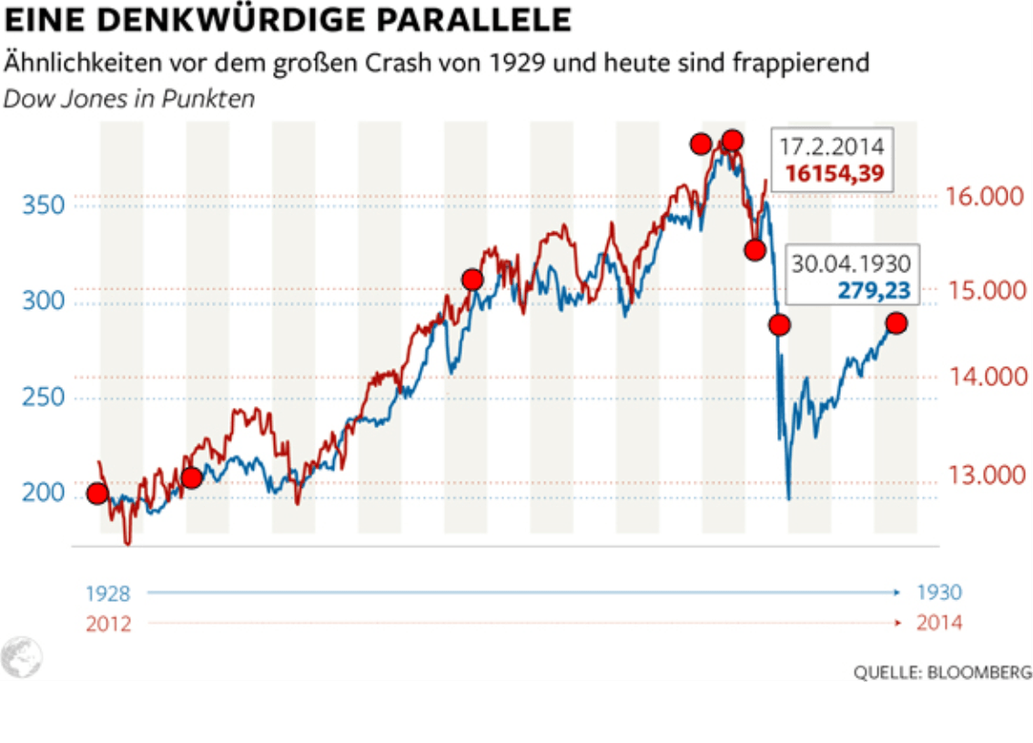
Source: www.welt.de/124946802, 18 February 2014
The chart was debated from many different angles. The political-economic circumstances were brought to light. Some articles talked about self-fulfilling prophecies. The selection of the time frame was debated as well (i.e. because there could have been other phases in which the Dow Jones development was similar to how it is today and did not end in a crash). As data analysts and DeltaMaster users, we would like to make some thoughts of our own. But first we need to ask ourselves: Is this chart telling the truth, and does it present the developments accurately? If not, it can hardly convey a serious message.
We have taken a closer look at the “Chart of Doom”. With DeltaMaster, you can easily recognize that it is a fake. To cut to the chase: If you scale comparably, as we did in the charts on your right, you cannot really talk about a frightening similarity anymore.
In this edition of DeltaMaster clicks!, we will show how you can prove it as well and use this example to illustrate a few special features of the Time Series Analysis.
A first suspicion
With just a simple rough estimate, we can already substantiate our hunch that something isn’t right with the chart. Take a look at the Y axes in the “Chart of Doom”. The left side spans from 250 to 350 which is equivalent to a range of 75 percent (150/200). The section on the right runs from 13,000 to 16,000, the equivalent of a 23 percent range (3,000/13,000). 75 percent on the left and 23 percent on the right is a factor of 3, which is a substantial difference for times series comparisons.
Do it yourself for data analysts
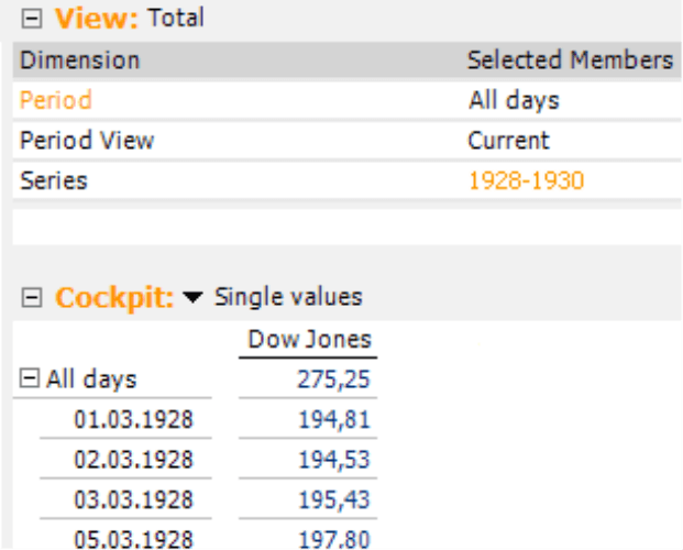
The next step, as is always the case when we check data visualizations in the media, was to obtain the data. This time it was not difficult because you can easily obtain historical stock prices in the Internet. We first saved the data to an Excel file. An important aspect of the preparations was to align the given dates for the listed values. The reason is that the time series must cover the same period of time so that you can place them on top of each other in DeltaMaster. As a result, we have moved the values for the present into the past and noted in an additional column if a value belongs to the 1920’s or to the present time.
Using DeltaMaster TableWizard, we could directly build a relational analysis model based on this Excel file and transfer it into an OLAP cube with DeltaMaster CubeWizard. This ensures that you have the greatest scope of flexibility for your analysis. The screenshot on your right shows the major components of our model: one measure (“Dow Jones”) and three dimensions ? the time axis (“Periods”), the period view, and the data record type (“Series”), which differentiates between “1928-1930” and “2012-2014” as described above. As it turned out, we did not even need the period view for our analysis. It still makes sense to include it in the cube, however, because you never know where an analysis may take you and when you need a time utility dimension to make comparisons to the previous period, cumulations, moving averages, and so on.
DeltaMaster clicks! 01/2013 contains a detailed explanation on how you can access tabular data in Excel with TableWizard and use it to create multidimensional data models with CubeWizard.
One chart, two series
At first, we wanted to see if our data’s line resembles the one of the “Chart of Doom”.
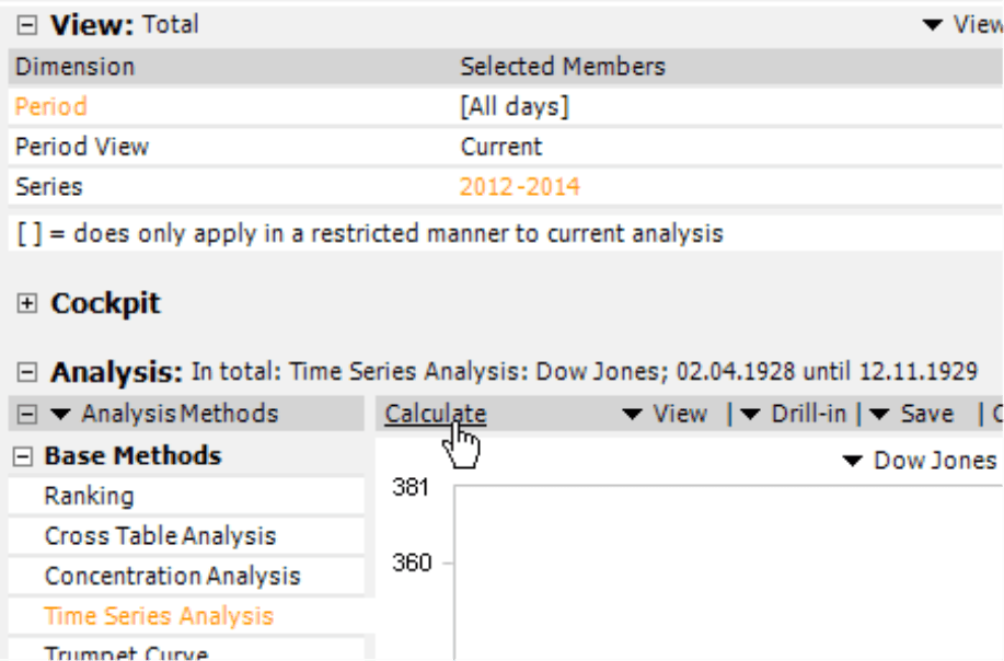
In order to examine multiple measures in the Time Series Analysis, we use the method in Miner mode. (Analyzer mode only supports one measure). Due to our underlying analysis model, we do not display two measures in the Time Series Analysis, rather one, but this one for different dimension members. For that, proceed as follows: Select the first member (e.g. “1928-1930”) in the View window and the desired measure (in our case “Dow Jones”) in the Analysis window. When you calculate the analysis, DeltaMaster will draw the first series in the chart. Now change the view, select the next member “2012-2014”, and calculate the analysis again. DeltaMaster will draw a second series in the chart. That’s how you create several series in a Time Series Analysis without having to create filter values: Select the relevant Members of the View in succession and calculate the analysis again each time.
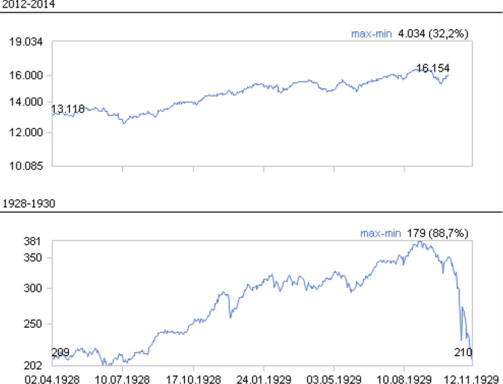
Finally, we modified the analysis so that it mirrors the “Chart of Doom”: We placed the second series for the index development from 2012 to 2014 on the Second Y axis and selected a Scale from Minimum to Maximum (both of which are options in the context menu and the I want to menu). When you apply these settings, DeltaMaster generates a very similar picture. We were relieved: Apparently we were using the same data.
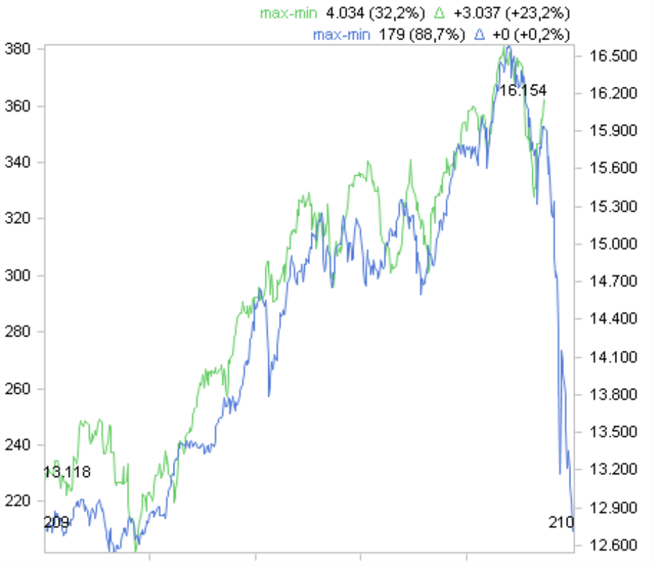
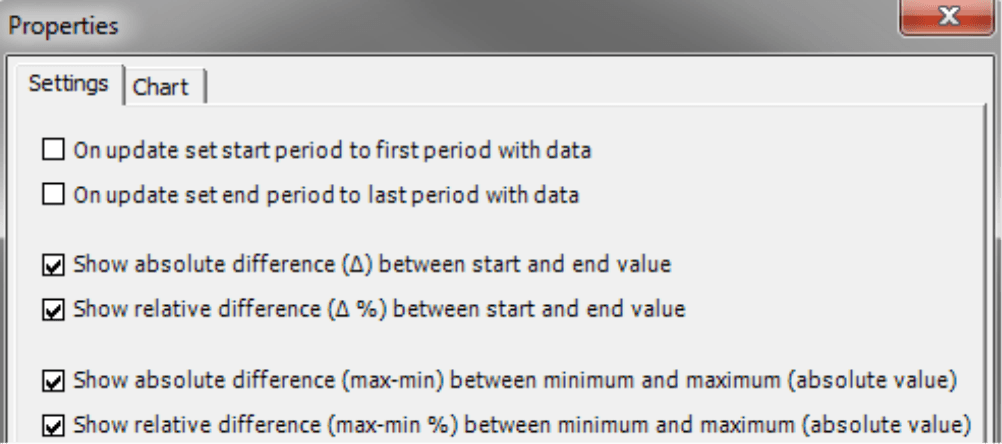
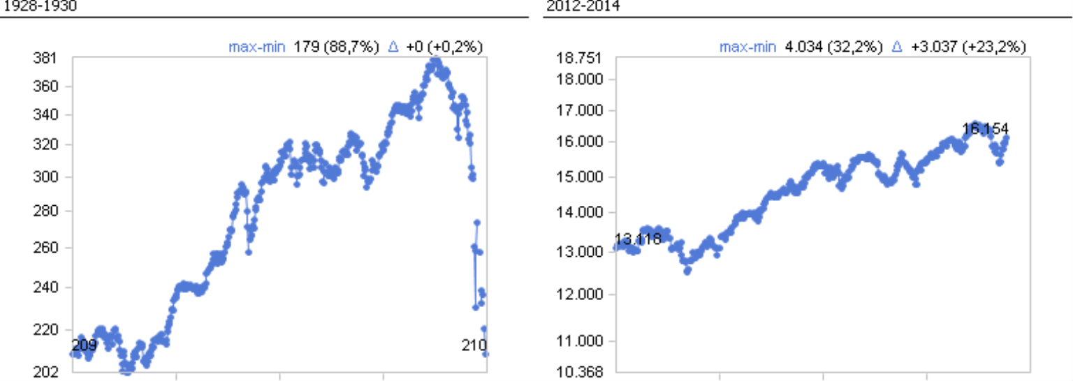
The visualization in DeltaMaster, however, includes a clue that you are dealing with tricky data: In the upper-right corner, DeltaMaster displays a few statistics about the lines such as the difference between the largest and smallest value of a series (“max-min”) and the difference between the initial and final value of the series (“?”), both as absolute and relative values (in regards to the minimum or the initial value).
You can display or hide each of these statistics individually in the Properties (context menu or I want to menu). The difference between the minimum and maximum provides a decisive clue: One series has 32 percent amplitude while the other has one of 89 percent. That doesn’t fit well together – especially not in one chart. We had already assumed that after a rough estimate at the very beginning, and now we can even prove it.
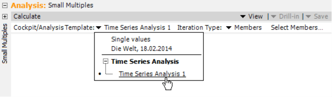
Two charts, one analysis: Small Multiples
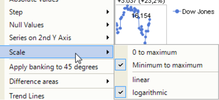
The problem with the visualization is that the sections of the Y axis are very different. If you place them in a single chart – one on the left, one on the right – you can no longer compare the series because similar slopes stand for different relative changes. The solution is to display each series in its own chart, scale the charts comparably, and place them next to each other. Small Multiples, an analysis method in Miner Expert mode, does just that. For more information and examples on how to use Small Multiples, please read DeltaMaster clicks! 12/2008, 11/2010, and 11/2012.
The prerequisite for Small Multiples is an analysis template which contains a saved configuration of the respective analysis method. In our case, it makes sense to apply a logarithmic scale between the Minimum and Maximum. The logarithm ensures that the same relative changes of a series are displayed with the same slope no matter on which level the change occurs (see DeltaMaster clicks! 07/2010). The limitation to the area between the minimum and maximum improves the differentiation of the presentation. You can set your mind at rest: Cropping the axes will not harm the proportionality (as would be the case if you were working with bars or columns).
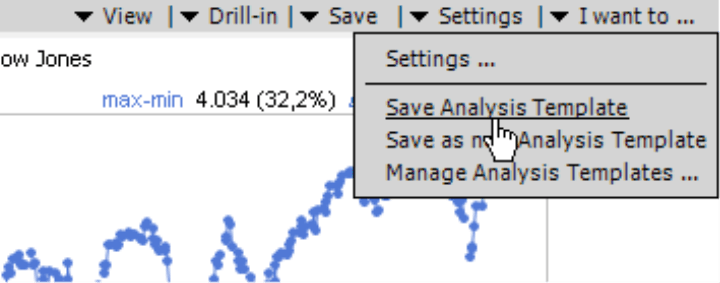
We save this configuration as an Analysis Template (Settings menu in the window Analysis). In the Time Series Analysis, DeltaMaster can only include one measure in the analysis template.
You can now use this analysis template as a repeated component in Small Multiples. For the Iteration type, select Members and both record types “1928-1930” and “2012-2014” with the respective links.
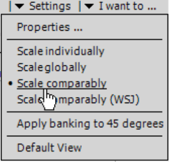
Once you have calculated the Small Multiples analysis, you can fine tune the scale in the Settings menu. Here you will find the option to scale comparably – a patented visualization that solves the problem.
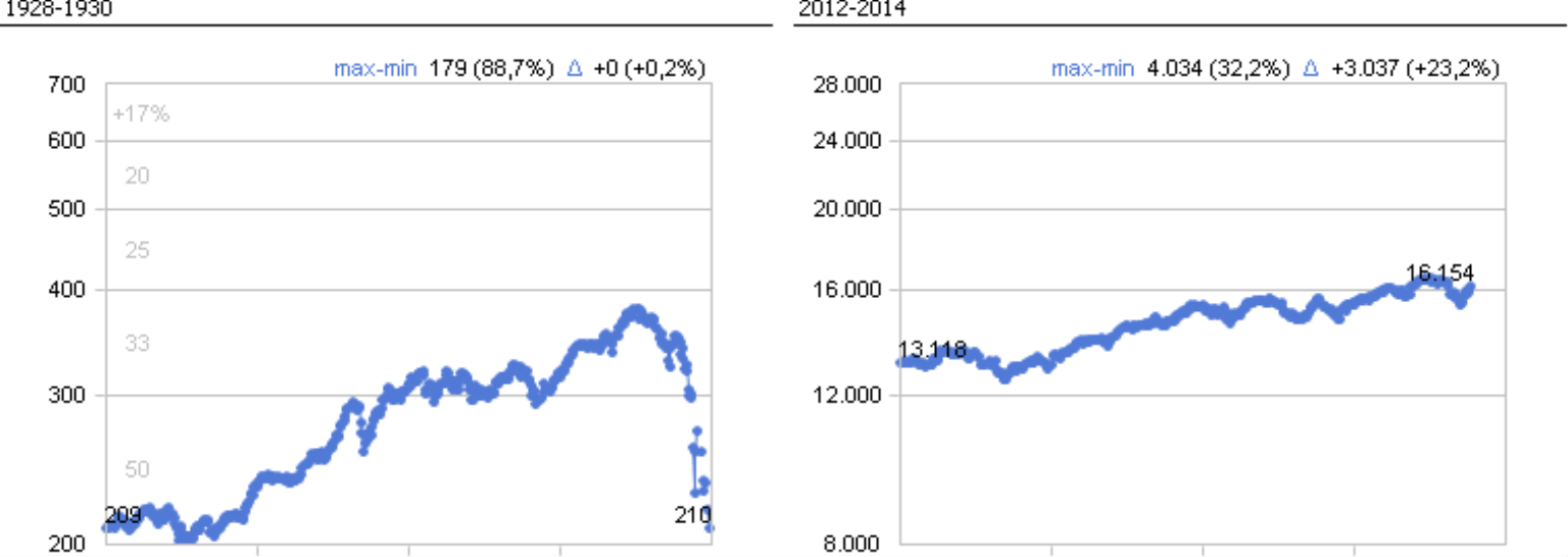
The following screenshot shows the Dow Jones development as a Small Multiples report which is scaled comparably. This ensures that the slope of the developments accurately represents their dynamic. When these developments are equally steep, the relative changes are equally strong. For that, the sections of the Y axis must be selected correctly – which DeltaMaster does automatically.
The underlying principle becomes even clearer if you select the WSJ type. Here, DeltaMaster adds reference lines that designate the percentage changes (see next page). A change from 200 to 300 is the equivalent of 50 percent growth while 300 to 400 equals 33 percent, 400 to 500 equals 25 percent, and so on. The reference lines run the same way in all multiples and emphasize the comparability. The name WSJ is in reference to The Wall Street Journal, which regularly uses a similar visualization with reference lines.
Setting the standard
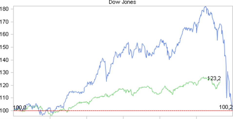
Another way to deal with extreme differences in size is to standardize the data to a common starting point. To do this, select the desired time period in the chart, and let DeltaMaster standardize the presentation by selecting the respective entry in the context menu.
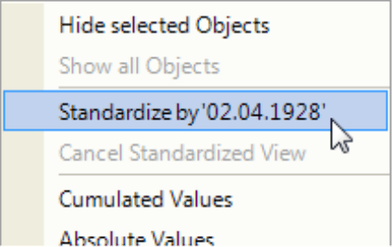
This, too, quickly makes the “Chart of Doom” less frightening because the developments look quite different. The disadvantage of standardizing the data, however, is that you can no longer see the absolute values. In place of the Dow Jones closing values, you only see index values. As a result, we generally recommend the use of other formats such as scaling comparably with Small Multiples.
Questions? Comments?
Just contact your Bissantz team for more information.
