![]()
Greetings, fellow data analysts!
It is amazing how close some competitions are in professional sports. While swimming or track and field meets are measured in hundredths of seconds, Formula 1 or ski races even use thousandths – that is how close the standings lie next to each other. In order to look that closely, you need a lot of technology. Once the results have been measured, however, it is easy to present them. In most cases, a simple table with names and times will suffice.
In management reporting, there are also some areas in which all of the results are very close to each other, for example, when you are working with sell through rates, service levels, or other percentages with an ideal ranking of 100 percent. If you have tables containing these types of values, the requirements for presenting them are even harder than in sports because you want to show the differences and gaps in addition to the rankings. And since the same report usually needs to display other figures as well, it isn’t easy to steer the reader’s attention to the values that deserve to get it. Although you can visualize these types of measures just like the others in DeltaMaster, you can make them much easier to read with a bit of thought and a few small adjustments. See for yourself!
Best regards,
Your Bissantz & Company team
Some industries and business departments work with ratios in which the ideal state equals 100 percent or the reference value should be as close as possible. Here are a few examples:
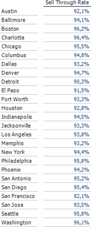
- In the retail industry, the sell through rate shows the percentage of purchased goods that has already been sold.
- The manufacturing industry measures capacity utilization and availability.
- Service levels and delivery reliability show the ratio of timely deliveries to the entire deliveries in a given period.
When you work with these types of measures, the report objects (e.g. article groups or machines) often have similar values – and all of them are very close to 100 percent. In some industries, for example, service levels below 97 percent are inacceptable. 99 percent availability may be insufficient for a server in a data center, for example, because that still means that the server can’t be used more than 3.5 days in the year. For that reason, most of the values lie in the same range. Reporting these types of measures is tricky. What is the best way to visualize them – and how can you see anything when everything is so close to each other?
In this version of clicks!, we will discuss a few ways how you can display these types of measures in graphical tables. As an example, we will use a typical sell through rate that a retail chain might use to analyze a certain article group. In the screenshot below, we have placed these different alternatives next to each other so that you can compare them more easily.
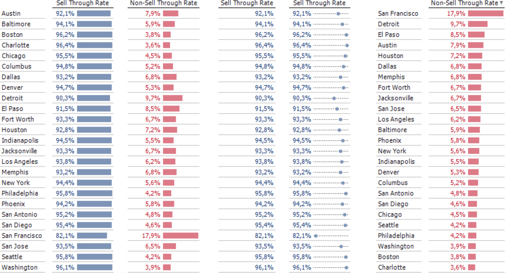
Now let’s take a look at each of these pivot tables in more detail.
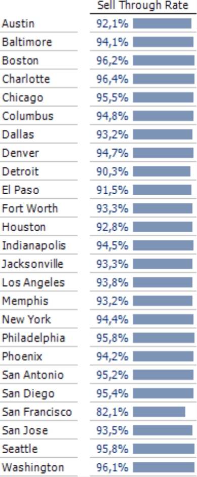
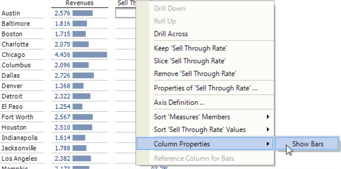
Not enough differentiation?
The bars in the graphical table on your right are supposed to visualize relationships, but the presentation doesn’t differentiate them adequately! The bar representing 96 percent is not much longer than one showing 94 percent. In this case, the bars don’t offer any help. The differences in length are so minimal that they can’t grab your attention. Even worse, they are distracting because a graphic is a signal that accompanies the value and demands to be noticed. If all of the values are screaming for attention, however, it is difficult to recognize which ones are important. In short, “standard” bars are not the best choice in this case.
Try a different perspective
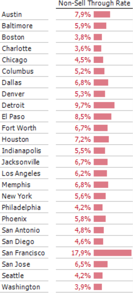
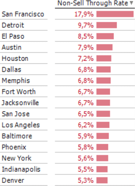
Instead of the percentage value, one good solution is to show its counterpart (i.e. 1 minus the percentage value). In place of availability, for example, you would show unavailability. Instead of capacity utilization, you could show the disuse rate. In this case, instead of showing the sell through rate, why not show the rate of purchased items that were left unsold? This will switch the value range from just under 100 percent to just above 0 percent, which you can differentiate much more easily. See for yourself:
In the screenshot on your right, you can see that the same findings from above show a completely different picture if you just view them from a different angle. The graphic elements work in this case because you can clearly see the differences, for example, in that a bar for 4 percent is twice as long as one for 2 percent. That’s a good presentation!
Our prime concern is the language. Some measures don’t have a short and simple counterpart. In some cases, there are common terms for both extremes – such as vacant and leased, waste and yield, or delayed and on time. Sometimes, however, the only option is to negate the term (e.g. with “not” or “non-“).
Another reason for hesitance with this option may possible stem from the habits of your readers who might argue that they have “always” received reports on sell through rates in the past and not the percentages that haven’t been sold to date. Actually that’s a strange argument because that was actually what was met the entire time! Articles that didn’t sell, the percentage that isn’t used, the deadline that wasn’t meant – those are the problems that should concern your readers and that they should be trying to solve. These types of terms dominate in many different areas – just think of the unemployment rate. Seen this way, your readers may just understand an unusual-sounding term – such as the “non-sell through rate” in the screenshot above – as a call to action to give the problem a name and increase awareness for it.
Switching around a measure in this fashion only requires a few steps in DeltaMaster. In the Measure Browser (Model menu), simply add a New Measure (I want to… menu) and select User-defined Measure for the Measure Type.
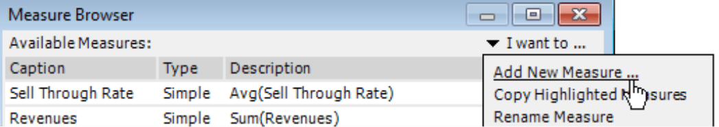
In the Definition, now you can select the respective measure (i.e. in this example, the sell through rate) for the Base Measure. In the MDX field, now enter the formula for the calculation: “1-#1”, where “#1” is a wildcard for the first (and in this case only) Base Measure, which is the sell through rate. In the bottom part of the dialog box, you can enter a Name (e.g. “Non-sell through rate“) and define the Format as a Percentage. Feel free to be stingy with Decimal Places. Displaying more than one decimal place rarely makes sense, and most times you can even omit them entirely (0 Decimal Places).
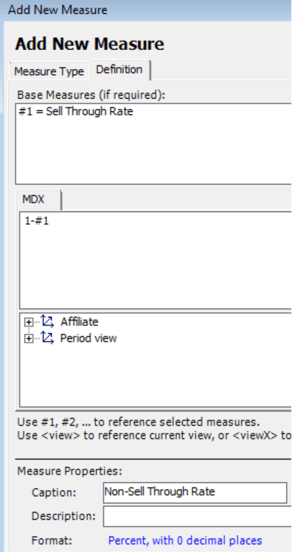
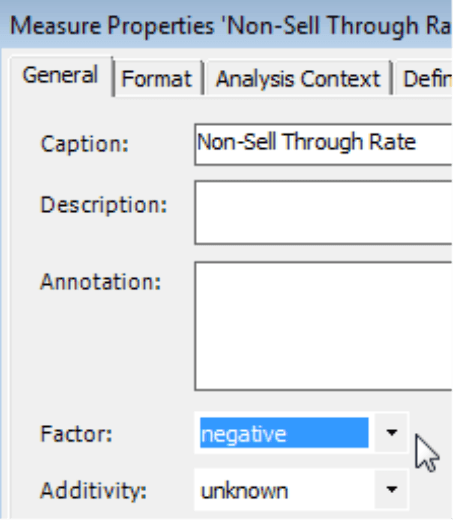
In the Measure Browser, you can find the newly created measure at the end of the list or the end of the current measure group. In its Properties (context menu or the F4 key) on the General tab, you should set the Factor which states if the new measure has a positive or negative effect on the results. In our example, the starting measure was defined as being positive (the more sales, the better) so its counterpart is negative (the more items not sold, the worse). This factor determines the color of the font and the bars (for more information on coloring, please see DeltaMaster clicks! 01/2010).
To display the new measure in the pivot table, first select it from the Axis Definition just as you did with the previous one. In some cases, you may want to display both values in the table – the original measure due to the familiar terminology and its counterpart to show the visual signals. In this type of report, however, you should avoid using bars for the original measure (see section below) and only display them for its counterpart.
No graphics are better than bad ones
If switching around your measure (i.e. to show 1 minus the percentage value) isn’t an option, simply omit the graphic. It will be much easier for your eyes to scan the column and measure the numeric values if they aren’t confronted with multiple bars of the same length. If all of the values lie very closely around the 100-percent mark, a column without bars will be much more legible than one with them.
If the table contains multiple columns such as revenues, variances, etc., you will probably want to display bars in some columns but not in others – and not omit them in the entire table. To do this in DeltaMaster, you first need to activate Bars for the entire table (under Graphic in the context menu of data cells in the pivot table) and then hide the respective bars in the individual rows or columns.
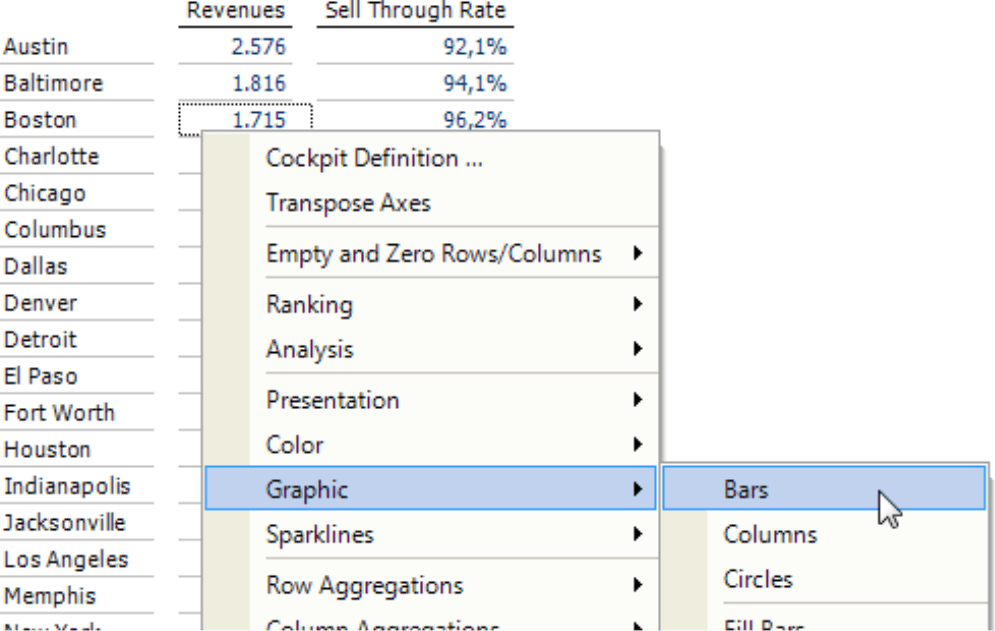
To hide the bars in this example, you simply need to open the Column Properties (context menu of column headings) and deactivate the Show Bars option.
Dot bars
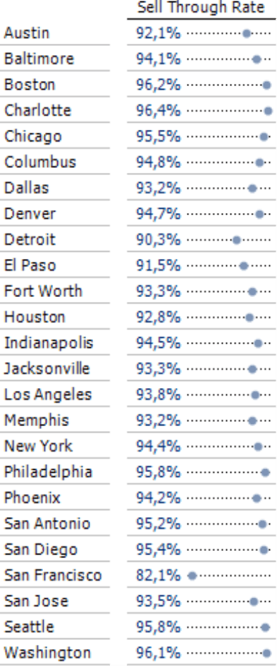
If you don’t want to omit the bars or switch around the sell through rate to show the items that aren’t sold, try using dot bars instead. You can activate dot bars in the context menu of the pivot table in the Graphic submenu.
The advantage of dot bars is that you can also scale them from the minimum to maximum values. When DeltaMaster draws the graphic elements, it will only include the range that is represented in the values – in other words, it will crop the axis. This option is not offered for normal bars due to what we call the “perceptive priority” or the fact that the human eye views the absolute length of the bar, in other words, the distance from the end of the bar to the common base line. The viewer relies on the laws of proportionality and expects the bars’ lengths to be proportional to the values that the bars represent. Cropping the bars would violate that and the presentation would be distorted. This is why DeltaMaster does not offer this option for standard bars. Dot bars, however, are a different story because the perceptive priority lies in the gaps themselves and not in the gaps to the base line. The human eye gauges the presentation from dot to dot and compares the gaps between the dots. Their distance from the base line is secondary. This is why DeltaMaster allows you to crop the axis for dot bars.
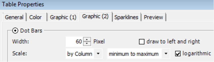
You can activate the Scale between the Minimum and Maximum values in the Table Properties (context menu, I want to… menu or F4 key) on the Graphic (2) tab. The default setting is a Logarithmic Scale. In this special case where all of the values are very close to each other, you can ignore the differences between a linear and logarithmic scale. Since the logarithm doesn’t affect your results, this option can stay activated.
For more in-depth thoughts about logarithmic scales see DeltaMaster clicks! 07/2010. For a detailed description of dot bars, please read DeltaMaster clicks! 12/2011.
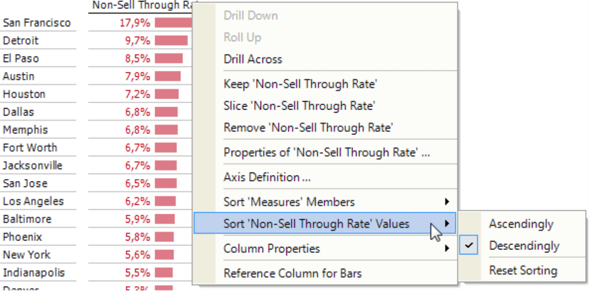
Sort and filter
Regardless of the presentation, it is always helpful to sort a table (as a hierarchy) based on the measure in question – and not alphabetically or by zip codes. You can either define this order in the Axis Definition on the Ranking tab or change this setting directly in the report in all user modes from Reader to Miner as well as in Presentation Mode. If the column axis only contains measures without nested dimensions, you only need to double click on the column heading to sort the table based on the values in this column.
In other cases or in Presentation Mode, you can change the order in the context menu of the column heading.
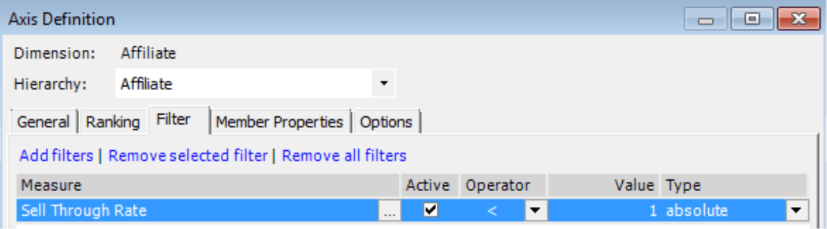
In applications where the viewed measure regularly reaches the 100-percent mark and only misses it on occasion, you can work with Filters to only display the objects that have missed the 100-percent mark as an exception. You can also define these filters in the Axis Definition by entering the comparative value in decimal form (e.g. 1 for 100 percent and 0.95 for 95 percent). The filter determines which objects DeltaMaster should place in the report – not which ones it should omit. This type of report is well suited for exception reporting with ReportServer, which regularly monitors if the measure in question stays below 100 percent and only sends a report if at least one object has not reached the 100-percent mark. For more information on Exception Reporting with DeltaMaster, please read DeltaMaster clicks! 11/2008.
Questions? Comments?
Just contact your Bissantz team for more information.
