![]()
Greetings, fellow data analysts!
Alongside the likes of Jacques Bertin, Otto Neurath, Edward Tufte, and Howard Wainer, William Cleveland is one of the big names in data visualization. Yet, as is often the case with great minds, his best ideas take the longest to spark interest. This includes an idea on how to present data graphically that features considerable differences in orders of magnitude. For many years, he has promoted the use of dot plot charts for this purpose.* Unlike bars, dot plots support logarithmic scales, a tried-and-true method for representing data of different orders of magnitude in a comparable manner. We have advocated the use of logarithmic scales for quite some time. Now, we want to help Cleveland make his breakthrough as well while staying true to the principles of industrial reporting. Our objective is to produce reports in an automated fashion that have a consistent quality and need no further editing – not even when publishing large quantities. That’s why we have integrated Cleveland’s dot plots as a new option in the pivot tables of DeltaMaster. Since they are so versatile, you can use these “dot bars” to visualize both less complex data constellations as well as your most challenging scenarios. In this issue of DeltaMaster clicks!, we’ll explain how you can use dot bars and why they are better than standard ones.
Best regards,
Your Bissantz & Company team
* William S. Cleveland, The Elements of Graphing Data, Murray Hill 1994.
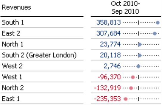
Starting in DeltaMaster 5.4.9, you can now use two new types of in-cell graphics in pivot tables. These dot bars (shown in the screenshot on your right) and dot columns are relatively new visualization forms that help clarify proportions in tables. Reading these dot bars is very simple. DeltaMaster simply displays the value as a point on a thin reference line, which represents the span of all values in the table or the respective column or row (see below).
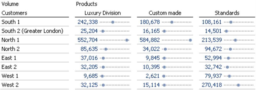
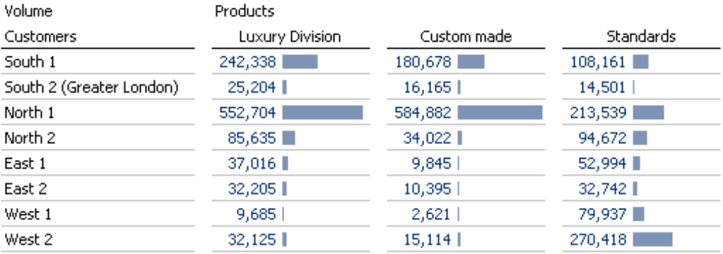
At a first glance, you might think that dot bars are simply a graphical variation of the familiar bars that transform the pivot tables in DeltaMaster into Graphical Tables. Instead of drawing the complete bar, however, a dot bar only marks its outer edge with a dot. As a result, the visualization is less crowded or, as Edward Tufte would say, needs less “ink”. And since this type of chart is new and relatively uncommon, your readers will probably spend a bit more time examining it. Those already are two plus points over standard bar charts – but there are even more!
After all, the big advantage of using dot bars is that you can scale them flexibly. That’s why they work well even in difficult data scenarios where you have relatively low differences in values on a high base level or differing orders of magnitude within a data series. This flexibility makes dot bars or dot columns a very versatile visualization form – and an excellent topic for this issue of DeltaMaster clicks!. For the purposes of simplicity, we will focus on dot bars for now. The same general information, however, applies to dot columns as well.
Adding dot bars
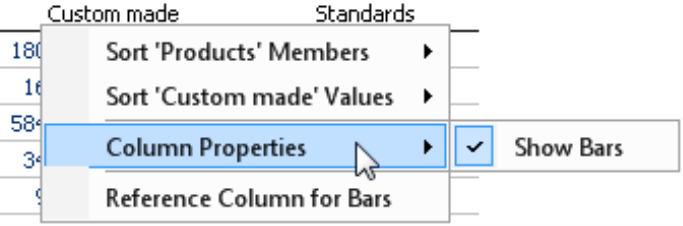
You can add dot bars to the table – just as you would add standard bars – in the context menu of the pivot table under Bars/Columns. This feature is supported in all user levels from Reader to Miner. You will be familiar with the scaling options in the context menu as well. Here, you can choose if you want to draw the dot bars with a common scale for the entire table, by column, or by row.
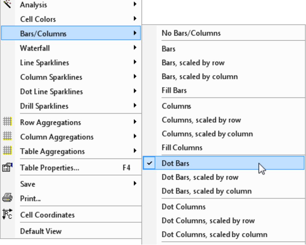
Initially, DeltaMaster enables this visualization for the entire table. You can, however, opt to hide it for individual columns or rows (Column properties in the context menu of the column header or the Row properties in the context menu of the row header) – but this, too, is probably nothing new for you if you have already worked with Graphical Tables in DeltaMaster.
Scales and other table properties
What really makes dot bars so special is that you can scale them like line charts. Bar charts can’t do that – and we will explain “why” below.
You can change the scaling options in Pivotizer, Analyzer, and Miner modes under the Table properties (context menu, I want to menu, or the F4 key) on the Graphical elements (1) tab. Here, you can opt to Scale dot bars logarithmically (instead of linearly). In addition, you can specify if the Scale should always include the base line (up to 0) or simply cover the range from the smallest value to the largest one of the reference area (i.e. Minimum to maximum – in other words, with cropped axes).
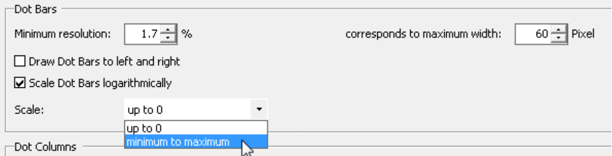
On this tab, you can also define the Maximum width of the dot bars in pixels (and, accordingly, the Minimum resolution) as well as choose if you want to Draw [the] dot bars to left and right. The second option is interesting in reports showing budget-actual variances, changes over the previous period, or other data constellations containing positive and negative values. If this option is enabled, DeltaMaster symbolizes zero with a small vertical line.
But why would you want to change the scale of dot bars – and why doesn’t that work in standard bar charts? That has to do with what we call “perceptive priority”.
Perceptive priority
We use the term perceptive priority to describe what the human eye uses for orientation when it “translates” the graphical elements of charts into numbers and numerical proportions.
- In bars and columns, the eye focuses on the length of the bars or the height of the columns, in other words, the distance of the data points to a baseline.
- In line charts, however, it primarily focuses on the distance between the individual data points, in other words, the slopes of the line segments from one point to the next. The eye literally glides along the line as if it were surveying a mountain ridge and compares the differences in height between the peaks and the valleys, regardless of how far above sea level they may be.
This realization has major consequences for the way we build charts.
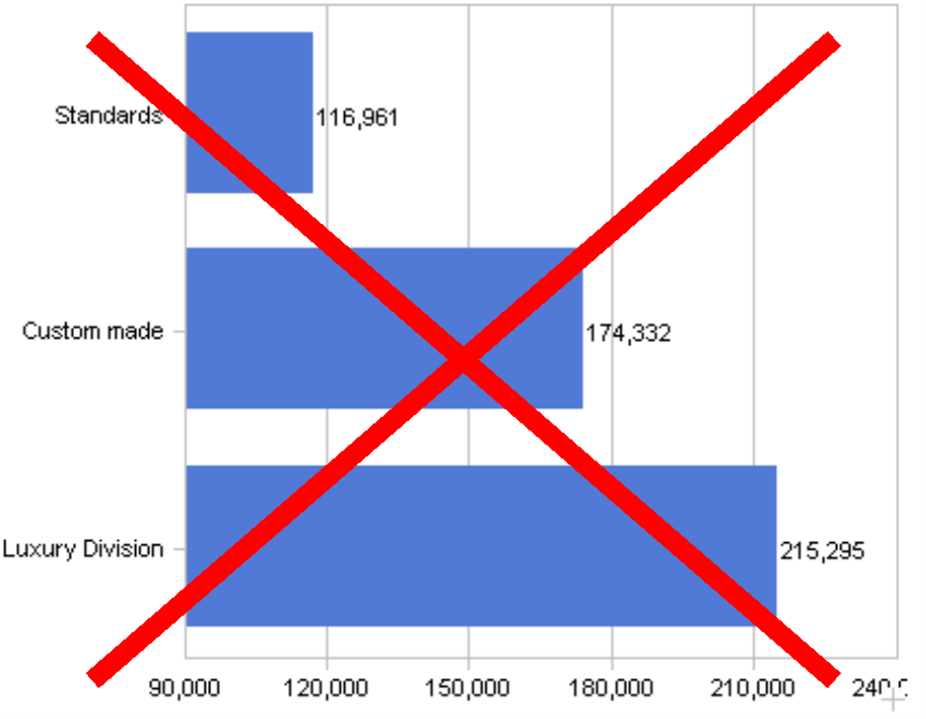
Bars and columns thus show a distorted view of the proportions when they are cropped, in other words, when you simply subtract a “base amount” and just draw the sections where the values have changed (e.g. between the minimum and maximum of the data series). When you crop an axis, the differences in values are no longer proportional to the lengths of the bars or the heights of the columns, which is exactly what your eyes need for reference with this type of chart. (That is why it is so frustrating that the current versions of Microsoft Excel automatically crop the axes when the values are within a close range if you don’t explicitly change this option in each individual chart.) In the screenshot above, you can see that the bar for “Custom made” is roughly three times as long as the one for “Standards”, even though the difference between the values is only around 49 percent.
Lines, however, are different. Here, the perceptive priority lies in the distance between the individual points and not to the axis. If you subtract a basic amount to crop the axes of line charts, the distances between the individual points might be more dramatic but they are still correct and not distorted. When the differences between the values are large, you simply use a logarithmic scale for the Y axis so that the same percentage changes from one point to the next are always shown with the same slope – regardless of whether the values are small or large. We have already discussed the advantages of and the need for using logarithmic scales in detail in DeltaMaster clicks! 07/2010. Logarithmic scales, however, only work with lines. If used with bars and columns, the human eye would only see the absolute lengths or heights – and would not be able to identify the relativizing effect of the logarithm.
As far as scaling is concerned, therefore, lines are definitely more flexible than bars and columns. But you can only use lines to show developments over time. You would only confuse your readers if you tried to compare structures in a line chart. After all, could you imagine showing the revenues of different sales regions or product groups for a single period as a line? That would be difficult – if not impossible – to understand.
And that brings us back to dot bars. Dot bars have the same perspective priority that lines do. Even though they don’t have a connecting line, we still read them like the points in a line chart. We follow the distances from point to point and the distance to a zero line becomes irrelevant. This is the reason why you can scale them like line charts. That also means, of course, that you can crop the axes to better differentiate the visualization and scale them logarithmically in order to identify relative differences in values even in the case of values of different orders of magnitude.
Scaling options compared
Let’s take a closer look at the Logarithmic and From minimum to maximum scaling options using data on the product groups in our “Chair” reference model. Please note, of course, you cannot use either of these scaling options for standard bar charts because they would distort the data due to the perceptive priority. Accordingly, DeltaMaster doesn’t offer these options for standard bar charts at all.
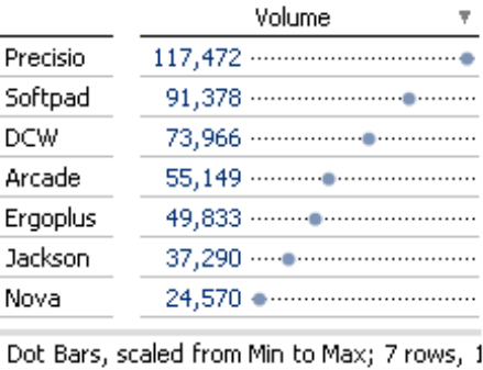
With the standard scale (linear, up to 0), the position of the points to the right of the vertical base line is proportional to the absolute values. The dot bar width here is set to 100 pixels.
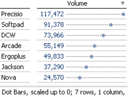
If you now choose Minimum and Maximum, DeltaMaster places the smallest value in the chart area on the left and the largest on the right. These gaps make the absolute differences in value comparable. The difference between 24,570 and 49,833, after all, is about as big as the one between 49,833 and 73,966, namely around 25,000. Using the Scale from Minimum to maximum improves the differentiation and ensures that you can still see small changes even on a relatively high level, as the chart on the right has more pixels available for the same absolute difference in value compared to the first chart.
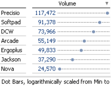
Finally, the Logarithmic Scale makes relative differences in value comparable. The same distance between the points stands for the same percentage difference, or the same factor between the values. The distance between 24,570 and 49,833 is approximately as far as the distance between 49,833 and 91,378 (about twice as far in each case, roughly speaking).
DeltaMaster displays the selected scale in the status bar below the report. In presentation mode, the status bar is located below the title so that your audience can interpret the visualization correctly.
Logarithmic scales are also useful in business scenarios where you are dealing with a wide range of values. For example, you might earn a large percentage of your revenues from a few key accounts while the rest comes from others after a large gap – or your U.S. headquarters probably has many more employees than your new subsidiary in Malaysia. If you visualize these types of scenarios with bar charts, you cannot see differences between the smaller objects because the big bars literally squash them.
You can avoid this problem by using a logarithmic scale.
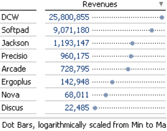
The logarithmic scale (right) makes relative differences comparable. Revenues for “Ergoplus” are roughly twice as high as revenues for “Nova”, revenues for “DCW” are roughly three times as high as revenues for “Softpad”. You can now see that these pairs of values have similar proportions just by glancing at the table – and to prove it, you just have to do the math (“Ergoplus” : “Nova” = 2.1, “DCW” : “Softpad” = 2.8).
Grouping
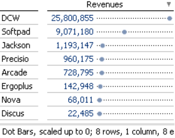
The right screenshot above also shows another advantage of using dot bars with a logarithmic scale. The location of the points also groups the objects to a certain extent. The top products “DCW” and “Softpad”, which both generate millions of dollars in revenues, are grouped together. “Jackson“, “Precisio”, and “Arcade” form a second group ranging from high six-figure revenues to just over a million. “Ergoplus” and “Nova” belong to another group and “Discus” clearly brings up the rear. None of these insights are visible in the above screenshot on the left. With the linear scale, you merely see two important objects that dominate the others as if there were no other differences among them.
Questions? Comments?
Just contact your Bissantz team for more information.
