![]()
Greetings, fellow data analysts!
Most hobby photographers and even amateur picture takers have realized that new cameras with more megapixels do not necessarily take better pictures. (This, of course, is just an across-the-board statement and should be judged as such.) Yet although consumers feel this way, the marketing departments of the manufacturers haven’t seemed to notice because they continue to run sensational marketing campaigns advertising more and more pixels.
Some people also feel that there is a tad too much marketing hype around business charts targeted to managers because they often only provide a hazy view of business reality. In Business Intelligence we want high resolution. Yet, that doesn’t necessarily mean that we have to use many pixels. On the contrary, most times a picture of a company’s status quo is clearer if you use fewer pixels to draw it. Once again, it all comes down to the right dosage. If you don’t use enough pixels, you can’t fit enough information into the picture; if you use too many, you can’t recognize anything. With DeltaMaster’s graphical tables, you have the right equipment for better visualizations. This edition of clicks! offers a few tips on how to apply it skillfully.
Best regards,
Your Bissantz & Company Team
What should a report look like? What information should it contain? These are common questions facing companies especially in light of today’s information culture. After all, today’s standard business charts including time series, column, and bar charts date back to William Playfair (1759 – 1823), and not much has changed in the past 200 years. Only recently, new formats such as graphical tables, sparklines, and in-cell charts have entered the scene.
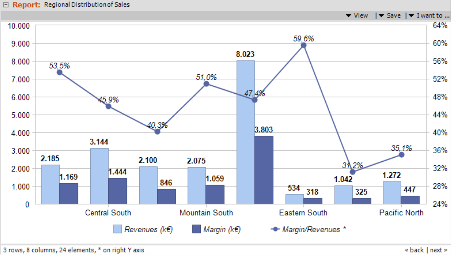
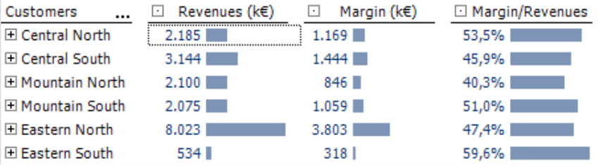
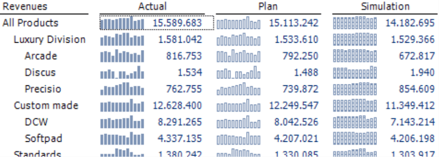
Sometimes, a simple chart that contains the same content and form from previous reports might trigger a discussion. The example on your right, for example, shows three measures (i.e. revenues, margin, and the percent share of revenues) for eight different sales regions. That totals 24 values as you can see in the status bar. Fans of new, data-dense formats probably feel that that this chart is too vague, doesn’t contain enough information for the amount of space that it uses, is too complex to produce, or is simply too instable or inflexible. All of these points are valid.
Of course, you can create these types of charts in DeltaMaster. But you can create different and even better ones. After all, you can fit the data in the chart above into a graphical table.
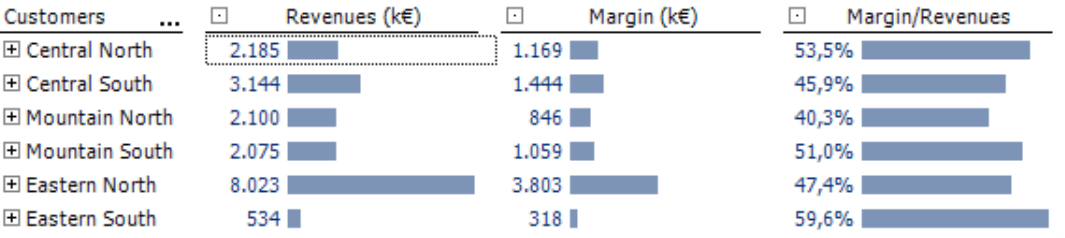
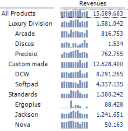
To briefly recap, a graphical table shows numbers in an unchanged form and maintains the same information density as the original table. Those are the advantages in comparison to a chart. The strength of a graphical table lies in its ability to steer the human eye and intuitively convey relationships in size. This task is performed by the graphical elements that are integrated in the table. When you create graphical tables, you can avoid conflicts between labeling and graphical elements even when the underlying data has changed (e.g. addition of objects or values; various relationships in size). This makes them highly robust and practical for automation.
In the chart on your right, you can see the same values as above in a graphical table from DeltaMaster. They are easy to read because they are sorted and placed in a single column as you would expect from a table. The bars reflect the relationships among the values so that you can quickly identify unusual situations and get a gist of the interval sizes.
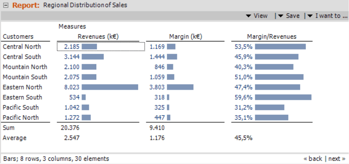
Both the graphic and the tables are based on the same pivot table in DeltaMaster and have the same size. With the graphical table, however, you still have space, which we used here to display sums and averages. You could also show additional columns and rows, add sparklines to show the relationship over time, display comments, and much more.
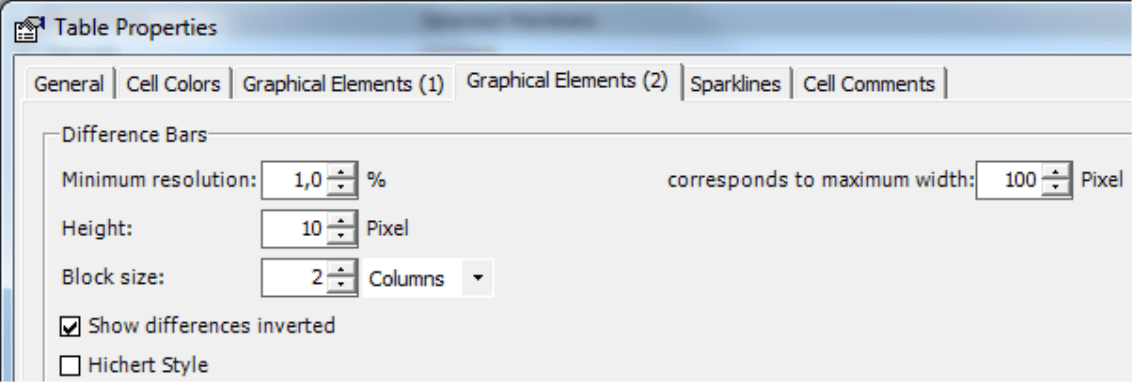
Bars: minimum resolution and maximum width
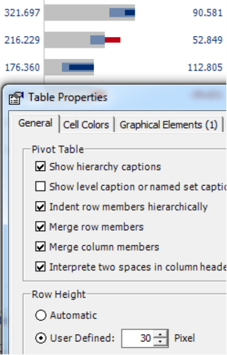
You can define how DeltaMaster should measure graphical tables in the pivot table under Table properties (context menu, F4 key, or I want to… menu). On the Graphical elements (1) tab, you will find the values for Bars, Columns, and Waterfall elements. For the time being, we will simply focus on bars; the directions below, however, also apply to the other options.
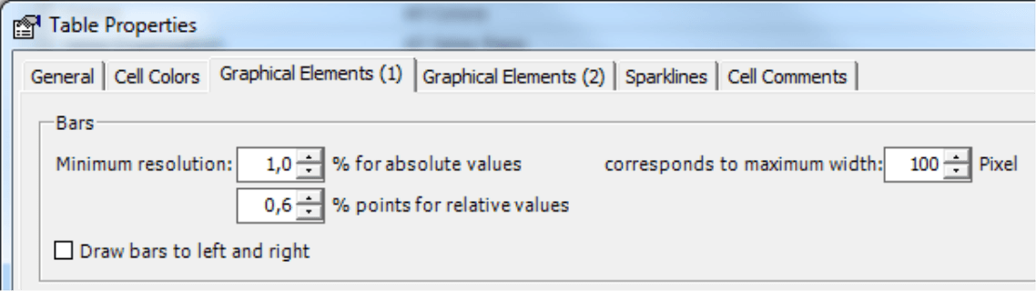
The chart on page 2 has a maximum width of 100 pixels. This is the width of the bar that represents the largest value. This could be the entire table, the respective row, or the respective column depending on the reference that is defined in the context menu of the pivot table.
DeltaMaster treats percentages separately. If you are using the same scale for the entire chart, it will visualize all absolute values in one scale and all percentages in another. That’s why the ‘Margin % revenues’ column contains a bar in the full width although the respective value (59.6 % = 0.596) is much smaller than the absolute values. DeltaMaster recognizes a Percentage through the Formatting in the Member properties. You can determine the Minimum resolution from the Maximum width. The parameter in the Table properties is linked to the Maximum width. A finer resolution (i.e. a smaller percentage) leads to a larger column width and vice versa. In our example, 1.0 percent means that DeltaMaster should divide the range that it should factor for the bar into 100 pieces, and each pixel on the screen stands for 1 percent of the span. If you increase the resolution to 0.5 percent, DeltaMaster will use 2 pixels to represent 1 percent of the span, and the bars will be twice as long.
The tables on your right show these effects more clearly. They have a maximum width of 60, 200, and 140 pixels respectively. In comparison, the last option with a width of 140 pixels seems a bit overdone. After all, the bars are only there to make the relationships in size clearer and that also workswith a lower resolution.
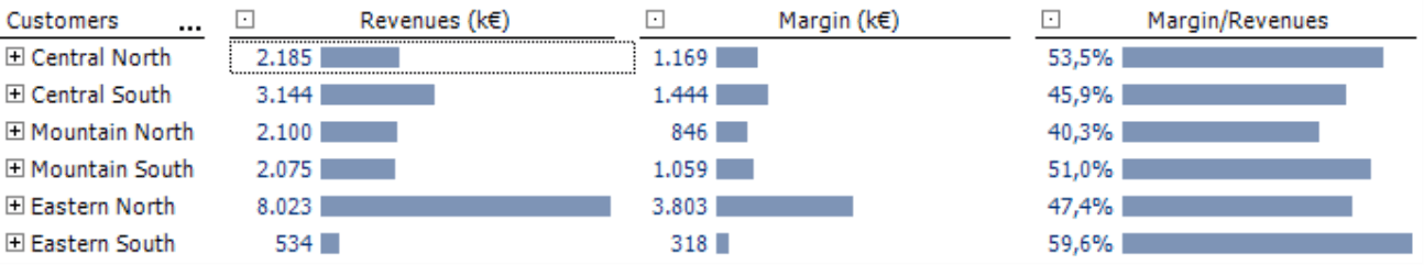
The human eye can differentiate a single pixel. As a result, a Minimum resolution or a Maximum width of 100 pixels is a good starting point if you want to fine tune your graphical tables. Depending on the underlying data (e.g. larger statistical spread), even more compact measurements can give the human eye the critical cues it needs to see which values act like the others and which ones need to be examined more closely.
You might be wondering if you can’t just crop the bars to improve the differentiation. Unfortunately, this is not an option because then the length of the bars would no longer be proportional to the values that they should represent. And isn’t that that purpose of visualizations, anyway?
Difference bars: bar height
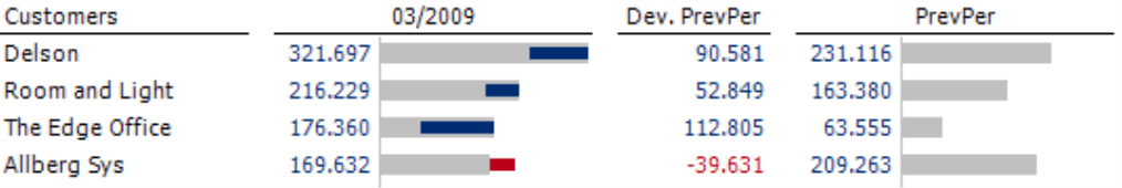
Another type of cell graphics are difference bars which you can use to visualize a base value and one or more difference values, for example, revenues and the variance from the previous month as in the screenshot on your right. For more information on this format, please refer to DeltaMaster clicks! 05/2010.
You can also define the size of the difference bars in the Table properties on the Graphical elements (2) tab. This table also contains the Minimum resolution and Maximum width, two control elements that are linked to each other as explained previously.
In the case of difference bars, however, there is also an additional aspect; they should visualize three or even more values. The blue and red pieces are nested within or placed on top of each other. In this case, you want to differentiate the bars that are placed on top of each other in addition to the individual data values.
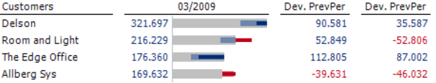
The example above, in comparison, has a Block size of 3 and now shows the variance from two months ago in addition to that of the previous month. In the zoomed screenshot on your right, you can clearly see how the two pieces lie on the gray bars. The inner (blue) bars represent the columns that are further away.
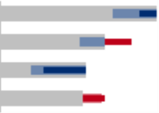
The default height of ten pixels is exactly 1 pixel smaller in the first rows of both the inner (dark blue) bar above and the outer (light blue) bar below. In this case, that is not enough because you can’t easily differentiate the inner from the outer bars.
In this case or in any case where you want to visualize three or more values with difference bars, you should allocate more space to the bar height.
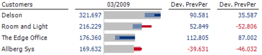
The screenshot on your right, in comparison, shows difference bars with a height of 14. This height is 2 pixels smaller in the first rows of both the inner (dark blue) bar above and the outer (light blue) bar below. Although we have only invested two more pixels than in the default setting, the visualization is much easier to read.
If you want to draw the difference bars even higher – for example, because you want to visualize four values or you want larger gaps between the nested bars, you can also edit the row height (Table properties, General tab). Otherwise, the higher difference bars will not fit in the row or you won’t be able to see the difference in height within the table.
The easiest approach is to simply test different variations by clicking the Apply button instead of just OK. This allows you to see how the changes would affect the pivot table without closing the dialog box.
![]()
Column sparklines: height, width, and spacing
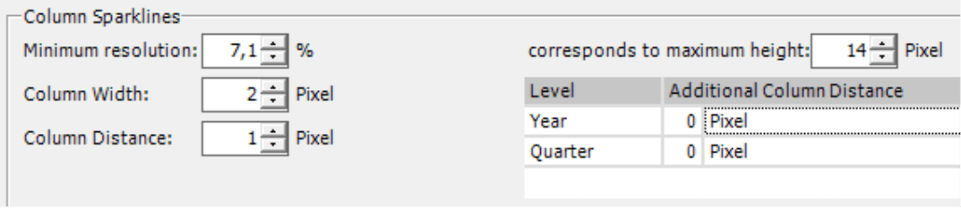
With sparklines, you can integrate the development of different measures over time into your cockpits and reports. In the default setting, you can already see that sparklines offer fewer options for differentiation – and that is good! After all, sparklines are not a replacement for standard charts. They are a completely new type of chart that profits from the deliberate omission of quantification. DeltaMaster draws column sparklines with a height of 14 pixels, the equivalent of a 7% resolution in its default setting. With these measurements, the miniature columns even fit in a standard row height.
You can define the maximum Height, Width, and Spacing of sparkline columns in the Table properties on the Sparklines tab. As with difference bars, these settings determine how easily your audience can read the sparklines.
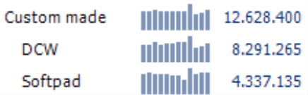
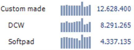
In the following screenshot, the heights of the sparklines vary. On the left, you see the default setting of 14 pixels, 18 in the middle, and 22 on the right. The goal of using sparklines – namely, showing patterns of how a value develops – has already been achieved with the smallest value, the default setting of 14 pixels.
 |
 |
You should practice great caution when you vary the column width and column spacing. If the values are too large, you will not be able to identify the sparkline as a coherent pattern. The screenshot below illustrates this well by combining column widths of 2, 3, 4, and 5 with a column spacing of 1, 2, and 3 pixels.
| Width 2, Spacing 1 | 3, 1 | 4, 1 | 5, 1 |
| 2, 2 | 3, 2 | 4, 2 | 5, 2 |
| 2, 3 | 3, 3 | 4, 3 | 5, 3 |
This overview proves that less is more – and that also applies to most of the other examples in this edition of clicks!. Smaller dimensions are more elegant and easier to read because you can follow the pattern more easily as well as create and compare it as a whole.
Column sparklines: grouping columns
As of DeltaMaster 5.4.5, you can group columns within a sparkline. This allows you to emphasize the breakdown of calendar months into quarters and years. To create a group, DeltaMaster places an additional gap between two columns when the respective parent member changes in the time hierarchy. You can clearly see the breakdown into quarters in the screenshot. This ensures that the spacing carries through all rows from top to bottom.
You can define additional column spacing along with other sparkline parameters in the Table properties. In the screenshot above, you only need one additional pixel spacing per quarter and an additional one per year. Larger gaps may be good for separating the values but make it more difficult to identify the patterns. Here, it pays to weigh the pros and cons.
![]()
Column sparklines and notation
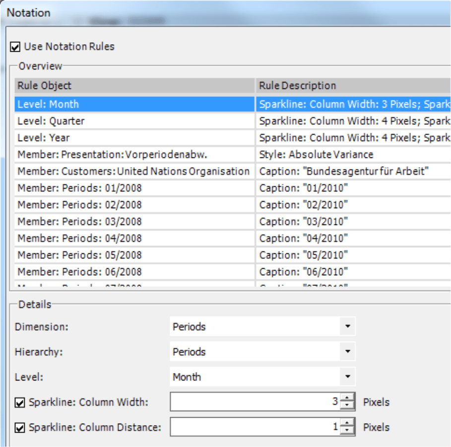
Unlike bars and difference bars, you can define the size of column sparklines in the Table properties and as part of a Notation (Model menu). These settings apply to all sparklines in all pivot tables of the current analysis session (.das file).
The notation rules tie the Column width and Column spacing to a certain hierarchy level in the time dimension. This way, you can use a visualization to compare values as well as signify which time frame is being shown. Since a quarter lasts longer than a month, a sparkline that represents a quarter could be longer than one that stands for a month. To ensure that the reader can instantly differentiate a sparkline for a quarter from one for a month, you simply need to make it bigger. Sparklines for quarters, however, do not need to be three times wider than those for a month. Since the size is defined in the notation, you can ensure that they are used the exact same way in all pivot tables. If the notation rules are activated, you will not be able to edit the fields for the column width and spacing in the Table properties.
You can also use notation rules to visualize bars in hallow or shaded forms, for example, to designate the values as budget or forecast data. These bar styles also apply to the columns of sparklines. To use these options, the columns must be at least 3 pixels wide, otherwise the columns will look as if there were filled.
For more information and explanations about using notation rules for a common report design, please refer to DeltaMaster clicks! 08/2009.
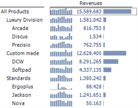
Column sparklines: scaling within a cell and combining with other members
All screenshots that you have seen with sparklines so far have been scaled by cell. That means that DeltaMaster uses the full height to achieve a maximum differentiation per cell. Using the options in the content menu of the pivot table, you could also choose a scale by row, by column, or even for the entire table.
In many cases, however, these options make the charts more difficult to read because DeltaMaster bases the scale on the largest value and probably won’t be able to differentiate the others well enough.
In general, we recommend that you scale sparklines by cell and show bars as well. The sparklines make it easier to observe developments over time while the bars show the relationships in size.
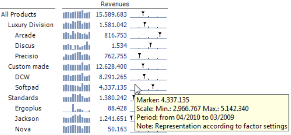
Another option to improve the differentiation is the Scale which shows how close the current value (which is also displayed as a number) is to the minimum or maximum of all values that are represented in the sparkline. You can display this option in the context menu of the pivot table as soon as the sparklines are activated. Since the scale is much longer than the sparkline’s height, this creates a very finite differentiation. It directs the reader’s attention to the current value and its classification in the span of the time series. For more information on this feature, please refer to DeltaMaster clicks! 02/2010.
Selective visualizations
All of the examples so far are variations of pivot tables. You can create and edit pivot tables as well as all of the graphical formats that you have seen here starting in Pivotizer level. And like all pivot tables, these graphical tables are extremely flexible, for example, if new rows have been added after a data update or even if you just want to sort the table or use additional measures. In addition, all of these examples show that it pays to be stingy with pixels and to carefully check if you can create a sufficient differentiation with fewer pixels.
But even though you can use graphical elements to create space-saving visualizations that are easy to understand and easy to maintain, not every value needs an accompanying graphic. In many cockpits or reports, there are select columns that are extremely important because they show the key message of the entire report. This is often the case with variance analyses. The reader should focus on the absolute or relative variance of the actuals to the budget values, or the current actuals to those from last year. Budget values belong in this report as well, but they are not as important as the actuals or variances. In cases such as these, it makes sense only to use graphical elements, sparklines, etc. in select columns and to leave plain numbers in the others.
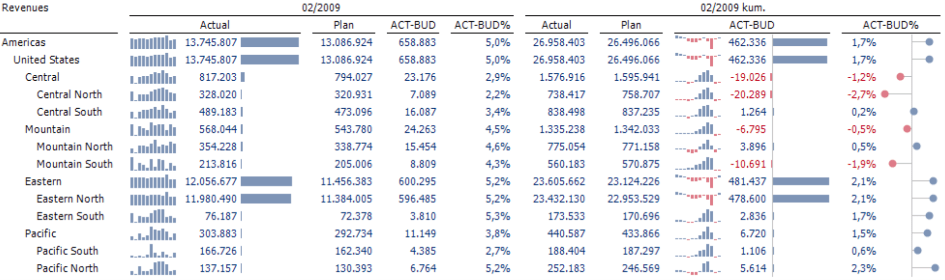
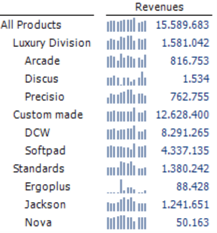
With that in mind, the report above uses visualizations sparingly. It shows the revenues in different customer regions with the current actuals and budget data as well as the absolute and relative variances for both the current month and cumulated year to date. You only see bars in three columns and sparklines in two. Five columns only show numbers. The visualization highlights the most important information in this report – the variance analysis. For many companies, it is more interesting to see the cumulated variance (i.e. year to date) than that of a single month. As a result, both columns on the right include bars – and one includes sparklines as well – to provide more information on the developments over time. (Note: Sparklines of absolute and relative variances always show the same patterns. As a result, you only need to show sparklines for one of them.)
To create a report like this in DeltaMaster, simply open the context menu of the pivot table and activate the visualization for the entire table, for example, bars or sparklines. In the context menu of each column header, you can then hide the visualization for that particular column. This allows you to remove the visualizations where you do not want them.
On a side note, the report above contains 420 values.
Questions? Comments?
Just contact your Bissantz team for more information.
