![]()
Greetings, fellow data analysts!
Using an average for orientation doesn’t exactly sound like an ambitious goal. Nevertheless, an average is often an effective reference value when we want to classify the objects in our analytical applications. This is especially the case when we are dealing with percentage variances or changes such as “Which products, sales markets, materials, etc. have generated above-average growth and which ones haven’t?” A synonym for the average is the mean, and for our purposes we can definitely take this literally: The mean is also a means for measuring one’s performance etc. After all, the average of an entire company or business unit, for example, is an indication of what was accomplished as a whole and, therefore, a good benchmark for the individual areas. And thanks to DeltaMaster, the time that it takes to create these types of analyses is below average to say the least – and that’s a nice goal as well. In that case (any only in this one), long live the average!
Best regards,
Your Bissantz & Company team
Showing the relevant measures for one report object – for example, the EBIT for a particular subsidiary, the gross margin analysis for a certain product group, or the revenues for a specific sales region – does have its advantages. But a report only really starts to get interesting when you can make comparisons. If you want to know where you must take action and where this is required most urgently, you need to be able to compare multiple objects such as subsidiaries, product groups, sales regions, etc. that shape your business. In this case, it often also depends on trend statements such as “Who or what has achieved above-average growth?” and “Who or what has performed below average?” In the following sections we will explain some of the methods you can use to create these types of analyses in DeltaMaster.
Comparing revenues with those of the previous month
The example on your right shows a revenue analysis of the products in our “Chair” reference model. In the rows of the pivot table, you can see the values for the entire product spectrum (i.e. “All products”), which is broken down into three product main groups (“Luxury Division”, “Custom made”, and “Standards”) which, in turn, have a total of eight product groups. The columns show the revenues for the current month, the previous month as well as the absolute change and percentage change. The previous month and the variances are defined in DeltaMaster as Time analysis members (see DeltaMaster clicks! 08/2007). DeltaMaster scales the graphical elements on a column-by-column basis and formats them using the notation rules (see DeltaMaster clicks! 08/2009); the bars to the left and right of the vertical line represent absolute changes, while the dots – which are an allusion to percentage signs – show percentage changes.
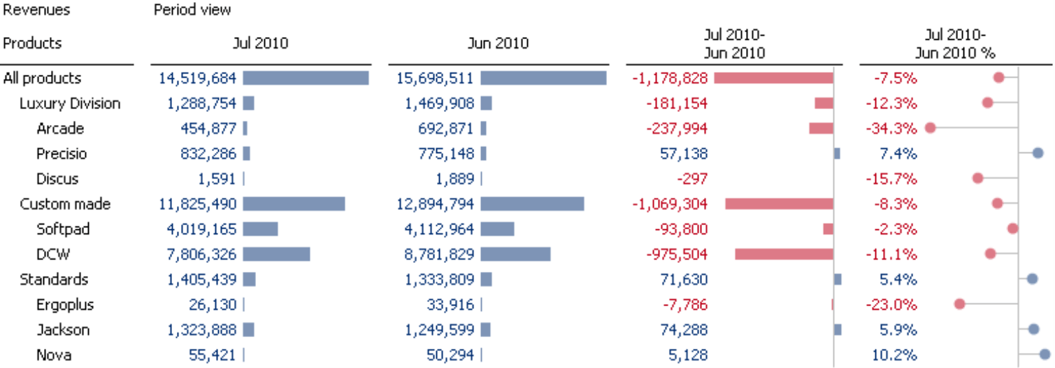
Thanks to these graphical elements, you can instantly see which major absolute and relative changes have occurred. If you now want to know which products have performed above and below average, you can elaborate on this very easily.
The average is “top”
The table above already contains everything you need to differentiate the products that are more successful than the average from those that are less successful than the average. This is because when you are dealing with percentage changes or variances, the average is actually the top member! Since the “All products” row shows the average revenue change across the entire product range, this top member of the hierarchy is an ideal reference point for comparing percentage changes and classifying them as “above average” or “below average”. This also applies to percentage variances (e.g. budget-actual variances) and other quotient values such as the rebate rate, profit margin, percentage of material costs, and so on.
If you sort the pivot table by the fourth data column (using Axis definition or the context menu of the fourth column header), this correlation becomes very clear.
When you sort the data in a pivot table, DeltaMaster generally works across all levels (except in the case of sorting hierarchically, see DeltaMaster clicks! 03/2007). In other words, DeltaMaster looks at the values of the sorting criterion and not at the superordinate and subordinate hierarchy of the dimension members. As a result, “All products” is now listed in the middle of the report in line with its change of -7.5% and not at the top of the table. And that makes sense because it now divides the table into two sections. The product main groups and groups that performed better than the overall market are listed above “All products”, while those that performed worse than the overall market are listed below “All products”.
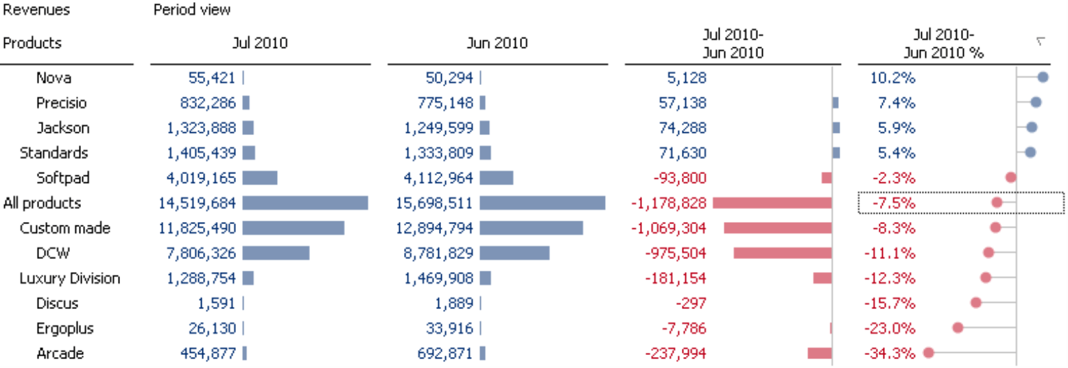
This is very helpful when you are making comparisons of percentage values, because you don’t need to worry about the definition of the average. Each aggregated member automatically delivers the weighted average of its child members. The member “Custom made”, therefore, reflects the weighted average of the custom-made products, while the member “All products” reflects the weighted average of all products. So if you want to identify above-average or below-average developments, you often only need to sort the rate of change across multiple levels (as shown above) in order to find the members above and below the top element (i.e. the uppermost member in the report).
When you compare growth in percentage terms, you neutralize size differences of a structural nature. “Custom made”, the most important product main group, experienced a large decline in revenues in absolute terms, but the percentage change was -8.3%, which is still close to the average. On the other hand, revenues for the Ergoplus model fell by 23.0%. Although this rate is substantial, this development isn’t alarming because the chart shows that the company only generates a small percentage of its revenues with this product. The revenue decrease for Arcade, however, should give you something to think about due to its significance in absolute terms and its severity in relative terms. In some cases, it may make sense to combine the absolute and relative variance into a weighted variance and to use this as a sorting criterion (see DeltaMaster clicks! 06/2008 for more information).
The graphical elements in the screenshot above do more than just help the user visualize relationships among values. Through their even patterns, they also show which column is used to sort the table – in other words, which measure or period view is the “leading” one.
Ranking and PowerSearch
You could also use Ranking and PowerSearch to identify objects that are above and below average. Both analytical methods provide an option for looking at averages.
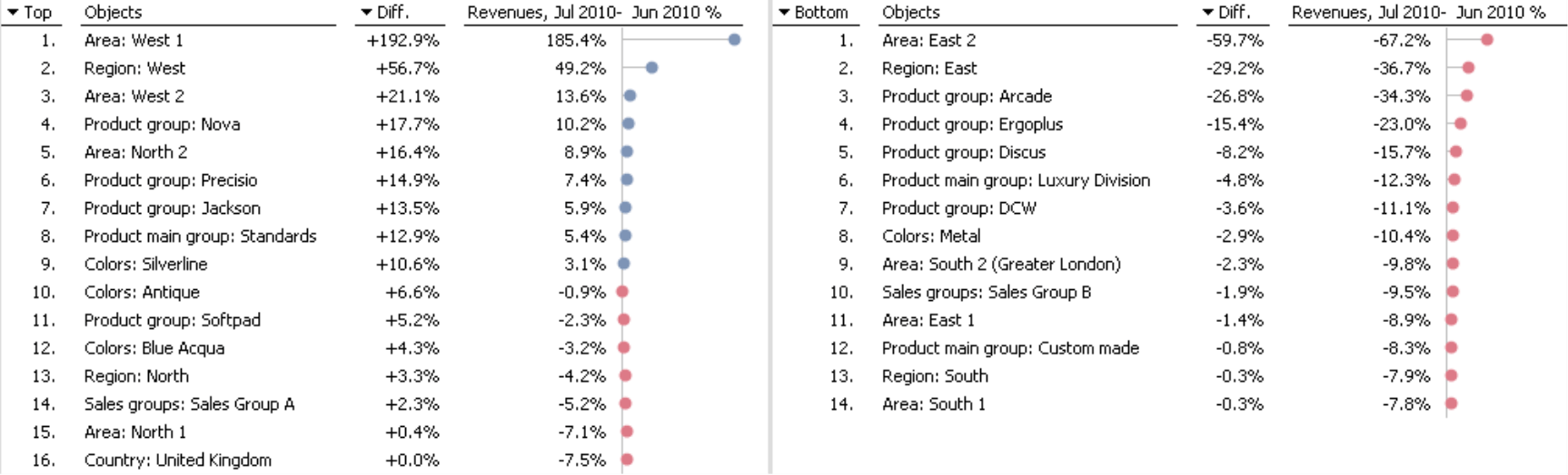
To obtain a ranking based on the percentage variance, select the Ranking method in the Analysis window in Miner mode and choose the desired hierarchal level (in this example, product group). Now, drag the desired value (in this case, -7.5% for the top member “All products”) from the pivot table and drop it into this window.
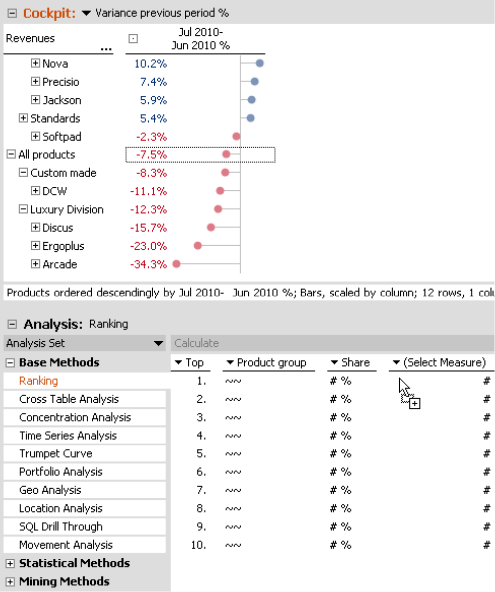
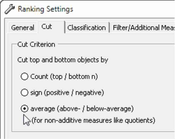
Once DeltaMaster has calculated the analysis, you can define the Cut criterion in the Settings (Analysis window). This criterion applies to Ranking reports that show the top and bottom members together. It determines which objects will be placed in the table on the left and which objects will be placed in the table on the right. There is also a separate option to analyze non-additive measures like quotients.
In the results of the analysis, DeltaMaster displays the members that have performed above average and below average separately.
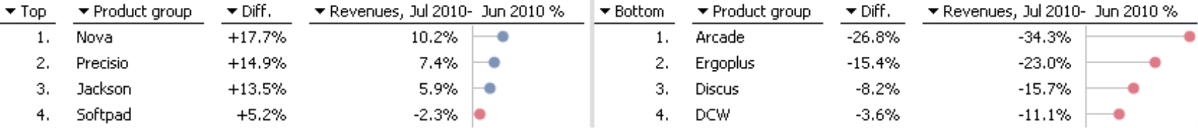
In this example, of course, these members are identical to the ones that you have already seen in the pivot table. Sales for the product groups Nova, Precisio, Jackson, and Softpad were better than average, while those for Arcade, Ergoplus, Discus, and DCW were worse.
In a separate column, DeltaMaster displays how far (i.e. how many percentage points) the respective member is from the average. From the pivot table, for example, you already know that “All products” had a change of -7.5%. Nova had the strongest growth (10.2%) of all product groups. DeltaMaster displays the difference between these values in the column: 10.2 – (-7.5) = 10.2 + 7.5 = 17.7. In this manner, you can also obtain information about the distance from the average in a Ranking or PowerSearch. Although it is not listed as such, you can see it in the Cockpit window.
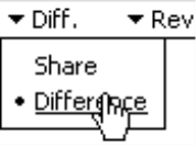
You can display or hide the Difference column in the I want to…. menu. If DeltaMaster displays shares instead of the differences, you can simply switch this option to Difference in the menu of the column header (note: differences only make sense for relative measures).
A Ranking applies to either a certain level or All levels of the respective dimension in the analysis. With a PowerSearch, you can extend this view to multiple levels and even different dimensions. To take into account product main groups and groups as in the pivot table above, you first need to go to the header of the second column and choose the According to analysis context option.
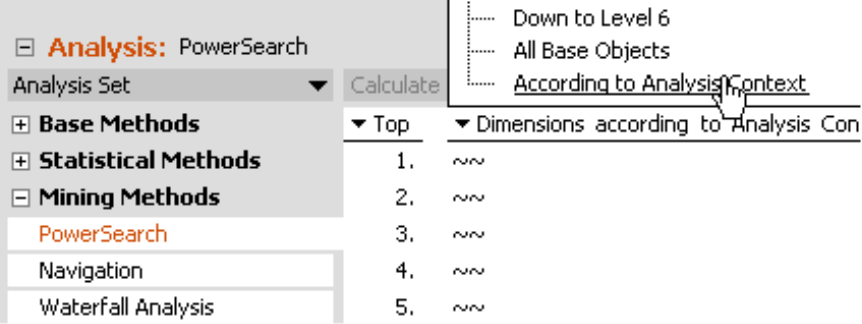
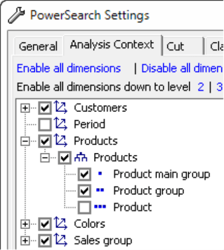
Afterwards, you can select which dimensions, hierarchies, and levels you want to take into account in the Settings on the Analysis context tab. This allows you to analyze the product main groups and groups together (as in the pivot table above) as well as further dimensions.
This method creates very informative reports that provide a wide range of influencing factors and possible reasons for the change that you want to analyze.
Small Multiples: Comparisons with the average historical pattern
In the examples above, you have always analyzed the percentage change compared with that of the previous period. Instead of just comparing a period, however, sometimes you would rather compare historical patterns. For example, has the total market demand developed the same way as the demand in the individual market segments? Is the material consumption for selected material groups the same as the average consumption for all materials? You can answer these and other questions using a Time series analysis in combination with the analytical method Small Multiples. To create these types of reports, you need a valid Miner Expert license. As always in the DeltaMaster user-level concept, users can access and use these reports in all levels down to Reader.
Since we have already provided an overview of Small Multiples in DeltaMaster clicks! 12/2008 as well as a more detailed look in conjunction with pivot tables in DeltaMaster clicks! 11/2010, we won’t delve into more details in this issue. Instead, we will focus on the topic at hand, namely the options that allow you to compare individual time patterns with an average pattern.
For these examples, we are going to use a different scenario. Let’s say that you are now interested in the rebate rate, i.e. the rebates as a share of revenues. In particular, you want to examine how the rebate rate has developed overall as well as for the individual product groups. The report shown below allows you to make this comparison.
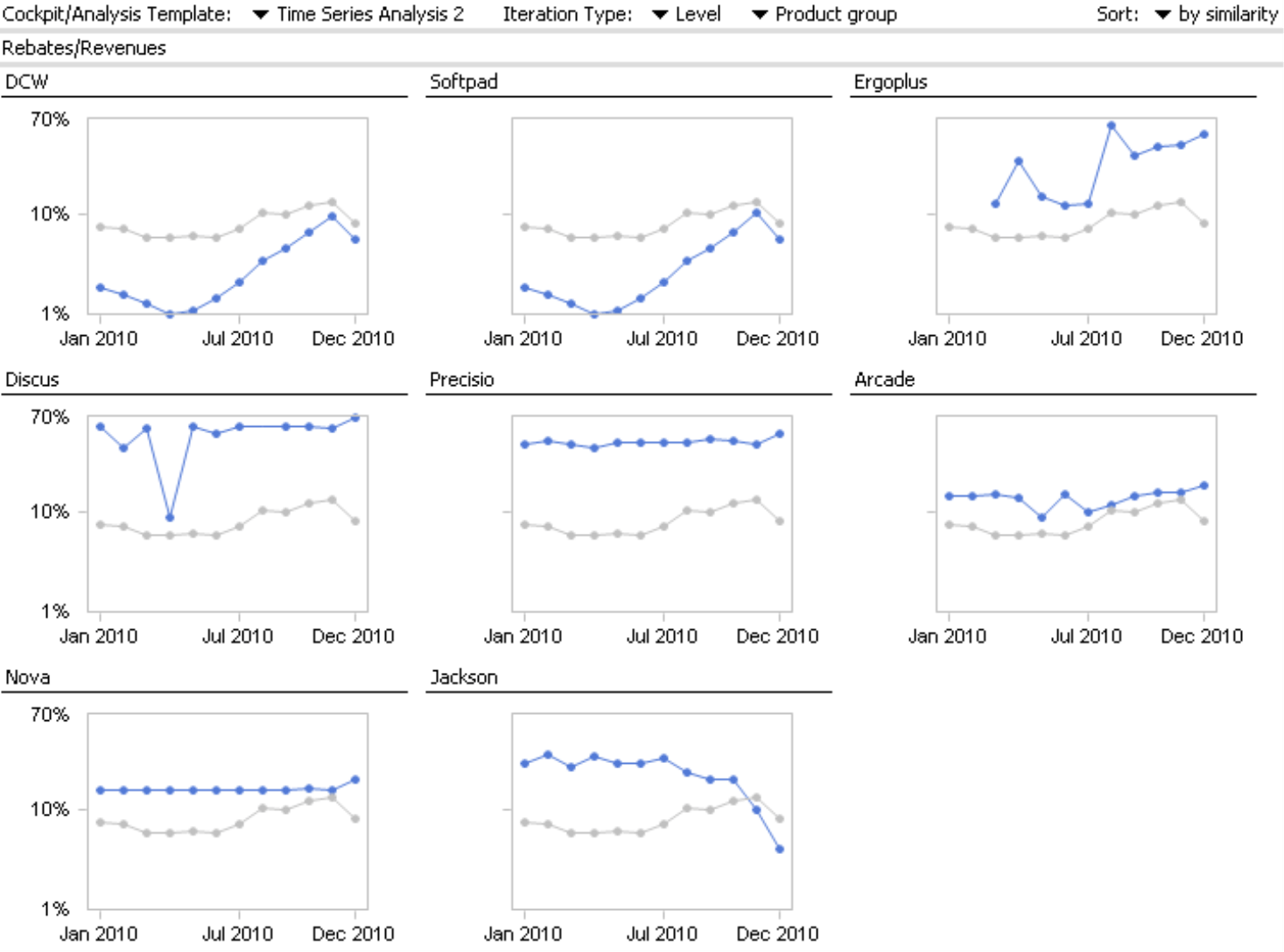
The report consists of eight tiles (eight multiples), one for each product group. Each tile has two time series. The blue line visualizes the development of the rebate rate for the respective product group over time while the light gray one shows the development of this measure over time across all product groups. This line is the same in all tiles and serves as a reference point for comparing the individual time series. The tiles are then sorted based on their similarity to the overall development. The pattern with the closest similarity is positioned in the top left corner while the pattern with the least similarity is in the bottom right corner.
To create this report, we first saved an analysis template (“Time Series Analysis 2“) in the Time series analysis. With Small Multiples, DeltaMaster calculates this template over and over again (iteration), once for each member on the product group Level.
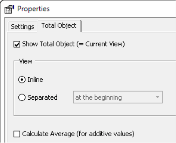
In order to display the overall development simultaneously, you must activate the Show total object option located in the Properties of Small Multiples (I want to… menu). DeltaMaster either determines the total object from the current view (for example, “All products” if this is selected in the View) or calculates it specifically for the Small Multiples report (in the case of additive measures). In the report displayed above, the time series for the overall development is inline in each tile (i.e. displayed together with the time series for the individual product group). You can, however, also choose to place it in a separate tile.
A Small Multiples report does not differentiate between above average and below average. Instead, you can use this analytical method to visualize and compare entire historical patterns.
Questions? Comments?
Just contact your Bissantz team for more information.
