![]()
Greetings, fellow data analysts!
Companies spend a great deal of time and effort collecting, saving, preparing, and consolidating data – and, ultimately, making reports. But if a report is read and understood or even triggers a reaction doesn’t just have to do with the quality of the underlying data. The design plays a key role as well. When it comes to designing reports, DeltaMaster already answers many open questions and takes over a range of tasks, for example, through reasonable default settings, automatic formatting, and a carefully defined set of options. And for all of the tasks that you can’t automate (yet), we have set up recommendations and guidelines. We will present these to you as a series of checklists and explanations in a special edition of DeltaMaster clicks!:
Part 1: General Guidelines DeltaMaster clicks! 09/2013
Part 2: Pivot tables/graphical tables DeltaMaster clicks! 10/2013
Part 3: Sparklines, pivot Charts DeltaMaster clicks! 11/2013
Part 4: Nomenclature DeltaMaster clicks! 01/2014
You will see how you can make many improvements to your reports with very little work. Oftentimes, all you need to do is tweak a few settings to make your reports more attractive and easier to understand. The readers of your reports and audience of your presentations will surely thank you.
Best regards,
Your Bissantz & Company team
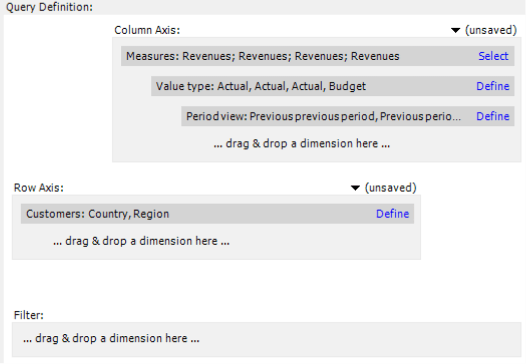
In the second part of our series on improving DeltaMaster applications, we will focus on pivot tables. As the most important format for efficient standard reporting, pivot tables provide an ideal starting point for detailed analysis and a stable foundation for planning. Here is an overview of our tips:
| Pivot tables/graphical tables
1) Hide hierarchy names 2) Use graphical elements only to highlight something 3) Represent structures through gaps 4) Check stand-alone row or column members 5) Arrange nested dimensions to branch out downwards 6) Use line breaks in column headers 7) Do not filter out bars for sum members 8) Use cell coloring carefully |
One tip before we get started: Use Pivotizer mode when you are working with pivot tables – even if you normally use a higher user level. In Pivotizer, you don’t need to deal with cockpits and reports; you only work with reports. If you wish to see the respective cockpits, you can always switch to Miner mode.
1) Hide hierarchy names
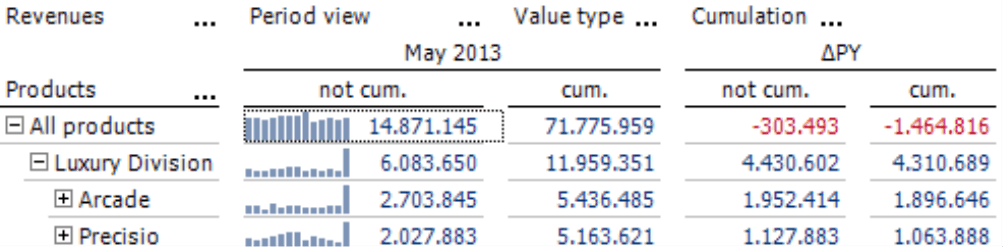
When you create a new pivot table, DeltaMaster will first display the hierarchy names – for example, “Customers”, “Products”, “Periods”, or “Measures”. Oftentimes, however, you don’t need to see these names to understand the report because the listed members clearly belong to a certain dimension. For example, you would recognize the customer regions, product names, calendar months, and measures as such even if they aren’t labeled with a heading.
 |
 |
In particular, abstract names such as “Period view”, “Value type” or “Cumulation” that you often use in analytical applications look awkward in reports and divert readers more than they help them.
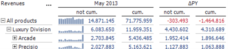
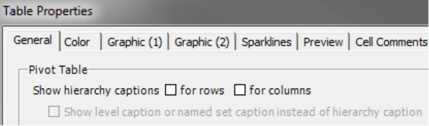
That’s why we recommend to hide the hierarchy names. To do this, open the Table Properties (context menu, I want to menu, or F4 key) on the General tab, and deactivate the option Show hierarchy captions. You can configure this option separately for rows and for column axes. In typical financial controlling reports, you can almost always deactivate the hierarchy names for columns because these usually list periods, value types, variances, and other members that you can clearly identify. You can usually do without hierarchy names in most rows as well. If, however, your reports contain lists of material numbers, customer numbers, zip codes, abbreviations for product series, classification codes, etc., you may want to keep the hierarchy names for rows.
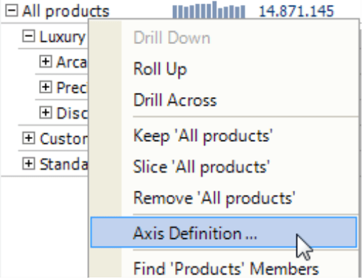
Some report editors fear that if they remove the hierarchy names, they will lose the ellipsis (i.e. three dots) which is a popular shortcut to the Axis Definition. These fears are unnecessary because you can open this dialog box from the context menu of the row or column axis. This feature has been supported since DeltaMaster 5.5.0.
2) Use graphical elements only to highlight something
You can use graphical tables to design highly compact, data-dense reports that are easy to read and can be automatically generated and updated. The graphical elements are supposed to clarify relationships among values, but most importantly, steer the readers’ eyes to important information. Graphical elements emphasize and highlight things for the readers. If you overdo it and wallpaper your reports with them, however, the effect of using visualizations will quickly go up in smoke. In this case, all of the rows and columns of the report scream for the readers’ attention, and they won’t know where to begin. In other words, the graphics will obstruct rather than aid their work.
Therefore, choose one leading column and direct the readers’ attention to it. Use bars and sparklines exclusively in that one, and hide them in the others.
 |
 |
If you are working with wide tables that have many columns, you may wish to use graphical elements in more than one column. As a general rule, however, the columns containing graphical elements should be in the minority. Which column you choose as the leading one depends on the purpose of the report. If the report shows budget-actual variances or changes to the previous year, the variances or changes are generally more interesting than the starting values. As a result, you would visualize the variances and changes – and not the budget values or those from the previous year.
The steps to activate visualizations for a particular column are the same for all graphical elements – whether they are bars, columns, circles, sparklines, trend barometers, scales, or cell colors. When you activate a visualization form using the context menu of the pivot table, it will be applied to the entire table. Afterwards, you can hide it for individual columns and rows (Column Properties or Row Properties in the context menu of column and row headers).
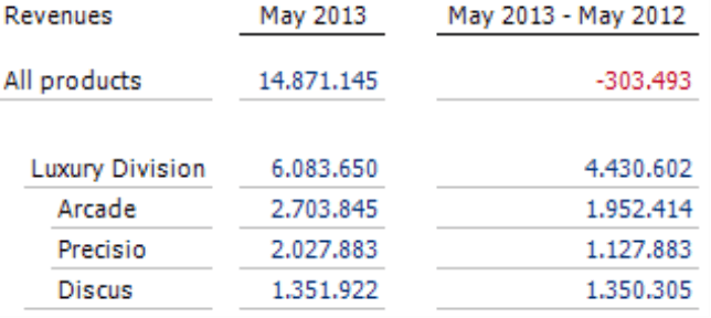
3) Represent structures through gaps
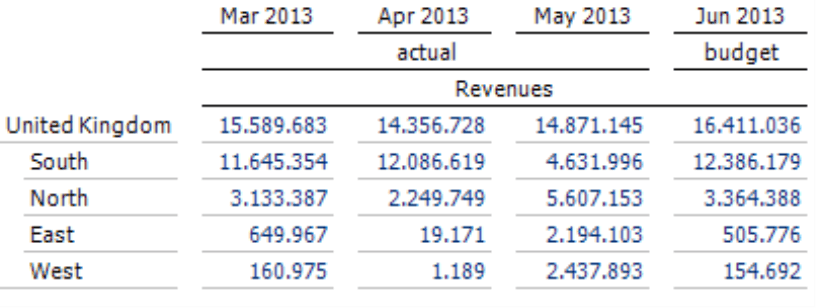
Most financial controlling reports contain dimensions that are nested within each other. To help your readers quickly recognize where a number belongs, you can emphasize the structure of the table. DeltaMaster doesn’t do that through frames, background colors, or bold type. It only uses gaps. This helps the brain concentrate on the meaning of the numbers without having to “filter out” optical embellishments.
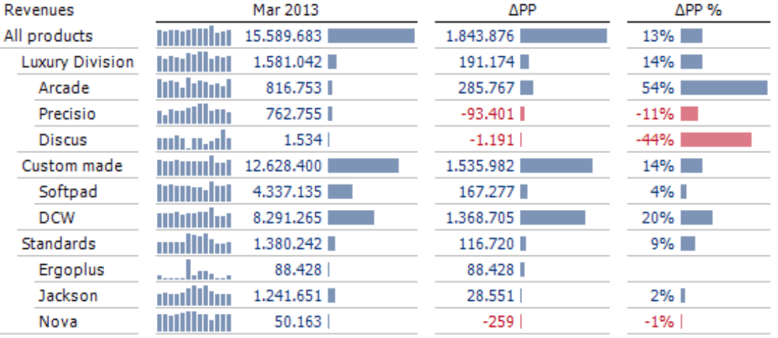
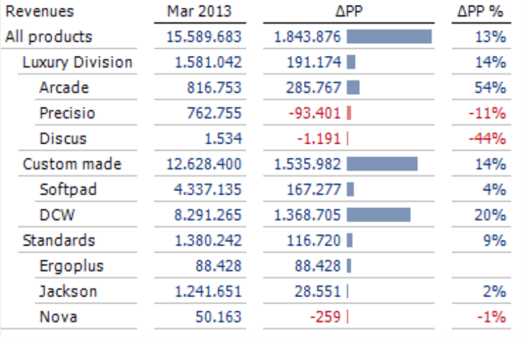
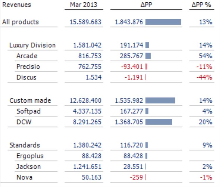
The screenshots below show the improved table as described in Rule 2, the one of the left doesn’t use gaps while the one on the right does. Do you see how clearly the structure stands out, how easily you can compare the numbers, and how elegant the table looks as a result? Gaps, of course, require additional space, but the investment is worthwhile when the table becomes so much easier to read as a result. And that is especially true when you are dealing with complex analyses.
|
 |
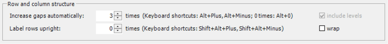
Optimizing the table in this manner is very easy. In Pivotizer, Analyzer, and Miner modes, you simply press Alt+Plus to increase the gap or Alt+Minus to make it smaller. DeltaMaster automatically knows where to enter gaps in the hierarchies and their nested members – and even changes the row height with every second step. This shortcut, therefore, provides a very quick way to add structure to your tables.
What’s more, your table remains dynamic and flexible the entire time. You can still sort and filter it, rearrange it using drag-and-drop functions, expand or collapse the rows and columns, show or hide graphical elements, start the pivot navigation, add row, table or column aggregations, and so on. In other words, the pivot table acts exactly as you would expect in DeltaMaster.
You can fine tune the structure using the settings in the Table Properties on the General tab. The keyboard shortcuts are listed here as well for reference. On this tab, you can also define if the rows should be labeled upright in order to gain space horizontally. For more information on optimizing the row and column structure, please read DeltaMaster clicks! 11/2012. Starting in DeltaMaster 5.5.6, you can also include levels. When you activate this option, DeltaMaster will automatically enter gaps within an individual dimension as well as for nested dimensions.
Our recommendation: Since adding gaps to the structure provides such an easy way to deliver compelling results, you could (and should) use it in virtually all pivot tables. Please, however, don’t overdo it. Usually, one step is enough to achieve the desired results.
4) Check stand-alone row and column members
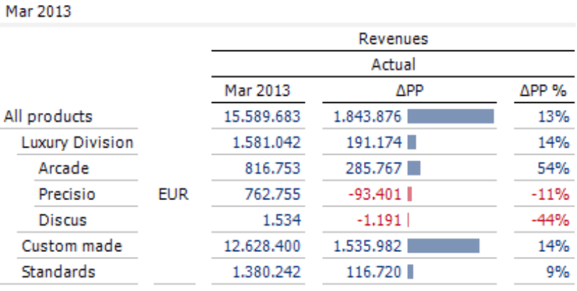
Sometimes, you may find a single row or column member without any neighbors for comparison in a report. This type of information is rarely necessary for analysis, wastes valuable space, and just makes it harder for your readers because the important member and measure names are separated from the values. Oftentimes, these types of members only appear in a report as a legend – for example, to emphasize that all values are actuals or displayed in Euros even though the report doesn’t show budget figures or other currencies. It makes sense, therefore, to place these types of captions in the view description of DeltaMaster, where they are automatically displayed anyway.
 |
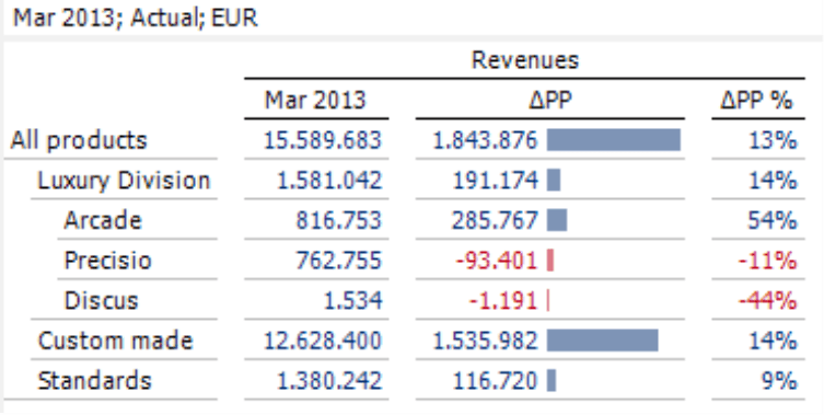 |
The view description is always displayed with (i.e. above) the report and included in exports. DeltaMaster displays the view description as a separate row above the report in Reader mode, in the title bar of the View in all other user levels, and directly under the heading in presentation mode. In short, you can always see this property and it is always easy to find. In the screenshot, we only left the member “Actual” in the view for didactic reasons. As discussed in Rule 2 in the first part of the “Check list for DeltaMaster applications” series (DeltaMaster clicks! 09/2013), you should hide it here as well.
Our recommendation: Check if you can eliminate all standalone members in the report, and be especially critical if these members are selected in the Axis Definition. Sometimes, a single member is only displayed in the default setting, but users in Viewer mode can select, display and, therefore, compare additional members from the same dimension. This is not the case if the members are in the Axis Definition, which makes it even more questionable if they belong in the report.
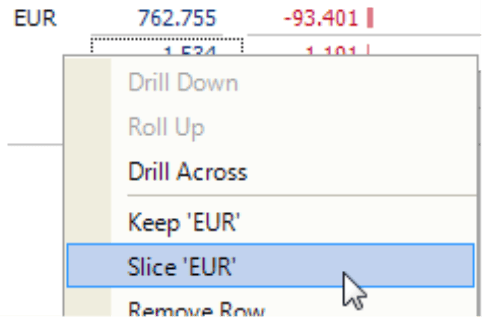
Removing a single member is simple. You can either drag it from the report and drop it in the View window or select Slice from the context menu of the member.
And if your report consumers should ever ask, simply show them where they can find the caption – always above the report. It’s that simple.
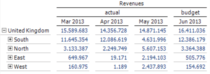
5) Arrange nested dimensions to branch out downwards
General to specific: That’s a common pattern of structuring all kinds of topics. It can be applied to nested axes of pivot tables, too.
Our recommendation: Arrange nested dimensions so that they branch out downwards. This lets you display a few, more general members on the top and many members that describe something particular on the bottom.
 |
 |
You can change the nesting order in the dimensions of an axis by dragging and dropping them to the desired position. The only time this doesn’t work is if the report contains individual member combinations that have been defined using the Row or Column editor (in these cases, you can change the order in the Row or Column editor). You can learn the basics of using this tool in DeltaMaster clicks! 01/2009. For more advanced tips such as how to add MDX expressions, please read DeltaMaster deltas! 5.5.2, feature #14.
To check and change the order, you may find it easier to observe the table from a birds-eye view in the Report Definition (Pivotizer and Analyzer mode) or the Cockpit Definition (Miner mode). Especially when you are working with more complex tables, you can often view the structure of the axes better and change them more easily here than directly in the report. You can arrange the dimensions within the axes (i.e. the gray boxes) or move them between axes using drag and drop. When you use this feature, DeltaMaster will not run a database query or calculate the values in the table, which allows you to work quickly even in tables that are large or involve a great deal of processing power.
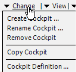
You can open this dialog field in the respective entry of the Change menu in the Report window (or Analysis or Cockpit window) – or, even faster, by simply clicking on the word Change.
6) Use line breaks in column headers
If the member or measure in the column heading has a long name, the entire column can become relatively wide and a large, empty space may appear in the table. There are several ways to fix this. One best practice is to enter two spaces in the name of the member or measure to create a line break in the column heading.
 |
 |
Another way to reduce the column width is to rename the member or measure, which also helps improve the readability of the report. For example, time analysis members that contain the periods that you are comparing (see screenshot above) have the advantage that you cannot confuse which period they are referencing, but the fact is that no one would read a description like that out loud. If you opt to use the acronym “PP” for the previous period, descriptions such as “PP variance” or “?PP“ are much quicker to say, easier to read, and save space as well. If you rename a member or a measure, this change will apply to the entire application or analysis session. Since DeltaMaster 5.5.5, you can even edit the labels for individual pivot tables.
It is also possible to set User Defined Column Widths for Data Columns and Fixed Columns in the Table Properties on the General tab.
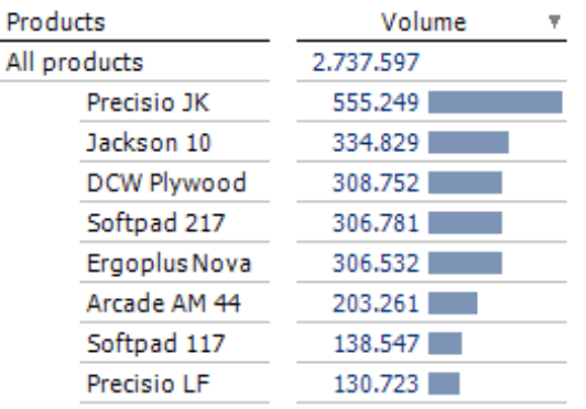
7) Do not filter out bars for sum members
Every once and a while, you may come across graphical tables in which someone has gone to great lengths to suppress bars for aggregated members such as “All Customers” or “All Products”. We find that problematic. Bars showing sums are important to recognize concentrations and distributions. The graphic sends a signal while the value shows the details. If, for example, no product has a dominant percentage of total revenues, that is an important signal that would be lost if you didn’t display bars for sums.
 |
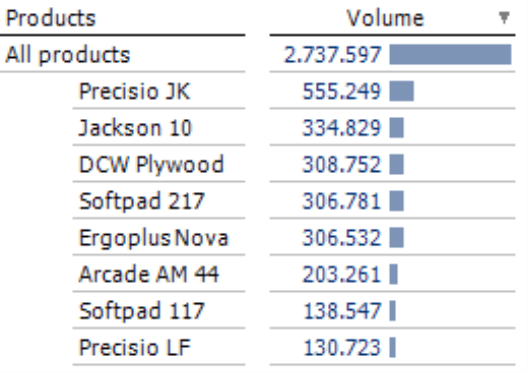 |
The example above illustrates how this can alter the way you interpret your data. The left screenshot, which has hidden the sum bar, shows the relatively strong meaning of “Precisio JK”. Yet it conceals the fact that the company needs to secure its success with five other products, because the total units sold (and, therefore, the success of the company) is distributed across a clearly defined group. The job of these types of reports is not to highlight well-known dominance, but rather to make a correlation to the overall success. This is the only way to correctly direct the readers’ attention.
8) Use cell coloring carefully
Just as with other graphical elements, don’t overdo it when you use cell colors (Color in the context menu of the pivot table). Although combinations are possible and can even make sense depending on the data, you shouldn’t go overboard.
If you take these general guidelines to heart, you will have already done a great deal to improve your DeltaMaster applications. We’ll continue in the next edition with tips for sparklines and pivot charts.
Questions? Comments?
Just contact your Bissantz team for more information.
