Animation doesn’t just put data in action. It creates a stir as well. Sure, animation does grab your attention. But at a second glance, do you ever remember anything that caught your eye the first time around? Plus, the interaction between the presenter and the audience is more important than usual.
In a highly acclaimed and impressive presentation at the 2006 TED-Conference, Hans Rosling showed how the average family size and life expectancies have changed in countries throughout the world. Previously, people living in Western countries had small families and lived long lives while those in the rest of the world lived short lives and had large families. In the meantime, however, most countries have long life expectancies and small family sizes. Rosling demonstrated this development with the help of a visualization program.
You are currently viewing a placeholder content from YouTube. To access the actual content, click the button below. Please note that doing so will share data with third-party providers.
“Debunking third-world myths with the best stats you’ve ever seen” – A segment from Hans Rosling’s February 2006 presentation.
Rosling uses bubbles to represent the population and animation to visualize the change in values. (The problems with area charts, of course, are no great secret here.) The bubbles move each year to a new position based on family size and life expectancy. In other words, the result is colorful chaos rotating in front of your eyes.
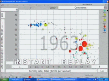
Rosling’s visualization of the development of family size and life expectancy in all countries from 1962 to 2003.
Rosling accompanies the animation with a lively, crusading, almost Faustian description of this change. It almost appears as if the animation visualizes his thoughts and the bubbles simply follow his gestures and not vice versa. What the audience sees, however, has much more to do with Rosling’s well-rehearsed dramatization than the quality of the data visualization. This presentation offers better tips on how to woo an audience than what comprises good visualization.
Trying to draw conclusions from moving objects is highly challenging to say the least. And that rarely works at all when the actions we observe follow relatively clear and not random patterns.
Ultimately, we need to decide what we want to accomplish. Do we simply want to play up a point that was already well made or do we want to investigate an unknown topic and try to understand it better ourselves? Things that we understand immediately are trivial. If the patterns are more complicated, however, we will only be able to recognize them when they are played over and over again. And that’s tiring.
Statistical presentations are better for exploration. For presentation, smart animation and theater are hard to beat. When it comes to time for reflection, however, the viewers will surely ask themselves if the presenter was trying to portray a serious message or simply even out, hide, sugarcoat or emotionalize something. And that answer could leave them with a bitter aftertaste…
If you plan on hosting a presentation at a TED conference, I would recommend following Rosling’s example. After all, the conference is all about technology, entertainment and design. I wouldn’t, however, for the next meeting with your board of directors. The audience’s reaction probably wouldn’t be worth the extra time you’d need to invest.
The title of his presentation needs a small adjustment as well. We saw one of the best presentations of statistics – but definitely not the best statistics.
