Before you can embark on innovative data analysis, you first need to know which tools are available. In a recent blog I already explored basic types of comparisons as described by Zelazny. But those are just the beginning!
Spatial comparisons – Maps are one of the most common ways to portray spatial comparisons. Although they are great eye-catchers, these comparisons are difficult to use, take up considerable space and hinder the proper placement of values and labels. Since countries and regions all have different sizes, the human eye also tends to judge the largest spaces as the most important ones.
So-called cartograms* manipulate a country’s boundaries so that the space is proportional to the chosen measure (e.g. income, population, election results). This works fairly well for global maps because most people can recognize the shapes of countries and continents. If you want to compare regions based on zip codes, however, you would have to place an original map next to the altered one in order to tell the difference. As mentioned before, the naked eye is not well suited for measuring the sizes of areas.
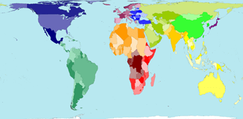
Land area (Source: worldmapper.org)
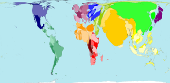
Population (Source: worldmapper.org)
Even “normal” maps only deliver added analytic value under certain conditions:
- The observed variables are spatial in nature. Distance, diffusion, accessibility, terrain and road development are aspects of the observation. This is not the case for business charts that simply show revenue distributions by country.
- Spatial neighbors deliver additional information that would otherwise be lost in a table. One example is shopping tourism in neighboring countries that have lower taxes on tobacco or gasoline.
- The exact location of countries or regions could be emphasized to show, for example, the geographical proximity to a disaster area.
In short, use with caution. Over the centuries cartography has developed to an art form of its own right. Cartographers are masters of information density. Good maps can integrate countless amounts of information in limited space through subtle color selections, the finest of lines and the strong, creative discipline of their designers.
Most cartographic visualizations of business data, in contrast, are just plain awkward. If you really want to add some style, simply place the data in a table where it is so much easier to read and compare the information.
For more musings on comparisons…stay tuned.
*Michael T. Gastner and M. E. J. Newman (2004) Diffusion-based method for producing density equalizing maps Proc. Natl. Acad. Sci. USA 101, 7499-7504.
