The following charts show revenues for margarine in three stores of a supermarket chain on consecutive days. While Supermarket 1, our control, did not do any special marketing promotions, Supermarket 2 used a cardboard display and Supermarket 3 had a friendly, young sales clerk who tempted shoppers with a piece of bread with margarine.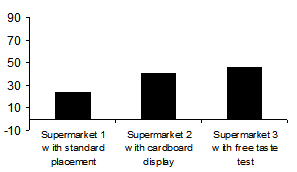
The first chart shows the mean of five daily revenues for each supermarket. The difference in these means seemingly signalizes a clear rank in effectiveness. Although this type of presentation is commonplace, it is very dangerous and downright wrong. It suggests security that doesn’t exist.
On a side note: If someone declared that this chart showed a 5% significant test result, most people would view the results as hard evidence. Unfortunately, only few statistical institutions and academic textbooks truly understand what “significant” really means*. In the meantime, the hysterical and ever-growing masses cling to their misconceptions…
My problem with the chart above is that it conceals more than it reveals. There is no explanation how the daily values are scattered around the mean and if an outlier somehow influenced the results. This can have one of two reasons. 1. The person who made this chart is naïve and truly fell for the typical marketing line that he or she can use statistical software without any background or knowledge of statistics whatsoever. 2. The individual is fully aware that the data is weak and chose to match the data to the argumentation instead of matching the argumentation to the data. At any rate, the readers lose the opportunity to think for themselves.
My tip? Ignore these types of visualizations. Otherwise, it will be impossible to get rid of them in the long run.
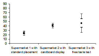
The second chart tries to correct the faults described above by integrating a graphical view of the standard error. It even complies with Geoffrey Loftus’ standards**. The standard error estimates how the values are scattered among the population. This only happens, however, if we are using a normally distributed test sample – which is not the case here.
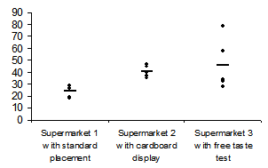
The last chart is my personal favorite. Even managers can understand it. In fact, I think it marks the difference between statistical rituals and statistical thinking.
*Krämer/Gigerenzer 2005, page 6
** see Loftus, G.R., A picture is more worth than thousand p-values: On the irrelevance of hypothesis testing in the computer age, Behavior Research Methods, Instrumentation and Computers 25 (1993) 2, S. 250 ff, figure 3.
