Presenting information in the context of space often goes awry. It’s so easy to manipulate the reader. If you want to report something correctly, you have to know how.
We know that it’s difficult to present business figures using geographic visualizations. Since each country, region, etc. has a different size, the human eye quickly assumes that the largest space is also the most important.
Matthew Ericson, the deputy graphics director of The New York Times, made a few good cases in point after the 2004 US Presidential election*. The usual state-by-state comparisons show that Bush had a stronghold in the American heartland, while Kerry dominated on the coasts and the Great Lakes. In the US election system, each state receives a number of electoral votes based on its population. This map, which shows the distribution of electoral votes by state, reveals a very close outcome of the election.
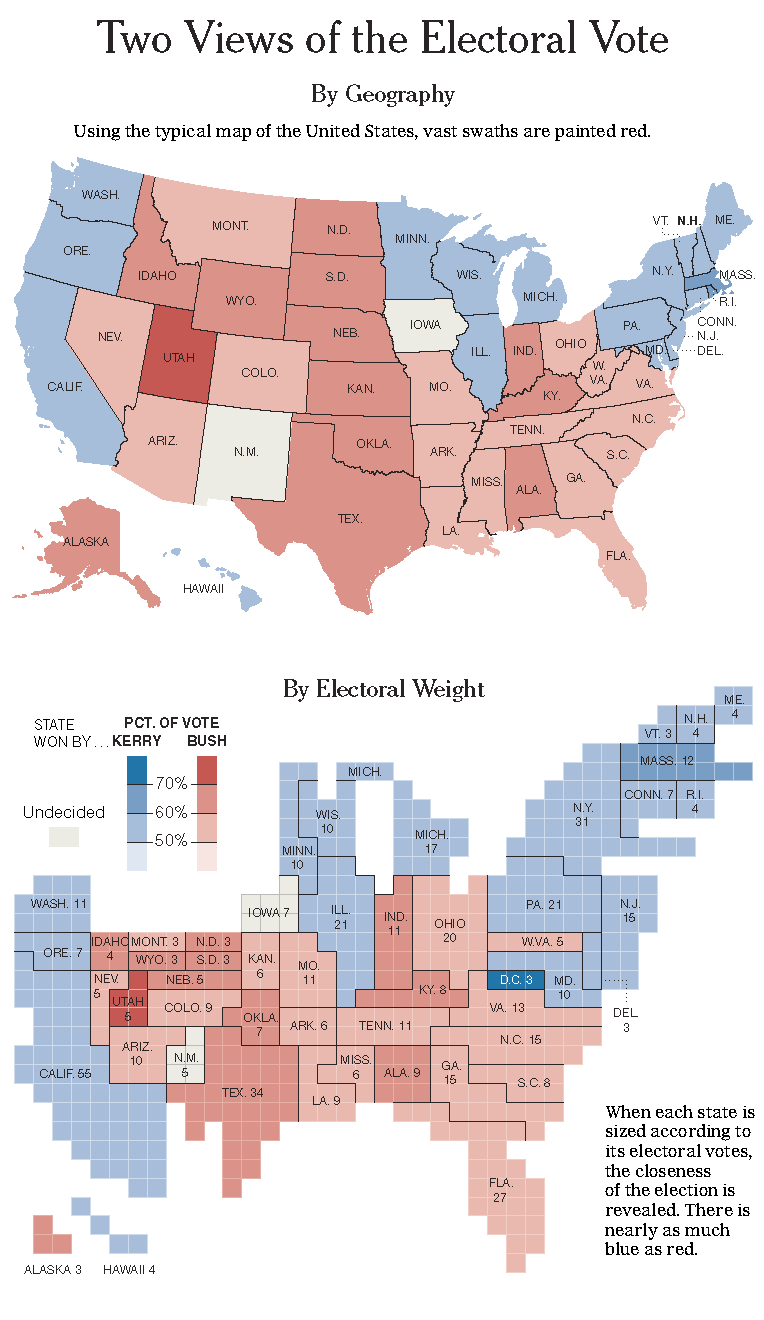
Source: New York Times. Click the image to enlarge.
Since it is difficult to visualize such numbers, some choose a different route. The map below shows the absolute winning margin for each presidential candidate per county. Circles place size into perspective and the map only serves as orientation. It also subtly puts the population density into perspective. In rural and suburban areas, due to their small population, only small absolute margins are realistic. Bush was successful in these regions, while Kerry dominated the densely populated, urban areas.
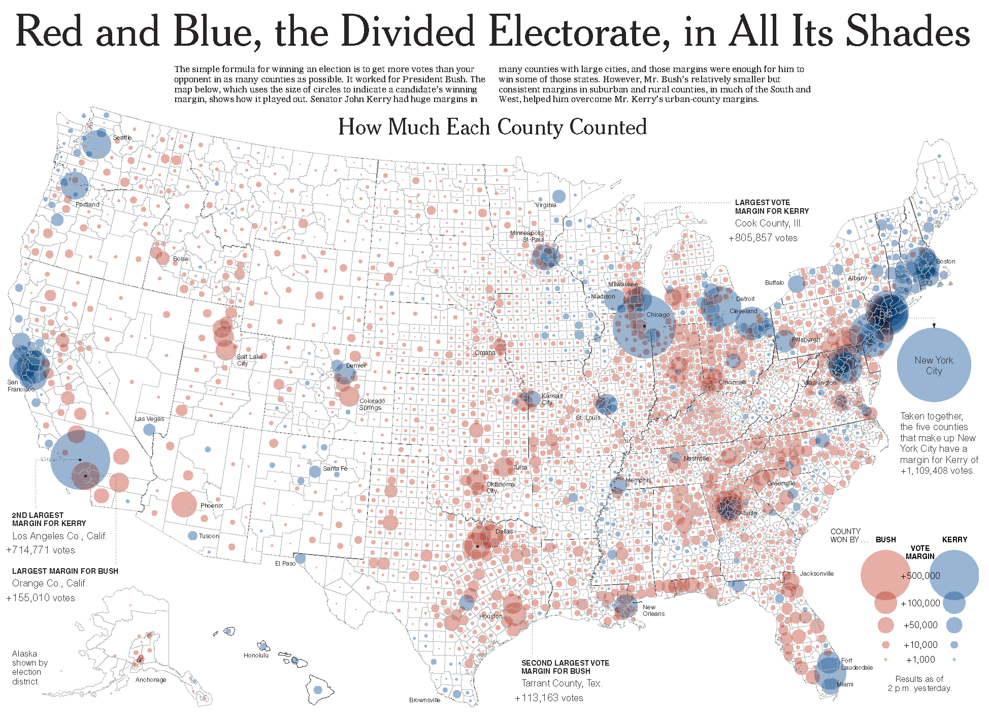
Source: New York Times. Click the image to enlarge.
It is very difficult to make comparisons based on bubble charts. In addition, the presentation of overlapping areas is not very legible either. Even though maps are nice to look at, it is not easy to create visualizations that are suitable for analysis.
* The 2004 Elections: The Electoral Map; Red and Blue, the Divided Electorate, in All Its Shades, Published: November 4, 2004, The New York Times. Map design: Matthew Ericson, Deputy Graphics Director, The New York Times. Click here for more fascinating pictures on this topic.
